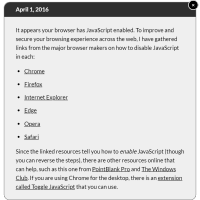
I added something to my site for April Fools’ Day, and it didn’t go quite so well (as opposed to my 2012 effort, which just went nowhere). In reality, it’s something I’ve wanted to add to my site for a while, but my gaming night was canceled last night (they…
In my ~20 years of responding to RFPs/RFQs, once organizations started to realize the value of accessibility (or fear of lawsuits), I saw more and more requests include a note on accessibility. In most cases this was just a single line item among many, often with nothing more than a…
Imagine that as a user you regularly use the keyboard for non-data-entry tasks. Think about how frustrating it is to have to grab the mouse to hover over something on the screen just to see it. Now imagine that you are a keyboard-only user. That problem can be addressed somewhat…
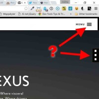
This is, to some extent, a response to the article at Usability Geek titled Making A Case For The Desktop Hamburger Menu (which I had the Wayback Machine capture because I have learned my lesson). I left a comment on the article, but it motivated me to write something on…
I received a design for a project recently that called for a search field hidden behind a single icon — no visible label text, no visible field, no submit button. While I’ve seen this pattern on sites repeatedly, I feel they generally get it wrong. Relying on bloated HTML and…
Last week Smashing Magazine published a lengthy and detailed post titled The State Of Airline Websites 2015: Lessons Learned. While it was an impressive dive into the user experience of each site covered, it left out any aspect of accessibility. Surprising perhaps no one, I got as far as reading…
I update this post regularly, but on June 30, 2020 I wrote #accessiBe Will Get You Sued, where I demonstrate that accessiBe’s product generates more testable errors and creates a worse experience. I also document paid news stories, deleting critical comments, and its efforts to undermine WAVE. There is an…
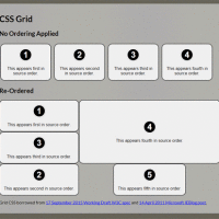
Last month in my post Source Order Matters I wrote about why we need to consider how the source order of the HTML of a page can affect users when the CSS re-orders the content visually. While I used a recipe as an analogue and cited WCAG conformance rules, I…
You can also view the slides directly at SlideShare. Sadly, the animated GIFs in my presentation did not survive the conversion to SlideShare. I’ve added them at the bottom of this post, but they are all quite large and will take time to load. If you want to save on…
Google wants to speed up the web, and it has a plan: For many, reading on the mobile web is a slow, clunky and frustrating experience – but it doesn’t have to be that way. The Accelerated Mobile Pages (AMP) Project is an open source initiative that embodies the vision…
A picture of my strawberry, balsamic, black pepper sorbet, which makes sense later in the post and because my blueberry sorbet didn’t come out so well. CSS is providing newer and more complex methods of laying out your pages. Given the multiple form factors a responsive site has to support,…
This weekend I read a post about techniques to get Apple’s new San Francisco font into your CSS. Since San Francisco is only just being added to iOS and OS X, it can be a bit tricky to get hold of it in Safari. What struck me was the use…