Be Wary of Add-on Accessibility
When I say “add-on accessibility,” I am referring to web sites that use custom tools to try to address accessibility gaps. Typically this is done in place of a team writing code that is accessible on its own. This is usually because the team doesn’t have the accessibility skill, a company is concerned about lawsuits, or a well-meaning stakeholder is trying to do the right thing.
Two Common Methods
I’ve encountered two techniques that vendors offer when pitching their accessibility solutions to existing sites, neither of which require the site owner to change much, if any, of their existing code. After all, it’s a pretty compelling solution when you’re promised legal compliance with little to no work from your development team.
1. Separate Site
One approach is the completely separate site. Harkening back to the text-only version of sites in the mid-1990s, companies slowly discovered that maintaining two separate sites with the same core content was impractical.
In fact, I did not think this practice existed any longer except as parody. As recently as last year, Léonie Watson found a site relying on this approach:
Closer inspection did indeed reveal the presence of a “link” leading to an alternate version of the website. It’s been years since an alternate version of a website was considered a reasonable (or even necessary) way to provide accessibility. Apart from building websites like it’s 1999, it’s the antithesis of progressive enhancement.
Many accessibility professionals see this as a separate but equal
approach and are understandably uncomfortable with it, as this image from Patrick Lauke demonstrates:
Longdesc: Small water fountain labeled "Accessible version" next to big labeled "Regular site." RT @patrick_h_lauke: pic.twitter.com/dHeod8SN1H
— Adrian Roselli (@aardrian) February 21, 20142. Toolbars
Sometimes an add-on takes the form of a toolbar or widget that might adjust change contrast or allow a web page to speak its contents to you, among other features. Typically these are not built by the site owners, but are embedded from a third-party source. Often they duplicate (or conflict with) existing assistive technologies that users may already have.
Sometimes these are developed by the site developers, commonly in the form of text sizing widgets or color switchers. There are some common interface elements (such as a button with a larger letter or plus sign, and another with a smaller letter or minus sign), but for the most part these are different from site to site.
One example of a third-party tool is Browsealoud, which speaks the content of a web page (from a section defined by the site owner). Another one is Hand Talk, which will present content in sign language via a Flash-driven animated avatar (that helpfully shows advertisements while it loads).
Caveats
Both of these methods (separate sites and toolbars) suffer from a common failing — namely that the stakeholder who commissioned the feature is probably not qualified to verify that it works well or at all.
Sure, the toolbar or separate site may address some issues in a compliant way, but it likely doesn’t flow well with the entire experience. It’s possible it even conflicts with the assistive technology the user already has.
Using a third-party add-on also means that the team responsible for the site not only doesn’t have the opportunity to develop new skills around accessibility, but that the team might even consider accessibility to be something that can be addressed by throwing some money at a vendor.
Money coming from a budget that could be used for accessibility training.
Two Questions
Alastair Campbell offers two simple questions to ask before embarking on hiring a vendor or buying an add-on tool:
Does it improve the experience for anyone?
This isn’t just a question of whether or not it’s well-implemented. Sometimes a user isn’t willing to waste time on a tool that might make it difficult to revert, and so documentation and support must be considered.
Should it be provided by the website, or the user’s software?
From usability testing, we know people ignore an unfamiliar widget in the top of the page and get on with their task using the main content, even if the widget would help them.
What Motivated This
Virgin America.
Seriously, it has been the low-hanging fruit of a public-facing site that got rave reviews while completely failing at accessibility. I’ve written about it before, it has been a staple in my talks, and it even was the impetus for me to create a handy bookmarklet. I’m not the only one who thinks it’s a cluster.
While casually perusing the Virgin America site last week I discovered that a new link has been added, visible when tabbing through the page, the offers a link to an assistive version
(changed to assistive view
by Sunday night) of the site, built by a third-party.
Except the assistive version
is not accessible.
. @aardrian IT'S NOT EVEN ACCESSIBLE EITHER ! :| pic.twitter.com/q01XrQUNkT
— Paul J. Adam (@pauljadam) November 4, 2015And even that page has a11y issues! <a accesskey="t" href="#text-only-options" … class="hidden_accesskey"></a> https://t.co/pErS4niIkl
— Karl Groves (@karlgroves) November 4, 2015
For a sighted physically-impaired user who relies on keyboard navigation, the “assistive version” is not helpful, and the main site persists in blocking these users by continuing to use the outline:none declaration for elements that have focus.
Don’t be Virgin America.
Update: November 10, 2015
Jennison Asuncion points out (LinkedIn-free version) that airline web sites must be accessible by December 12, 2015 — or just about a month from now. SSB Bart Group outlines the core features of a site that must be accessible next month (such as booking a flight or checking in), and outlines what can wait until December of 2016 (just some leftover marketing pages at that point).
It’s possible Virgin America paid for the third-party solution in an effort to make the deadline. Sadly, if nothing improves between now and next month, Virgin America will not be compliant and may have to throw more money at an already sub-par solution.
Update: Also November 10, 2015
Today Smashing Magazine has kicked off a UX review series starting with the airline industry. Virgin America’s site ranked well, but no consideration of accessibility was mentioned anywhere. So I got ranty in the comments.
Update: November 13, 2015
Too good not to add:
I suppose I shouldn't find it surprising that snake oil salesmen are also comment spammers. pic.twitter.com/674V9eQP7O
— Karl Groves (@karlgroves) November 13, 2015It’s a screen shot from The Legal Intelligencer with a comment from Nate Bradley, in all-caps, saying that NBA can fix this lawsuit by using AudioEye. Full comment (don’t need to get past paywall to see it).
Update: Also November 13, 2015
Karl Groves was also inspired by Virgin America’s broken site to write his own perspective. His is more direct than this post and he also spends more time explaining some of the accessibility failures of the assistive
version of the Virgin America site: When the treatment is worse than the disease
Update: January 8, 2016
Debra Ruh explores the benefits of one kind of add-on, with examples, in her article Should Accessibility Overlay Tools Be Used as a Strategic Part of your Accessibility Efforts. Karl Groves responds to that post specifically: On Overlays as a means of resolving website accessibility issues.
Update: January 19, 2016
I forgot to link to my 2014 post Patents versus Accessibility — Again, where I identify a patent to automagically make sites accessible by a company that itself would have benefited from such a tool. If it’s not clear from that statement, I am of the opinion that any web site that misses the low-hanging fruit for accessibility is not qualified to apply some magic tool to anything and expect it to fix accessibility issues.
Update: April 4, 2016
Virgin America is getting bought. Hope they don’t average the accessibility efforts between Alaska Air and Virgin America.
Well this is one way to deal with Virgin America airlines's terribly inaccessible website https://t.co/io3mcMCgTi
— Karl Groves (@karlgroves) April 4, 2016
Update: April 17, 2016
I neglected to mention that you should point to these broken examples of accommodations made specifically for self-identified screen reader users whenever anybody asks about detecting screen reader users. There is ample evidence to show that you’re better off just fixing the main site instead of providing a broken alternative. Read my post On Screen Reader Detection
Update: December 14, 2016
Today there is a post from Jeffrey Zeldman, In Defense of Font Size Widgets, suggesting that we should consider going back to using bespoke text resizing tools on sites.
If you want to give them a whirl, by all means go right ahead. I only ask that you track their use with Google Analytics or similar and make a commitment to remove them after some period when you find they are not used. Having built many over the years, I am confident you will find they are mostly ignored.
If you built your site well, then all the text sizing control users need is built into their operating system and their browser. There is no need to develop a brand new interface on yet another site for them to replicate what they can already do natively.
Instead, use that time to fix known accessibility issues in your site. It isn’t as satisfying and you do not get to point to a shiny widget to show how you care about users, but it is likely a better use of your time and real users will really benefit.
Update: December 15, 2016
I penned a response to the renewed call for text sizing widgets: Don’t Re-Create Browser Features
I use the broken example from the New York Times to demonstrate how it can easily go wrong.
Update: February 11, 2018
Remember that add-on tools can be attack vectors.
ALL website's currently using the @texthelp "browsealoud" plugin (which claims to make websites more accessible with speech, reading and translation tools) are currently infected with a #cryptominer #InfoSec #CyberSecurity #coinhive
Update: February 13, 2019
Someone will always try to sell a quick fix for accessibility. Usually a few minutes with their own tool will demonstrate what a mess it is. Karl has a thread:
Gradiose claims of automatic compliance with WCAG? Check. List of companies they've duped into buying their snake oil? Check. Keyboard trap in the header? Check! (alt: gif of overlay vendor's website. Focus cycline through keyboard trap in the very top of page) pic.twitter.com/mm4C2ufVtC
Eric also has a thread:
If a company offers you turnkey accessibility compliance they are lying to you. You will take on liability, and more importantly, you will continue to lock people out of your site despite your best intentions. To be clear, this site is snake oil. pic.twitter.com/hiiF1tOzY5
AccessiBe cannot stand up to scrutiny. It is also near User1st, another one previously found to be pitching a product that cannot deliver. Maybe they are sharing the same broken technology from workers who have moved between them.
Update: March 22, 2019
Add-ons come in all forms, even as WordPress plug-ins. Joe Dolson discusses his own experience in Your Accessibility Toolbar Doesn’t Help.
Update: June 18, 2019
Accessibility 'overlays' touted as magic fix-alls for accessibility issues prevent your team from getting to the why – they promote a lack of discovery for tools, processes and the pursuit of an org specific perspective.
Your org would be better served applying resources to training, engaging with experts, going after low hanging fruit further developing an accessibility framework within the org.
"But, it will help us get started…it will help us learn what to do…it will lower our risk…"
No, it won't. Full stop.
Be better.
Update: February 12, 2020
I can guess this tweet is related.
Sad but true: Just got a Google Ad reading: "Understand WCAG 2.1 & Comply | Be Compliant in Minutes." No website can be "compliant" in minutes. Be careful how you spend your digital accessibility dollars. Involve disabled people and build something that will last. #a11y
Update: February 14, 2020
Another accessibility overlay company has manifested: EqualWeb.
It appears to hail from the same city as the others I reference above, which makes me wonder if they are trading staff, technology, clients, or marketing efforts. I am not suggesting they are in cahoots, but this is such a niche effort that I do wonder. For example, accessiBe is in Tel Aviv, User1st was in Tel Aviv (but now has a mailing address and Chamber of Commerce membership in the DC area), UserWay has a virtual office in Wilmington but its CEO founded a couple start-ups outside of Tel Aviv, and EqualWeb’s Terms of Service asserts jurisdiction in Tel Aviv. EqualWeb was also a 2018 MassChallenge 2018 cohort finalist out of Israel.
Anyway, market coordination conspiracy theories aside, similar to my response to an accessiBe comment below, Karl Groves made a video walking through the fundamental flaws in EqualWeb’s offering.
Think of it as a sequel to Karl’s October video that generally dismantles the concept of overlays.
Update: May 13, 2020
In Bolt-on Accessibility – 5 gears in reverse, Steve Faulkner walks through offerings from accessiBe, User1st, and Userway, and demonstrates how their features create new and exciting barriers.
These tools fail to live up to their claims and crucially they can add barriers to access for users with disabilities that rely upon their operating system, browser and/or assistive technology accessibility features to use the web. […]
These may draw those afraid of a lawsuit, but the more risk averse among you should recognize they can do the opposite.
Not to mention they are a shit-show for users.
Update: May 14, 2020
Translated into English from French:
Many companies publishing accessibility overlay tools lie to sell their product. Lies are often displayed very proudly on the sales website, are conveyed via advertising videos or in sales speeches. […]
I appreciate how frank it is (there might be a pun here).
Update: May 19, 2020
It appears there are cases appearing where the promises from these overlays are being met with the reality of how they reduce accessibility instead:
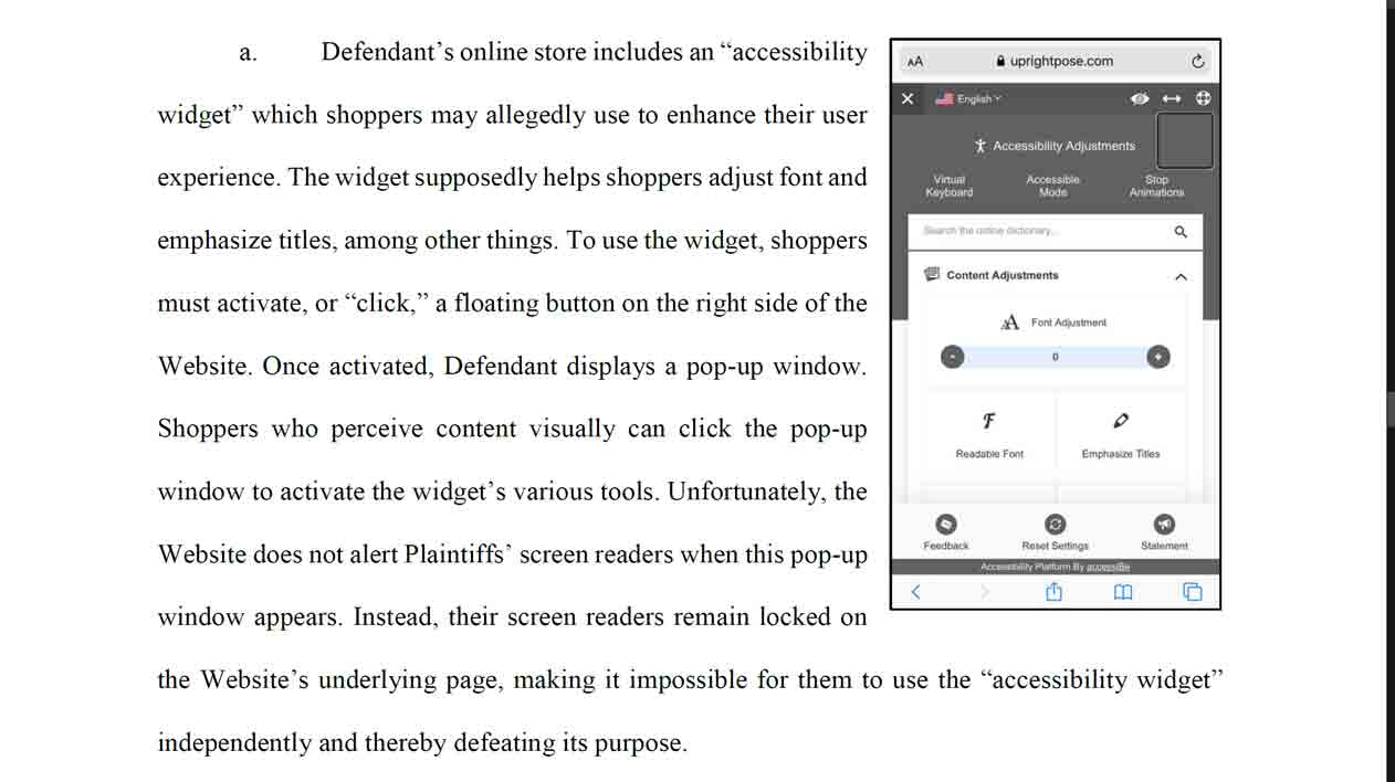
In the U.S. District Court, Western District of Pennsylvania, in the Civil Docket of Case #1:20-cv-00017-AJS, Judge Arthur Schwab has received multiple cases including Thomas Klaus and Robert Jahoda v Upright Technologies, and Kolesar v. Bylt, LLC. This particular judge has received many of these similar types of lawsuits and has started to consolidate into a single complaint. […]
The links to those cases are behind a paywall. UsableNet also mentioned these cases in its own ongoing tracking of accessibility and app lawsuits and that led me to a pair of PDFs. You can see screen shots of the overlays in the examples I excerpted.

Update: June 28, 2020
There is a new player in the useless overlay world, Adally. So far it seems as ineffective as its competition.
🤔Google, show me another automated accessibility overlay product that can't even get basic #a11y of their website correct:Adally.com pic.twitter.com/bkJt1YG503
10 min manual assessment of adally.com
⚠️missing alt text
⚠️missing link text
⚠️missing focus indicators
⚠️poor color contrast
⚠️images of text
⚠️lack of keyboard support for link menus
⚠️incorrect keyboard and semantics for modal dialog
/cc @LFLegal @karlgroves
Update: June 30, 2020
I have written some 3,000+ words on accessiBe in my post #accessiBe Will Get You Sued.
I demonstrate that accessiBe’s product generates more testable errors and creates a worse experience. I also document paid news stories, deleting critical comments, and its efforts to undermine WAVE.
The title is hyperbolic and a riff on accessiBe’s recent post taking a shot at UserWay’s also-crap product. You will not get sued as soon as you put accessiBe’s overlay on your site. However, you will be using a product that generates more errors than not using it.
Update: July 15, 2020
Jess Beck looks at the intersection of SEO and accessibility overlays in Don’t use AccessiBe (And other automated follies).
This interview discusses overlays in general and shows Betteridge’s Law in action: É possível tornar um site acessível de forma automatizada? (Is it possible to make a website accessible in an automated way?)
Update: July 16, 2020
Timothy Springer, CEO of Level Access, has been writing a series on LinkedIn (yes, I know LinkedIn is a terrible platform for your content) looking at the legal aspects of overlays (exposure, protection, application).
- Do Accessibility Overlays and Widgets Provide ‘Full and Equal Access’ as Required Under the ADA’s General Rule?, June 30, 2020
- Should Accessibility Overlays and Widgets Be Viewed As ‘Separate but Equal’ Solutions?, July 7, 2020
- Do Accessibility Overlays and Widgets Provide Effective Communication?, July 9, 2020
- Is Deploying an Accessibility Overlay or Widget Better Than Doing Nothing?, July 14, 2020
Update: August 11, 2020
Lainey Feingold has written a post, Honor the ADA: Avoid Web Accessibility Quick-Fix Overlays, where she takes issues with overlay vendors who promise WCAG compliance with a line of code. She cites promises from some of the vendors and includes quotes from disabled users and experts to show how those promises are not only not true, but impossible to honor.
Update: August 17, 2020
This post in Hebrew, machine-translated as The failures and barriers that accessibility supplements / accessibility bars for people with disabilities produce identifies 16 overall issues with overlays, and even cites the WCAG Understanding Conformance document to discuss relying on activation of widgets to make a site conformant.
The original title in Hebrew:
הכשלים והחסמים שמייצרים תוספי נגישות / סרגלי נגישות לאנשים עם מוגבלות
Update: September 12, 2020
Colleen Gratzer has a podcast episode, Overlays and Plugins Aren’t the Answer to Accessibility, that goes over the issue with these tools at a high level. I missed this when it came out in April.
Update: March 9, 2020
I received the following email this morning:
Mr. Roselli:
This represents Vispero/Freedom Scientific. We have identified a false statement re: accessiBe and Vispero’s JAWS product on your website, at https://adrianroselli.com/2015/11/be-wary-of-add-on-accessibility.html#comment-164513. The text at the suite states falsely that “The process also included leading experts in accessibility, as well as a developer from the JAWS team whom, as you may know, is an eminence in screen-reader technology in the world today.”
Neither Vispero nor any of its developers have ever worked with accessiBe relative to any products and services.
Please remove such reference to JAWS and accessiBe from your website.
I agreed to strike it visually and programmatically, since it demonstrates a deceptive marketing practice on the part of accessiBe.
16 Comments
Actually, if not taken as a wannabe-assistive technology, BrouwseAloud can be useful to users. Some of our goverment sites added BrowseAloud not to replace screen readers, but to help those who are illiterate or low-lettered, Dutch as a second language, dyslexic, or for whatever reason can understand the page better when it’s read to them who are not themselves screen reader users.
The real question for stuff like that then is, how many people choose to use it? (it has to be invoked.)
In response to . A few years ago a client chose to embed Browsealoud (their capitalization, I checked) on its site. The client was pretty excited that now it would be accessible, even though it already was. In that case, the client bought into a product for the wrong reasons.
After about a year the client was able to check if anyone had used it (I think Browsealoud made that number hard to get, but my memory could be off) and other than the first couple days that it was posted, it went unused.
So yeah, I can see a use case as you suggest, but too often the lack of understanding of the issue (if any) coupled with lack of measuring use means these add-ons are often wielded in a way that only hurts their perception and/or benefit.
On the flip side, I have used Browsealoud to read a page while washing dishes.
Forcing users to use a separate site is equivalent to electronic segregation, while implementing “toolbars” is equivalent to hiring a 4th grade tutor, who helps kindergartners read, to read web content aloud to it’s user. And this 4th grade tutor, who has only been in business for the last 4 months, knows more about what you want to do online than you or your professional application does, which has been in business for over 20 years, and will override your applications hotkeys if it tries to step up and perform it’s functions.
Yes, some of the toolbars are getting better about working with other programs. Don’t assume users want guided assistance, just assume they want to actually browse your site on their own. Users have their own tools to use, each setup with different configurations, and toolbar implementations disrupt users ability to use/navigate your site properly.
[…] Be Wary of Add-on Accessibility – Adrian Roselli – https://adrianroselli.com/2015/11/be-wary-of-add-on-accessibility.html […]
[…] there was Adrian Roselli’s post Be Wary of Add-on Accessibility” followed by Debra Ruh’s article on accessibility overlays in the Huffington Post and then […]
Hi Adrian,
We noticed that you found a keyboard trap while navigating our site. We’d like to clear any possible misunderstanding but, first, we want to share with you what we do and how we do it.For more than 18 months, our Research & Development process focused on working back to back with people with different disabilities, even prior to our first live version.
The process also included leading experts in accessibility, as well as a developer from the JAWS team whom, as you may know, is an eminence in screen-reader technology in the world today.At this present moment, we’re the first and only AI-powered solution to make web accessibility simple, automatic and affordable, in compliance with all worldwide legislations. We currently work with 3,000 customers who trust us, including industry leaders and hundreds of companies that were saved from being sued.
Our solution enables today thousands of users with disabilities to access the internet with a personalized interface tailored to their individual needs if they are visually impaired. If they are motor-impaired or blind, our AI will take care of the necessary behaviors, Alt tag, aria-attributes, and other optimizations. We are constantly receiving amazing feedback from people using accessiBe saying that otherwise they wouldn’t be able to use our customers’ websites.
Now, regarding the “keyboard trap”, this was by design and after an actual request from motor-impaired users who use accessiBe to not miss the button that triggers keyboard navigation adjustments. Once users get into the website and press the Tab key, as you saw, they can’t move further without activating the keyboard navigation adjustments.
Unfortunately, we had to change that behavior due to the number of accessibility consultants testing the keyboard navigation without really stepping into the shoes of a motor-impaired person who is trying to navigate the websites.
In our current solution (which is an even better solution — but still a shame we had to replace an actual request from actual motor-impaired people because of that), if you are using the keyboard, you can press on the Tab key and be prompted with a button to turn on Keyboard Navigation Adjustments instead of the previous behavior. If you are using a screen-reader, you’ll be prompted with a message to press ALT+1 to turn on screen-reader adjustments.
We envision a world in which all digital space is fully accessible to all users without any exceptions. But we’re living in an era where websites still cost less than making them accessible. Thus, we understand that the only way to achieve our vision is by offering a product instead of a service.
Over 90% of businesses today are small businesses, and they cannot afford accessibility services (not to mention maintaining their website’s accessibility) even if they really want to, which leaves 95% of the internet fully inaccessible — if the only solution is manual. Thus, the only practical way to achieve an accessible internet is by utilizing an AI-powered solution that makes it not only automatic and simple but also affordable to every website owner.
If you want to know more about our solution, you can check our video: https://www.youtube.com/watch?v=x8qWZbEpLZc&t=345s. Along with that, as an accessibility expert, we’d love to show you how our solution works in a one-on-one video-meeting. We’re sure you’ll be really impressed!
In response to . Pamela, thanks for lengthy response, though Karl is the one (in his tweet) who identified the keyboard trap.
I am going to respond to specific assertions since trying to address the marketing language is pointless.
…as well as a developer from the JAWS team whom, as you may know, is an eminence in screen-reader technology in the world today.
I know the JAWS team. I have started to ask around for who worked with you, because knowing and working with them I am a bit suspect that you interpreted their feedback as they intended.
…We currently work with 3,000 customers who trust us…
Of the 8 you link on your home page (using the
#showacsbswitch in the URL to ostensibly trigger the add-on configuration screen) only 4 of them have your tool and one of them is a link directly to a JPEG (so no opportunity to add alternative text).Now, regarding the “keyboard trap”, this was by design and after an actual request from motor-impaired users who use accessiBe to not miss the button that triggers keyboard navigation adjustments.
Hobbling an experience for all other users because one person made a request is not the right solution. The lesson there should have been that your button was too easy to miss (for at least this user) and warranted testing to find a better solution instead of one that would invalidate your claim above of being
in compliance with all worldwide legislations(since most of them incorporate WCAG at least by reference).I will leave the debunking there, because a quick stroll through your site without your add-on demonstrate a host of problems. For example, your focus styles are browser defaults making it harder to see that I am tabbing through your navigation twice — once as the visible navigation and once as its duplicate navigation hidden behind a keyboard-inaccessible hamburger (unless you use IE, since the SVG does not prevent focus).
Heck, even the YouTube image embedded at the bottom corner of the page is an animated image that does not stop.
It fails contrast checks in a dozen places, uses the ARIA
menurole without the required children, doesn’t use atitleattribute on the Facebook<iframe>, fails to putaltattributes (not tags, as you call them) on the images in the<div>-as-button controls that trigger your features (failing the First Rule of ARIA), tries to change the native<nav>withrole="none", and putsrole="navigation"on the child<ul>, breaking all the semantics of the<li>s, and as a final kick to low vision users disables page zoom withmaximum-scale=1.The JavaScript alert telling me turn on your tool is the icing on the cake.
When I turn on your tool, I can tell you may be unaware that fully one-third of screen reader users can see because you have allowed the page to be clipped on the left, truncating entire words.
The correct solution is always to code something correctly, not rely on a third-party tool that has to be learned and which can change (and fail) outside of a user’s control.
In response to . Pamela, I have stricken a statement in your comment after receiving an informal cease and desist about your claim. While it is your claim, it is on my site, so the attorney contacted me.
Wow, that’s a lot more than I can cope with except “accessibility adaptations” are not limited to the content of the IOT as, for the majority of display screen users in education or workplace eye-strain remains the primary issue for 58% plus who predictably cannot cope with the standard white back-lit contrast while trying to sustain convergence and accommodation on a near or close-up screen.
So, it is not the conventional notion of on screen content wysiwyg accessibility that has been declared a “Global Pandemic” by the WHO scaled in their ICD-10 but simply over-exposure to the standard screen contrast that results in visual repetitive stress injuries or monocular 2D vision presenting in lazy-eye, blurred or worse double vision as an induced vision loss. ( https://icd10coded.com/cm/H53/ )
Nevertheless, I can appreciate that far too many websites are a long way off being accessible to a significant number of the preexisting access disabled who will also be at a 4 to 7 fold increased risk of suffering debilitating “stress induced binocular visual deficits further impairing access to text particularly”.
In response to . Nigel, I removed the links to your product.
Accessibe does not work, had to remove it after only two months.
In response to . Bernie, I hope you were able to get a refund.
I agree with the article but find it ironic an article about accessibility on a website with a black background and white font.
In response to . I see you are running in dark mode, as you are getting my inverted theme (via
prefers-color-scheme: dark). So, what about the (off-)white on (off-)black is the problem?
There’s also this post by Deque: Not All Accessibility Overlays Are Created Equal discussing the downsides of tool-based overlays vs. Custom JavaScript Overlays.
In response to . Yeah, it raises some good points about the difference between a universal solution (which aren’t) and a custom remediation. However, I skipped it because a third of the post is a product promotion and the general comparisons are with its product. But it confirms the problem with overlays and draws a line at customized solutions.
Leave a Comment or Response