Last month in my post Source Order Matters I wrote about why we need to consider how the source order of the HTML of a page can affect users when the CSS re-orders the content visually. While I used a recipe as an analogue and cited WCAG conformance rules, I failed to provide specific examples. I prepared one for my talk at Accessibility Camp Toronto, but have since expanded on it with more examples.
I want to make sure that we all understand that the source order versus display order discussion is not unique to CSS Flexbox. It is not unique to CSS Grids. Many developers have been dealing with this (correctly and incorrectly) since CSS floats and absolute positioning were introduced (and even earlier with tabled layouts). As such, I have examples of each in this post (no tabled layouts).
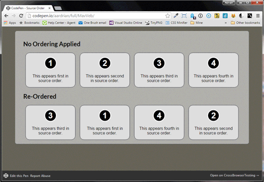
Examples
As you test these examples, make sure to use the Tab↹ key so you can understand how a screen reader or non-mouse user will experience the order versus how it appears. These all assume a left-to-right, top-to-bottom reading order.
You can visit the full version of this CodePen directly if the embed isn’t working (or you just don’t want to be trapped on this page’s tab order).
There are other examples of how Flexbox ordering can change the expected (whether by user or developer) flow of focusable elements on a page. Alastair Campbell provides one showing a generalized page layout. Jules Ernst has one that also documents how browsers and screen readers behave. Right now Firefox is the outlier, as the following animated images demonstrate.
The first image is an animation of Chrome 45 tabbing through flex items. The second is animation of Firefox 41 tabbing through flex items.
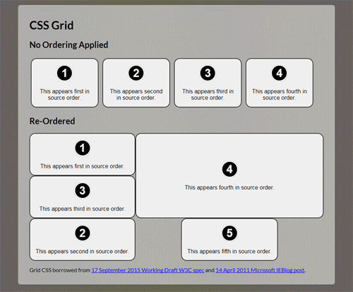
See full version of this CSS Grid example at Codepen. Only Internet Explorer 10+ or Edge support Grid, though prefixed. You can enable in Chrome through the “experimental Web Platform features” flag in chrome://flags. You can enable in Firefox through the layout.css.grid.enabled flag. Get more current information at Can I Use.
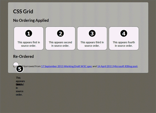
These animated images show how the tabbing sequence looks in Internet Explorer 11 and Firefox 41 (where Grid doesn’t work even with the flags enabled).
The first image is an animation of Internet Explorer 11 tabbing through CSS Grid items. The second image is an animation of Firefox 41 tabbing through CSS Grid items. The flag has been enabled, but as you can see support is pretty poor.
The questions about HTML source order versus CSS order are on the mind of both developers and standards bodies, which is a good sign that people are interested in making this work in a way that makes sense for everyone.
@karlgroves@aardrian It's also on the agenda for @W3C#TPAC at the end of the month. PF/APA WG hoping to meet with CSS WG to discuss
@leoniewatson@karlgroves@aardrian had lots of questions re flex, grid and tab order in my workshop yesterday. People are interested.
I have two suggestions which I will continue to follow until this is all sorted out…
If you are using CSS Flexbox, don’t use order, as that can be a can of worms.
Whether or not you have access to a screen reader, you can at least test your page with the keyboard by tabbing through. If the tab order doesn’t match the expectation based on the content, and if browsers all handle it differently, then you should reconsider your approach.
Update: February 21, 2016
I’ve been remiss in linking Léonie Watson’s great post about the problems with keyboard navigation within flexbox, so I’ll finally do that now: Flexbox & the keyboard navigation disconnect.
In short, you won’t see any changes to current behavior in Firefox 54.
Update: June 20, 2017
Alastair Campbell outlines much of what I have said above, but a lot more recently, in his post The responsive order conflict for keyboard focus. He also adds links to related posts at the end.
There was some hullabaloo this weekend over a post that used strictly CSS to allow table sorting. Many folks rightly noted its inacessibility and failure to honor the separation of concerns. It also demonstrated that plenty of people do not know that throwing display: flex onto a <table> makes it no longer a table in the eyes of a screen reader (pun?). I made videos to demonstrate.
The table from the example with CSS disabled as heard in NVDA.
I am using table navigation controls. NVDA announces the number of rows & columns, all the headings when hopping cells, and tells you when you hit the edge of the table.The same table with CSS flex added, as heard in NVDA. It is longer presented as a table. The tab order when tabbing through the links is confusing, headers are not announced, sorting controls do not work.
In short, using CSS flex on an HTML table will override its native semantics and render it essentially useless to a screen reader. Do not do it.
Any CSS grid talk, tutorial, or article that does not address reading order versus source order must be received warily. WCAG failure risk built in.
Update: April 13, 2019
I have created a bookmarklet to test reading order (not focus order). It is not perfect, but until accessibility checking tools can build something into their own tests this might still be handy for some of us.
Update: May 11, 2019
Manuel Matuzovic has an ongoing series about CSS Grid and accessibility. In The Dark Side of the Grid (Part 2) he talks about the risk of changing DOM order, mostly leaning on tab order as a proxy.
Make sure that visual order is comprehensible and that it matches DOM order as good as in any way possible.
Update: June 2, 2019
Sarah Drasner released a tool to prototype grid layouts. She included a warning about reading order, though I doubt most visitors will note it. I called it out because all these tools need to state it and ideally make it obvious.
For those working on a11y and CSS, this has been discussed before, however given the things I am starting to see in the wild, I think this has to have some urgency behind it.
If you have been reading my blog, then you know I have seen this in the wild for a while (as the date of this very post indicates). Accessibility tends to be the canary in the coal mine for new technologies, spotting issues well before they impact a larger audience. The more voices raising this issue the better.
Update: October 15, 2019
I made a pitch video:
If that video is too large or otherwise chunking, view it at YouTube, which does a better job with streaming. It has the same captions. Links to the screen shots and resources mentioned in the video are available at Smashing / Web We Want Video Pitch.
Update: September 9, 2020
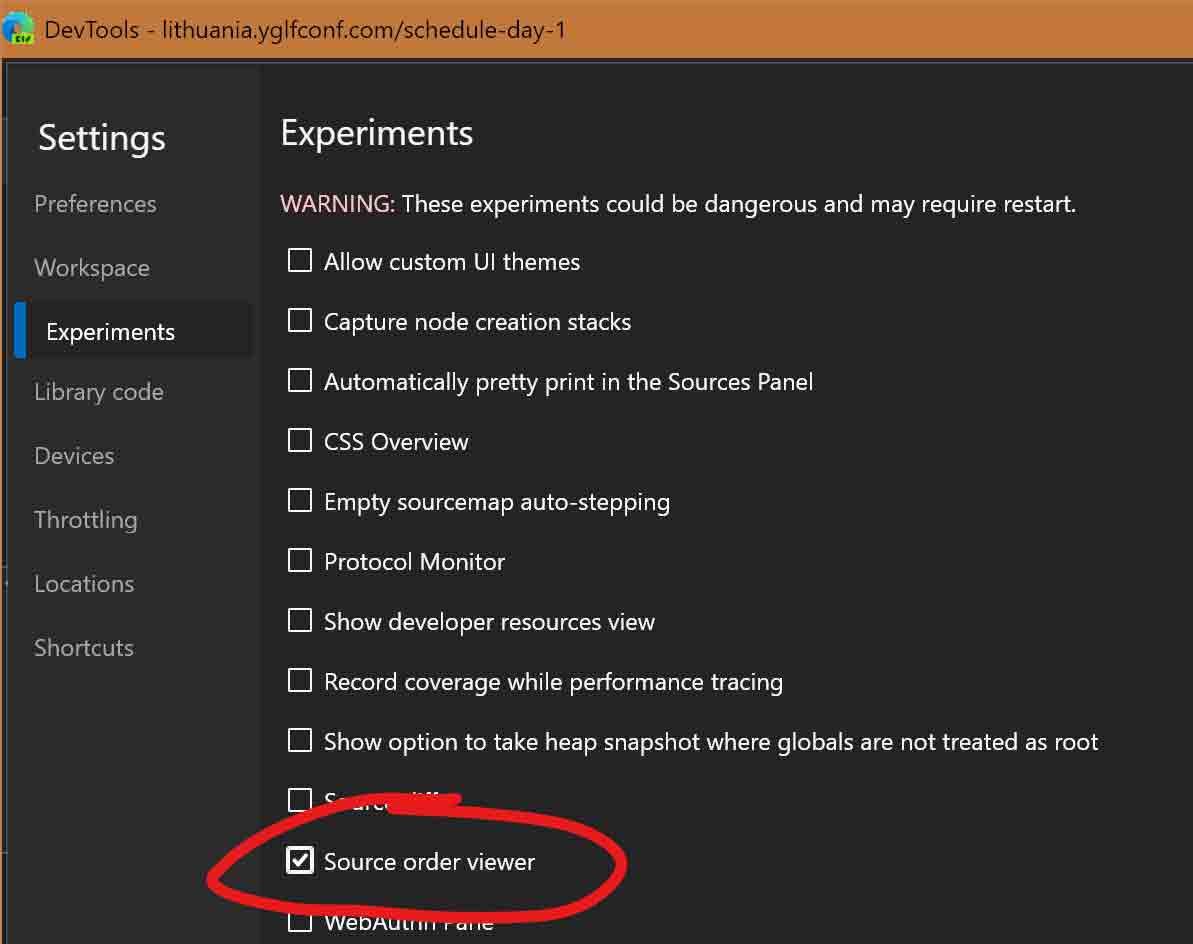
In Edge 86, press Ctrl + Shift + I to open the dev tools, then F1 to open the settings, arrow down twice to Experiments, then Tab to and select “Source order viewer”.
Microsoft has added a source order view to Edge 86 which, at the time of this writing, is in the Dev channel and must be enabled. It also lives in Chromium, so could do this in Chrome as well if you prefer. I give a bit more context and more screen shots in my post Source Order Viewer in Edge 86.
What the WebAIM post addresses applies to more than flexbox, however. CSS grid, floats, and absolute position are all just as risky, as I demonstrate in the examples above.
There is a section on re-ordering and accessibility that, at a glance, appears to take into consideration accessibility feedback I left in June. I encourage accessibility practitioners and users to give their feedback.
Rachel linked to Solving the CSS layout and source order disconnect, posted April 12 on the Chrome developer blog. While I had not seen the post until the live stream, it looks to cover similar properties I linked in my last update (December 2022). The GitHub issue where this is being tracked appears to be the same one that has the feedback I left in June.
To distill it down to the simplest bits, the proposed solutions are:
following randomized layouts with reading-order: auto, and
following non-randomized layouts with reading-order-items.
These two properties only work in the context of flex and grid. They do nothing for floats or absolute positioning.
The explanation (emphasis at the end mine because boy do I twist up inside at such blanket statements that feel like the re-wordings of tech bros pitching to funding sources in every episode of Silicon Valley):
We want to allow the content displayed on a screen to be navigated visually and not always follow the DOM order navigation.
To do this, we need to add support for grid and flex reading orders. This helps for keyboard navigation and screen to speech tools; which help make the web more accessible for all.
Rachel Andrew has responded with Masonry and reading order on her own blog (so it’s not necessarily Google’s opinion).
I’m really excited about the fact that we have some forward motion on a reading order solution. I presented the idea at TPAC last year, with the accessibility folks in the room, and they were in agreement that this seemed like a workable way forward (obviously pending testing once we have an experimental implementation). […]
CSS and reading order are still an ongoing concern 9 years after I wrote this post, as demonstrated in this CSS Day talk. And I get a shout out related to trying to re-order tables (no).
Pay attention to the section related to display: contents and then go read Request for developer feedback on reading-flow and elements with display: contents. If you work in accessibility in particular, please weigh in. Part of the reason display: contents is such a mess is because it was poorly specified and the needed digital accessibility expertise was not part of that process.
[…] just written a post, HTML Source Order vs CSS Display Order, which shows how different CSS layout methods can affect visual display. You can consider them […]
• Source order equals tab order makes the most sense developer wise.
• CSS order equals tab order makes sense visually.
I sort of lean toward CSS order as I think users benefit from that situation. Although this statement needs more research! This would also only work if AT followed the CSS order (which I don’t think they do).
Per Jules Ernst’s post, Firefox 41 follows Flexbox’s order declaration, but NVDA 2015.2 did not (even when paired with Firefox). I think Firefox is ultimately going to follow the other browsers and honor source order. I cannot speak to JAWS, VoiceOver, etc. I am happy to have people leave notes of what they find.
Regardless, your point about making sense visually is accurate. Expectations can be set by visual layout, creating an even bigger problem for a sighted keyboard user. That becomes even more apparent with Grid using the example I pulled right from the spec.
The issue still open against Firefox has a lot of discussion worth considering. It turns out this is not an easy issue to address and word is that at least one other browser is considering using the approach Firefox uses.
Hey Adrian,
Thanks for keeping us up to date on this issue, which has been taxing me for a while now, and I haven’t found a good solution. On Desktop I want
img1 | text1
text2 | img2
and on Mobile
text1
img1
text2
img2
Easy peasy using order, but nasty for DOM and visual.
What are the creative ways you’ve seen to implement this?
Jonathan, without context I am not sure that is an issue. If the images are primarily decorative then likely not an issue at all. If the images have content that is integral to understanding the text, and vice versa, and the order in which they are read is critical, then I would need to know more about the context and user expectations.
Hi Adrian. Thank you for keeping updating this.
There is something that is not clear to me though. What about titles and subtitles? Let’s say you have a subtitle that is usually displayed bellow the title, like the following:
My lorem ipsum title
Subtitle
Lorem ipsum long text
However you want to use that subtitle as a label to be displayed above the title only for some scenarios. Is it okay to use flex order to put it on top of the title?
Example:
— Label —
My lorem ipsum title
Lorem ipsum long text
The label would work as a category for the article, and I don’t think changing the position would change the meaning. However, I’m not sure if that confuses accessibility technology users because they will read the title first and then the label. Is that a fail for 1.3.2 Meaningful Sequence?
Having the sub-title before the related heading in the DOM would be a 1.3.2 risk. So yeah, you would use something like flex to address it, as I outline in this 2020 post (anchor link).
Thank you for keeping up with this issue for so long! I’ve been following along for awhile, and I just found that reading-flow is finally generally available in Chrome 137.


Leave a Comment or Response