My Slides from Accessibility Camp Toronto 2015
You can also view the slides directly at SlideShare. Sadly, the animated GIFs in my presentation did not survive the conversion to SlideShare. I’ve added them at the bottom of this post, but they are all quite large and will take time to load. If you want to save on your data plan, hit the browser’s stop
button now.
Tweets
First talk of the day! Let's get into fringe #a11y techniques with @aardrian #a11yto
— Alexis Ronse (@alexisronse) October 17, 2015— Nicolas Steenhout (@vavroom) October 17, 2015
Fringe Accessibility Technoqurs with @aardrian pic.twitter.com/BH7w1akQrU
— Jason Jang (@jasonjang) October 17, 2015. @aardrian on importance of link underlines with examples of what page looks like with Color blindness #a11yTO pic.twitter.com/m4KCQN1eJ1
— Nicolas Steenhout (@vavroom) October 17, 2015#a11yto is now trending in #Toronto http://t.co/aqsD7sgjX4
— Trendsmap Toronto (@TrendsToronto) October 17, 2015http://t.co/ifMzcOItl5 from @aardrian's talk at #a11yto
— Nell Chitty (@NellChitty) October 17, 2015Have crappy automated captions on your #video? http://t.co/xzrrRq8sZv #a11y #a11yto Thanks for the tip @aardrian
— Alexis Ronse (@alexisronse) October 17, 2015Test in Windows High Contrast Mode – advice from @aardrian at #A11YTO http://t.co/6e6B0iGPS9 pic.twitter.com/stXsvQ5yJY
— Nell Chitty (@NellChitty) October 17, 2015"Different people are going to find different support from different affordances you make." @aardrian #ux #a11yTO
— Michael Sanford (@msanford) October 17, 2015Awesome tip from @aardrian: How do you provide alt text for pictures on Twitter? Reply to your own tweet #a11yto
— Janna Cameron (@jannacameron) October 17, 2015Great session @aardrian: Accessibility is design principle, process, not checklist #a11yTO
— ericaand (@ericaand) October 17, 2015@aardrian great talk. You taught me some new "Technoqurs" :)
— Jason Jang (@jasonjang) October 17, 2015A concise, useful presentation for devs getting started with #a11y https://t.co/dfIwsNiq3E
— Janna Cameron (@jannacameron) October 17, 2015Thank you to everyone who put on an amazing #a11yTO @a11yTO pic.twitter.com/bU2rh0GzsI
— Vanessa Merritt (@vanessamerritt_) October 17, 2015Thank you speakers + volunteers for a great #a11yTO. Took home some gems @a11yTO pic.twitter.com/CyIxknpISF
— Henri Helvetica (@HenriHelvetica) October 17, 2015What an awesome bunch of people. Have had such a fun day, a little sad it's over. Thank you all very much! #a11yTO pic.twitter.com/Eq5vmWdk5z
— Rachel Lane (@humanplusdesign) October 18, 2015Animated Images
These are the animated images that were in my slides but which did not survive in the transition to SlideShare. They are all quite large and will take time to load. If you want to save on your data plan, hit the browser’s stop
button now.
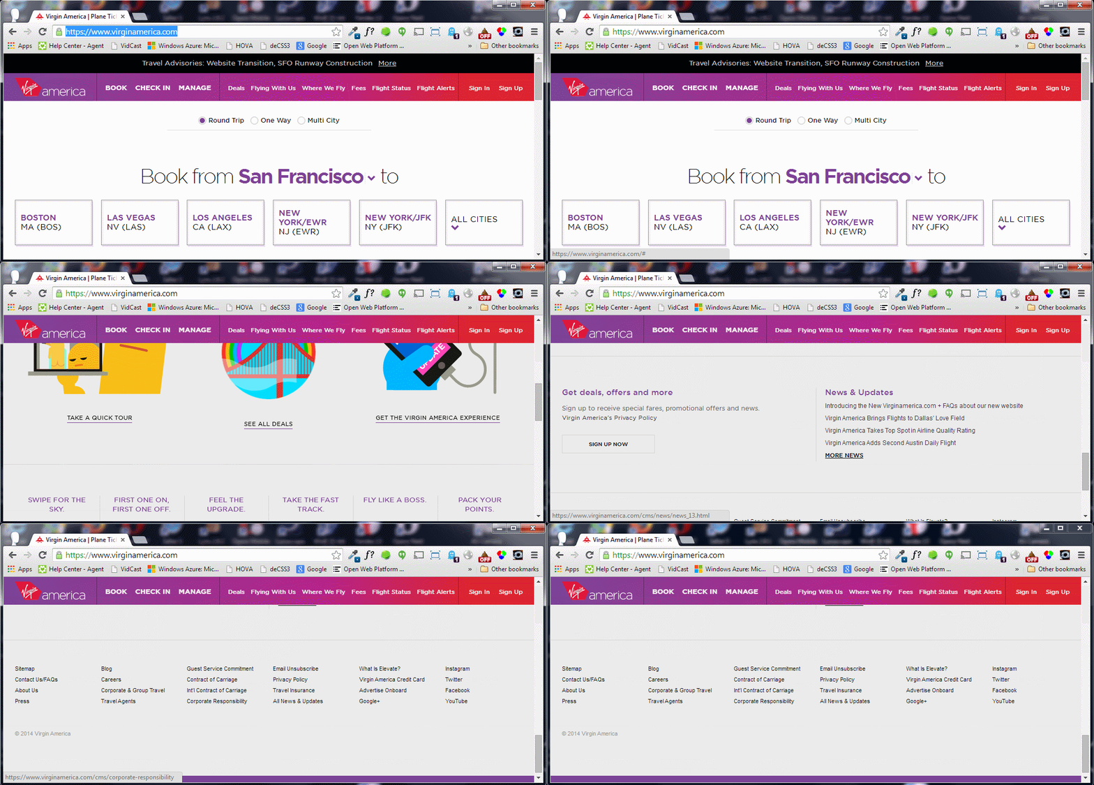
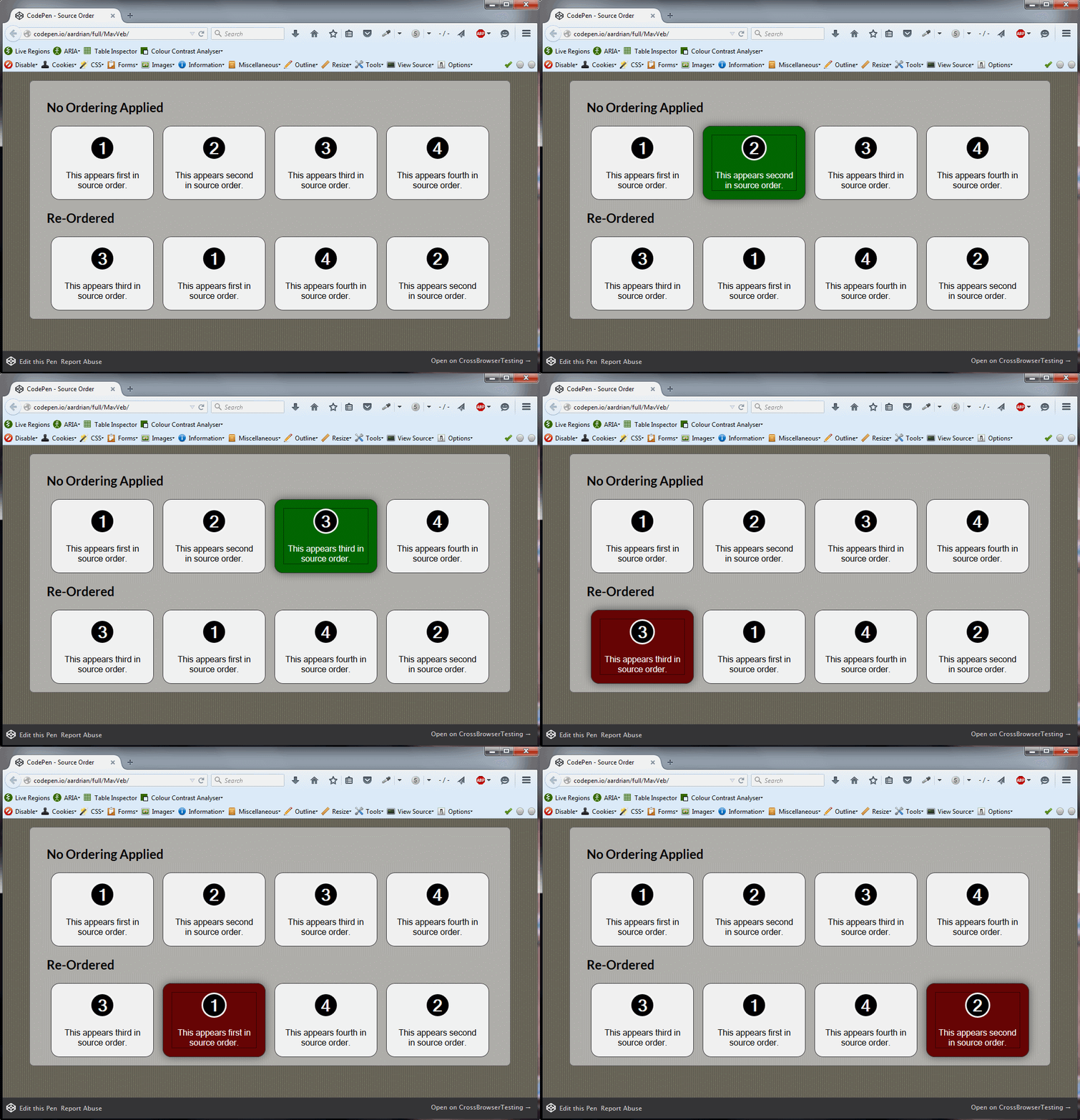
:focus Styles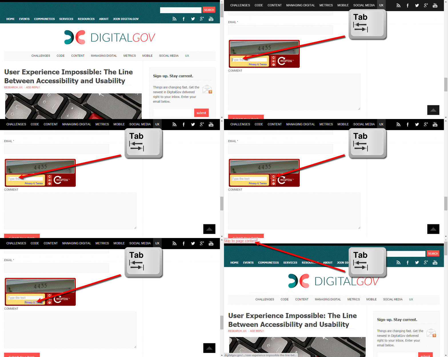
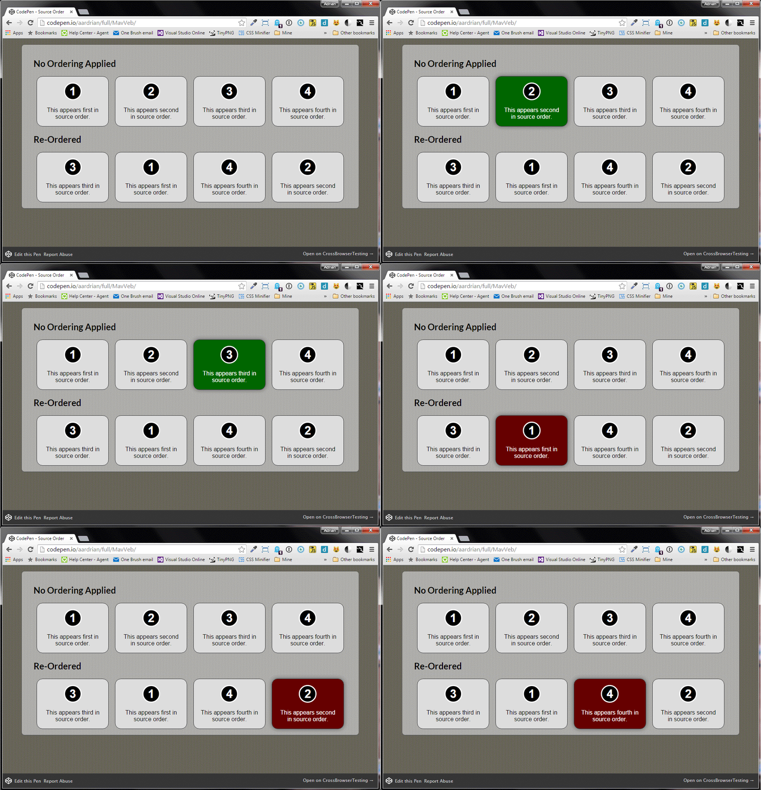
tabindex > 0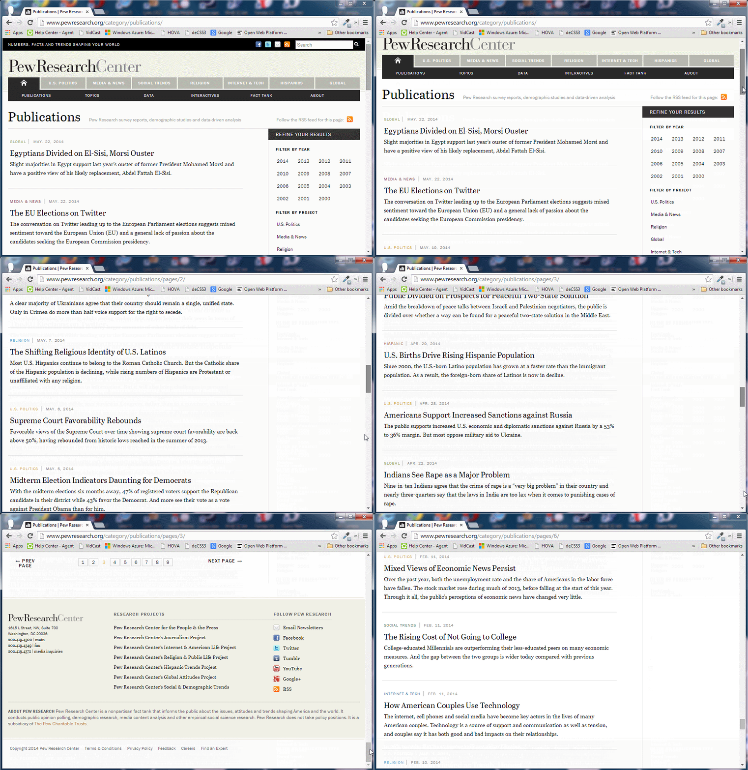
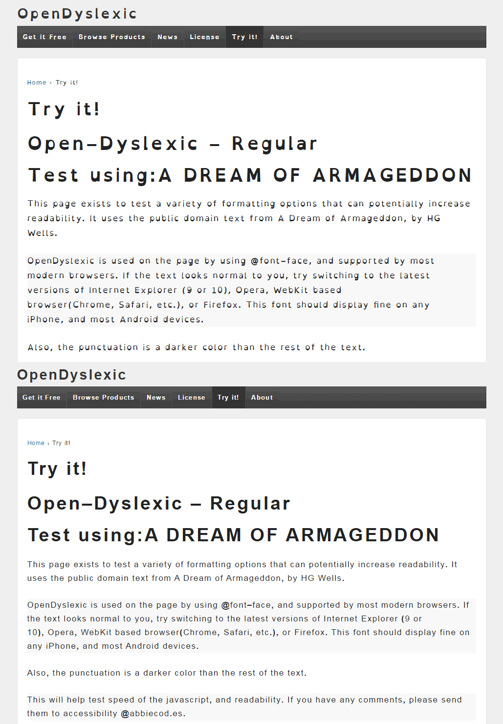
3 Comments
[…] My Slides from Accessibility Camp Toronto 2015 – Adrian Roselli – https://adrianroselli.com/2015/10/my-slides-from-accessibility-camp-toronto-2015.html […]
[…] My Slides from Accessibility Camp Toronto 2015: In his Fringe Accessibility Techniques presentation at Accessibility Camp Toronto last weekend, Adrian Roselli highlighted some less-discussed techniques for web accessibility: link underlines, heading usage, adding :focus to :hover styles, tabindex (don’t use tabindex > 0), and more. […]
[…] and cited WCAG conformance rules, I failed to provide specific examples. I prepared one for my talk at Accessibility Camp Toronto, but have since expanded on it with more […]
Leave a Comment or Response