New iPad Browser: Coast by Opera
 Yesterday Opera announced the release of its newest browser, Coast, built specifically for iOS tablets (I would say just iPads, but if my fridge gets an iOS tablet UI then I’d be wrong and will have paid too much for a fridge).
Background
Recently Opera moved away from Presto as its rendering engine and hitched its future to Blink, the rendering engine born from WebKit that powers Chrome. Now instead of Opera worrying about the rendering engine, it is focusing on the user interface, the place where it can set itself apart from the other browsers.
Essentially Opera is removing the browser chrome (implying to the user that a web page is just an app) and adding gesture support. Given that Opera was the browser that introduced us to mouse gestures well over a decade ago, and given that a touch screen is an inherently gesture-based UI, this seems like a natural fit.
Bits for Developers
Sadly, my office wifi was down and I couldn’t play with the browser immediately (my crusty iPad 2 is wifi only). So instead I took some time to read through the developer notes.
Tablet First
Overall Opera recommends general responsive design current best practices, though it promotes a tablet-first approach. Opera offers some CSS you can use to specifically target iPads Mini, 2, 3 and 4 (Retina and non-Retina), though it leans on vendor prefixes with only a brief note to also use other prefixes and unprefixed rules.
Responsive Images
It’s also clear that Coast supports the new
srcset option for responsive images. It even offers a code example: <img src="image.jpg" srcset="retina.jpg 2x">
Note: As Bruce was kind enough to inform me (because I missed it in the dev notes), responsive images will be supported only in iOS7 and up.
Update as of September 20, 2013
According to Opera, iOS7 did not come with a WebKit update. That means Coast cannot support responsive images via the srcset attribute without a polyfill. Nor can Safari, of course.
Tile Speed Dial Web App Image
Instead of “Speed Dial” icons/images, Coast now looks for a “web app image.” If you don’t have one, Coast will first look for a Windows 8 tile image, then an Apple touch icon, then a shortcut image, then just a favicon. You can, however, create your own 228 × 288 pixel image and stuff it into your site with the following HTML:
<link rel="icon" href="$URL" sizes="228x228">
User Agent String
Don’t use this to do any browser sniffing. Browser sniffing bad. This is instead handy for recognizing it in your logs:
Mozilla/5.0 (iPad; CPU OS 6_1_3 like Mac OS X) AppleWebKit/536.26 (KHTML, like Gecko) Coast/1.0.2.62956 Mobile/10B329 Safari/7534.48.3.
General Review
Getting going is pretty easy, just start typing into the only field on the screen. As you type you can see a Google preview on the left, which you can tap at any time to go to Google, or a list of icons on the right which correspond to sites you might mean. The icons start out just displaying the first letter of the site, and then identify the site’s tile or shortcut image.
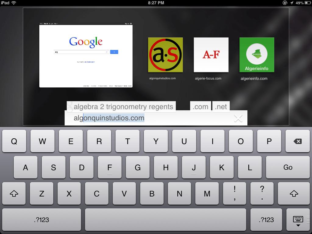
Once you are on a page, you can go back by swiping from the left, forward by swiping from the right, or reload the page by pulling down from the top — but not too far or you get the iOS menu instead.
Opera Coast skips tabs and windows altogether and, frankly, feels a lot more like Internet Explorer for Metro than other current tablet browsers. It’s pretty easy to see the open “tabs,” flip through them, get more details, and discard them. It’s also incredibly easy to forget you have so many tabs open. I regularly found myself littered with tabs because of all the links opening new windows.
While in that tab view, you can also see how “safe” the page is and can get to options to share it, email it, print it, and so on.
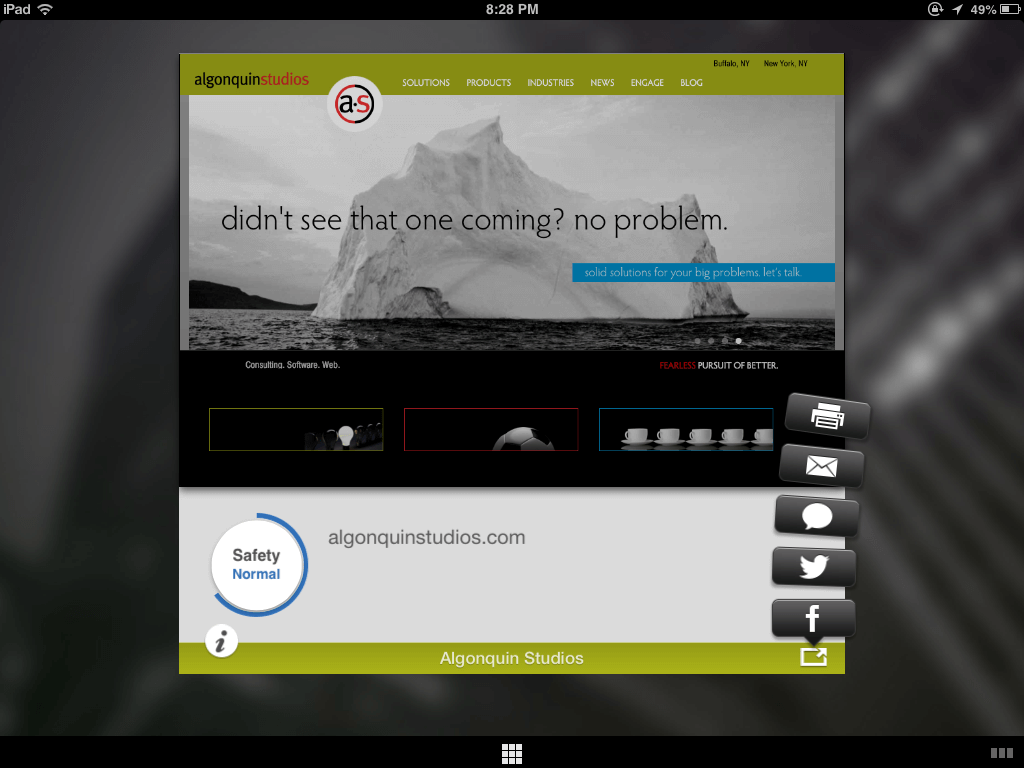
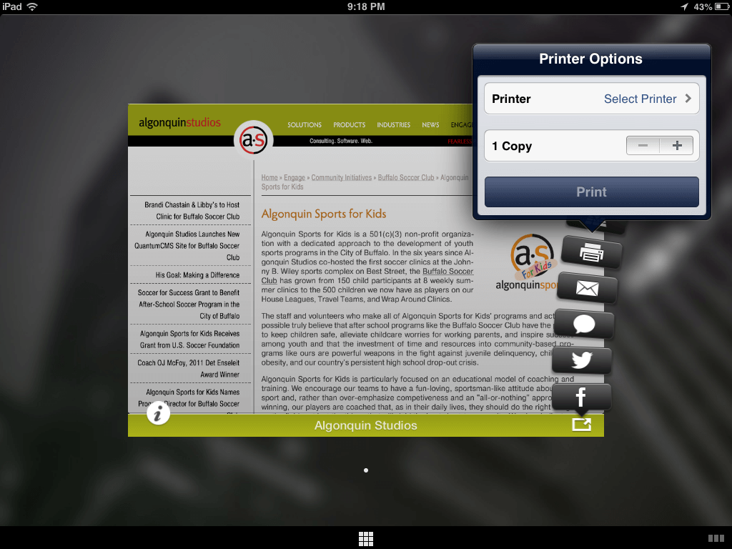
Adding and removing a bookmark, tile, whatever, is pretty easy. It took a few swipe-fails, but I got the hang of it well enough to show the whole process in one uninterrupted Vine:
Gotchas
There were a few things that threw me off. Perhaps because I am a power user, perhaps because I only played with it for one evening.
Swipe History
The swipe for back/forth is handy, but conflicts with behavior I have already learned. In Chrome for Android, swiping left or right has the infuriating feature of bringing me to the next or previous tab in the stack order. For those rare sites that implement a slide that is swipe-friendly, imprecise swipes will move me back and forth in the history instead.
Web App Images
Using the browser in portrait view, the additional screens of tiles (speed dial icons if you are already familiar with Opera) aren’t immediately apparent. It wasn’t until I turned to landscape that I saw them. The tiny dots under the Coast icon weren’t enough for me to intuit that. They also aren’t nearly large enough to tap to jump to a specific screenful of tiles.
Hit Sizes
The 9-box grid at the center bottom as well as the three rectangles at the bottom right are the only real browser chrome in play as you surf. They are also maddeningly small to tap. And I have dainty, lady-like fingers, so I suspect it may cause consternation for others.
Address Bar
If I am on a site and I want to change the address of the current page (maybe I fat-fingered and got to a 404, or I know a super-secret URL), I could not find a way to bring up the address bar and change it. It also made it impossible to know the current page address at any time. As someone who regularly looks at the URL for familiar addresses, indications of scam sites, quick commitment to memory, and so on, this alone takes it out of the running as an everyday browser for me.
Email a Page
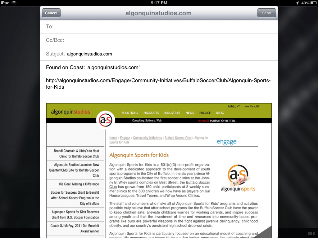
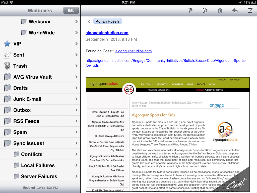
I did not care for the email feature one bit. Not only does it embed a screen shot of the page (with a Coast watermark), the screen shot won’t display on other devices. Outlook blocked the image because the attachment ended in .com (not .png or .jpg). Had it not come from me, I wonder if Outlook would have blocked it as spam. My Android email client couldn’t display it because there was no file extension to give it a clue.
Tweet a Page
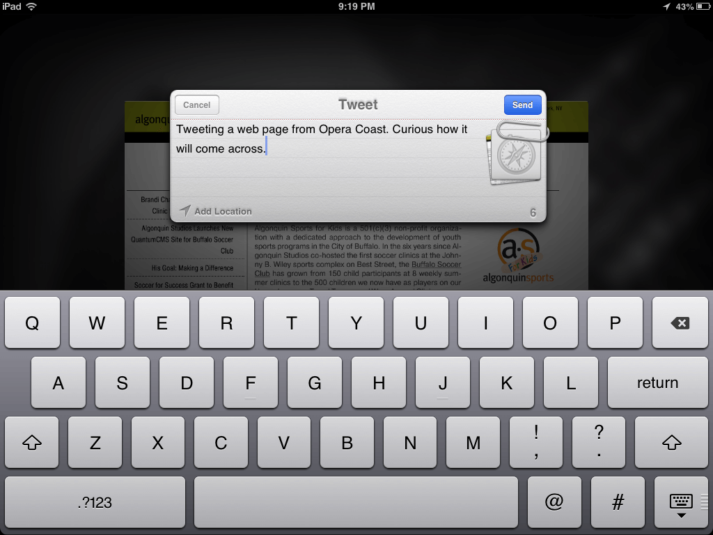
Tweeting a page left me similarly dissatisfied. By default it includes a Twitpic screen shot of the current page with an Opera Coast watermark. When composing the tweet, I tapped the paperclip icon to see if it would do anything, but nothing happened. I opted not to tweet again.
The resultant tweet:
Tweeting a web page from Opera Coast. Curious how it will come across. http://t.co/bdx3mcQxiO pic.twitter.com/eq3vRhFX5N
— Adrian Roselli (@aardrian) September 10, 2013
Wrap-up
Overall, I like the browser. I like what it’s trying to do for consumers. As a power user, however, It’s not a fit for me though I’d be interested in bringing it in front of some other members of my family.
I also didn’t get to try out unsafe sites, printing pages, responsive images (need iOS7), or poorly-built sites. My opinion might change as I continue to play with the browser.
Open Question
There are a lot of Android tablets out there, not just the four screen size offerings from Apple. So how long before we can see Coast on my Nexus 7, if ever?
Updates
I’m adding notes throughout the day as they come up.
- Feedback from users over at MacRumors.
- Norwegians just launched the iPad browser Apple couldn’t build at BGR.
- A Vine from Opera Coast showing how to move/rearrange groups of tiles/bookmarks at once (update 22 Nov 2016: with Vine going away, that is a link to a copy of the video hosted here).
Surprising no one, the following reviews from more mainstream sources completely fail to include any screen shots or videos that weren’t pilfered from Opera. I only say that to remind you that by reading this post you have gotten the most in-depth review currently on the web and you should be excited and send me a thank you note and maybe read all my other posts and high-five me on the street.
These articles are, however, worth visiting just to see the comments and how others are reacting to it.
- Opera Coast iPad Web Browser Treats Websites like Apps at Time.
- Opera’s iPad Coast browser debuts, packaging websites as apps at ZDNet.
- With Coast, Opera reboots its browser for mobile future at Cnet.
- Opera Coast: a Stripped-Down Browser Built Just for iPad at Gizmodo.
- Opera Launches Coast, A Slick New WebKit-Based iPad Browser at TechCrunch.
- Opera releases Coast, an iPad browser that turns the web into a home screen at The Verge.
Tips from Bruce:
Want to add a background image to your Coast home screen? Long press an image, set as background. Pull curled corner to remove it.
— bruce lawson (@brucel) September 9, 2013
If you don't see your new 228px site icon in Coast, empty cache by deleting yr old speeddial entry (drag to top of screen) & revisit yr site
— bruce lawson (@brucel) September 10, 2013
To clear history in Coast by Opera or change size of Speed Dial grid from 3×3 to 3×4, go to iPad settings > Coast
— bruce lawson (@brucel) September 12, 2013
Update: September 18, 2013
Opera has fielded some questions about Coast and collected them into two posts (so far):
- Coast by Opera is only a few days old, but we’ve already gotten a lot of questions about how things work. Here’s some answers.
- Nope, there are no tabs in Coast. That and a few more answers for this second set of FAQ.
Update: September 25, 2013
Another FAQ post from Coast:
Leave a Comment or Response