Google’s Web Book May Not Help Those Who Need It Most
 In an effort to help educate the general public about its browser, Chrome, and the web in general, Google released an online “book” called 20 Things I Learned About Browsers and the Web. Done in the style of an illustrated children’s book that allows readers to flip through the pages, it is designed to provide a general overview of the internet and how it works (DNS is fun with cartoons!), all the way down to the browser on your computer. Read about it in the Google Chrome blog post, A curious guide to browsers and the web, from November 18.
While having a conversation with a friend/client, I sent her a link to the part of the book that explains web browsers and why a modern browser is probably a good idea to use instead of an outdated browser. This user is on Internet Explorer 6 and is not allowed to upgrade per corporate policy. What I did not expect was the page to break so forcefully for a user on Internet Explorer 6. She was immediately prompted to download and install some fonts, and declining to do so resulted in a page that could not be read (owing to the text flowing off the left side of the screen) and a curious illustration of a dog and fire hydrants (which she took to be some sort of mean joke from Google):

On a whim, I suggested she reload the page to get the fonts it was pushing down to her, and I can say that the experience improved — albeit slightly. The main copy of the page was visible, but the content was cut off on the first “page” with no way to get to the remaining “pages” in the section. Take a look for yourself:
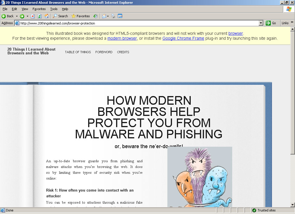
You may note that there is a caption at the top of the page telling users to download a modern browser (Chrome) or at least install Google Chrome Frame. It says flat-out that the page was designed for HTML5-compliant browsers (which is a small list, and ever-changing given that the spec is not done).
Owing to the growing collection of HTML5-sites-that-aren’t-really-HTML5, I was suspect about this one, so I looked under the hood. Lo and behold, among an assault of divs and spans I actually found some HTML5 elements — header, nav and footer. Unfortunately, I think many of the divs and spans could have been better served with the oft-maligned and misunderstood aside, section or article elements, assuming this site really wants to tout HTML5.
If you are going to exclude older browsers because you want to play with the newest whiz-bang, why not just go for the gusto and pepper the site with as many HTML5 elements as you can muster? And while you’re at it, why not take out the whole section explaining why you should upgrade your browser? Clearly if you can read and use the book, you are already modern enough.
In case you are curious, that same page above as rendered in Google Chrome:

Related
Some examples of what I’ve written about people not quite getting HTML5.
- Google Doodle: Bouncy Balls Aren’t HTML5
- Google, Arcade Fire Confused on HTML5
- Methods to Select an HTML5 Element
- Does Your Browser Really Support HTML5 and CSS3?
- HTML5 and CSS3 Confusion
- Too Soon to Advocate HTML5?
Leave a Comment or Response