Horizontal Scrolling Containers Are Not a Content Strategy
I should clarify that I am not talking about carousels. That said, because users often consider horizontal scrolling containers to be carousels, I will be talking about carousels.
Also, this post is written by a monolingual American. While I discuss localization issues, there’s no way I can get into all the nuances and challenges of recreating or translating one of these to a non-left-to-right language. This post also assumes a page that is in a left-to-right or right-to-left language.
What Is a Horizontal Scrolling Container?
These can come in a few flavors:

- Content that’s too big for the viewport (word length, data structures, etc) that limits the horizontal scroll to itself instead of the page.
- A “gallery” of movie titles, or books, or testimonial quotes, or clients, or whatever really.
- A toolbar or button bar or other collection of controls.
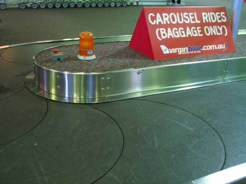
- A carousel.
Why Do They Happen?
There are a few reasons:
- It can be a method to satisfy WCAG Success Criterion 1.4.10 Reflow when in a narrow viewport or zoomed context, most commonly used with data tables.
- The site has a too many stakeholders and everyone wants to own a piece of the page, so this is one form of compromise.
- The author really doesn’t want to wrap something, typically for design preferences but sometimes for better usability.
- An author wanted to be bleeding edge and try CSS carousels, but had to justify why they would make a carousel when users hate carousels and carousels are used less than print styles, then they found out CSS carousels are fundamentally broken, but they already got sign-off on their Figma, so now they have to build something so what the heck, just make it scroll and call it “progressive enhancement.”
So What’s the Problem?
Some of these items link to far more detail, so I encourage you to dig into them:
- I outline challenges with supporting keyboard users in Keyboard-Only Scrolling Areas, which includes WCAG concerns.
- Voice control users are at an extra disadvantage given the difficulty identifying and operating the scrolling container.
- There’s a chance the focused thing won’t completely move into the viewport, risking a 2.4.11 Focus Not Obscured (Minimum) failure or warning.
- Sometimes the highlighted text from an in-page search won’t fully move into view. Horizontal scrollbars don’t add marks showing where to scroll to see the hit.
- You cannot rely on the user’s OS or browser having scrollbars enabled, you’ll want some visual affordance to identify to users that a thing scrolls (commonly done with shadows).
- If you choose to make custom scrollbars, be careful of size, contrast, and consistency within the site.
- If you rely on lazy-loading images, understand the scrollbar may dynamically resize and can mess with expectations.
- Be cautious with scroll snap, as it can make some content functionally inaccessible in limited cases.
- Mouse wheel scrolling becomes a hassle (not every user knows to press Shift — where it’s supported), assuming a user has a mouse wheel.
- Horizontal swiping creates risk for navigating away.
- Targets in the container that receive focus from an anchor link are harder for users to identify (this is from experience, sorry no study to cite).
- Considering some users may surf on a mobile in landscape mode, your scrollbars could be outside the viewport.
- That also means you need to pay attention to the height of your scrolling area, and consider if or how viewport height media queries should factor.
- As extra fun for landscape mobile users, a sticky header or footer can make it even harder to scroll and read that content.
- The height becomes an even bigger challenge (pun intended) when the user zooms the page or scales the text, as it can (and will) impact everything I’ve covered so far.
- If you are a believer that “the fold” is a thing on web pages, then congratulations, you’ve added even more folds (maybe even above the fold).
- Should your page ever get machine-translated to a non-left-to-right language (eg, Hebrew, Japanese), you had better be sure you used CSS logical properties.
- Even if you insist it isn’t a carousel, users are likely to believe it’s a carousel and skip right by it. Which means it’s a carousel for all intents and purposes (other than the animation part).
Is There a Reason Your Headings Are Loaded Questions?
Yes. Laziness.
What’s the Strategy Part?
If you consider horizontal scrolling containers as a way to get more content on the page or to de-clutter a page or even to keep content above “the fold” then you might want to reconsider.
Rework your information architecture, your page design, your objective, and so on. Otherwise you risk creating barriers, usability hassle, and functionally lost content.
Anyone Else Think This Way?
Yes.
- Consider accessibility when using horizontally scrollable regions in webpages and apps by Bogdan Cerovac.
- Horizontal Scrolling by Kevin Yank.
- A UX perspective on Horizontal scrolling by Damian Rees.
- Beware Horizontal Scrolling and Mimicking Swipe on Desktop by Katie Sherwin.
- Nested Scroll Bars Are the One of the Biggest Accessibility Evils, Ever by Sheri Byrne-Haber (added 3 September 2025).
Wanna Try?
Now scroll up. Annoying, yeah?
One Comment
Thanks you!
We’ve been wanting to get rid of carousels for years and years, but no, all the lazy designers had to do was keep copying the aesthetics of streaming platforms.
The only good thing we can see is that they’ve stopped using automatic scrolling, so there’s no need for a pause button anymore.
Leave a Comment or Response