CSS Logical Properties
I have often remarked that my blog is little more than a place for me to offload my memory. I need not remember the syntax, logic, test results, etc. of every control, widget, style, browser, and so on. I can just write a post and refer to it later.
This post on CSS logical properties is just that. I don’t need to know it all yet, but when browser support is common I need to be able to support it out of the gate. I need to be able to implement it, test it, debug it, and understand the accessibility impact. Since my work straddles accessibility and internationalization, those are critical skills.
Whether or not you know it, dear reader, this probably applies to you too.
The Syntax
Logical properties mostly do away with positional naming. Positions can become meaningless when text is rendered in a different language. For example, making list items by padding on the left and dropping a bullet in the gap will look a bit weird when translated to Hebrew, which is read right-to-left. The visual indent will be consumed by end-of-line spacing (since it is read from the right) and the bullet will look like a really aggressive period.
Keywords that are based on content flow are a key aspect of logical properties (and values). While text-align: left may be your standard style for a ragged-right block of text, a logical style would be text-align: start.
I made a thing to try to illustrate the mapping change. It is really for native English speakers (me). Yes, it leans on the colors from the Firefox dev tools.
See the Pen Logical Properties Mapping by Adrian Roselli (@aardrian) on CodePen.

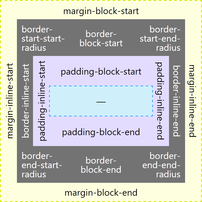
For those (me on Thursdays) who want a chart instead of a visualization to compare, the following table might help. It also includes a few mappings not in the preceding visualization.
| Typical | Logical |
|---|---|
border-top |
border-block-start |
border-right |
border-inline-end |
border-bottom |
border-block-end |
border-left |
border-inline-start |
border-top: Xborder-bottom: Y |
border-block: X Y |
border-left: X;border-right: Y; |
border-inline: X Y; |
border-top-left-radius |
border-start-start-radius |
border-top-right-radius |
border-start-end-radius |
border-bottom-left-radius |
border-end-start-radius |
border-bottom-right-radius |
border-end-end-radius |
margin-top |
margin-block-start |
margin-right |
margin-inline-end |
margin-bottom |
margin-block-end |
margin-left |
margin-inline-start |
margin: X Y; |
margin-block: X;margin-inline: Y; |
padding-top |
padding-block-start |
padding-right |
padding-inline-end |
padding-bottom |
padding-block-end |
padding-left |
padding-inline-start |
padding: X Y; |
padding-block: X;padding-inline: Y; |
min-width |
min-inline-size |
min-height |
min-block-size |
text-align: left; |
text-align: start; |
text-align: right; |
text-align: end; |
Block vs. Inline
By now you should have noticed a lot of block and inline in those properties. Once you get your head around the general meaning it might be easier (it was for me).
- Inline
- This corresponds to the axis of the text flow. English, for example, has a left-to-right text flow, so the inline axis is horizontal. For Japanese it would be vertical (since it has a top-to-bottom text flow).
- Block
- This is the axis perpendicular to the text flow axis. For English, the block axis is vertical. For Chinese it would be horizontal.
Start vs. End
You probably also noticed start and end used throughout as well. Once you know the text direction this might be easier.
- Start
- This corresponds to the text direction and reflects the side of the text from which you would start reading. For English, this corresponds to left. For Hebrew this would be right. For Chinese this would be the top.
- End
- This also corresponds to the text direction and reflects the side of the text at which you would end reading. For English, this corresponds to right. For Hebrew this would be left. For Chinese this would be the bottom.
An Example
For this example I use a quote originally in English. I machine-translated it into Urdu, Japanese, and Chinese, representing horizontal left-to-right, horizontal right-to-left, vertical left-to-right, and vertical right-to-left.
It uses margin, padding, borders, border radius, CSS generated content, quotes, widths, and text alignment. Seeing them in action makes it a bit easier to understand the effects of logical properties.
I want to stress — I do not speak any of these languages. I am using them for demonstration purposes only. If you understand these languages and find my translations (and mark-up) lacking, then please share. After all, I am just a guy from Buffalo who has the ego to assert he knows how to make kaya, but the humility to know that is not true.
See the Pen Logical Properties Demo by Adrian Roselli (@aardrian) on CodePen.
View the debug version of this pen.
As of this writing, if you are using any browser other than Firefox you should be unimpressed. Toggling between typical styles and the new logical styles will likely make each example look broken, including the English one (the first one).
Screen Shots
I collected screen shots in Firefox to show how these should look. A before and after, showing how one looks with typical styles and then how it should look with logical styles.
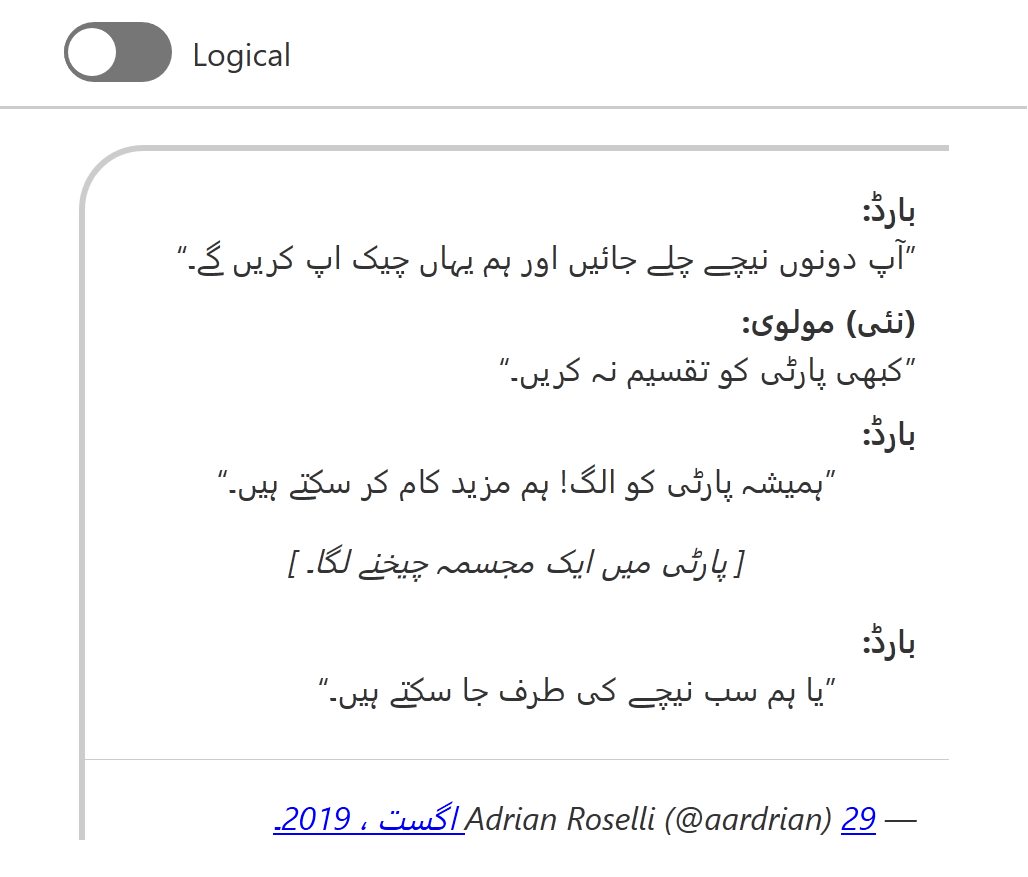

<dd>s now indent from the right.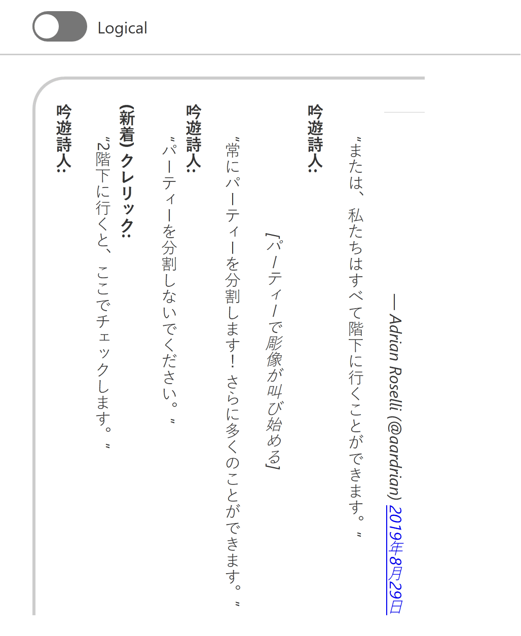
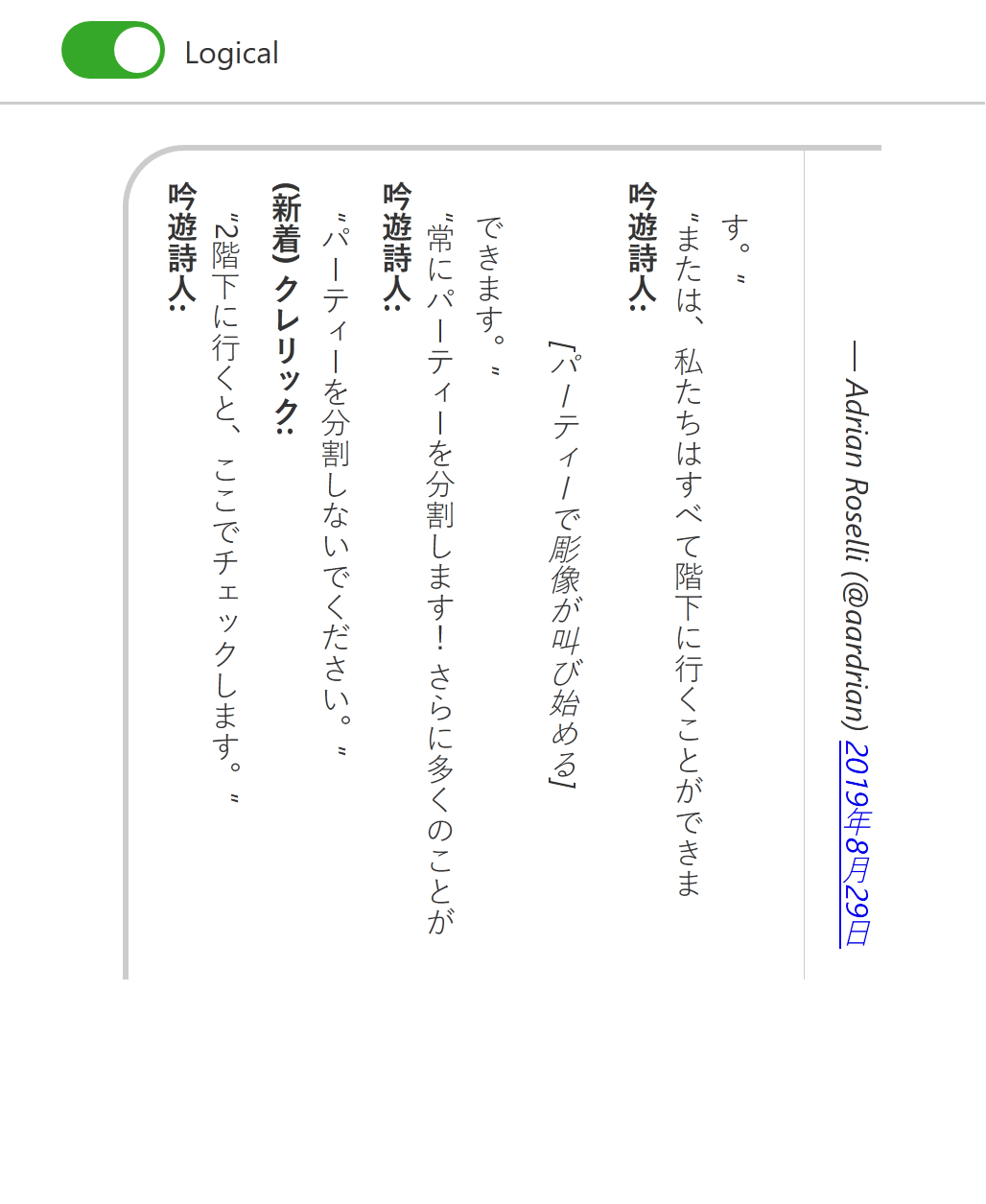
<blockquote> is now applied on the correct axis (vertical) and the border on the <footer> shifts to the correct orientation.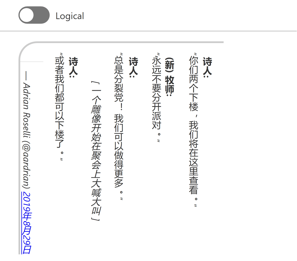
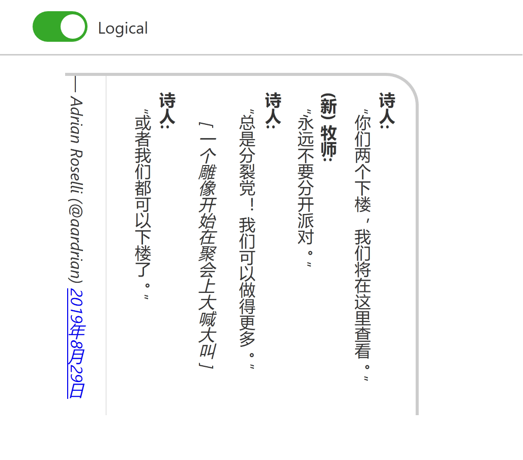
<footer> shifts to the correct orientation and the overall border changes sides to correspond with the text direction.A Cheatsheet
I am not going to remember all the syntax every time. I can, however, refer to my own cheat sheet to refresh my memory.
I built this for me, so it may not work well for your way of learning. For example, I use <button>s as my containers because I wanted to be able to use my keyboard to quickly jump around (and do some scripting that I have since removed).
Note that at the top of the page I have radio buttons to flip between writing modes and text directions, making it easier for me to confirm a style adapts, the browser does not support it, or remind myself that not everyone consumes content the same way.
You can also visit a debug version of this cheatsheet pen.
See the Pen Playing with CSS Logical Properties Support by Adrian Roselli (@aardrian) on CodePen.
Wrap-up
If it’s not obvious, I tried a few different approaches to get my head around logical properties. Maybe one of these will help you. If not, links follow.
References
- CSS Logical Properties and Values Level 1, W3C Working Draft, 27 August 2018
- CSS Logical Properties and Values at MDN
- Can I use CSS Logical Properties?
- Vertical typesetting with writing-mode revisited, Chen Hui Jing’s 2017 post exploring support, along with an amazing demo in Chinese.
- CSS Writing Modes by Jen Simmons, from 2016.
Update: 10 December 2019
The CSS Working Group has published CSS Writing Modes Level 3 as a W3C Recommendation w3.org/TR/2019/REC-css-writing-modes-3-20191210.
Defines support for various international writing modes & their combinations, including left-to-right and right-to-left text ordering as well as vertical orientations. pic.twitter.com/hi80XdombH
Update: 31 December 2019
RTLStyling.com looks to be a resource for styling right-to-left text in CSS. It contains a general guide and, unlike my post, was written by someone who understands and reads/writes an RTL language.
Update: 14 December 2020
Over at CSS Tricks, Adam Argyle has written an overview of logical properties that has some images and metaphors that may click with some folks better than mine (note that the images do not have alternative text, so you need to see them to grok them). He also has a switcher so you can see the impact on a piece of content. Read Late to Logical.
Update: 9 October 2021
Good news, everybody! Safari 15 support for CSS logical properties is good! We don’t need to let Safari or IE hold back a multilingual web anymore!
Obviously, be certain the audience for the project where you want to use these features is running the appropriate browsers.
Bear in mind that in some communities, non-native speakers may be under-employed and therefore running on older hardware. This matters if you decide to implement these styles on, say, a municipality site in the U.S. where the Urdu-speaking population may not have the same access to jobs to be able to afford an iPhone 6S or later (the oldest handset which can run iOS 15). We may not be able to end systemic racism, but we can try to ensure we do not encode it in our work.
Update: 11 August 2025
Chris Coyier asks, Should we NEVER use non-logical properties? He outlines the places where we can’t yet, but broadly agrees we should use them everywhere we can.
3 Comments
I’m not a web developer, but it seems like CSS is developing into something resembling a wounded wild beast, crashing around and overturning most of what we’ve come to know and love – pardon the mixed metaphors. At 70 years of age I’m struggling to learn the subtleties and machinations of grid, so these additions/replacements have no chance of infiltrating and remaining in my over-worked mind.
I also think CSS is also becoming more of a “programming language” than a styling and layout one. The future danger is it may well contribute to one of the things that developers are currently advocating against – bloat-spread. There’s a lot of potential in CSS, but look at the code for seemingly simple css effects and there’s many, many lines of code. CSS is the perfect “language” for the bloat-scenario of “Let’s do this … because we can.”
Be interesting to see how CSS develops in the next five or so years . If this is any indication, I’m going back to tiddly-winks.
Thanks for a great post! I used some of it in a small python utility to mass-convert many .css and .scss files into logical coordinates based on these rules. https://gist.github.com/nyurik/d438cb56a9059a0660ce4176ef94576f
In response to . Yuri, that looks ace! I shared it on Twitter.
Leave a Comment or Response