My Carousel Use Stats

I started this post way back in March after reading Brad Frosts’ bit on carousels. Then I let it sit unfinished. With the buzz around ShouldIUseACarousel.com this week, I figured I’d finish it up. The data is old, although I offer updated numbers at the bottom.
The Process
I looked at all the visits to my home page between February 1 and March 3 to get 30 days of data. Of those visits to the home page, 83% of the time the home page was the landing page. I figured if a smaller percentage of initial visits to our site came via the home page then I would not read too much into the value of these numbers as the user might have already been through enough of the site to get what he or she wanted, but 83% is a pretty big number.
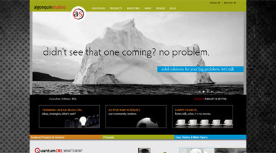
The home page has many content areas, but by far the most prominent is our carousel. During the time frame tested, there were 5 different carousel images with accompanying text. Each one has its own Google Analytics event tracker so I can tell which carousel item has been clicked.
For those playing at home, and using Google Analytics, it’s as simple as adding an onclick to your anchor: a href="/Products" onclick="_gaq.push(['_trackEvent', 'Slider', 'Columns']);". In this case I am tracking a custom event named “Slider” with the value of “Columns” (so I know which specific image/slide was chosen).
The Results
In the 30 days I tested, the carousel links were clicked less than 1% of the time the home page was visited — 0.8% to be slightly more precise.
Every other element on the home page received at least twice as much activity, with the tabs getting used nearly 10% of the time. Site-wide, the skip navigation link got clicked (tapped, followed) half again as much as the carousel at 1.2%.
To qualify this a bit, the carousel wasn’t intended to serve as our only call to action on the home page. It’s more about presenting a message to help brand the company as part of our new marketing push. Adding this tracking feature has allowed us to track how the carousel gets used, if at all, and which images/messages are more compelling.
The Latest Results
For this updated version of my draft post I looked at the last 30 days again (June 11 to July 11, 2013) to see what activity we’ve had on the carousel. The last 30 days are a good fit since we haven’t been showing off the features of the slider to clients (which results in activity that is a function of people playing, not truly discovering and naturally using).
For the last 30 days, the number of clicks on the carousel is much lower. 0.2% of unique visitors clicked a carousel slide. For every 500 unique visits to the site, someone clicks on the carousel. Interestingly, this is the same number of people who print pages from our site and lower than the “skip navigation” activity in the same time period.
About the Carousel
Our site is a great place for us to experiment with the carousel since we can quickly refactor it, tweak it, replace it, and so on. Since its launch 7 months ago I have made a number of tweaks to the technology and we have played around with the messages to see what sticks.
We’re revisiting the design of the carousel now to see how its relative size and different images and messages can affect its use. At some point it may go away, but not until I’ve had a chance to gather lots of data.
The carousel itself is both swipe-friendly and keyboard-friendly, uses a linear flow with a clear start and end, has indicators to show where a user is in the overall collection (also allowing a user to jump to a specific slide), and pauses when there is any action taken on the carousel (hover, click, tap, etc.). I built it to also serve images at appropriate sizes for appropriate devices, something which I am regularly tweaking. The base for this is the Royal Slider.
Related
- ShouldIUseACarousel.com
- Accessibility expert warns: stop using carousels, July 11, 2013.
- Carousels, January 23, 2013.
- Carousel Interaction Stats, January 22, 2013.
- Auto-Forwarding Carousels and Accordions Annoy Users and Reduce Visibility, January 19, 2013.
- Don’t Use Automatic Image Sliders or Carousels, Ignore the Fad, September 27, 2012.
- That big sliding banner? Yeah, it’s rubbish, September 6, 2012.
- 5 Big Usability Mistakes Designers Make on Carousels, August 2, 2011.
2 Comments
I’d love to see an update, 4 years later now in 2017. Have users learned to slider?
In response to . Floyd, I would love to see an update too. Sadly, the site I used (my now former-business) is no more. I do not have any clients who are using carousels (woo!) on the sites of theirs that I control, so I cannot just spin it up and re-test. Not being the same site with the same audience, those numbers would be suspect anyway.
Leave a Comment or Response