NFL Raises Colorblind Awareness
Not intentionally, of course.

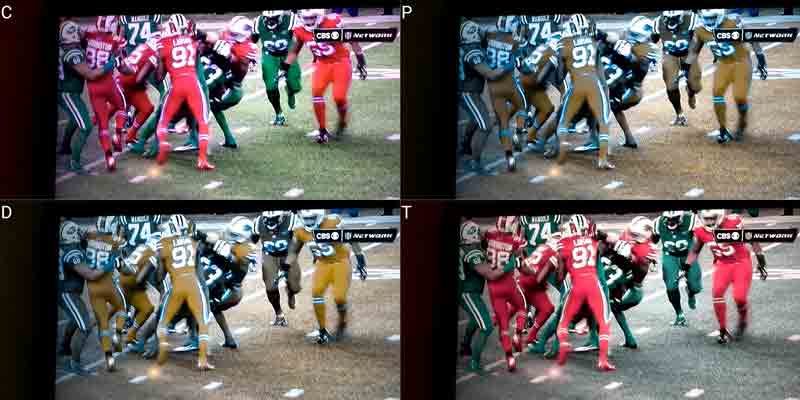
The NFL provided a great and highly visible (pun!) case study in how colorblindness affects people and, given football’s wide appeal in the US, got people talking about an issue they might otherwise forget.
A professor of color science distilled what happened pretty succinctly (moreso than his title):
The failure is that the NFL didn’t test those uniform colors through the TV system.
The broadcast technology isn’t the only thing that can affect how well these colors can be distinguished. Colors that otherwise have sufficient contrast from one another can have that contrast reduced dramatically from even a little glare or sunlight (not to mention what color constancy can do to our perception).
I suspect that the entire process of designing the uniforms, coordinating the Thursday night schedule, developing marketing to support it, and getting the broadcast together involved more than twelve people (for proofing and approvals in each step). Given that roughly one in twelve Americans is red-green colorblind, I’m surprised nobody caught it.
I’m hoping this proves to be a great case study for interaction / user interface / web designers. Something we can keep in mind when making user interface elements that otherwise barely pass contrast checks.
Ultimately, this is just further evidence that Big Color is in bed with the NFL.
Related Bits
- Color-blind people driven nuts watching red Bills, green Jets uniforms (I might have phrased that differently)
- Stupid Nike Uniforms Wreaking Havoc On Colorblind NFL Fans
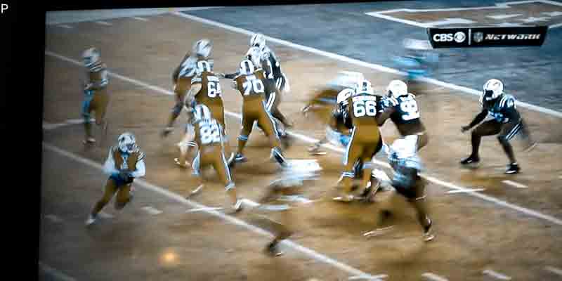
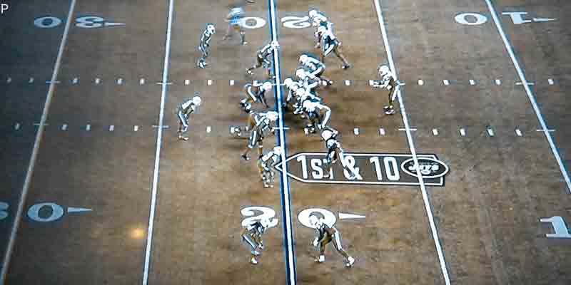
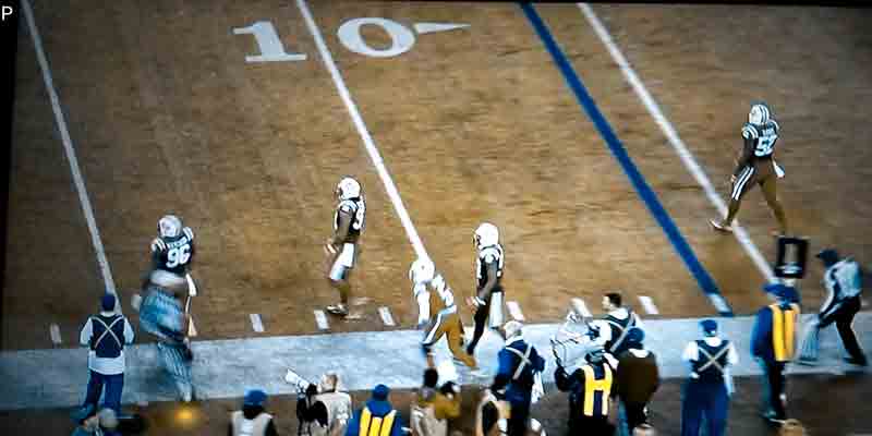
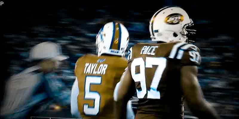
For those with red/green color-blindness, Bills are tan, Jets are darker tan. pic.twitter.com/StkJYPTobP
Update: Thanksgiving, 2015
Apparently this post was enough to give someone who works in accessibility but doesn’t care about football some common ground for dinner conversations with family who care about football but do nothing in accessibility. Yay!
Can't believe I was able to talk football with the family, but they were aware of the issue with: twitter.com/aardrian/status/666275… #a11y at dinner
Update: 3 September 2020
I see that soccer (other football) is also struggling with this: Colour blindness in football: Kit clashes and fan struggles – what is being done?
Loosely applying Betteridge’s Law of Headlines to answer that question: nothing.
Update: 15 December 2021
The NFL has once again raised awareness for vision impairments!
Following a series of questionable calls by its referees in a contentious game, people started to donate to Buffalo’s local blind association, VIA (Visually Impaired Advancement), formerly known as Olmsted Center for Sight.
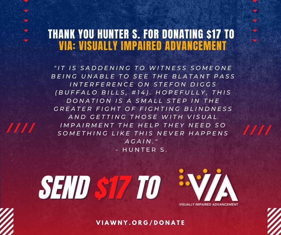
Thank you, #BillsMafia members, for donating $17!
While we recognize that NFL referees are not visually impaired, $17 makes an impact on VIA to help individuals who are visually impaired. If you would like to donate to VIA, go to viawny.org/donate. #LetsGoBuffalo pic.twitter.com/uCCT1pDBgb
One of the local televisions news outlets ran a story as well: Bills fan ignites donation frenzy for visual impaired organization following Sunday’s game
Update: 7 February 2022
And another one: Six Nations: Wales-Ireland kit clash frustrates colour-blind fans

Leave a Comment or Response