CSS and System Fonts
This weekend I read a post about techniques to get Apple’s new San Francisco font into your CSS. Since San Francisco is only just being added to iOS and OS X, it can be a bit tricky to get hold of it in Safari.
What struck me was the use case outlined in the post for why a UI person might want to get that font into play:
As a developer, there are often cases where we need to use the system font on web pages. Many times these pages are embedded in our apps and manage things like remote settings or documentation. In these contexts, matching the content to what the customer sees in their surrounding environment makes a big impact on the user experience. Think about how out of place an app feels when it displays Sparkle release notes in Lucida Grande while running on Yosemite.
We’ll soon be faced with a lot of surrounding content that’s displayed in San Francisco and will need ways to specify that same font in our CSS. It turns out that’s not a simple thing to do.
This use case is less about accessing a specific typeface and more about accessing the font(s) that the operating system uses in its native controls (menu bars, buttons, menus, icons, and so on). It turns out there is already a property in CSS for doing just that — defined 17 years ago.
I understand the use case. In the Internet Explorer 5 days I championed the approach and built client-facing web-based administrative tools that looked very much like the operating systems on which they were viewed. At the time it reduced some resistance to web-based applications from users as I could make the screens mimic the VisualBasic applications to which they were accustomed, while keeping their own system color and font preferences (including that one guy who used Hotdog Stand for a theme).
What I don’t understand is why Apple would be using its proprietary prefixed -apple-system-font instead of using the 17-year-old CSS spec, or working to have the spec updated for its additional styles.
Background: CSS 2 through CSS 3
A specification for pulling fonts (among other attributes) from the user’s operating system dates back to 1998 and CSS 2, was continued in CSS 2.1, and is still in CSS 3 and unchanged. The set of options is limited but straightforward:
- caption
- The font used for captioned controls (e.g., buttons, drop-downs, etc.).
- icon
- The font used to label icons.
- menu
- The font used in menus (e.g., dropdown menus and menu lists).
- message-box
- The font used in dialog boxes.
- small-caption
- The font used for labeling small controls.
- status-bar
- The font used in window status bars.
The color and sizing information comes from the operating system itself, which means you can only set the initial values with the font property:
System fonts may only be set as a whole; that is, the font family, size, weight, style, etc. are all set at the same time. These values may then be altered individually if desired. […] That is why this property is “almost” a shorthand property: system fonts can only be specified with this property, not with ‘
font-family’ itself […]
You can test them on your own system(s) using this CodePen example (link to the full-screen view):
See the Pen System Font Support by Adrian Roselli (@aardrian) on CodePen.
Browser Support
I ran some tests in assorted browsers and operating systems and screen-captured the results:
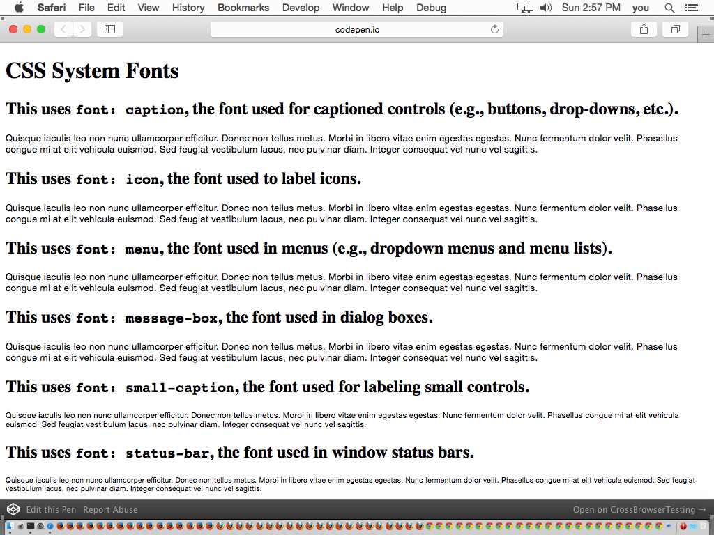
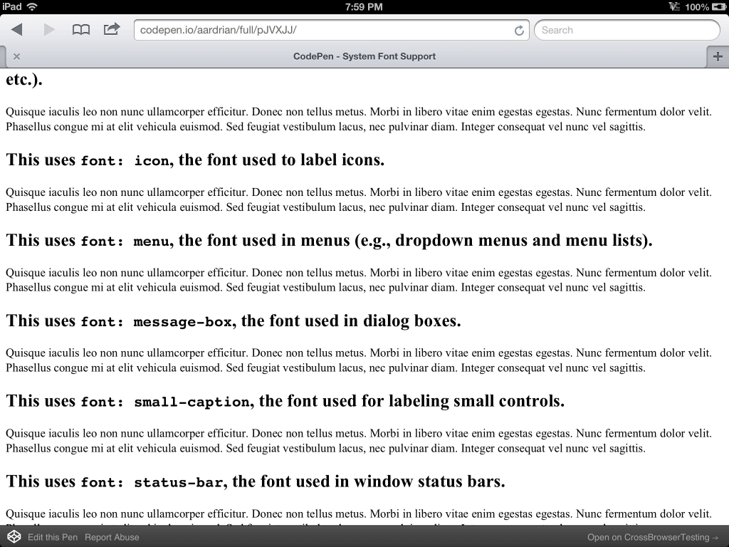
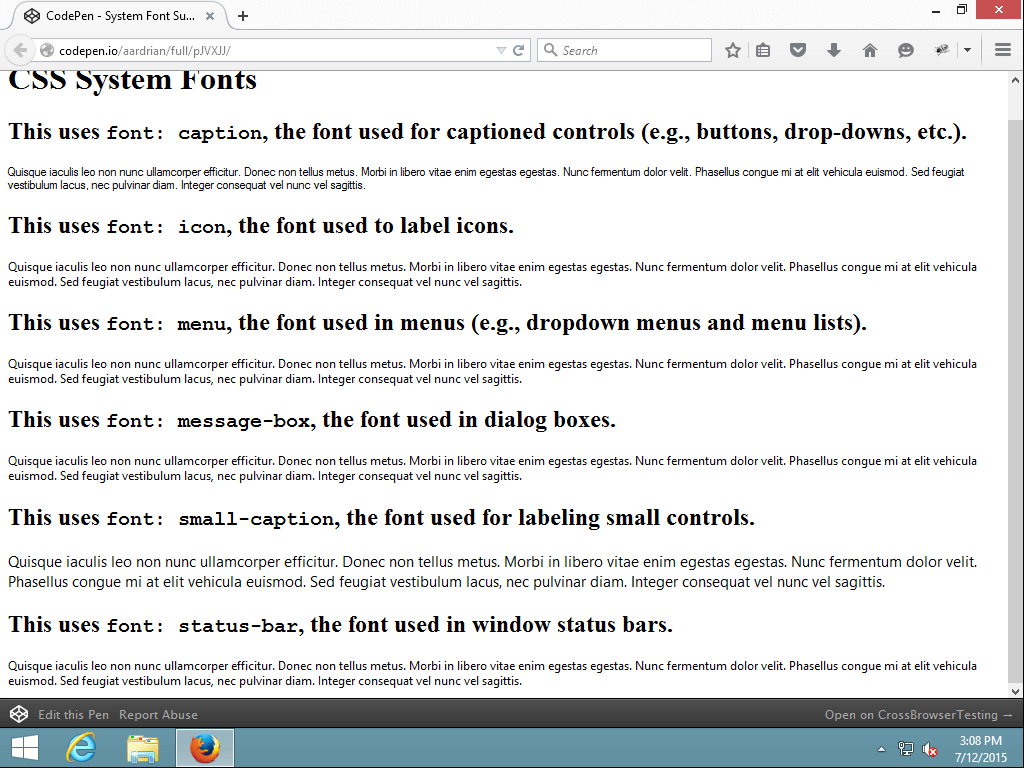
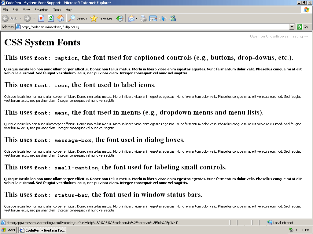
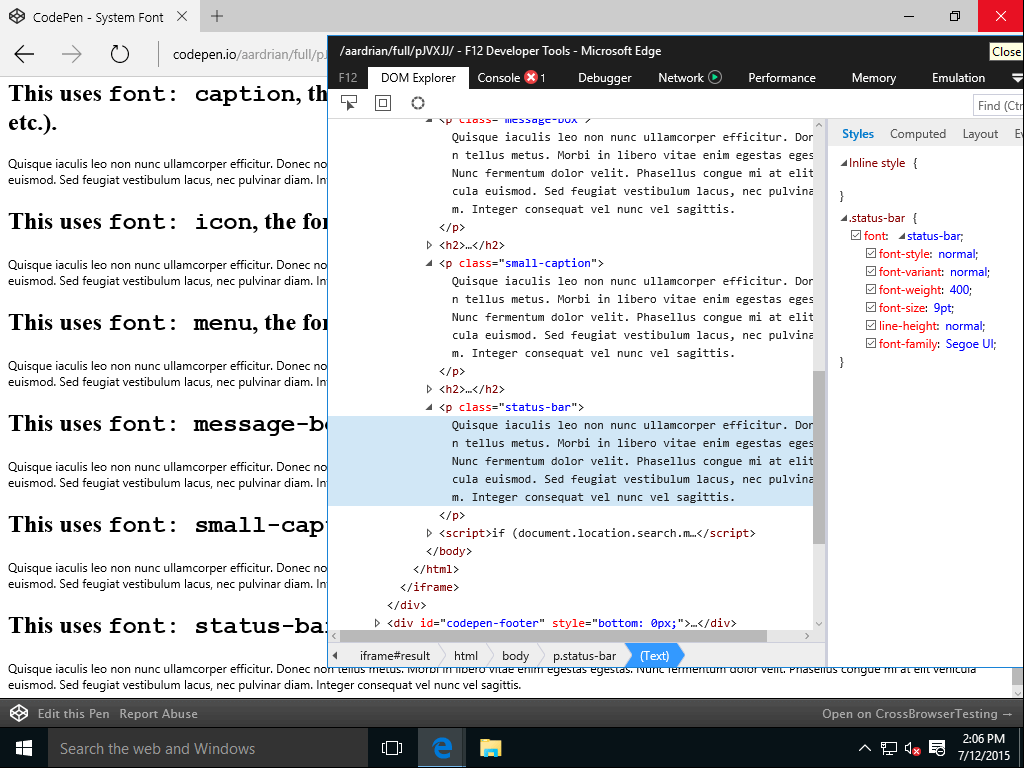
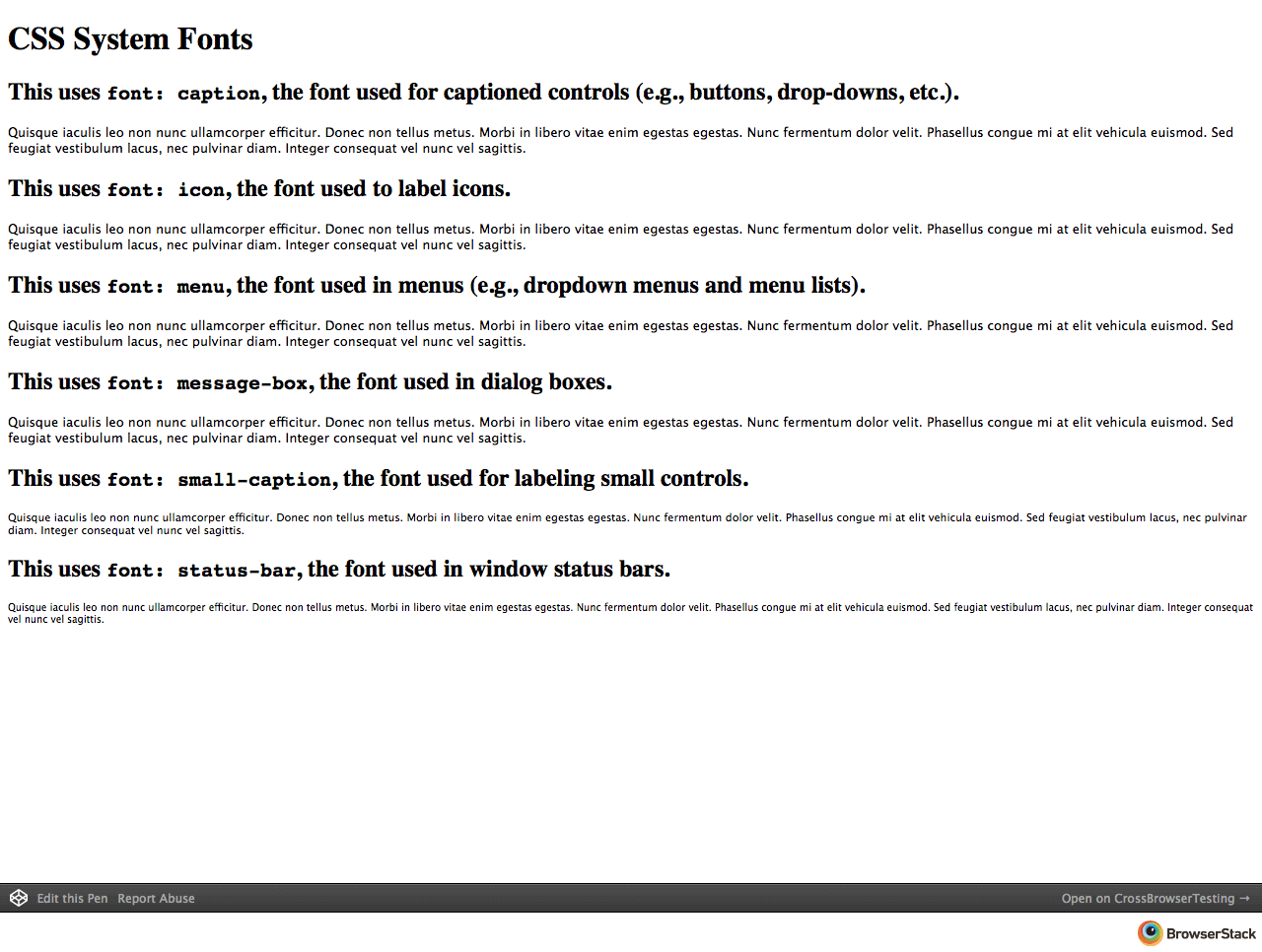
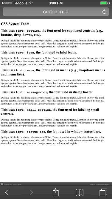
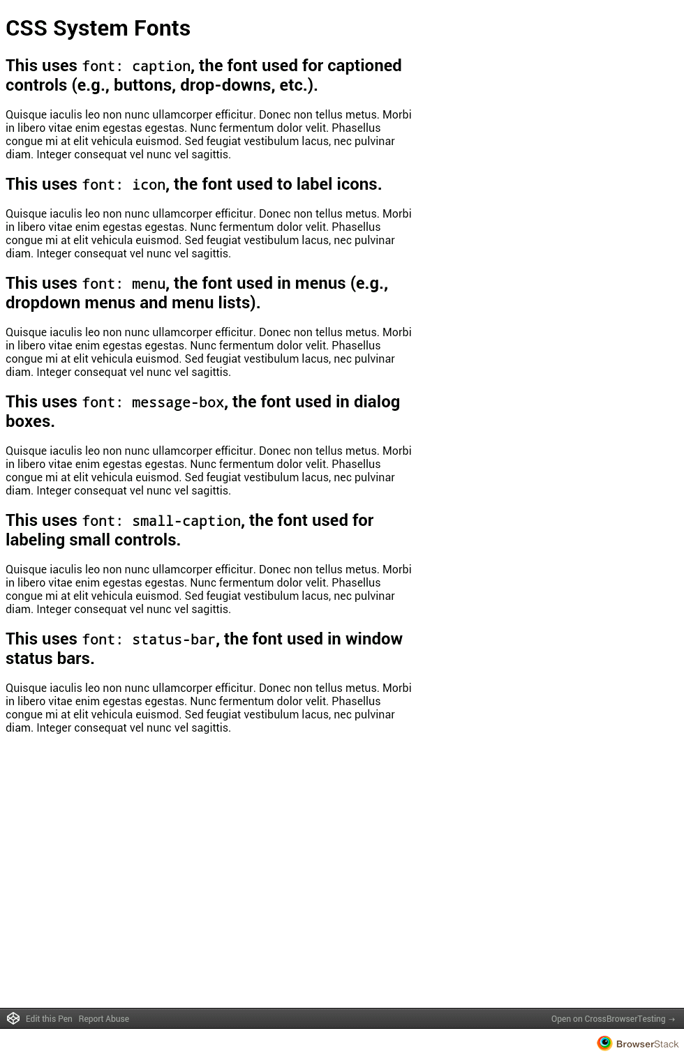
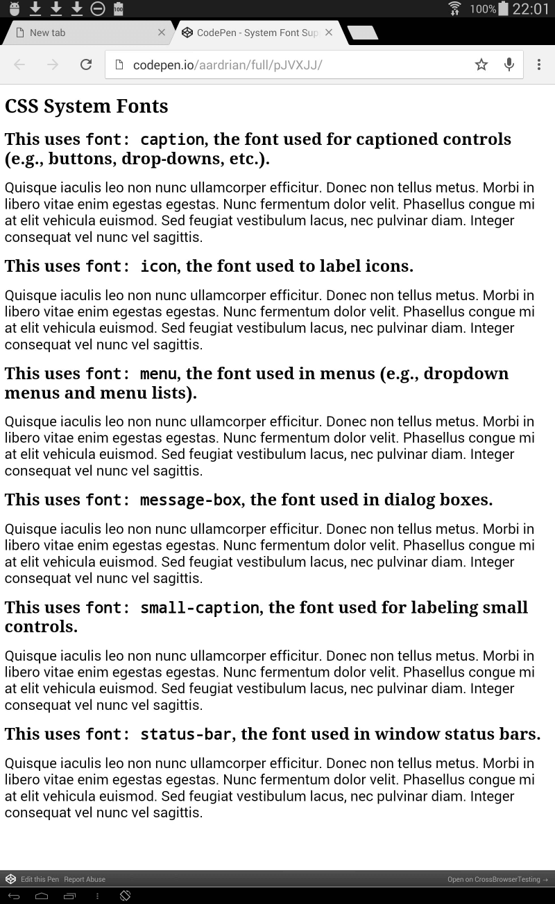
What I found (to spare you the squinting or opening each image individually):
- Safari 8 on OS X 10.10 seems to honor the styles.
- iPad 4 running Safari 6 doesn’t like them.
- Firefox 39 on Windows 8.1 also seems to honor them.
- I am not surprised IE6 on WindowsXP supports them.
- The forthcoming Edge on Windows 10 honors them, but it looks like all the UI elements in Windows 10 may be 9pt Segoe UI.
- Safari 7 on OS X Mavericks also seems to honor the styles.
- No luck with Safari 8 on iPhone 6.
- I genuinely cannot tell on Android 4.1 on a Nexus 7.
- It looks like Chrome 43 on the Galaxy Tab S might honor them.
The gist here is that Safari on iOS does not honor the CSS specification for system fonts. I don’t know why.
Conclusions?
Sorry, I don’t have answers. I’m mostly just wading into what I know today.
Given that some of the handling of the syntax looks like the spec (use of the font shorthand property only) and some of the Apple keywords resemble existing ones from the spec (caption from the spec, -apple-system-caption1 from Apple), this feels like the developers knew the spec.
I’m guessing a decision was made to skip trying to extend the spec and instead to just make prefixed styles. The argument might be that it only targets iOS devices (for now as I suspect support in Safari on OS X is to come). Since iOS doesn’t allow any other browser engine, prefixing doesn’t negatively affect iOS users. As this is probably best used in a webview in a native app, all the more reason to not worry about ignoring the spec (nor working to extend it).
The risk is that monoculture developers may not bother to use the CSS spec as a fallback (for system fonts or other fonts) and miss an opportunity to support native styling when porting a native app to another platform. Worse, web developers who eschew browser compatibility may play with these new prefixed declarations and fail to implement functional fallbacks.
Again, this is me speculating out loud. I am open to corrections and/or different explanations.
Sorta Related
Retro Fun!
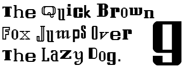
The original Apple typeface has scarred me forever.

Related CSS System Properties
I did not integrate any of the CSS system colors as those are explicitly deprecated in favor of appearance, which appears to be missing from the spec referenced from the deprecation note. You can get some information on appearance and prefixed support with properties over at CSS Tricks or read the language deleted from the draft spec at the Internet Archive where it made its last appearance (I’m punny) in the CSS 3 UI spec on January 13, 2012.
That same version of the specification notes that font properties are at risk of being dropped from the CSS 3 UI spec, but given the lack of a deprecation note for them in CSS 2.1 and the fact that this language doesn’t live in the latest version of the CSS 3 UI spec, I take it to mean that the CSS 2.1 font system properties still stand.
Update: November 18, 2015
Greg Karus provides some notes for using the custom Apple feature in the post Text Resizing for Web Pages in iOS using Dynamic Type.
While I would have preferred Apple just follow the pre-existing spec instead of making up its own variant (evidence suggests Apple doesn’t do that), the post includes some potentially useful tips.
I cannot speak to what happens if you just leave font-size unspecified in the CSS (no iOS device handy), though it should just lean on the user’s preferences. The article cites all of the other browsers that don’t support Apple’s built-in fonts
as the reason for some of its code examples, but iOS famously won’t allow any other rendering engines on iOS, so I’m not so sure this is a big issue.
Update: April 29, 2017
The folks at Booking.com were affected by Apple’s proprietary font approach in an interesting way (others had been through this, but this was the first I had heard of it):
So, lesson learned; don’t use
-apple-systemat the head of a shorthand font declaration, and test thoroughly, especially when playing around with proprietary stuff like system font declarations. If it looks like a vendor prefix and smells like a vendor prefix, chances are at least one browser is going to treat it like a vendor prefix.
Update: July 28, 2017
Back in April, Greg Whitworth penned How to use -ms-high-contrast. In it he provides some details on how the colors in Windows High Contrast Mode are assigned to web pages:
To make this easier we mapped the Windows High Contrast colors to CSS system color keywords so you can utilize the specified colors without needing to know them.
- Text is mapped to
windowText- Hyperlinks is mapped to N/A, we apply the color to
<a>- Selected Text is mapped to
highlightText&highlight- Button Text is mapped to
buttonFace- Background is mapped to
window
CSS system color keywords are an awesome feature, one that many developers keep forgetting exist.
6 Comments
Thanks for the article.
Been searching the web, and can’t seem to find an answer: Is it legal to implement Apple’s new font in web interfaces not solely used for OSX or iOS?
Wondering if Apple would encourage their font to be implemented through the web (like Google’s open sourced material design) or would rather keep the typeface to their own products.
In response to . Gabe,
I suspect not given Apple’s history, and this post suggests that San Francisco cannot be used outside of OSX, iOS, Apple Watch, and whatever other hardware OS may exist by the time someone else reads this. There is probably more at developer.apple.com/fonts.
In response to . Makes sense.
Do you know of any fonts that emulate San Fransisco’s form? I’m looking for type that renders well on Mac and Windows. Ironically, San Fransisco works beautifully on PC.
In response to . Nope. Also don’t have a Mac handy to eyeball it. I’d check some type forums as I’m sure it’s been debated pretty thoroughly.
Chicago is THE original apple typeface : https://en.wikipedia.org/wiki/Chicago_(typeface)
In response to . I meant the original version of San Francisco up above. But heck, San Francisco would have been awesome as the original default Mac typeface!
Leave a Comment or Response