Let’s Share More Accessibility Experiences
I think the accessibility community has an opportunity (has had an ongoing opportunity) to get its message across to the broader developer community that it hasn’t realized. A couple recent write-ups make me think we should all be trying harder.
Stories
- Medium
- Podio
- Shopify (added June 21, 2016)
- U.S. Digital Services (added March 23, 2017)
- Trivago (added September 26, 2017)
- Etsy (added October 10, 2017)
- Pornhub (added October 10, 2017)
- Basecamp (added May 3, 2018)
- Pinterest (added May 3, 2018)
Medium
Last week Medium shared its experience with working to make its site accessible. The team chose a title that was appropriately humble: Five Goofy Things Medium Did That Break Accessibility
The article outlines six (not five) lessons that the author learned but which aren’t new to those in the accessibility community:
- DON’T: “Intercept” clicks by creating a transparent overlay over a control.
- DON’T: Use opacity: 0 to hide elements.
- DON’T: Create an <a> tag without an href
- DON’T: Create a button or link without text.
- DON’T: Attach actions to SPAN or DIV tags to listen for user input.
- [Use headers and footers.]
Podio
A few days later Podio wrote about its own revelations in accessibility: How some hard truths helped us start improving the Podio experience for the visually impaired
In short, a developer met a customer with a visual impairment and realized the overall interface was lacking. He came away with a valuable lesson from the whole thing:
Sometimes you actively decide to leave out a feature, sometimes you forget some details and your implementation has bugs, and sometimes out of pure ignorance you leave your users behind with a really bad user experience
In his story he defines the basics for his readers, from semantic mark-up to screen readers (he is writing about one user, so other assistive technology is understandably absent). For a few readers there is nothing new there, but for so very many developers that is brand new information.
Shopify (added June 21, 2016)
Shopify may not be aware of this post, and may not even care, but it is going and doing exactly what I hoped more companies would do. It is sharing what it is learning, both what it gets right and what it gets wrong. Dave Newton kicked off the series with this:
At Shopify, our mission is to make commerce better for everyone. […]
- 9.1% of adults with vision trouble [Source: Disability and Functioning, CDC], and 8% of men and 0.5% of women who are color blind [Source: Color Blind Awareness].
- 16.8% of adults with hearing trouble [Source: Disability and Functioning, CDC].
- 15.1% of adults with physical functioning difficulty [Source: Disability and Functioning, CDC].
- 4.4% of adults with cognitive disabilities [Source: 2014 Disability Statistics Annual Report, UNH].
I hope more companies follow Shopify’s lead.
U.S. Digital Services (added March 23, 2017)
U.S. Digital Services put out an article sharing its own experiences: Mythbuster’s Guide to Accessibility
Trivago (added September 26, 2017)
Trivago shared its own journey in a post today, opening with a pretty frank assessment of its starting point:
If you looked at our site a year ago, it was completely inaccessible to users who attempted to access our site with anything other than a mouse or touch screen.
Stumbling blocks are important to share, since many other organizations hit them as well. Trivago is not shy about it:
A few weeks after the keyboard accessibility functionality went live, it had to be completely switched off again rather than accepted into the codebase.
As before, I encourage everyone to share their own stories. There is a lot of value from knowing others have hit the same stumbling blocks and gotten past them.
Etsy (added October 10, 2017)
I made a note to post this story a few months ago, and lost it in the shuffle. One of the engineers from Etsy wrote his own experiences after leaving Etsy and opens with a pretty important note:
While the lessons are still fresh I want to write the blog post that I wish I had read when I was first starting down this path, in the hopes that it gives you insight into possible steps and the belief that crafting culture around accessibility is possible. Teaching coworkers at your company about accessibility will only raise the engineering standards across our industry moving forward.
It’s a long and in-depth post and you should read it. It is informed by experience.
Pornhub (added October 10, 2017)
Pornhub shares not in a lengthy blog post by an engineer, but instead Wired has written an article on the efforts of its team to create a more inclusive experience.
…[L]ast year, Pornhub took another major step toward accessibility by introducing a “Described Video” category, in which videos include a scripted voiceover that describes each scene in extensive detail.
Now, Pornhub will push its accessibility efforts further in significant ways. The site will now offer enlarged text and customized color contrasts, for viewers with limited visual acuity or colorblindness. It will introduce keyboard shortcuts to make navigation easier for the blind. And it will add alternative text to better describe images for visitors who cannot see them.
If it has value for the porn industry, it probably has value for your industry.
Basecamp (added May 3, 2018)
The intro to the Basecamp story may sound familiar to many of us.
Over the past year, I made it a personal mission to make Basecamp 3 more accessible for people with disabilities that affect how they use the web. It’s something we’d been meaning to focus on at Basecamp for a while. But as with many unfamiliar and seemingly immense tasks it was just too easy to put off! Which is exactly what we did, for years.
I have no idea why it uses an m-dot domain, nor why removing the m-dot results in a 404.
Pinterest (added May 3, 2018)
You might not consider Pinterest as a platform for blind or low-vision users. That is the same problem Pinterest had for years. This example from the article is a great example of just asking the question.
“We asked one user, would you use Pinterest? You can’t see what’s on the screen!” Long recounts. “She said, ‘of course I would.’” Visually impaired or not, we all want tasty recipes, better haircuts, and fashion advice. And Pinterest is loaded with billions of pins full of this stuff.
Current Situation
In each case, accessibility-minded people point out where the lessons and efforts fell short. Skipped headings on Medium, too low text contrast on Podio, and many more items. That approach has defined the message from the accessibility community for years — you didn’t go far enough.
There are exceptions of course (A11y Wins comes to mind), but it can be intimidating for anyone giving accessibility a go.
Meanwhile, these two developers were ill-prepared to even consider accessibility. I challenge you to find an instructor in a higher education setting who teaches his or her students about accessibility; someone who integrates it into the conceptual skills most developers need or even into the tool-set and language training that developers use to get jobs.
Combine these factors and you have developers who haven’t been exposed to accessibility. For those who become developers without schooling first, there is no easy way to discover accessibility practices and many never even realize that there are practices.
How We Can Reset the Conversation
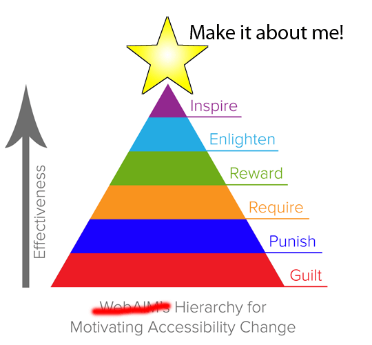
Make it about me!I first proposed this model at the HTML5 Developer Conference in March 2014 (see my Selfish Accessibility slides).
The average developer might look at the Medium list and not immediately understand why those are issues. That same developer recognizes the Medium brand and sees that brand’s willingness to acknowledge that it learned by screwing up. The same is true of Podio.
That can be powerful. That can reach developers in a way that the accessibility experts cannot — partly because of the perception that we (I’m a bit uncomfortable using we
here) all take the fun out of web development by not letting designers use grey text on white or developers use divs as links.
Perhaps as accessibility advocates we can move away from taking shots at sites that do it completely, utterly wrong (like I continue to do with Virgin America) and instead promote the ones that are making an effort.
Every time we help an organization to learn something new about accessibility and improve its tooling, processes, user interfaces, and so on, we should encourage them to write about it. Help them share those lessons and wins with the broader community.
Think of developers who love to read about what’s going on at their favorite sites as told by other developers — their peers. Imagine if those stories included regular experiences and lessons learned from improving accessibility (often with the follow-on benefits). Consider how many of those could be informed by the time you spent consulting or raising issues on accessibility.
I’d love to see developers brag about some new accessibility feature just as frequently and fervently as they do with some new shiny technology. I’d love to see that from all developers, not just those in the accessibility world.
Let’s all see if we can appeal to the existing desire to share (or just appeal to ego) when we help someone discover an accessibility trick and help them get it in writing. Maybe we can change the nature of the conversation altogether, modifying the tone from negative to positive.
I think that would be pretty swell.
Self-Fulfilling Tweet
Sort of out of context, but it preemptively validated my point…
@aardrian I totally agree. These stories show transparency and commitment to #a11y improvement, and share experiences. All good stuff.
2 Comments
I was happy to blog about our failures at Safari since I knew it would push us to do better.
In response to . The URL for that blog post has changed since this comment was posted, so I have updated the comment to use the current URL.
Leave a Comment or Response