Thoughts on Muse (Obvious Pun Avoided)

 I downloaded and installed Adobe’s new web design tool, Muse (code name) (also at Adobe Labs) out of morbid curiosity. Just like Adobe Edge (which refuses to launch), I had very little expectation that this would be a fully-developed sales-ready product. Instead of getting into extensive detail about the quality of its code, its accessibility support, and so on, I figured I’d do a very quick review of how I think it affects web developers.
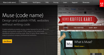
The target audience is pretty clear from the Muse (code name) web site introduction:
Create websites as easily as you create layouts for print. You can design and publish original HTML pages to the latest web standards without writing code. Now in beta, Muse [(code name)] makes it a snap to produce unique, professional websites.
And this:
Design your pages
Focus on design rather than technology. Combine images and text with complete control, as flexibly and powerfully as you do in Adobe® InDesign®.
Right there is the gist of the product — enable print designers to convert their designs into web pages. Just like Photoshop would produce massive image slices to support Photoshop “designers,” this product isn’t about the code. With its integration of jQuery effects and Lightbox widgets, it seems almost like this would be a tool for a photographer to build a gallery site.
If you are a coder, or someone who cares about the code, this tool isn’t for you. You will quickly see that the HTML is produces is not exactly structural or semantic, and that the piles of CSS and JavaScript aren’t exactly necessary. Muse (code name) doesn’t allow you to edit the HTML, so you still need to “publish” your work before you can edit it. If part of your coding process involves making your HTML meet accessibility standards or even just structure your content for good SEO, you will find it impossible.
If you are part of a web team, perhaps in an ad agency or interactive firm, then you will find that this tool doesn’t allow you to collaborate well. If you get a favicon, for example, from another member of your team, Muse (code name) cannot import it; it only accepts PNG, GIF or JPG. If you receive a background image to drop into an element, Muse (code name) will crop the image, even increasing its dimensions to fill the element, regardless of your plan to allow more of the image to be revealed should the container change in size.
If you find yourself pasting HTML code from Google Maps or Twitter in order to embed third-party widgets on your site, you may find that is nigh impossible short of publishing your pages and then hacking through the HTML output. While I did not find a menu option to do that, even if it exists it will require a full “publish” step every time you want to tweak your embed code.
If you find yourself leaning on CSS techniques as simple as printable styles or as complex as media queries to support alternate display sizes, you will be disappointed. This tool is not intended to support liquid designs, adaptive layouts, document re-flow, or really anything related to alternate viewing.
If you support a web content management system, then for all the reasons above Muse (code name) is not a good fit. Just building a single page to use as a template will require a great deal of work to reformat the code to fit into most content management systems that are out there. Should you ever have to change the core template you either have to go back to Muse (code name) and repeat the process, or you will have to skip Muse (code name) for all future revisions.
In short, it comes down to these two key points:
- Muse (code name) has the potential to be a great tool for the single graphic designer interested in showing off his or her work without having to learn a technology outside of his/her knowledge area (nor worry about accessibility, standards, alternate displays, SEO, etc.);
- If you are a web developer (or web development firm), your job is not at risk. Muse (code name) is making no effort to replace you. If anything, it might keep you from getting fewer calls from people who might not be good clients anyway.
If you are looking for a pedantic review of the HTML output, I suspect plenty of others will cover that. Since Muse’s (code name) target audience won’t care, and anyone who does care will already know the issues just by playing around, it’s not even worth getting into here. Besides, with 120,000 other people downloading Muse (code name) after the first day, I expect plenty of reviews of the markup will come.
Now to Examples!
These aren’t intended to be open shots at Muse (code name), but instead I hope someone at Adobe can use them to help better it overall.
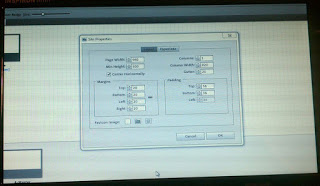
This image shows how Muse (code name) looks on my netbook (I may have tweeted my frustration last night). As you can see, the menus are off the top of the screen along with every other useful feature. I was able to close the application thanks to standard keyboard shortcuts.
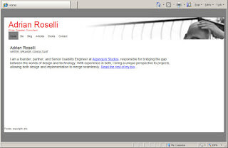
Using the default page size settings (960 pixels with a min-height of 500 pixels), this is the sample site I quickly cobbled together. I did not start with a design or goal other than throwing some elements on the page, so don’t tell me my site isn’t as awesome looking as it could be. Because it couldn’t be awesomer.
What about the file output you ask? Here is the /css directory:
| File name | Size (bytes) |
|---|---|
| articles.css | 5,106 |
| bio.css | 5,106 |
| blog.css | 5,106 |
| books.css | 5,106 |
| contact.css | 5,106 |
| ie_articles.css | 5,009 |
| ie_bio.css | 5,009 |
| ie_blog.css | 5,009 |
| ie_books.css | 5,009 |
| ie_contact.css | 5,009 |
| ie_index.css | 5,009 |
| index.css | 5,106 |
| site_global.css | 4,305 |
The duplicates are for IE support and you can expect to see all your content in every page twice as it relies on IE conditional comments to serve up one copy for IE9 and one copy for anything below IE9.
Here is the /scripts/0.9 directory:
| File name | Size (bytes) |
|---|---|
| jquery-1.4.4.min.js | 78,766 |
| jquery.museMenu.js | 2,382 |
| MuseUtils.js | 9,317 |
| SpryDOMUtils.js | 14,604 |
Without those script files, those simple-looking menus on my example just don’t render.
That background image I mentioned earlier? Muse (code name) re-cropped it and converted it to a PNG file, increasing both the dimensions and file size:
| File name | Size (bytes) | Dimensions | |
|---|---|---|---|
| Banner_bg.jpg | 11,271 | 627 x 80 | original image |
| master_U355_full.png | 41,800 | 960 x 97 | Muse (code name) -ified image |
Related
- Developers respond to Adobe Muse at .net Magazine.
- Adobe’s Muse (code name) site re-coded as XHTML 1 strict, dropping from 78k to 5k.
- Added August 25, 2011: ZDNet asks, as a response to Muse (code name) criticism, What is wrong with bloated markup? I answer in the first comment.
- Added September 2, 2011: Even FastCompany weighs in on this: Adobe’s Muse Lets Designers Make Websites Without Knowing Code
One Comment
Great review. I've heard mostly good things so far about Muse but from reading your article, I see it's lacking in several areas. I haven't tried it yet though. The whole "do it all for you" comes across as a threat to web designers when in reality, semantically correct code and core css will out last the rest.
I'm surprised to see that you cannot edit the HTML, I guess it's really not meant for us coders.


Leave a Comment or Response