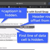
Though JS-free fixed table row and column headers have been possible for quite some time, Safari’s and Chrome’s recent fixes got some people pretty excited. Enough that folks are copying code samples in whole, without always paying attention to necessary considerations. That same excited demo included other CSS properties that…
TL;DR: Stop using the word pop-up. Instead choose a term that accurately describes the control you want. I encourage you to read my post Stop Using ‘Drop-down’, which provides the set-up for this post. Along with another term I would prefer everyone stopped using. As you embark on a design,…
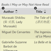
This post expands on what I covered in my April 2021 post, Sortable Table Columns. You may want to read that first to understand the broader challenges and techniques for making a table sortable by one column at a time. That last statement is what matters here. ARIA 1.1 says…
An accessible sortable table is not necessarily the same as a usable sortable table. Outline: Basics Let The User Know This Thing Has Sorted Screen Reader Announcement Sort Arrows Column Background Column Background via <col> Let The User Know This Thing Sorts SVGs Layout Windows High Contrast Mode Screen Readers…
Others in this sorta-series: Under-Engineered Custom Radio Buttons and Checkboxen Under-Engineered Toggles Under-Engineered Toggles Too Under-Engineered Text Boxen I am still confounded how many developers and designers see a <select> and immediately reach for a library or framework to re-create the features from the ground up. Though, frankly, I am…
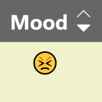
Table of Contents Example The HTML Live Region Button Decoration Accessible Name The Styles Hide the Live Region Color and Contrast Active Animations Text Resize and Reflow Windows High Contrast Mode The Script The Click Event Manipulate Outcomes Screen Reader Output WCAG Success Criteria What This Does Not Do Wrap-up…
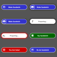
I had this post queued up for Halloween because, come on, skeletons, and then life did its thing and now it is a … Thanksgiving post? Many skeleton patterns do a poor job presenting themselves to screen reader users in any meaningful way. They often stuff aria-busy into their widget,…
I have written a bunch about responsive tables. Maybe too much. I keep trying to give developers the information they need to make informed decisions — ARIA attributes, screen reader & browser pairing results, bugs, and so on. I have spread things out over years of posts. I have filed…
Visually and functionally sortable column headers on tables are straightforward (I have a post on that coming soon). However, making them accessible can be a bit frustrating. To clarify, making them accessible to screen readers is frustrating. I wrote the post I promised in the opening: Sortable Table Columns There…
In early March, Steve Faulkner shared this nugget for making sub-headings: 👉If you want to semantically identify a heading subtitle, look no further than role="doc-subtitle" w3.org/TR/dpub-aria-1.0/#doc-subtitle #HTML #ARIA #WebDev pic.twitter.com/uaHcVRp6oz Steve Faulkner (@stevefaulkner) March 7, 2020 On its surface it looks pretty handy. Handy enough that Chris Ferdinandi wrote about…
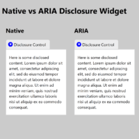
A disclosure widget is a simple control whose sole purpose is to hide or show stuff. Native HTML has one built in via the <details> and <summary> elements. Until recently, if you wanted to use it in modern browsers you needed to use a polyfill. In most cases it was…
The moment you change it. As soon as you start to tweak the underlying code or aspects of the design, you run the risk of introducing bugs. That part should be easy for any developer to understand. The tougher part to get your arms around is that once you add…