When Is a Vetted Pattern No Longer a Vetted Pattern?
The moment you change it.
As soon as you start to tweak the underlying code or aspects of the design, you run the risk of introducing bugs. That part should be easy for any developer to understand.
The tougher part to get your arms around is that once you add features that on their own may be perfectly valid, you can create an experience that does not make sense for your users. In some cases it can be completely unusable.
Examples
I’ll grab a couple examples to try to highlight my point. I am using patterns from WAI-ARIA Authoring Practices 1.1, whose interaction is well documented, even if the testing is less so.
Tabs
Let’s use a set of tabs as an example. The HTML, ARIA, CSS, and JavaScript needed to make a tab panel is generally well documented. In particular, regardless of how you choose your HTML elements and progressively enhance your tabs, the ARIA needed is very clear — at minimum you need to use tablist, tabpanel, and tab roles. Then there are various ways to assign accessible names, ensure you are conveying state properly, and build keyboard support.
You may choose to implement the tab widget pattern from WAI-ARIA Authoring Practices 1.1 (which is a note, not a standard). You may also recognize that it is not well tested and instead choose a more robust progressively-enhanced tab pattern from Scott O’Hara’s collection.
You build it, test it, get it approved, deploy it, and all is good.
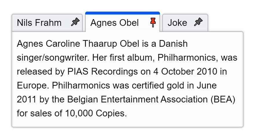
 Then one day someone asks you to enhance it. They want to let users pin a tab and they want to let users do it right on the tab itself, not in the tab panel.
So you add a <button> to your tab, confirm you can get to it with keyboard, and maybe even look in the browser accessibility inspector and see it is exposed as a button. But then you discover a problem — some users cannot use it. You dig around, you find that nesting interactive controls is forbidden and then you find the tab role explicitly treats all children as presentation, stripping their semantics.
Then you decide to make the pins live adjacent to each tab, instead of within them. After all, tablist does not explicitly forbid that (15 May 2021 that will likely change in ARIA 1.3). But then you find your users are confused by the fact that pressing ↹Tab does not navigate tab panels, and pressing Enter seems to have no effect, or (if you do not support arrow navigation between tabs) that there are now two tab-stops to every tab.
Your once vetted tab widget is now a mess.
Listbox (Custom Select)
One of the first patterns to emerge from ARIA was the listbox, allowing developers who replaced native <select>s with their own custom code to finally make them accessible. ARIA even defines the listbox role as a replacement for a native <select>.
Presuming you make the right choice for your control, you then have to choose which pattern to use. Whether you follow the listbox pattern from WAI-ARIA Authoring Practices 1.1 (all caveats about testing apply), copy one from Kendo UI or Office Fabric (read more on these curiosities from Sarah Higley), or hate yourself enough to develop one from scratch, ideally you get one that works for your users.
You build it, test it, get it approved, deploy it, and all is good.
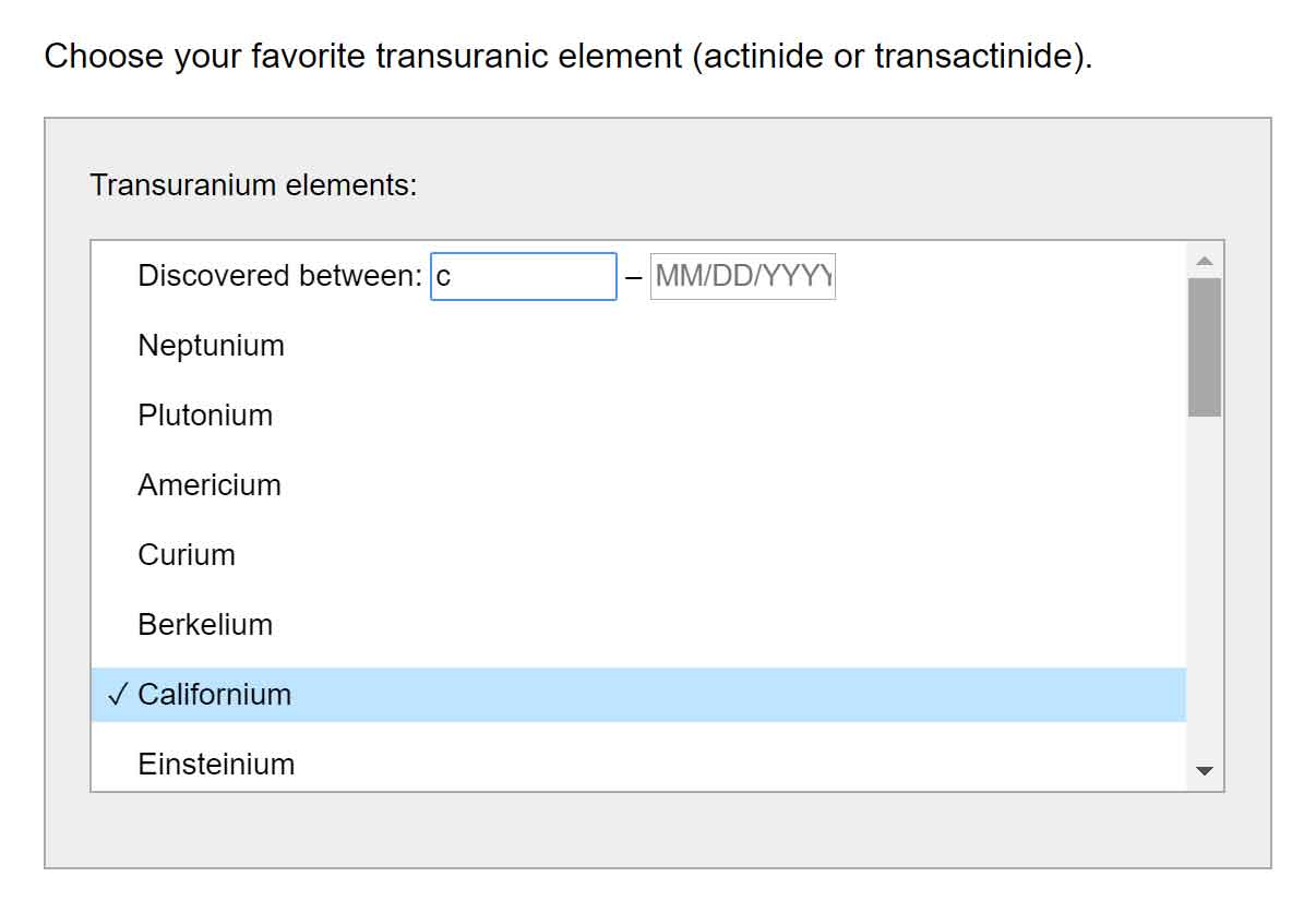
 Then one day someone asks you to enhance it. They want to embed a pair of date fields at the start of the options so users can filter by a date range.
So you add a pair of <input>s to your options, confirm you can get to them with keyboard, and maybe even look in the browser accessibility inspector and see they are exposed as input fields. But then you discover a problem — some users cannot use the fields. You dig around, you find that nesting interactive controls is forbidden and then you find the option role explicitly treats all children as presentation, stripping their semantics.
Then you decide to make the fields live above or below the options, instead of among them. After all, listbox does not explicitly forbid that. But then you find your users are confused by the fact that pressing ↹Tab navigates fields, but pressing arrows navigates options, and if focus is in a field then typing anything to choose an option later in the list is stolen by the field.
Your once vetted listbox widget is now a mess.
Float Labels (added 9 May 2020)
The float label pattern has become the default labeling method in Google’s Material Design design system. That means it has been taken up in Google’s Angular framework in the form of Angular Material Design components.
Angular developers can drop <mat-form-field> into a form and feel confident that no more effort is needed on their part to ensure a functional (and hopefully accessible) input field.
The problem is when those developers discover that placing the <label> after its field results in unexpected announcements for screen readers in browse mode (rare though it may be). The workaround I have seen is to retain that <label>, but hide it from screen readers with aria-hidden. Then place another <label> before the field and visually hide it. The construct then looks like this:
<mat-form-field […]>
 <div […]>
  <div […]>
   <label […] for="mat-input-26" class="sr-only">Input</label>
   <div […]>
    <input […] id="mat-input-26" aria-invalid="false" aria-required="false">
    <span […]>
     <label […] id="mat-form-field-label-71" for="mat-input-26" aria-owns="mat-input-26" aria-hidden="true">
      <mat-label […]>Input</mat-label>
     </label>
    </span>
   </div>
  </div>
[…]
 </div>
</mat-form-field>
Yes, that is a lot of code for a text field and its label; and that is after I removed all the Angular cruft (classes, custom attributes, inline styles, etc).
Eventually these devs have a valid reason to disable a field, and then they discover that the field is gone from browse and forms mode. This is because of Chrome’s aria-owns bug that treats owned elements as descendants in the accessibility tree (I have a Codepen showing a simplified test case).
aria-owns bug in action on Google’s Angular Material simple input example.Your once vetted float label is now a mess.
Takeaway
Obviously these two examples are technically fixable. While you may be ahead of the game by re-using an existing component as your base, and adding features, you must consider that you are also introducing code that can result in bugs. In addition to bugs, you are introducing changes that can be confusing to users.
Should you go down this path, be sure to build in enough time to run through a full testing suite — code validation, accessibility, testing with users, security, and so on. You may have reduced your development time, but not your testing time. You have to treat it as completely new.
A robust pattern should account for localization, different contexts, different use cases, and so much more. Your base pattern ideally already has that, but if you are generally unfamiliar with all that the original developers (should have already) considered then I have a short list of basic custom control requirements that also links to other resources and checklists for reference.
2 Comments
Just a small note — looks like you forgot to update the last 2 paragraphs of § Listbox (Custom Select), as they still mention tabs.
In response to . Fixed! I unintentionally demonstrated how copying stuff I had already reviewed just to save time by tweaking it resulted in bugs. Yay me!
Leave a Comment or Response