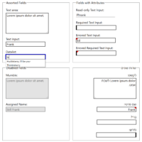
TL;DR: Stop using the word drop-down. Instead choose a term that accurately describes the control you want. I have worked both with native platform developers and web developers. While control names might differ, if a control was functionally the same then it was not an issue. A TextBox, for example,…
Whether you call them cards, block links, or some other thing, the construct of making an area of content clickable (tappable, Enter-key-able, voice-activatable, etc.) is not new. While hit area size is mostly a usability issue, marketers often want a larger click area around their calls to action (CTAs) to…
In current user interface terms a toast is a message that appears on the screen; it is often short, often appears only briefly, and often animates up from the bottom (like a piece of ghostly yet precisely-crafted toast), though other directions and a fade-in/-out is common. The Name When Google…
Here is the priority I follow when assigning an accessible name to a control: Native HTML techniques, aria-labelledby pointing at existing visible text, Visibly-hidden content that is still in the page, aria-label. Too often folks will grab ARIA first to provide an accessible name for a thing. Or they may…
Since the early days of the web, when images could be floated and text would wrap around them, designers have wanted to bring drop caps onto the web. Then we learned how terrible a pattern like <img alt=”M” align=”left”>atthew is for users, and CSS introduced :first-letter, letting us believe all…
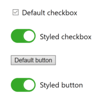
Others in this sorta-series: Under-Engineered Custom Radio Buttons and Checkboxen Under-Engineered Toggles Under-Engineered Toggles Too This is the latest, and not last, in my informal series of posts on under-engineered controls. Generally I am looking at the minimum amount of CSS necessary to style native HTML controls while also retaining…
I regularly work on projects with HTML tables that have been pushed to the edge with styles, scripts, and widget features. A common pattern is where rows are hidden until the user opts to show them. Unfortunately, the pattern is often over-complicated with unnecessary script and styles that regularly break…
If you are working on a custom control, a complex widget, or a novel interface element to integrate into a project, library, or framework, there are some core features you need to build. These represent not just what works for users across the most contexts and preferences, but also what…
Updated Intro Whether you use a <button> or <input type=”checkbox”> for your toggle depends on a few factors: Use <button> if: you can count on JavaScript being available, flipping the toggle has an immediate effect, the toggle will never have an indeterminate state. Continue reading this post. Use <input type=”checkbox”>…
Calendar controls, date pickers, date widgets, whatever you call them, however they are described, they follow the same basic principle — present the user with a calendar to enter a date (and sometimes a time). Chris Blakeley, CC BY-NC-ND 2.0 The native implementations come from browsers when authors use <input…
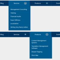
10 July 2026: I encourage you to read Link + Popover Navigation instead. It uses the new HTML popover feature and CSS anchor positioning to create the same outcome without script and with less ARIA. Obviously you’ll need to decide if you audience is using browsers that support these features…