Multi-Function Button
In my post Be Careful with Dynamic Accessible Names I talk about cases where a developer wants to change the name of a control on the fly so it can act as its own trigger, message container, and method of conveying the status of a process.
Scenarios where I have seen this control proposed:
- Download, downloading, download failed, try again, downloaded;
- Send message, message sending, message failed, try again, sent;
- Reserve, reservation in progress, reservation failed, try again, reserved;
This post shows how you can make one of those multi-function buttons (that also safely changes its accessible name).
This may be a viable alternative to a case where everything other than the first step is conveyed via toast messages — unless you have ensured those toasts are accessible and users find them.
Example
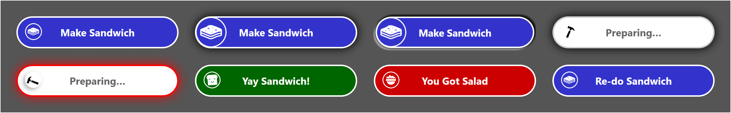
My example is a sandwich-making button. It hooks into the SandwichAPI, which triggers the Hammer service. Every time you press the button it attempts to make a sandwich (it is still unclear where the sandwich goes). Sometimes the process runs out of bread and deposits a pile of greens wherever the sandwich was supposed to go (likely somewhere on the prime material plane, though maybe a pocket dimension), but it lets you try again.
This button supports two outcomes — success and failure. Importantly it also indicates when it is waiting to hear back from the service (the user is waiting). You can see either outcome by choosing the appropriate option in the example. Reloading the example will return it to its default (the Rerun button at the end of the embedded frame will do it).
See the Pen Multi-Function Button by Adrian Roselli (@aardrian) on CodePen.
You can also view the pen directly, or visit it in debug mode if you want to test it without the wrappers.
The HTML
For an accessible control you need valid HTML.
<span role="status"></span>

<button type="button" class="multi"
        data-status-label="Preparing…"
        data-status-region="r"
        data-busy-msg="Preparing."
        data-finished-msg="Yay Sandwich!"
        data-failure-msg="You Got Salad"
        data-retry-msg="Re-do Sandwich">
  <span class="icon"></span>
  <span class="status">Make Sandwich</span>
</button>
This control does not use the ARIA states or properties you might expect. For example, neither aria-pressed nor aria-busy is appropriate here. The former is for a binary control, the latter is to remove content.
As such, I am very careful to avoid using the words property and state in this post since those have specific programmatic and functional meanings in the context of interactive controls and accessibility (though I do use them with CSS when appropriate).
Live Region
The first node is an ARIA live region due to its role="status". As this node gets populated with text, a screen reader will announce it. This ensures a user does not need to keep focus on the button in order to hear any changes.
Button
You may see the <button> has a bunch of data- attributes. These hold the messages that feed the live region and/or the visible text. The value in data-status-label is what is displayed visually, while data-busy-msg is what is sent to the live region. In my example the text is the same, but there are cases where it is appropriate to have differing text, so these are distinct.
Decoration
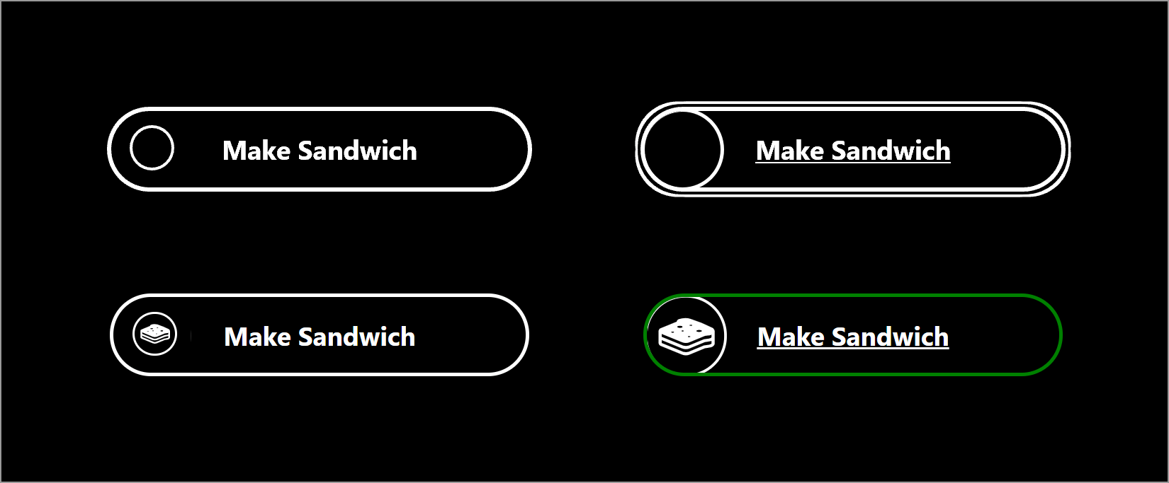
You can keep or remove <span class="icon"> (or add others) as it is strictly decorative. It holds the SVG icons. It does not have a text alternative because a blind user is not impeded by its absence.
Accessible Name
On the other hand, <span class="status"> is necessary as it provides the visible and accessible name for the button and gets updated along with the live region. Importantly I am using plain text as the accessible name of the button — no ARIA, no nested images (see Be Careful with Dynamic Accessible Names).
The Styles
It is easy to get lost in the styles. My arguably ugly button should not determine how effective this control is nor how swell it could look. Instead I will focus on styles necessary to keep this accessible.
Hide the Live Region
We don’t want the live region to be visible, but we also want to make sure we don’t hide it from screen readers. This will do the job:
[role="status"] {
  opacity: 0.00001;
  position: absolute;
  pointer-events: none;
}
If the opacity hits zero, some screen reader / browser combinations might fail to announce it, so I use an absurd value that the browser treats as transparent while not removing it completely. The position removes it from the document flow, reclaiming its space. Usingpointer-events: none means it won’t accidentally block a click no matter where it appears.
Color and Contrast
The control uses four colors to represent the status of the operation at any time: blue when ready to activate, white when in process, green when successfully completed, and red when not successful. IE11 does not recognize var(--button-color) and shows gray instead of blue. For each combination, I ensure the text has contrast ratios ranging from 5.7:1 on the low end to 8.4:1 on the high end.
I use icons for each distinct status to ensure the control does not rely on color alone to convey it. For the focus and hover states, I scale the icon and add a shadow. For the active state, I scale the entire button and adjust the shadow.
Active
I have styles for when the user activates the button (with a click, tap, key press, voice command, or however). I use the :active selector.
When the button indicates that it is processing we don’t want the user to activate it again. The following styles provide a visual cue which, in testing, was helpful for those prone to double-clicking.
.multi.busy:active {
  transform: none;
  border-color: #f00;
  box-shadow: 0 0 1em #f00;
}
The transform: none prevents the scaling I define in the initial :active style, and the border-color and box-shadow of red are the visual cue. You may find a different approach works better for your needs (such as changing the cursor or making the button look grumpy). Not all browsers show the active styles on key press (Firefox, for example).
I intentionally do not use aria-busy. Few screen readers honor it, but where they do it removes the button from the accessibility tree, requiring the developer to move focus somewhere specific. I found doing this confused users and was dependent on context.
Definitely do not give the button a disabled attribute when it shows as processing. That will prevent the button from receiving focus for everyone (such as keyboard users) and you will need to manage focus instead.
Animations
When the icons scale on focus/hover, I animate them via a transition property. I also have some animation when the process is running (the hammering with the smashing).
While the animations may be minor for most, I honor the user’s preference for reduced motion by disabling them:
@media screen and (prefers-reduced-motion: reduce) {
  .icon,
  .icon::before {
    transition: none;
  }
  .busy .icon,
  .busy .icon::before {
    animation: none;
  }
}
You can do the inverse and only enable them when the user has no preference set. My approach better supports IE11 users.
Regardless of the user’s reduced motion setting, I also use animation-iteration-count to ensure the animations do not run for longer than 5 seconds. Because each of my animations is 1 second, the math is straightforward.
.busy .icon {
  […]
  animation: bang 1s ease-out;
  animation-iteration-count: 5;
}

.busy .icon::before {
  […]
  animation: spin 1s ease-in;
  animation-iteration-count: 5;
}
If you anticipate your process taking longer than 5 seconds, you may want to use a different method to convey the progress.
Text Resize and Reflow
All sizes in the control use relative units (primarily ems). This allows the entire control — icons, borders, spacing, etc. — to scale in unison if the text gets scaled on the page, wrapper, control, or by the user.
The page in my example sets no font size, so it uses your default as its base size. The .multi class has font-size: 110%, which you can adjust to see the entire control change.
I left some styles commented-out on body that you can un-comment to test how your own forked version would perform if the user adjusts the leading, tracking, or word-spacing:
body {
  […]
/*  For easy 1.4.12 testing  */
  /*   line-height: 1.5; */
  /*   letter-spacing: 0.12em; */
  /*   word-spacing: 0.16em; */
}
Windows High Contrast Mode
The High Contrast Mode built into Windows is different than dark mode, and not at all the same as inverted colors mode. It is unique to Windows in that it replaces colors across the web and applications with a very limited user-defined palette.
Up to IE11 (and Ledgacy, the original Edge), you could use a proprietary media query, -ms-high-contrast, so you could assign specific system colors (via CSS3 system color keywords) if necessary.
With ChromiEdge, support changed a bit. This new Edge leans on the (draft) forced colors feature query, which in turn leans on (draft) CSS4 system color keywords.
Because the property support between IE11 and Edge does not completely overlap, I added an underline on focus/hover for both browsers, an extra border-like drop shadow for IE11, and set the busy icon fill to a system color for Edge:
@media screen and (-ms-high-contrast: active),
  screen and (forced-colors: active) {
  .multi:hover,
  .multi:focus {
    text-decoration: underline;
    box-shadow: 0.1em 0.1em 0 ButtonFace,
      -0.1em 0.1em 0 ButtonFace,
      0.1em -0.1em 0 ButtonFace,
      -0.1em -0.1em 0 ButtonFace,
      0.2em 0.2em 0 ButtonText,
      -0.2em 0.2em 0 ButtonText,
      0.2em -0.2em 0 ButtonText,
      -0.2em -0.2em 0 ButtonText;
  }
  .busy .icon {
    border-color: ButtonFace;
  }
  .busy .icon::before {
    content: url("data:image/svg+xml;charset=utf8,%3Csvg xmlns='http://www.w3.org/2000/svg' height='100%' width='66%' viewBox='0 0 66.07 100' fill='ButtonText'%3E%3Cpath d='M62 16C48-1 38 0 33 0H22l-2 1c0 1-1 2-3 2h-3l-3-2-2-1H2L0 2v14c0 2 1 3 2 3h7l2-1c0-2 2-3 3-3h3c2 0 4 2 4 4v7h14v-4c0-8 9-10 24-2 2 1 4-2 3-4zM21 32l-2 59c0 2 2 3 4 3h9c2 1 4-1 4-3l-1-59z'/%3E%3C/svg%3E");
  }
}
The Script
When I first started building this control, I bounced the idea off Scott O’Hara. He essentially told me I was re-inventing the wheel and showed me a pattern he had made which was similar but did not quite fit the use case I had outlined. The script chunks that follow are modified versions of his original code. So kudos to him for letting me take it and make it worse.
The variables are all set at the start of the script, so you can refer to the embedded example if the naming in these snippets is not clear enough. I use getAttribute() to pull the data- values from the HTML, but you can use the dataset API if that is your bag since this pattern is not intended to support anything prior to IE11. I left a block of commented-out dataset references if you want to try it. Incidentally, the IE11 support is why I use setTimeout() instead of a Promise().
Because this is just an example, there is nothing in here that talks to a service that confirms a process has fired, is happening, or was completed (successfully or not). These functions are meant to show what bits of the control to manipulate to present to the user — both the visual display and the underlying accessibility features.
The Click Event
The click event has to do a few things. When first clicked it needs to remove the classes that indicate the outcome (if any) of a previous use, and add the busy class.
Then it updates the visible text (which is the button’s accessible name) and the live region, promptly followed by replacing the click event with a function to update the live region when clicked again.
var clickEvent = function () {
  this.classList.add("busy");
  btn.classList.remove("success");
  btn.classList.remove("failure");

  if (btnBusyLabel) {
    btnLabel.innerHTML = btnBusyLabel;
  }

  live.innerHTML = busyMsg;

  this.removeEventListener("click", clickEvent);
  this.addEventListener("click", busyEvent);

  // arbitrary timeout to demonstrate functionality.
  setTimeout(clearStatus, 4000);
};

var busyEvent = function () {
  live.innerHTML = busyMsg;
};
Manipulate Outcomes
Remember that the button never has a waiting, busy, success, or failure state. Programmatically there are no ARIA roles nor HTML attributes that convey any of that. This entire example leans on manipulating CSS classes, a live region, and an accessible name.
That manipulation falls to this second function.
It checks for the result of the process (in this example, which radio button was chosen) and then updates the live region, button class, its accessible name, and the appropriate click event.
Finally it clears out the live region to ensure a screen reader user navigating with the virtual cursor does not stumble across the last message.
var clearStatus = function () {
  if (result.checked) {
    live.innerHTML = failureMsg;

    btn.classList.remove("busy");
    btn.classList.add("failure");
    btnLabel.innerHTML = failureMsg;

    btn.addEventListener("click", clickEvent);
    btn.removeEventListener("click", busyEvent);

    setTimeout(function () {
      btn.classList.remove("failure");
      btnLabel.innerHTML = retryMsg;
      live.innerHTML = retryMsg;
    }, 2500);
  } else {
    live.innerHTML = finishedMsg;

    btn.classList.remove("busy");
    btn.classList.add("success");
    btnLabel.innerHTML = finishedMsg;

    btn.addEventListener("click", clickEvent);
    btn.removeEventListener("click", busyEvent);
  }

  setTimeout(function () {
    live.innerHTML = "";
  }, 4000);
};
Screen Reader Output
Here is the example as experienced by two screen readers.
WCAG Success Criteria
The following Success Criteria are addressed with my example:
- 1.1.1: Non-text Content
- 1.3.1: Info and Relationships
- 1.4.1: Use of Color
- 1.4.3: Contrast (Minimum)
- 1.4.4: Resize text
- 1.4.11: Non-text Contrast
- 1.4.12: Text Spacing
- 2.1.1: Keyboard
- 2.2.2: Pause, Stop, Hide
- 2.4.3: Focus Order
- 2.4.6: Headings and Labels
- 2.4.7: Focus Visible
- 2.5.3: Label in Name
- 2.5.5: Target Size (AAA)
- 3.3.1: Error Identification
- 3.3.2: Labels or Instructions
- 4.1.1: Parsing
- 4.1.2: Name, Role, Value
- 4.1.3 Status Messages
The other Success Criteria either do not apply or are not at risk of being affected (barring a decision to go against recommendations made here). If you make your own version of this button, the list is a good start to ensure you don’t accidentally remove something that would trigger a WCAG failure.
What This Does Not Do
This example does not talk to any delis or sandwich shops on the back-end. The button changes you experience come from arbitrary timings that adjust those values. You would need to rip those triggers out and replace them with calls to whatever services or APIs you use.
This example pattern does not follow progressive enhancement best practices. If the JavaScript barfs, or the CSS chunks, this control does too. This control is written to integrate with an asynchronous operation, which requires script already. Your overall process should account for broken scripting, so use whatever triggers you have in place to hide this control until you know the script has parsed and the services are stood up.
This will not auto-translate. Its reliance on data- attributes to hold the text strings means they will be ignored by any browser-based automated translation services. If you choose to localize the page, make sure to get the text strings from those attributes. Your design may have to adapt to longer text strings as well.
This example is different than Sarah Higley describes in her post Playing with state. There she describes toggle buttons and how a play/pause button is an exception. This example does not rely on a programmatic state, nor even programmatic properties, but instead conveys its status with plain text because it does not have a simple on/off outcome.
Wrap-up
My example may still be non-ideal for some users. It combines a lot of information into one control. If a user is not paying attention, has a cognitive issue, is from a culture other than the one that came up with the images & colors, is not a native speaker of the language, is a novice user, and so on, then that user may struggle.
The intent is to demonstrate how to make this kind of control accessible after you have been mandated to use it in lieu of a simpler pattern — whether mandated by a client, a boss, or even users.
I have to go find a sandwich now.
Update: Samples
On Twitter, the animated example caused some confusion. I did not include real-world examples partly because I did not want to call out specific organizations.
However, Codepen has plenty of samples of other styles from which to draw:
In reality, of this set of six, only the download button would be a good candidate. The cart button wouldn’t warrant it unless there was genuinely a need to process and report back on the end of the process — so maybe at the place order stage. The submit buttons are generic, but would only fit if accompanied by some asynchronous operation. The weightlifter amused me, which is the only reason it is here.
Update: 30 December 2025
I’m not saying to never put a live region in / on a button, but I am saying it may not (will not) perform as you want. Debug version of the following example.
See the Pen Button as live region by Adrian Roselli (@aardrian) on CodePen.
The multi-function button in this post may not fit your use case, but it’s probably closer than the live region button mash-up of chaos.
8 Comments
That’s a tasty button.
Two thoughts:
1) In situations where you’re confident that you don’t need different announcement text from the visual text, can you see any reason against just putting
aria-live="polite"on the button element itself instead of having the extra span?2) When using the visually-hidden span, might it be worth slapping a
user-select: noneon there as well? Otherwise mouse users might still be able to select it accidentally.
In response to .
- From memory (no test results at hand), some screen reader / browser combinations performed poorly with a live region on a button (as in, not at all);
- Sure? Ideally the live region would be completely hidden to a mouse with those styles, but if you have a case where that does not happen then your CSS is one option to address it (as is scaling the container, and so on).
Great read as usual! You might want to consider the following:
Sometimes people use innerHTML to retrieve or write text inside an element, but textContent has better performance because its value is not parsed as HTML. Moreover, using textContent can prevent XSS attacks.
In response to . Yeah, you are correct but this article is also providing the actual way to do so.
1) Maybe my question sounds a lot like the one from James Catt, but I’m gonna go ahead and ask if I could afford to just use the button>span with role=”status” on it? perhaps the status div can be omitted in favor of just that single attribute. Or does the status attribute have risky implications where it’s not needed?
2) What if I decided to avoid the timeout reset in favor of a click-to-revert principle? For screenreaders it’s hard to know for certain if the reader keeps up with our timeout. Trying to pace a timeout against the users processing speed doesn’t seem like a great pattern. We may either put them on needless wait while blocking their actions or we may be cutting into the message which is currently being read. Also users may be navigating away from the button in their wait time which also can result in missed messages.
To avoid this I let the failure message and success message stick around until clicked, which then gets reverted to the initial message. This allows the user to read the messages at their own pace without a magic timer suddenly cutting in. I adepted the language accordingly. My succes reads: “Message sent. Click to add changes.” while my failure message reads “Failed to send. Click to retry.” both return to the default message “Submit form”. 1 more click seemed like an affordable cost to make sure the user can keep up with the process. In this process I also didn’t like the idea of creating even more messages(such as “retry” and “add changes” on the default status) considering we commonly only have about 4 real status types. I was just wondering what you think about this approach.
In response to .
<button>only allows presentational children, so giving that<span>a live region role is invalid and unlikely to work.- Two instances of the
setTimeout()are there solely for the scope of the demo (hence the “// arbitrary timeout to demonstrate functionality” comment). I note in the post that you would replace those with the response from whatever operation is being performed. Do not fake the operation. The thirdsetTimeout()is there to clear the text in the live region so it doesn’t get encountered via virtual cursor. You will want to keep that (and maybe shorten the time, depending).I encourage you not to make users trigger the control that performs an operation in order to then perform a different operation. I see only risk there. If you are insistent it will work for your audience, then test it first.
In response to . It’s just that it feels like overhead to have a container exist for the sole purpose to convey status if the button itself could contain the status. Im happy you took the time to clarify that there’s no avoiding a container for the status.
When I wrote my comment I attempted to be considerate around setting absolute limits to variable parameters. It made me consider that there is no real way to have scripts respond to screenreaders. I mean it’s not like there exists a screenreader object which observers or listeners could attach to.
I made a proof of concept demo to play around with the button. I figured it would make sense to make it describe subsequent states until finalized to success/failure. The event handler would remain swapped for a preventDefault until the ajax/fetch would be done processing . It seemed sensible to let the succes/failure message stick until clicked. Only after clicking it would revert to a button which could submit again. The idea would be that the form never really disappears and remains open for corrections and retries. I’m not familiar with existing tested user friendly patterns to match this description.
I’m still left somewhat confused as to what I’m supposed to do to so my forms and apps can appear sensible and logical if there are tasks to process which may take a while.
In response to . I’m still left somewhat confused as to what I’m supposed to do to so my forms and apps can appear sensible and logical if there are tasks to process which may take a while.
This tutorial is not for that. This tutorial is generally for a stand-alone button that may or may not be part of a larger process. If you have a form (where users fill it out and then wait for it to validate and confirm, like filling out their address in an ecommerce flow), then you likely want a page-level message. Which is also conveyed with a live region or, more aggressively, by moving focus to the message.
Leave a Reply to Anubhab Cancel response