Be Careful with Dynamic Accessible Names
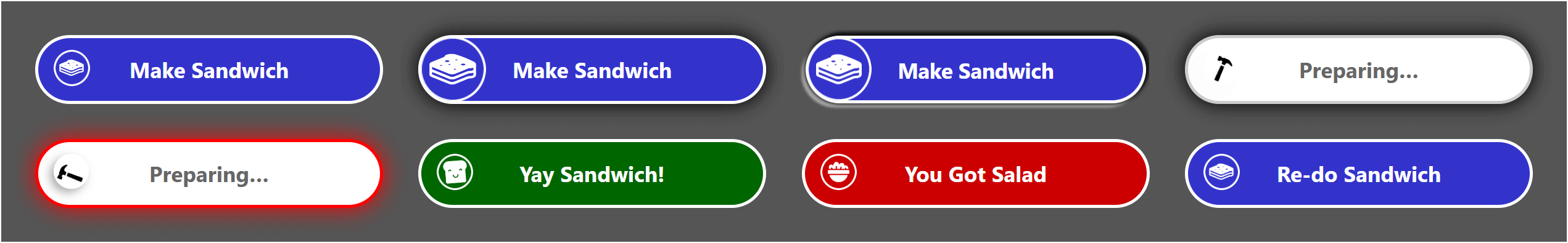
Many of my clients try to reduce the number of controls on a screen by replacing them with single controls that change their name based on their purpose (what they unironically call reducing complexity).
For example, presenting a download button that also acts as its own progress indicator and completion message. Or a submit button that animates to indicate the process is happening, and then maybe cries a little when it fails.
The challenge is that many of these re-used controls change their accessible name without any consideration of what that means for users who rely on the accessible name — screen reader and voice users.
That new accessible name is not always conveyed to these users, and the results can be problematic.
Don’t Trust the Inspector
I am a big fan of using the browser developer tools and their built-in accessibility inspectors to identify potential gotchas. When you see CSS display properties remove semantics from a control, for example, the browser’s developer tools can save the day without needing to fire up a screen reader.
The problem is that the accessibility inspectors are an abstraction of the accessibility tree (which gets handed off to assistive technology via the platform accessibility APIs). Which means they may not match.
Here are two examples of where the browser shows us a change has been successfully made to the accessibility properties of a node, but the screen reader is likely getting different information.
Results of Testing
I threw together a rather simple chunk of code to test how accessible names are reported and supported. It is not thorough.
For example, I do not go through all the variations of the Accessible Name and Description Computation from HTML Accessibility API Mappings 1.0 (no placeholder, no title).
I also do not try many variations. For example, have an image with alt text which provides the accessible name to its <button>, and I have an SVG with aria-label that does the same, but I do not also pair those with other techniques on the same control. The permutations can get big, and mostly I am just here to prove a point.
Screen Readers
- JAWS 2020.2008.24
- Chrome 87
- The
<button>that gets its accessible name from thealton the<img>(the Bill Murray button) does not change, except for one or two cases where I kept mashing the keyboard.
- The
- Internet Explorer 11
- The
<input type="submit">would not change without leaving the window and switching to another window or application first. - The
<button>that gets its accessible name fromaria-labelon the nested SVG (the blue arrow without the text) only ever announced as “unlabeled 1 button”. - The
<button>witharia-pressed(Push alerts toggle) does not change, though I did not test if thearia-pressedwas the culprit.
- The
- Chrome 87
- NVDA 2020.2
- Firefox 84
- The checkbox, using a
<label>andfor/idassociation, does not change. - The
<button>s witharia-labelandaria-labelledbyannounced their accessible name change when each changed, with theonblurevent, prior to announcing the control that had just received focus (the × button and the >< button). - The
<button>that gets its accessible name fromaria-labelon the nested SVG did not announce the new value (the blue arrow without the text).
- The checkbox, using a
- Firefox 84
- Narrator
- Edge 87
- Performed well.
- Edge 87
- VoiceOver (macOS 11.1)
- Safari
- Performed well.
- Safari
- TalkBack (Android 11)
- Chrome 87
- Performed well.
- Chrome 87
- TalkBack (Android 11)
- Firefox 84
- Performed well.
- Firefox 84
- VoiceOver (iOS 14.1)
- Safari
- Performed well.
- Safari
Voice Control
I chose accessible names that are hard to speak (because I am a dolt), and some of them are visibly hidden (so they would fail 2.5.3), but for the testing they were passable. I am not a regular voice user, so I recommend testing on your own patterns with skilled users.
- Speech Recognition (Windows 10)
- Edge 87
- I could not get voice control working on my example at all.
- Chrome 87
- I could not get voice control working on my example at all.
- Firefox 84
- Performed well.
- Internet Explorer 11
- For the controls I could select and which triggered the
onblurevent, it performed well.
- For the controls I could select and which triggered the
- Edge 87
- VoiceOver (macOS 11.1)
- Safari
- The
onblurevent was not triggered on many of the buttons, but after forcing them it performed well.
- The
- Safari
- Voice Access (Android 11)
- Chrome 87
- I could only focus the
<select>by speaking the visible value; that did not trigger theonblurevent to change the accessible name. - After the text fields (
<textarea>and<input type="text">) changed, I was unable to reselect the<textarea>and I could only get the other field by using the second word in its name.
- I could only focus the
- Firefox 84
- I could only select the last three buttons (the blue arrow, the toggle, and the ><), but for those it performed well.
- Chrome 87
- Voice Control (iOS 14.1)
- Safari
- Not all controls changed the accessible name with the
onblurevent, and I could not select the image button, but for those where it did and I could, it performed well.
- Not all controls changed the accessible name with the
- Safari
If it seems I got a bit lazy there, I did. I could have modified my example code and run at this again, but I still have cookies to bake and this sentence takes less time to write than a whole new set of tests.
Example
The example I used for my testing. You can visit the pen directly at Codepen or try it in the debug view for testing.
See the Pen QWKvQLx by Adrian Roselli (@aardrian) on CodePen.
You can fork this, modify it, and run your own tests.
Wrap-up
Avoid changing the accessible name of controls on the fly. It may not get conveyed to users, or it may become oddly verbose, confusing users.
I did not test named regions. I don’t see dynamic accessible names on those enough to worry. Yet?
Update: 4 January 2021
The research for this post helped inform the pattern in my latest, Multi-Function Button. Essentially I demonstrate how to build a button that acts as a trigger and message container, and how to do it accessibly.
Update: 10 January 2024
Darin Senneff has done some fresh testing in Dynamic accessible descriptions reference. His key takeaways:
- Don’t rely on accessible descriptions for dynamic information,
- Screen reader navigation methods are not equal,
- Text inputs have broader description support,
- VoiceOver has big issues with accessible descriptions, and
- Changes to accessible descriptions of focused elements are not reliably announced.
5 Comments
I refrain from altering aria-label strings exactly for the above reasons. I prefer toggling an aria-pressed prop rather than changing a button’s “play” [aria-]label to a “pause” label. I do wonder if setting an aria-live prop on a control would yield any different results.
In response to . I should have referenced Sarah Higley’s post, Playing with state, where she discusses the specific use case of a play/pause button. She also has a chart of dynamic accessible name support.
In response to . I’ve seen aria-live used exactly the way you mentioned to get around this exact problem. It does seem to “work” in the sense that the updated button text is announced, although since the role is not also announced it could be potentially confusing.
I generally stick to Adrian’s advice of avoiding the situation entirely, but I think the aria-live approach may work in some situations like the “loading” button—since the main objective is informing the user that the activity is occurring. Still not ideal, of course, but better than nothing.
In response to . You are correct that making a control into a live region has inconsistent results. I should have addressed that in my response.
A live region separate from the control can work, and something like a “loading” control could rely on that (since we know
aria-busyis effectively useless and which I mention in my post on skeletons).
In response to . James, my newest post, Multi-Function Button, shows how you can have a live region along with a control. I was writing that piece when I put this post together but it was not ready yet so I could not reference it.
Leave a Comment or Response