GitHub Contributions Chart
GitHub profile pages are, to many, the de facto place to quickly judge the value of a developer. The contributions chart is an at-a-glance visual indicator of that value.
I disagree completely with the notion of the chart (or GitHub overall) as a way to value anyone, and I am not alone. But that is outside the scope of this post.
That being said, the contributions chart is wildly inaccessible. It may look pretty, but for anyone is who is not working in idealized conditions it is a problem. It is completely keyboard inaccessible, its hit areas are too small, it offers no cues for what is interactive, its contrast is poor, it is not exposed to screen readers in any way, heck, it’s not even responsive.
In short, if it is as important as many claim, then it needs to be rebuilt.
The Rebuild
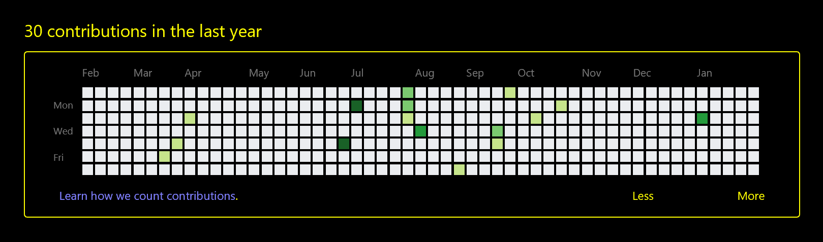
See the Pen GitHub Contributions Chart I by Adrian Roselli (@aardrian) on CodePen.
The first, most critical thing to do is represent the grid with HTML that is appropriate. SVG is not it, since SVG does not natively impart any semantic nor structural value. A pile of <div>s is also wrong for the same reason. Lists do not fit since they are for single dimensions of data, and even a definition list is still a single dimension of name/value pairs.
The chart is quite clearly best served with a <table>. It is tabular data arranged into related columns and rows. In fact, this qualifies as a simple table with only a couple complexities (the spanning column and row headers). I have a whole blog post about making this kind of table, and it is accessible. I make it responsive, and still accessible, with a simple wrapper, which I address in another post.
Oh, there is also no JavaScript. I wasn’t trying to avoid it, but it just is not needed.
Keyboard-only Support
I make it usable with a keyboard in the most appropriate way possible. Each cell that represents contributions contains a link, because those links bring you to a page of activity. A keyboard user can Tab through the chart to get to a specific cell. A screen reader user can jump out of table navigation and also Tab through the chart.
Those inaccessible mouse-only tool-tips are just as easy to make accessible. I use the same technique as I wrote for making emoji accessible. They are keyboard-friendly and supported in screen readers. I also ignore all the empty cells because that would just be noise.
I also made sure to add an obvious focus outline style since the browser default is woefully inadequate. Relying on the tool-tip alone won’t do, since when tightly packed with activity it can be hard to distinguish which day has the focus.
Contrast
The squares rely on color to convey the relative number of commits for a day. Because I wanted this rebuild to look very much like the current chart, I used the same shades of green. However, for anyone with reduced vision, or who works in the sun, that just won’t do. If you toggle the Change fill checkbox then you can see the boxes change the area of the fill to signify contribution volume instead of color.
For users of Windows High Contrast Mode, those colors are essentially useless, but it is an easy fix with the right media queries. The squares are partially filled using a diagonal gradient with CSS system color keywords Window (black in this theme) to Highlight (green in this theme). The amount of the box filled corresponds to the amount of commits on a day.
Update: February 13, 2018 (Fat Tuesday)
Per Glenda’s comment, I added a toggle to enable borders for each day box in the grids. I set it to to #949494 against the white background to meet the 3:1 ratio in the proposed WCAG Success Criterion 1.4.11, but I also left #767676 commented out in the code if you decide you want to see it at 4.5:1
Low Vision / Mobility
The whole thing is resizable without causing weird layout problems. All units are set in relative sizes (ems) so if you scale the default text size in your browser, the chart honors it. The tool-tips for the last few columns (from 45 up) adjust their position so they do not push past the right edge of the grid. I do this with a :nth-child(n + 45) and adjust the spacing accordingly.
You can try the resizing by changing the base font size of your browser. Alternatively, toggle the Make bigger checkbox, which adds font-size: 200%; to the wrapping <div>. While WCAG 2.1 has a minimum target size (Success Criterion 2.5.3 Target Size), it is only at level AAA, or beyond the level AA de facto standard most organizations follow. Regardless,
I should note that I would not advocate a toggle to enlarge the text in a real-world use of this chart (do not recreate browser features). The ideal base size for users should be chosen, and it should allow users to scale it as they see fit.
Screen Readers
Making such a large table easy to navigate can be tricky. With proper use of scope attributes, the header cells can do their job just fine. I also added headers attributes to point to the ids of the header cells and relay them in the order I want. So <td headers="Feb17 y17 Sun"> tells the screen reader to read the month, year, and day name in an effort to get the more important information spoken first. This way a user can quickly know if she has changed months when jumping into a new cell, for example.
For cells with links, I use aria-labelledby to pull the same text that I use in the tool-tips. This reads as plain language and also corresponds to what a sighted screen reader user will see (since not all screen reader users are blind).
The Re-Rebuild
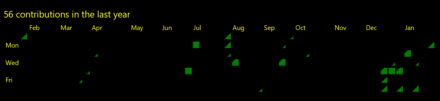
See the Pen GitHub Contributions Chart II by Adrian Roselli (@aardrian) on CodePen.
Spending time hitting Tab to navigate the chart made me wonder if it made sense for each row to span months. When I think of a wall calendar, it goes day by day through each month, not by each Sunday of the year, then each Monday of the year, and so on.
So I swapped the axes of the grid. Sunday through Saturday across the top, months down the side. Like a wall calendar. This has the advantage of fitting in a narrow display quite nicely. It also meant that making it adopt the wider layout on the GitHub site required some CSS trickery.
The first step was using CSS to rotate the table. Because adapting the <caption> was going to throw off all the spacing, I visually hid it and am using a <h#> as a visual landmark. Then I had to separately rotate some of the text, including the tool-tips.
Because rotating the table means the layout (and tab order) is essentially inverted from what we want, I also had to mirror the the entire table. Which then meant I had to un-mirror the text. Here is where I learned that the order of operations on a CSS transform matters. It’s amazing how transform: matrix(-1, 0, 0, 1, 0, 0) rotate(90deg); can save your day.
Fun fact: it all works in Internet Explorer 11.
I made no effort to adjust the width media queries nor the tool-tip positioning when the user toggles to larger text. This version is very prototype-y. Also, sighted screen reader users will struggle with table navigation on wider displays (since down means right, right means up, and so on) due to the mirrored and rotated table. After all, source order drives focus order, and they should match.
Filing an Issue
GitHub has no official issue tracker for its own site. I followed its documented process and provided a report through the contact form. I also file an issue in the unofficial GitHub repo (not maintained by GitHub): Profile page contributions chart is inaccessible #1182
The Motivation
I think I need to frame this first. It all started with a tweet. Jeffrey Zeldman shared a CSS grid experiment by Ire Aderinokun which was a recreation of the GitHub contribution chart. I saw it picked up at CSS Tricks, shared elsewhere, and generally fawned over.
Of course I did what I do, and got frustrated on Twitter. It is a nice experiment, but only an experiment. Visually, it is a natural application of CSS grid, though practically that is the wrong reason to use grid. Further, the code example uses lists, does not consider the interaction in place, and is inaccessible in as many ways as the original.
This pile of words is my effort to be more productive. Experiments are all too often taken as gospel when the right voices get behind it.
Update: June 8, 2018
Now that Microsoft owns GitHub, I suggested perhaps Microsoft’s accessibility team could help here. At their suggestion via Twitter, I have filed an issue on the User Voice forum that points back to this post. Because there is no GitHub category, it is mis-categorized for now.
So, yeah, go vote I guess? Since the forum implies popularity of an issue gets eyeballs, this may sit for a long time before being passed to anyone at GitHub.
Update: June 30, 2018
As the WAI looks for implementations for WCAG 2.1, this was added as an example for SC 1.4.11.
Update: April 19, 2021
Almost 3 years later, and the GitHub contributions chart is still utterly inaccessible. The UserVoice entry I filed back in June 2018? Gone, along with the entire UserVoice instance. So I guess according to someone’s standards, they fixed the problem.
Update: May 25, 2022
I only discovered a couple days ago that I can give feedback on GitHub accessibility directly to GitHub — not as an issue, but as a discussion (intro in the discussion forum). I filed an ‘issue’ for the inaccessible contributions chart I have been trying to get addressed for 4¼ years:
The contributions chart that appears on profile pages is inaccessible to many users. To limit the feedback to just WCAG 2.1 violations:
- The SVG used for the chart has no plain text equivalent to convey the rankings for the dates, potentially a violation of SC 1.1.1 Non-text Content.
- The SVG used for the chart does not convey the structure of the grid, potentially a violation of SC 1.3.1 Info and Relationships.
- The individual dates rely on instructions (from the legend) that only visually convey colored boxes to understand the content, potentially a violation of SC 1.3.3 Sensory Characteristics.
- The boxes use only shading to indicate less or more activity, a violation of SC 1.4.1 Use of Color.
- Zooming the page causes the chart to become clipped, with no method to scroll to see the left axis, a violation of SC 1.4.4 Resize text.
- At narrow viewports, the bulk of the grid is clipped with no way to scroll, a violation of SC 1.4.10 Reflow
- The tool-tips do not persist (to copy text or otherwise interact), a violation of SC 1.4.13 Content on Hover or Focus.
- 3 of the 5 colors used for the grid have a contrast ratio below 3:1 with the background, a violation of 1.4.11 Non-text Contrast.
- The tool-tips that list contributions on specific dates cannot be activated with the keyboard, a violation of SC 2.1.1 Keyboard.
Ways I have tried to convey this to GitHub:
- I reported this to GitHub using its contact form in February 2018 and did not hear back.
- I filed an issue on an unofficial GitHub repo in 2018 in the hopes someone from GitHub would see it.
- I logged it to UserVoice (which as since been shuttered) at the request of Microsoft Accessibility’s Twitter account in June 2018.
- Pestering random people I think might have a connection and can help.
A potential solution:
- Convert it to a table. I have outlined a series of changes in this February 2018 prototype rebuild to show how it can be done. I would change the hover items to toggle-tips now that WCAG 2.1 is the standard. The post: GitHub Contributions Chart.
I see it is now possible to view my contributions in 3D. This was added since I first raised the issue of the inaccessibility of the contributions chart and, while that is a nifty feature, I think the time spent adding more seemingly inaccessible versions of the chart could have been better applied fixing what is there now.
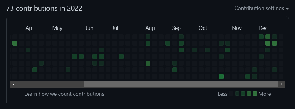
Update: March 4, 2023
As of March 2, the contribution chart has gotten an overaul. Gone is the inaccessible SVG, now replaced by an HTML table with ARIA grid roles and an effort at keyboard accessibility — but apparently only if you are logged in. You can read an overview in GitHub Community question #49015 Accessibility improvements for the contribution graph.
It is indeed far better than it was. It also still needs work.
Visually the most obvious ongoing issue is the contrast between the background and among the cells that indicate contribution levels. What I noted above still applies, in both the dark and light mode.
While this lives in a scrolling container now, meaning it should adapt better to narrow viewports, the left axis is not fixed when scrolling. While not a WCAG violation it is a usability challenge.
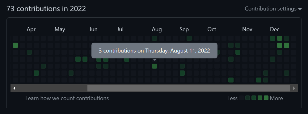
The tool-tip still has the same issues, namely the inability to dismiss it without moving the pointer and the inability to select the text.
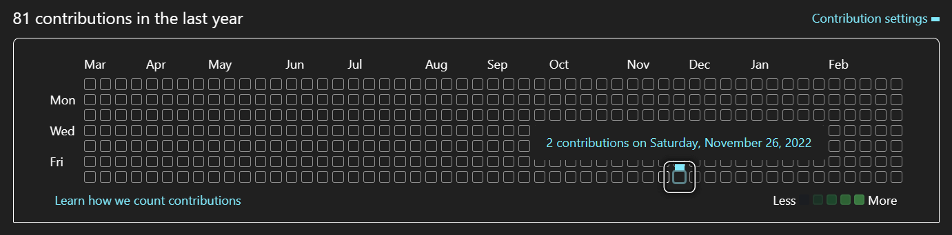
The chart is definitely accessible to screen readers now. That is a huge win. It is, however, verbose. Following is a transcript of navigating to a cell in the table using NVDA:
T
Contribution Graph table clickable with 9 rows and 54 columns User activity over one year of time. Each column is one week, with older weeks to the left. Select
↓
a day to filter the quote contribution activity quote section.
↓
caption Contribution Graph
↓
row 4 clickable 4 contributions on Monday, December 12, 2022
Ctrl + Alt + →
column 44 clickable 4 contributions on Monday, December 19, 2022
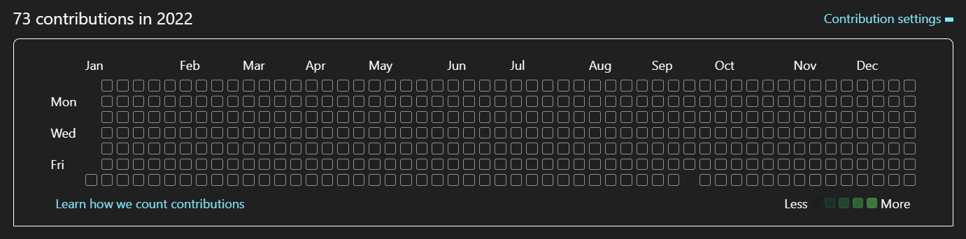
Here I am using JAWS to activate one of the dates:
T
54 columns and 8 rows Contribution Graph Column 1, Row 1 Day of Week
Ctrl + Alt + ↓
No contributions on Sunday, March 20, 2022 Row 2
Ctrl + Alt + ↓
5 contributions on Monday, March 21, 2022 Row 3
Enter
Main Region Contribution Graph Grid User activity over one year of time. Each column is one week, with older weeks to the left. Select a day to filter the quote contribution activity quote section. 5 contributions on Monday, March 21, 2022 selected col 14 row 3
Tab
Learn how we count contributions Link
Shift + Tab
Contribution Graph table Column 14, Row 3 Contribution Graph Grid User activity over one year of time. Each column is one week, with older weeks to the left. Select a day to filter the “contribution activity” section. 5 contributions on Monday, March 21, 2022 selected col 14 row 3
This is generally the outcome of forcing accessible names when screen reader users already do quite well with captions, and column & row headings.
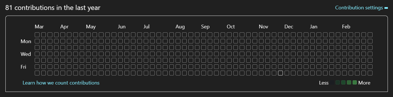
There is still no affordance for folks using Windows High Contrast Mode (or Contrast Themes or CSS forced-colors). The colors indicated in the legend are not present in the table — every cells is empty regardless of count. Even the indicator is different between a click and a key press, with one clearly less ideal.
opacity from .5 to 1.Again, this is far better than what was there before. I fear that instead of incremental updates to address the rest of the issues they will need to do another overhaul, however.
7 Comments
Adrian, I love this! I’m working on the proposed SC for WCAG 2.1 proposed SC 1.4.11 Non-Text Color Contrast and your change fill in the rebuild totally made my day!
One question I have…could you add thin dark outline on each light grey grid blocks? For people with low vision those light grey boxes have very little contrast with the white…and I think they do add value (are informational).
What do you think?
In response to . Glenda, yep, a thin gray outline is absolutely do-able. I even played with one briefly but left it off for the following reasons:
1. I was trying to mimic the current look first,
2. I felt the empty cells were mostly noise so letting them recede was better,
3. I thought it looked crappy (my opinion) and was very busy.They could just as easily be added with another toggle checkbox. Maybe when I get back from Fat Tuesday gluttony I will add one.
In response to . Glenda, I modified both examples with a toggle to enable borders.
I just looked at it quickly so perhaps I’m missing something but I don’t think that a tall narrow activity sheet will meet their usability needs except maybe a mobile view. Why not swap the row and columns to make it long and wide?
In response to . David, I may be misunderstanding your question. The default grid is long and wide. The first example (the embedded CodePen) shows this. The second example (the other embedded CodePen) is my effort to re-order the grid so it follows a different visual tab sequence. In a wide screen it would still be long and wide. The tall and thin version for narrow screens is just a bonus.
It looks like it finally has support for Contrast Themes using CSS
forced-colorsnow!
In response to . I see they went for circles that go from small to large (versus the diagonal fill I proposed above). I am sure Microsoft spent a good deal of time over the last 7 years prototyping and testing this approach with users before rolling it out.
Leave a Comment or Response