Links, Buttons, Submits, and Divs, Oh Hell
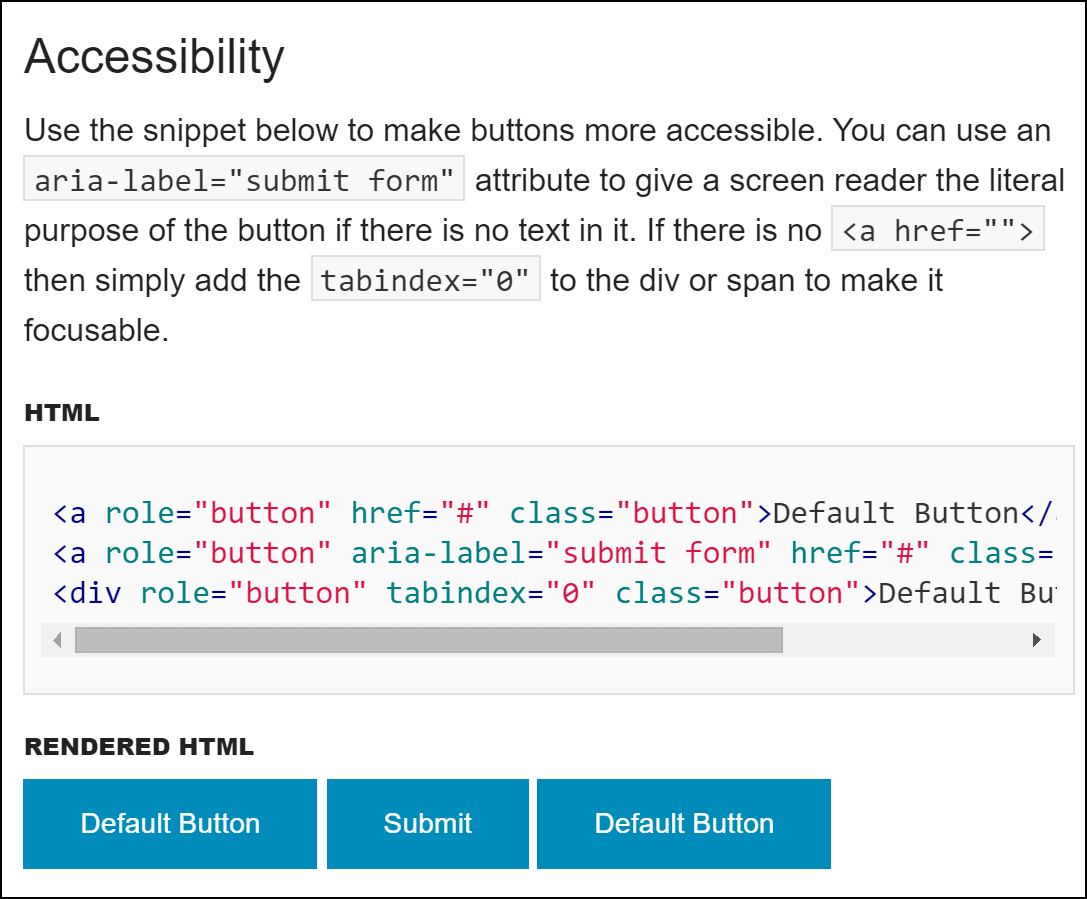
div each with role="button". In short, a perfect example of everything you could do wrong. NOTE: This was version 5.5.3. Most of this is fixed in the current version as of this writing (6.1.2).The struggle to help developers how to understand the right HTML to use for visual buttons has been written about over and over. Yet libraries, frameworks, templates, and by extension, sites & applications still continue to get it wrong.
Best Practices
I’m going to quickly recap the correct approach, as generally regarded across the industry by accessibility pros, UXers, and even the specs themselves.
There are exceptions to every rule. I am certain if you think really hard you can come up with one. I bet if you think even harder you can see how that exception applies to you. It doesn’t though. You and your project are not a unique snowflake, a pretty flower that gets a free pass to play in the gray area. You have to justify it well.
It is generally a terrible idea to mix approaches. If you are going to do something incorrectly, you are better off doing it incorrectly in the same way throughout your page / site / application, since users can often adapt. Inconsistency can be confusing and, depending on the purpose of your visual buttons, will reduce the number of users doing the things you want them to do (buy stuff, edit profiles, verify details, etc.).
Does the Control Take Me to Another Page? Use an Anchor
If, when clicked, tapped, or activated by keyboard or voice (or insert novel interaction method here), the user is whisked to another URL (including an anchor on the same page), then use <a href="[URL]">. Make sure you use the href attribute and that it has a real URL, not a “#” (otherwise you’re probably relying on JavaScript, which is not at all necessary for a hyperlink).
Update, January 30: based on comments below I did a poor job here of being specific. If an href points to just a “#”, then you’re probably doing it wrong. If it points to a named anchor as part of your progressive enhancement efforts, then that’s totally valid.
Does the Control Change Something on the Current Page? Use a Button
If, when activated, the user is not moved from the page (or to an anchor within the page), but instead is presented with a new view (message boxes, changes in layout, etc.), then use a <button>. While you could use an <input type="button">, it’s more likely you’ll get into conflicts with pre-existing styles and subsequent developers (like me).
Does the Control Submit Form Fields? Use a Submit
If, when activated, information the user has entered (either by manually typing or by choosing items on the screen) is being sent back to the server, then use an <input type="submit">. This has better live within a <form>. If you need more styling control or have to embed more than just a simple text string, use a <button type="submit"> instead.
Worst Practice
Don’t use a <div>, <span>, or some other non-interactive element. If you cannot tab to it with a keyboard, it’s probably a terrible idea to use. Adding role="button" doesn’t help, that makes it worse.
If you end up with code that looks like this, you are doing it wrong and I would slap you (and no jury would convict): <div onclick="DoThing();" onkeypress="DoThing();" tabindex="0" role="button">Do a thing.</div>
You can see me go into a little more detail on this in my talk for Accessibility Camp NYC, starting at slide 85 or at 25:50 in the video. Dylan Barrel also made a JSFiddle to correct my lack of type="submit" (something I said in the video but corrected in the posted slide 89).
Keyboard
Think of keyboard users for a moment. A hyperlink can be fired by pressing the enter key. But a true button can be fired by pressing the enter key or the space bar. When a hyperlink has focus and the user presses the space bar, the page will scroll one screenful. If there isn’t more to scroll then the user just experiences nothing. Given a set of interface elements that look the same, if some work with a space bar and some don’t, you can’t expect users to have much confidence in how the page behaves.
I’ve made a sample to show this in action. All three interactive elements are styled to look the same (as you might encounter in Bootstrap, Zurb Foundation, Semantic UI, … for example). I’ve embedded it below, or you can visit the pen directly without any other links to make it easier to test.
See the Pen Button vs. Anchor Keyboard Activation by Adrian Roselli (@aardrian) on CodePen.
I think it’s also worth mentioning that events triggered by a space bar only fire when the key is released, whereas using the Enter key will fire the event as soon as you press the key down (prior to releasing it).
If you are using the button to submit a form and your audience uses Internet Explorer 7 or below, then you may have run into the bug where IE submits the innerHTML instead of the value attribute (see last paragraph under Remarks). In that scenario you can use client-side scripting to bypass that bug and/or logic in your server-side processing to still respond accordingly if the JavaScript doesn’t fire properly (progressive enhancement FTW).
Update: May 23, 2016
After spending some of my weekend repeating this a few times on Stack Overflow, I made some tweetable nuggets that you can copy or re-tweet for your own edification.
[0/3] Some general tips on when to use an <a href> versus a <button> or <input type="submit">…#HTML #a11y
[1/3] If the user is going to a new page/URL (or anchor on the page), use a <a href>.
w3.org/TR/html5/links… #HTML #a11y
[2/3] If the user is changing a state on the current page, use <button>.
w3.org/TR/html5/forms… #HTML #a11y
[3/3] If the user is submitting a form, use <input type="submit"> or <button type="submit">.
w3.org/TR/html5/forms… #HTML #a11y
[4/3] <a href> can be fired by pressing the enter key. <button> can be fired by pressing the enter key or the space bar. #HTML #a11y
[5/3] Events triggered by space bar fire when key is released. Using Enter key will fire event as soon as you push key down. #HTML #a11y
[6/3] Do not add role="button" to <a href> when you can use <button> instead. Violates first/second rules of ARIA.
w3.org/TR/aria-in-html/#notes…
Update: July 12, 2016
Marcy Sutton has written a post about how this applies to single page applications (SPAs), in particular Angular given her work with the platform.
Update: September 20, 2016
Additional handy reference material, both brief and not.
On link vs. button, @IanPouncey says: " I have a right click test. Does it make sense to open in it a new tab, etc.? If not, it's a button"
This video is not related to the previous tweet.
Update: October 10, 2017
In the post But sometimes links look like buttons (and buttons look like links), Adam Silver discusses how buttons and links should appear to convey their purpose.
He misses a great opportunity to discuss the implications for accessibility that using the wrong control can have, though he touches on it:
Forms and links may take users to the same place. But just because the destination is the same, the journey (the interaction) is different.
Pretending they are the same and removing the affordance in the process can’t be useful. Semantics are there for a reason, why design the meaning out of a component due to aesthetic minimalism?
Regardless, it is a useful article that comes at the issue from a design perspective and frames the questions we should be asking when prototyping our interfaces.
Update: February 27, 2019
Vadim Makeev has a post at Smashing, When Is A Button Not A Button?, which walks the reader through the process of making a button. It assumes the reader is a developer who wants to avoid styling a button and shows how much easier it is to just build a button and add three styles.
I added a comment about keeping the button borders visible for Windows High Contrast mode users.
Update: February 14, 2020
CSS-Tricks just posted A Complete Guide to Links and Buttons. It captures what I wrote above (not stealing; it is a common topic) and collects it with other resources (including my post about link underlines, target size, and link targets) in an effort to provide a one-stop resource for choosing the right element and building it correctly.
16 Comments
Re: “Does the Control Change Something on the Current Page? Use a Button”
By “change” do you mean content, or presentation as well?
Presumably anchors for ‘tab’ panels is still legitimate? As per https://24ways.org/2015/how-tabs-should-work/
In response to . I probably should have been clearer. I think application of progressive enhancement can help answer that.
I consider a tab or disclosure widget, when done with progressive enhancement like the one you linked, to be a great example of using anchors. My own effort at an ARIA-enabled tab panel also uses anchors.
However, I have also built an experimental modal that relies on JavaScript (no PE), and so the button makes sense as there is no anchor to fall back to.
If I revisit that to work sans JS, then likely I’ll find those buttons are better served as anchor links.
@jonathan this is an alternative to anchors for “tab panels”: http://cssmojo.com/pure-css-tab-panel/ </shameless plug>
Thanks for clarifying, Adrian.
And thanks, Thierry, I’ve used the :checked approach before. It’s no JS capability is great, but it bugs me that it is JS dependent on IE7-8 and Android 2.x, and so utterly broken under no JS where :checked is not supported.
After reading @rem’s article last month I’m returning to the anchor pattern.
For disclosures, what we could all do with is something like https://discourse.wicg.io/t/panels-and-panelsets/1184/8.
In response to . Agreed, I’d love to see
<panel>/<panelset>become a thing.
Well put Adrian!
The example you used is an older version of Foundation and I’m seeing that the guidelines you put out here have been implemented in the new version: http://foundation.zurb.com/sites/docs/button.html
I think it will help a lot of people design more accessible sites but knowing the best practices and aving the code to do so.
Great article!
In response to . Rafi,
You are correct, I linked to (and captured) an old version. I pulled it out of my own archives and didn’t check the current release, so that’s on me (and I’ve updated the links and reference above). I see things are far better in the current (6.1.2) release.
Thanks for pointing that out to me.
[…] Roselli explains when we should use an a, a button, or an input type="submit" element for a clickable action item and why using a div is never a valid option for such […]
I’m curious: why would your first choice be an
<input type="submit" />instead of simply a<button>? Thebuttonelement’s default type is submit, so to me it seems like it would be better to just use that element for both cases. Other than the IE bug you mentioned, is there a major advantage to using<input type="submit">instead of<button>?
In response to . Nate, there are two reasons I use the
<input type="submit">in that scenario:
- The pre-IE8 bug (along with general really-old browser support);
- In my experience working with teams, leaning on
<input type="submit">for a<form>and a<button>for a non-form use helps reinforce the purpose of the control with developers. This has had the effect of getting them used to making decisions about client-side scripting, error handling, styles, and so on as their brains are primed for a specific type of interaction belied by the element chosen. Of course, YMMV.
Make sure you use the href attribute and that it has a real URL, not a “#” (otherwise you’re probably relying on JavaScript, which is not at all necessary for a hyperlink).
I don’t think that’s a fair assessment. I’ve personally used # for jumping to anchors or IDs on a page using native browser functionality way more often than relying on JavaScript to do anything.
In response to . Ken, as I mentioned in a comment above, I think I could have been cleared on that point.
Linking to just a “#” suggests there is client-side script involved (else it’s a lazy link-to-top effort).
Linking to a named anchor is totally valid and is a key principle of progressive enhancement.
Really helpful, thanks!
All great stuff, but I especially loved the last link you provided. I feel like you spent 100% of your effort on the “why use a button when you want to use an a href” part, and 0% (except for that last link) on the “no really, it’s not hard to just use a button … REALLY!” part.
But to many developers that’s *at least* half the equation: buttons look like buttons, and it feels like a lot of CSS work to re-style them to look completely different.
If you’re the kind of dev who focuses on what those buttons do when clicked, not how they look, then you might not be *against* accessibility, but you are against lots of unnecessary work for people you’ll never even hear from let alone meet … so that “no, REALLY … it’s easy to do the right thing!” part is super important.
Hey i want to add an href while its a submit button
In response to . Don’t. Neither
<input type="submit">nor<button>accepthref, so that will not work. Making a link into a submit button means either the link is doing the submission or you are trying to submit while also linking. Both require JavaScript and will absolutely cause pain should the script chunk or have errors. Just use the right HTML for the job. See above for what to use and when.
Leave a Reply to Rafi B Cancel response