Letting Mobile Users See Desktop View of RWD Site
 Bruce Lawson tweeted out a seemingly random musing today that I have pondered myself — what if, while on a mobile device and surfing a RWD web site, I want the desktop version of a site?
There are many reasons as a user that this might be the case, ranging from poor development practices that hide chunks of content you need to see to just wanting to know what it looks like.
Clearly it’s enough of a use case that mobile browsers such as Opera Mobile, Chrome, Firefox, and so on, have a feature to request the “desktop” version of a site from a menu built into the browser.
Except that feature doesn’t work with a RWD-powered site because media queries, typically based on viewport width, are used to deliver styles for traditional desktop window sizes. The browser feature only sends a different user agent string (bypassing terrible user agent sniffing) but doesn’t do much else. Your 320-pixel-wide device is still 320 pixels wide, and the media queries know it.
Until the mobile browser makers report a false viewport (or, rather, assume one when choosing CSS from a set of media queries), we’re kind of stuck. While I have many ideas on how that might work, that won’t address the issue today.
While I had bandied about an idea to address this on the redesign of my site a couple years ago, it took a client request last year to get my team the time to finally code a solution.
There are some core steps the hammer out in the logic of any solution:
- Put a link on the page to view the desktop layout. I prefer to have it in the raw HTML over writing it in with script.
- In the more mobile-friendly CSS files allow this link to display. In the more desktop-friendly CSS files hide the link.
- Either using a round-trip to the server or client-side script, remove the media query logic and serve up the “desktop” CSS.
- Warning for Europeans: cookies. Set a cookie with that preference for the user. Whether it is for the current session, forever, or somewhere in between is worth an internal discussion.
- Now display a link to view the “mobile” version of the site. Again, this can be done with or without script.
- If the user clicks the link to see the mobile version, re-instate all your media queries, clear the cookie and pretend nothing happened.
This process is a bit oversimplified, but it covers the broad strokes.
There are some hurdles, of course. Your users might not understand what you mean by “desktop” or even “mobile.” You could make the link to get out of one of the views too hard to find. You could bump up against expectations set by the mobile browser feature to request the desktop site. If you serve mobile styles to IE6 users, you could confound them if you don’t clear the link from the page for them. And so on.
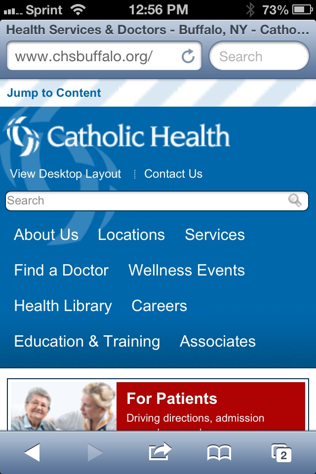
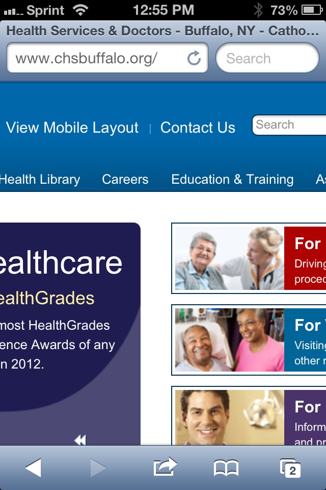
You can play around with what we implemented for our client at CHSBuffalo.org. View the source to see the styles and script. There is obviously logic on the server side, but you can make up your own for your own server platform.
These screen shots should give you an idea of what to expect when you visit the site:


Related
- Turning off responsive web design, January 12, 2013 from Bruce Lawson.
- Opt-Out Responsive Design? September 12, 2012 at CSS-Tricks.com.
- Creating a faux ‘View full site’ button for responsive sites, May 26th, 2012 at NeilCarpenter.com.
- View Full Site Link for Responsive Web Design, April 12, 2012 at CreativeAndCode.com.
Update: March 25, 2013
In this post, Roger Johansson shows code the code behind making his similar technique work: Letting users disable responsive layout.
Update: March 29, 2013
Two more posts popped up this week around the idea of disabling responsive design, both of them looking a bit at the larger issue and then proposing an icon to toggle a design between responsive and non responsive: Thoughts on Toggling a Responsive Design On and Off by Jordan Moore and A suggestion for Responsive Design toggle icons by Andy Clarke.
I’m of the opinion that icons only mean something to a sub-set of users, so relying on them may be inadequate. I still like plain text.
Update: May 3, 2013
An article over at SitePoint asks “Should Users Have the Option to Switch Off Responsive Design?” The author tends to think that such an option is superfluous and many of the commentors agree. Many others point to bad RWD implementations as a reason to offer the option (though the developers of those bad RWD examples probably wouldn’t care about letting users disable it). An interesting read if only to see more opinions.
Update: January 3, 2014
Depending on how you read these two tweets, they may support having an option to see the desktop version/view of a site:
Priceless :-) " Samsung have worked very hard to give my iPhone the screen resolution it needs so I can enjoy the full website". 1/2
— Stephanie Rieger (@stephanierieger) December 30, 2013Context: an old comment on the Guardian site during their responsive launch…user complaining that he would prefer the full web site 2/2
— Stephanie Rieger (@stephanierieger) December 30, 2013Update: January 13, 2015
Include a backup plan on #mobilefriendly sites. Make sure to keep visitors on their preferred version the whole time. pic.twitter.com/Z8SFMU9xoK
— Google Webmasters (@googlewmc) January 12, 2015
The text in the image (from Google Webmasters) reads: Include a ‘Take me to the desktop-optimized version’ option.
It also includes the #mobilefriendly hash tag.
So here we are, two years on from when I wrote this post and three years on from a client implementation, and it looks like this approach is considered a best practice from Google. You know, the bigger search engine on the web.
2 Comments
Irony:
This site ignores "request desktop mode" and gives a narrow jumbo font version even on a high resolution mobile device
In response to . By "this site" do you mean this blog? It works for me, but perhaps because I am using Chrome on an Android device and the blog is powered by Blogger. That being said, this Blogger isn't the best platform for RWD examples nor use.
Leave a Reply to aroselli Cancel response