Web Accessibility Sorta-Infographic
 WebAIM is a non-profit organization within the Center for Persons with Disabilities at Utah State University. It has a reputation (perhaps only in my head?) or providing resources both to the disabled and to organizations enlightened enough to want to support the disabled (or selfish enough to recognize they will be disabled as they age).
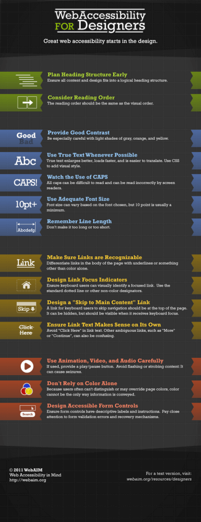
WebAIM makes the point that accessibility should be considered early in a web site’s development, all the way back at the design phase (something lost on the Adobe Muse development team). WebAIM made a graphic, with accompanying text alternative, for its post Web Accessibility for Designers. It’s not easy for me to be critical of an organization that does work for good (apparently not hard for me, either) but its latest infographic is nothing more than a pretty checklist (see the checklist below the graphic, but read the original post for more detail).
Web Accessibility for Designers
- Plan Heading Structure Early
- Consider Reading Order
- Provide Good Contrast
- Use True Text Whenever Possible
- Watch the Use of CAPS
- Use Adequate Font Size
- Remember Line Length
- Make Sure Links are Recognizable
- Design Link Focus Indicators
- Design a “Skip to Main Content” Link
- Ensure Link Text Makes Sense on Its Own
- Use Animation, Video, and Audio Carefully
- Don’t Rely on Color Alone
- Design Accessible Form Controls

Leave a Comment or Response