Social Media Spam Sorta-Infographic
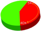
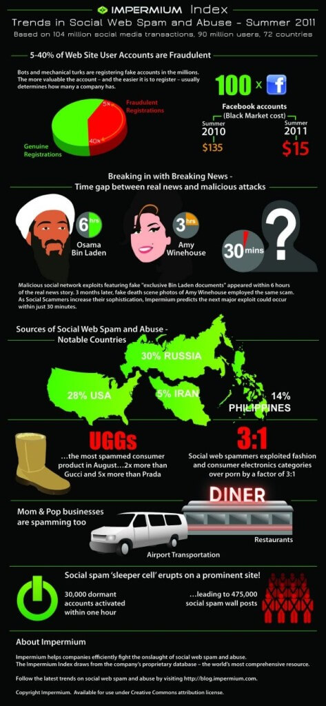
 Today’s sorta-infographic contains four pie charts, one of which is supposed to show a range, and the other three are ostensibly based on 12 hour clocks. Despite it’s clip-art-style graphics, it does provide some pretty interesting factoids and comes with accompanying text to explain the graphics and provide more details. You can read the commentary, and comments, at the original post: Debut Impermium Index Reveals Surprising Trends in Social Web Spam Attacks.
Some of the trends Impermium outlines:
- Online ID signup fraud.
- “Sleeper cells” of social web abuse are a ticking time-bomb.
- Social media exploitation techniques are evolving fast.
- Uggs was the #1 most exploited brand.
- Porn got stripped.
- Mom & Pop are spammers.
Much of this isn’t news to many, but it is validating to those of us who wonder if what we are experiencing is in line with current trends. I suggest reading the comments to see some of Impermium’s responses to criticism — ok, really just read the comments for the criticism.

Leave a Comment or Response