Trying Google Font Previewer

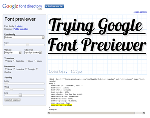
I’m going to make the assumption that if you are reading this you have at least a passing interest in typography on the web and have heard about Google’s new font preview tool. There are already plenty of articles talking about how easy it is, how Google hosts the typefaces, how licensing isn’t an issue, and so on. Some of them are linked at the end of this article, so go read up. As such, let me just dive right into the piece I find most interesting — the implementation.
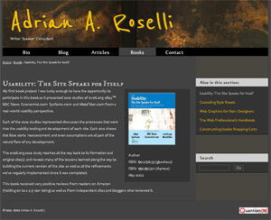
I started to play around with Google Font Previewer by dropping code samples onto my development site. I tried to see how many typefaces I could embed, how I could mesh the code into my site, how easy it would be, and how it would look in different browsers. The screen shot below (from Google Chrome) shows my site with three of the typefaces in place: Molengo for the overall copy, IM Fell DW Pica SC for the headlines, and Reenie Beanie for the banner text with my name. You won’t see this on my live site because this is, after all, only a test and I am not writing a ransom note.

In order to use these typefaces I needed to drop three references to the Google typefaces into the head of my document (one for each typeface):
<link href="//fonts.googleapis.com/css?family=Molengo:regular" rel="stylesheet" type="text/css">
<link href="//fonts.googleapis.com/css?family=Reenie+Beanie:regular" rel="stylesheet" type="text/css">
<link href="//fonts.googleapis.com/css?family=IM+Fell+DW+Pica+SC:regular" rel="stylesheet" type="text/css">
From there I simply found the appropriate selectors in my CSS file and added the following styles (you’ll note that I edited them heavily from what the tool provides):
body {
  font-family: 'Molengo', Trebuchet, sans-serif;
  font-size: .82em;
  font-weight: 400;
  word-spacing: -0.1em;
  line-height: 1.6em; }

h1 {
  font-family: 'IM Fell DW Pica SC', serif;
  font-size: 25px;
  text-shadow: 2px 2px 2px #333;
  line-height: 1em; }

#Banner p#Title {
  font-family: 'Reenie Beanie', serif;
  font-size: 100px;
  font-weight: 600;
  text-shadow: 4px 4px 4px #333;
  line-height: 1em; }
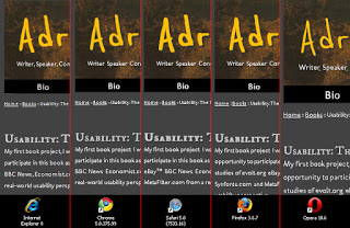
You can see that I played around with font sizes (switching between using ems and pixels), font weight, drop shadows, and even adding an alternate font in case the user cannot see the selected typeface. I then loaded up my most current browsers on my Windows machine (my Mac and Ubuntu machines are hiding) and ran the site through each, comparing and contrasting. The image below shows a representative slice of the page with all three typefaces loaded in each browser. Click the image (or use whatever input device you prefer, such as your meatstick) to see the full-size screen shot. Browsers used in the test:
- Internet Explorer 8
- Chrome 5.0.375.99
- Safari 5.0 (7533.16)
- Firefox 3.6.7
- Opera 10.6
I noticed the browsers were generally consistent on the font scaling and weight, with minor differences in anti-aliasing and line-height. Shadows showed greater variance among the browsers. Opera seemed to have a whole different idea of font weight, size, and anti-aliasing, but wasn’t so far out of the park that it was unusable. Most interesting was how punctuation was treated. Note how only Internet Explorer and Opera show the commas in the tag-line under my name, or after the word “project” in the first sentence. Chrome, Safari, and Firefox each lost the commas altogether. While I am comfortable with the other display differences, losing punctuation is a deal killer for me.
Overall, the Google Font Previewer is a great way to quickly select and style type, drop it into your pages, and get it done quickly enough to go get an ice cream before your Dallas reruns. However, take some time to clean up the CSS it provides so that it matches your site coding style and isn’t full of unnecessary declarations (do you really need to define word-spacing if you aren’t changing the browser defaults?). Consider adding other, standard typefaces into the list as back-ups. Once you’ve done that, make sure you fire up your newly-typographized page in a few different browsers and are comfortable with the results. Those punctuation marks can be a killer, so check those. Don’t limit yourself to your own browsers, either. Go find some variety and give the page a spin in alternative browsers, older browsers, and even mobile devices. You just might find that you added a style that works well with current browsers, but blows up the version of Netscape 4.x sitting on your grandmama’s old Centris 610.
Related
- New Google Font Previewer – Webfonts Easier and More Fun
- Google Font Previewer
- Test Drive Your Type With Google Font Preview
- HOW TO: Implement Google Font API on Your Website
- Google Makes Custom Web Typography Ridiculously Easy
3 Comments
I guess I'm not surprised that the fonts look the best in Google Chrome.
I believe they look best in Opera. Opera didn't lose the punctuation, but Chrome, Safari and Firefox did. Opera also honored the font-weight for the heading (set to normal) and did the best handling the font-weight for the banner (set to 600, or less than the standard bold of 700).
Great info thank you for sharing.

Leave a Comment or Response