Under-Engineered Estimated Reading Time Feature
There are plenty of plug-ins, libraries, and tutorials that will add an “estimated reading time” visual cue to your site. There are also browser extensions for users.

Most use JavaScript and CSS to calculate based on word count and viewport position. All require more work on the part of the browser, never mind additional bandwidth and potential security risks.
But I have a near-perfect solution. It works for most sighted users, using their familiarity with their own reading speed. It requires only a couple steps from authors.
As an Author
These two simple tricks can be a boon for your users without requiring you to bring in any third-party dependencies:
- Don’t disable scrollbars, and
- Don’t style scrollbars.
Probably also be consistent in your header and footer sizes so they don’t vary wildly in height between pages of your site.
Don’t Disable Scrollbars
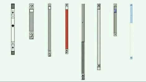
If you have styles like overflow: hidden, you are disabling scrollbars. Maybe don’t do that on something that holds content. If you do it on the <body> or <html> elements with the notion of rolling your own, maybe don’t.
Don’t Style Scrollbars
While you may not hide the scrollbar, styling it can functionally hide it for some users in some contexts. While there are ways you can maybe do it without messing it up, experience tells me you / we, as an industry, can’t.
As a User
Scrollbars tell you how long a page is by screenfuls (number of viewports), while also telling you how many screenfuls remain from your current position. They persist as you move and are more consistent than the estimated reading time your browser’s reading mode provides.
Once you see the text size, the spacing, understand the header & maybe footer size, and consider how quickly you read, you will have a good sense if the page is something you can skip, skim, or tuck in to read. I bet you already do that without consciously thinking.
Make sure scrollbars are turned on in your operating system. I show how in two desktop OSes.
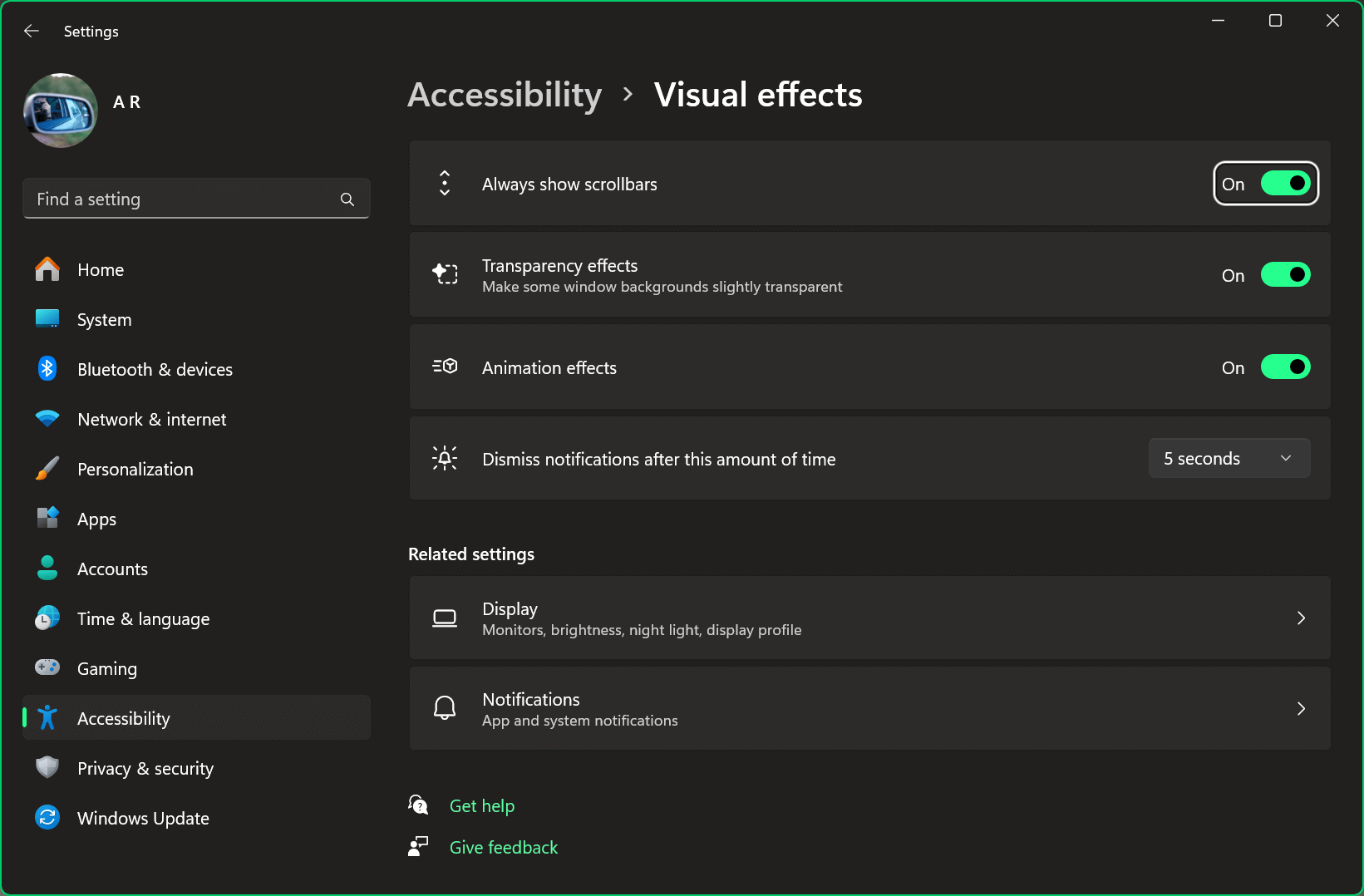
In Windows 11
- Go to system settings:
- Open the Start menu (the Windows logo) and go to Settings (the gear icon), or
- Press Win + I
- Either:
- Search for “scrollbar”, or
- Navigate to Accessibility (Tab from search box and then arrow down) then
- Under Vision choose Visual Effects
- Go to Always show scrollbars and toggle it to “On”.
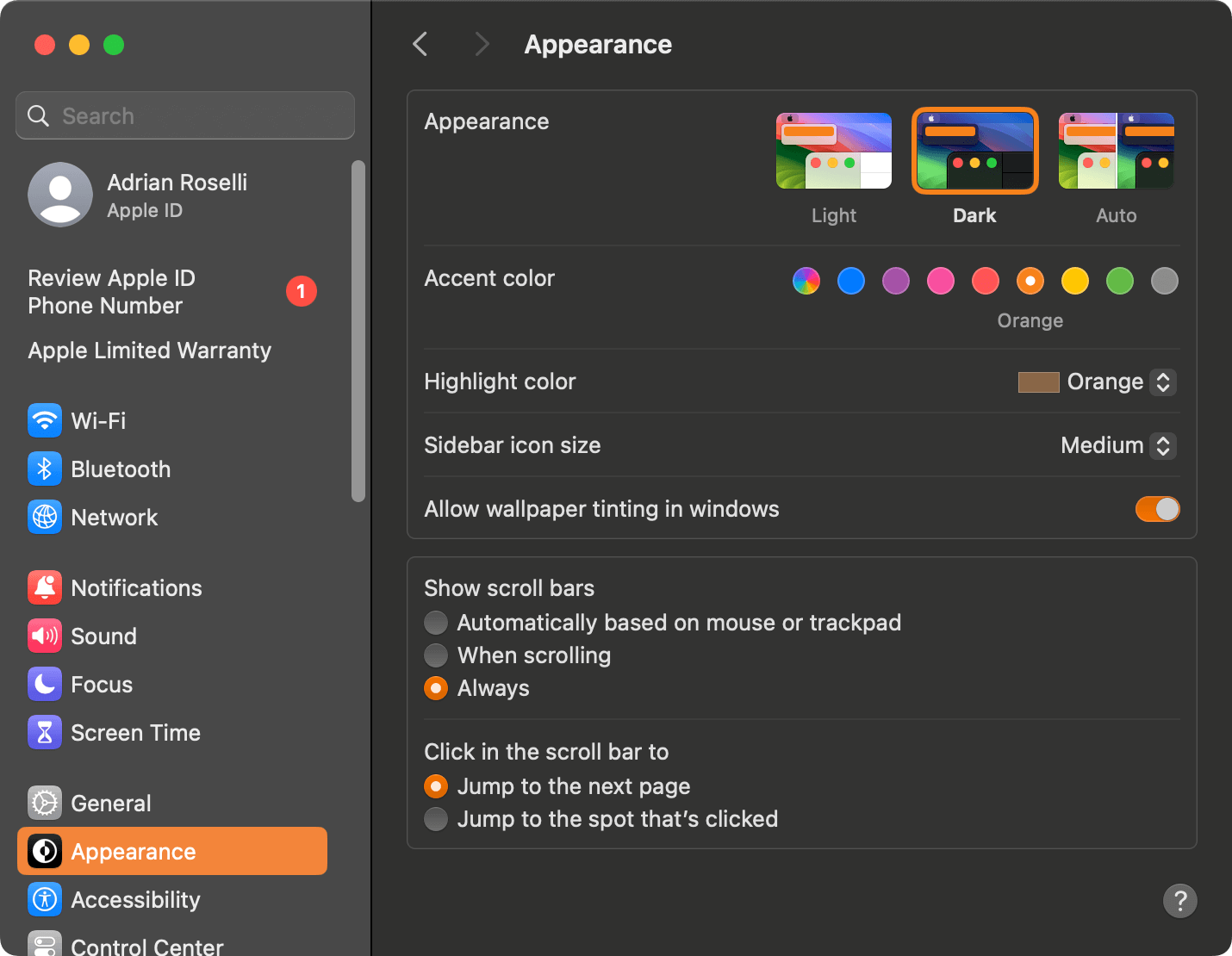
In macOS 14
- Go to system settings:
- Open the Apple menu and choose System Settings, or
- Press Ctrl + Fn + F2 then ↓ to System Settings
- macOS remembers where you last were, so either:
- Choose Appearance, or
- Search for “scroll bar” and choose Appearance.
- In the Appearance pane, find Show scroll bars and choose “Always” (if using keyboard, you have to Tab through every individual setting since Shift + Tab puts you in the search box)
As an OS Developer
Please, leave scrollbars on by default. Don’t hide them under system accessibility settings. Don’t make them skinny and translucent and ephemeral. We get that you are an expert in GUIs and have a top-end computer. You are not your user.
Wrap-up
I am intentionally not linking to any third-party add-ons, extensions, or libraries. If you have one that works for you as a user, share it here. If you have one you like as a site author, then unless your users have also said they like it, maybe don’t share it here. If you are an OS developer, please leave scrollbars on by default.
If you are a blind screen reader user and you have a tip for what you use to guess reading time, please share.
It’s ok to feel those other options are ableist. It’s also ok to feel they are useless. It’s all the more reason to ignore them and lean on the features we already have.
The opening image is by Maggie Jones taken in Tower Hamlets cemetery. It is public domain.
Update, Elder Scrolls
The Elder Scrolls

Update, Another Opinion
I’ve always viewed any service that sticks a “reading time” widget on its articles as the literary equivalent of fast-food: you’re not here for quality, but for expediency.
The post does not have a comments area, but my response on Mastodon resulted in a couple interesting threads from others.
Update, Apple Scrollbars as a Harbinger to Liquid Glass
In the post Rose-Gold-Tinted Liquid Glasses, Louie Mantia uses Apple’s purging of the user-affording scrollbars to highlight the years-long regression of Apple’s visual UI design.
5 Comments
As a user I installed the add-on Scroll Progress New on my mobile Firefox. In the top right corner it shows the percentage of the page that’s already read. On mobile phones webpages are often so long that the scrollbar shrinks to a small dot. The percentage helps me better see what amount I’ve already scrolled.
Thank you for this, awesome advice. I’d add, to make this even more effective:
1. If your site includes infinite scroll, give people the option to disable it, and think about whether it’s even a good idea for your use case. It probably isn’t.
2. If your site has lazy loading, think about whether you can pre-stage all the frame sizes, if possible. That has a lot of accessibility wins, too; dynamically resizing page areas as the reader scrolls has many negative accessibility implications.
3. If your site has lazy loading but the user actively has to click a “continue” or “read more” button in order to load the rest of the page content, as is common on news sites, turn that off. I guarantee you haven’t implemented that accessibly. Certainly I have never encountered an accessible version in the wild.
4. If your article includes the comment sections or other peritextual elements, only show a small number by default, with a link to view the rest, so a user can gauge length by scrollbars and usefully use their “end” button to jump to the bottom of the page.
In response to . 1. As I wrote a decade ago, most devs have no idea what it takes for an accessible infinite scroll (and usually only add it for vanity stats anyway).
2. Indeed, Google’s Web.dev has this annoying habit of adding the table of contents after I have started into the post, pushing what I am reading off-screen.
3. +1. Also implemented as a vanity stat tracker.
4. As a reader, I disagree with this in some contexts. For many sites I am very much interested in the comments and so I factor reading them all into my time. This is not true for a typical news site, however.
I love this article. Such a simple and effective solution! Because everyone has an intuition for how much a scrollbar should move. Ever had an app or a game where the scrollbar has a fixed (usually tiny) size? And then be surprised that the scrollbar moved so much if you scroll just a little?
That’s the power of default scrollbars. The larger the scrollbar, the shorter the page. So elegant!
I was not aware of the scrollbar feature in Windows. As a blind user, I always find navigating with a screen reader easy, even on long pages, but my sighted peers have always complained. I never knew it might be due to the styling of the scrollbars.
Thanks for this wonderful write-up!


Leave a Comment or Response