2.4.11: Adversarial Conformance
I made a demo for WCAG 2.2 Success Criterion 2.4.11 Focus Not Obscured (Minimum). I built it strictly to capture screenshots, so while it is not a good demo as a standalone (which is why it is not embedded here I added it) it is handy to demonstrate something.
Conformance
Three of the following screenshot examples pass the SC but only one is useful to users. It comes down to this SC language (emphasis mine):
When a user interface component receives keyboard focus, the component is not entirely hidden due to author-created content.
User interface component is defined by WCAG as a part of the content that is perceived by users as a single control for a distinct function
. I argue each button in my demo is a single control.
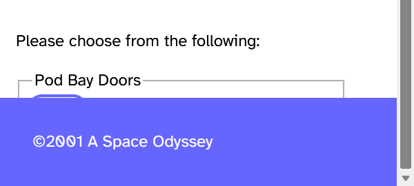
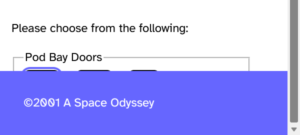
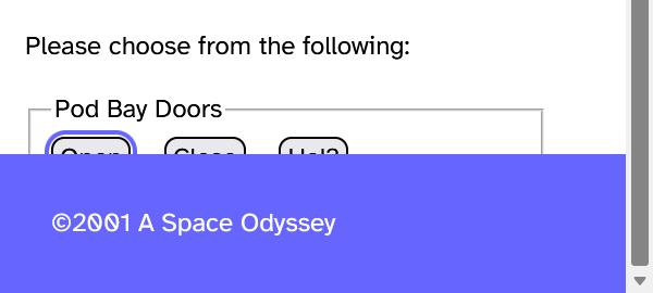
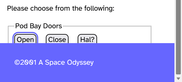
Two of the three passing examples are terrible. That last passing example is not much better, however. Throw your favorite 1.4.12 Text Spacing bookmarklet at my 2.4.11 demo and watch all the buttons disappear.
I added the example on 29 December 2023:
Adversarial
Since two of these buttons could result in doom for Dave, it stands to reason that HAL designed this interface — creating a de facto anti-pattern to potentially drive a particular outcome. Or maybe just for the lulz. HAL had an interesting sense of humor.
This is something I call adversarial conformance. HAL the UI designer can claim that it followed WCAG even though it’s clear that HAL expended effort on minimally conforming while negative outcomes are seemingly obvious.
That extra effort is the tell, even if it is not always obvious HAL had to do more work. Heck, sometimes HAL would not recognize it did more work just to avoid implementing what it felt was an ugly design decision.
I have experienced these kinds of efforts over many years of consulting and I figured I would start documenting them.
In the very specific case of HAL the UI designer, its effort is clearly malicious conformance. That is going a step further than I am outlining in this post (since trying to kill the user is generally not a goal), but it is still a genuine concern.
Related
Update: 2 November 2023
WCAG issue #3529 Clarification for Understanding 2.4.11 Focus Not Obscured (Minimum) to ensure consistent testing, filed today, seeks to confirm that the focus indicator is not part of the control.
In July, co-editor of WCAG Alastair Campbell noted that including the focus style in the component size would have messed up the calculation for SC 2.4.13: Focus Appearance (creating a loop), so the focus style was never meant to be included in the definition of the component:
What is perceived as the user interface component or sub-component (to determine enclosure or size) depends on its visual presentation. The visual presentation includes the component’s visible content, border, and component-specific background. It does not include shadow and glow effects outside the component’s content, background, or border.
If the focus style is considered part of the control, then my first example would pass and still be useless to most users.
Probably a good idea to watch for the outcome.
Update: 26 December 2023
Semi-transparent content sitting in front of other content is nearly always a hassle for readers, not just because of overlapping text and text contrast issues. But it would likely pass this SC.
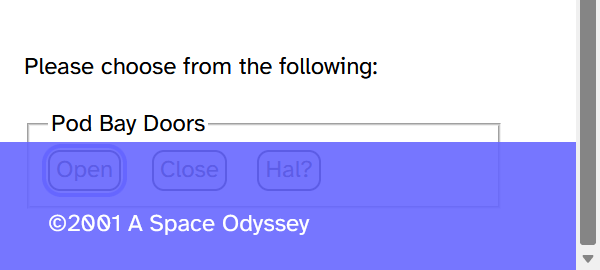
Update: 29 December 2023
I embedded the demo.
3 Comments
Thank you for demonstrating how annoying “sticky” things can be covering stuff. I loathe sticky nav and sticky headers — and the versions that appear when I scroll up a tiny bit because I want to reread something.
Also, Hal the UI designer brought me joy.
In response to . Thanks. I was trying not to turn HAL into a larger commentary on fake-AI code generation and design automation, but yeah.
Very much looking forward to you documenting examples of adversarial compliance!
Leave a Comment or Response