#FACILiti Will Get You Sued
 FACIL’iti is one of many vendors that claims its accessibility overlay product can make your site “accessible”. Like the other overlay vendors, FACIL’iti’s overlay does not. If you have been lead to believe that FACIL’iti’s overlay will protect you from complaints, whether by FACIL’iti advertising or sales efforts, then it is important to know that is not true.
In fact, using FACIL’iti will add demonstrable WCAG failures and in some cases have no impact for users. I outline a few examples in this post. It is not an exhaustive collection, however.
Promises
FACIL’iti doesn’t make grandiose promises on its site. Unlike accessiBe, UserWay, and others (see Overlay False Claims), FACIL’iti’s claims are more tempered.
Compliance
One of the more questionable promises is improved compliance
. It is questionable partly because of its claim:
FACIL’iti provides improved accessibility adaptations that work without refactoring your website’s existing code thus increasing the compliance with WCAG 2.0, ADA, & Section 508 requirements.
Setting aside the fact that ADA compliance isn’t a thing, if we look at only the WCAG claim then you should know that including the FACIL’iti button on your site introduces at least two WCAG issues. I demonstrate these, and others, later in this piece. These WCAG issues decreases WCAG compliance.
Notice, however, that FACIL’iti specifies WCAG 2.0, not WCAG 2.1. That means FACIL’iti can assert that it need not worry about errors from WCAG 2.1, even though you must as a site owner. After all, WCAG 2.1 has been the standard since June 2018. FACIL’iti is happy to lag 4 years behind the law. You don’t have that luxury.
Interestingly, the current WCAG 2.0 language on the FACIL’iti site appeared sometime between 30 August and 1 October 2018, or between two and four months after WCAG 2.1 became a Recommendation. Which means FACIL’iti was already lagging behind when it launched its current site.
Regardless, FACIL’iti’s current statement is far more realistic than its original 2015 claim (note the emphasis, which I converted to proper HTML here):
FACIL’iti est une solution permettant de rendre accessible le contenu des sites web à tous!
That translates to: FACIL’iti is a solution that makes website content accessible to everyone!
Compare this with a carefully written disclaimer on the Abilities Expo site:
It’s important to note that this technology is designed to take an already WCAG compliant website to the next level of accessibility and not intended to be a substitute for the incorporation of important accessibility features into the bones of your platform.
Offline Marketing
In January 2020, FACIL’iti posted about its trip to CSUN in Retour sur le CES 2020. In the section “Notre CES 2020 en images…” (“Our CES 2020 in pictures…”) there is a series of photos showing FACIL’iti’s activities. As an aside, the photos all have blank alt text, which seems incongruous for a company focused on making content accessible that chooses to tell a story through pictures.
I am referencing the page because of the FACIL’iti trade show booth.
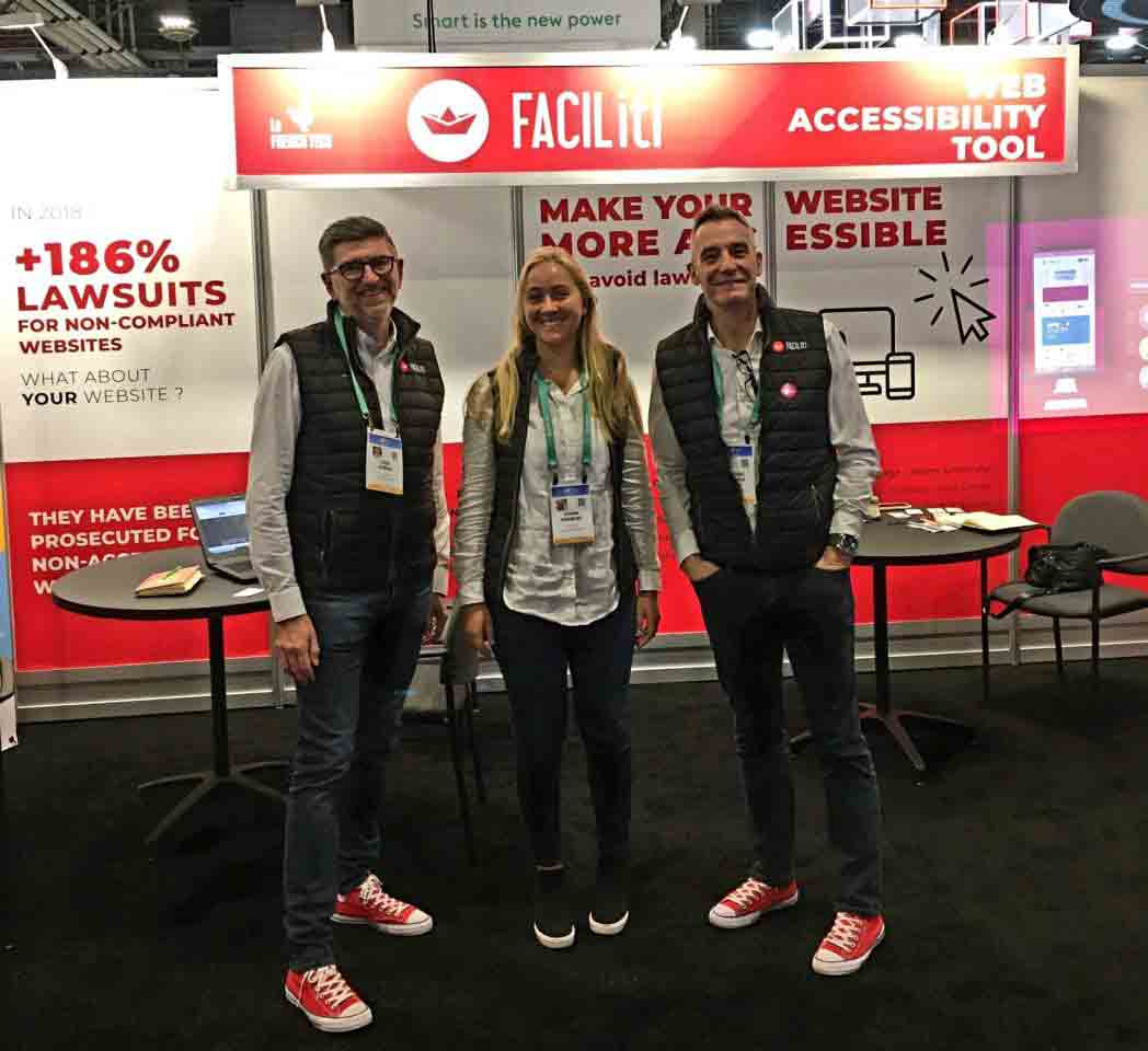

The two photos I selected show the banner from the booth with the prominent text, Make your website more accessible and avoid lawsuits.
It appears under the branded text, FACIL’iti, web accessibility tool.
None of this explicitly says FACIL’iti itself will make your site more accessible. Nor that FACIL’iti protects from lawsuits. But the implication is clear and FACIL’iti is marketing on the back of that confusion, intentionally or not.
Numerama
Not being a French speaker meant my digging for this piece was limited. I wanted to be sure I did not cite evidence that was the result of broken machine translation. It turns out FACIL’iti’s claims have already been evaluated in French media.
In the Numerama piece FACIL’iti, la solution pour l’inclusion en ligne qui refuse la critique? (FACIL’iti, the solution for online inclusion that refuses criticism?), the author clearly did a better job of mining French content than I could. I suggest you read the piece, but I am going to excerpt some interesting bits here.
In a 2020 interview on Europe 1, FACIL’iti’s CEO made a simple statement that tells us it has no intention of helping with WCAG or RGAA compliance: I don’t want to comply with regulations, I just want to help users
. Complying with regulations is necessary so you do not increase risk for your clients. It is also a signal that you understand the bare minimums of accessibility.
Je ne veux pas être conforme à la réglementation, je veux juste rendre service aux usagers
Another nugget from the article is a company saying it never used the FACIL’iti overlay, but its logo still appeared on the FACIL’iti site. The quote: We don’t use it. Two people from our association met the managers of the site. It turned out that it was not possible to adapt it to our audience. I even think that our logo should be removed from their site!
Nous ne l’utilisons pas. Deux personnes de notre association ont rencontré les dirigeants du site. Il en est ressorti qu’il n’était pas possible de l’adapter à notre public. Je pense même que notre logo devrait être supprimé de leur site!
The organization’s logo is not on FACIL’iti’s site today, but the link (using link text …
) on FACIL’iti’s home page to see all its clients is broken. As recently as 4 February 2022 you could search through its clients. Today that link is 404, but the customer search page still exists from the Voir tous les sites équipés
link. Update, 21 March 2022: FACIL’iti again changed the link to the customer search page, but without making the last functional one redirect properly.
The only real promises we can glean from FACIL’iti leadership statements is that it chooses not to comply with RGAA or WCAG, even though its advertising implies otherwise. It also may claim customers that never used FACIL’iti.
To Other Customers
After reading about one organization that denied ever being a customer of FACIL’iti, but which was still listed on FACIL’iti’s site, I opted to look at others that FACIL’iti claimed.
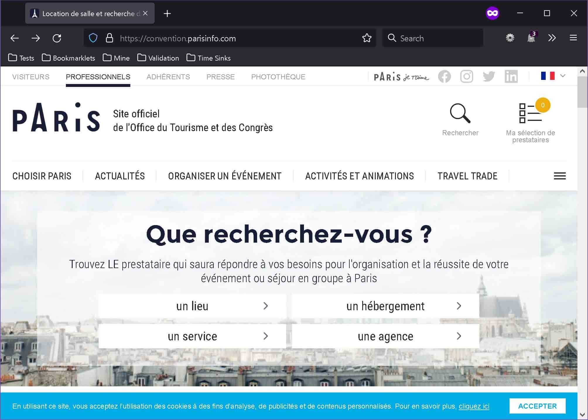
Paris Info is the official tourist site for the city. It features a prominent link in the header for accessibility information on visiting the city, phoning for information, stopping by its offices, and (first on the page), FACIL’iti. Except nothing is there to launch the overlay. There is a link to a YouTube video and a link to the FACIL’iti profile page.
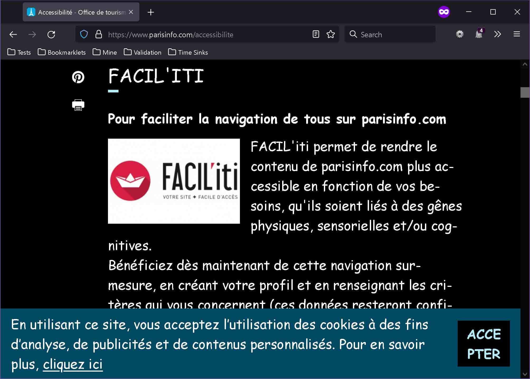
I disabled my ad blocker completely, made a profile that included changing the typeface to Comic Sans (I can choose another typeface in a different setting in the same profile, but only one applies at a time), scaling the text to 25 (no units provided), and darkening the site. Then I reduced my browser privacy settings as directed.
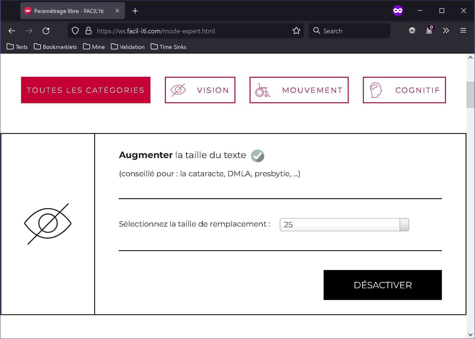
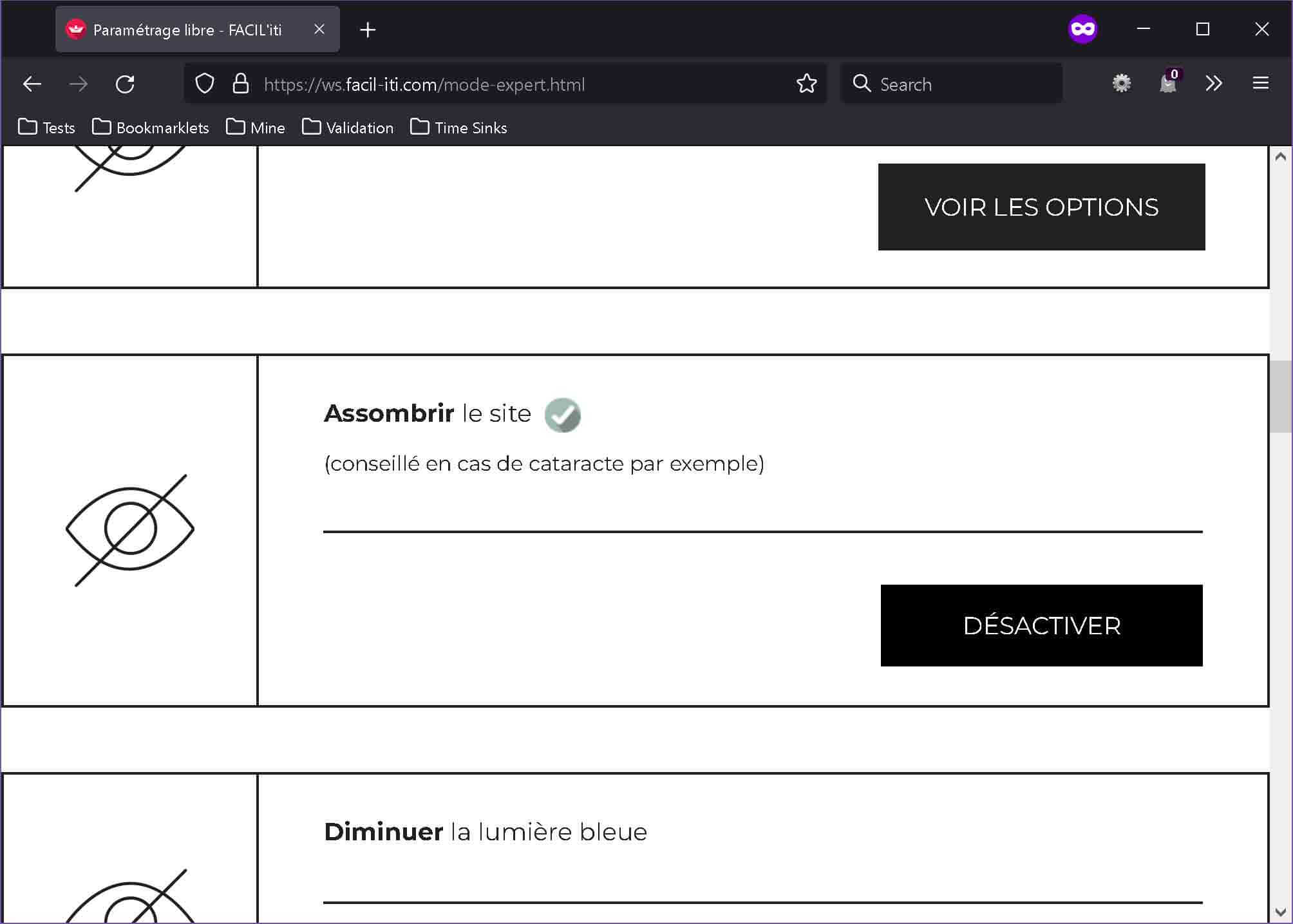
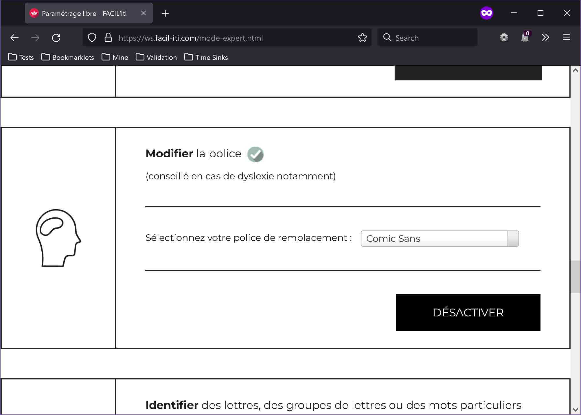
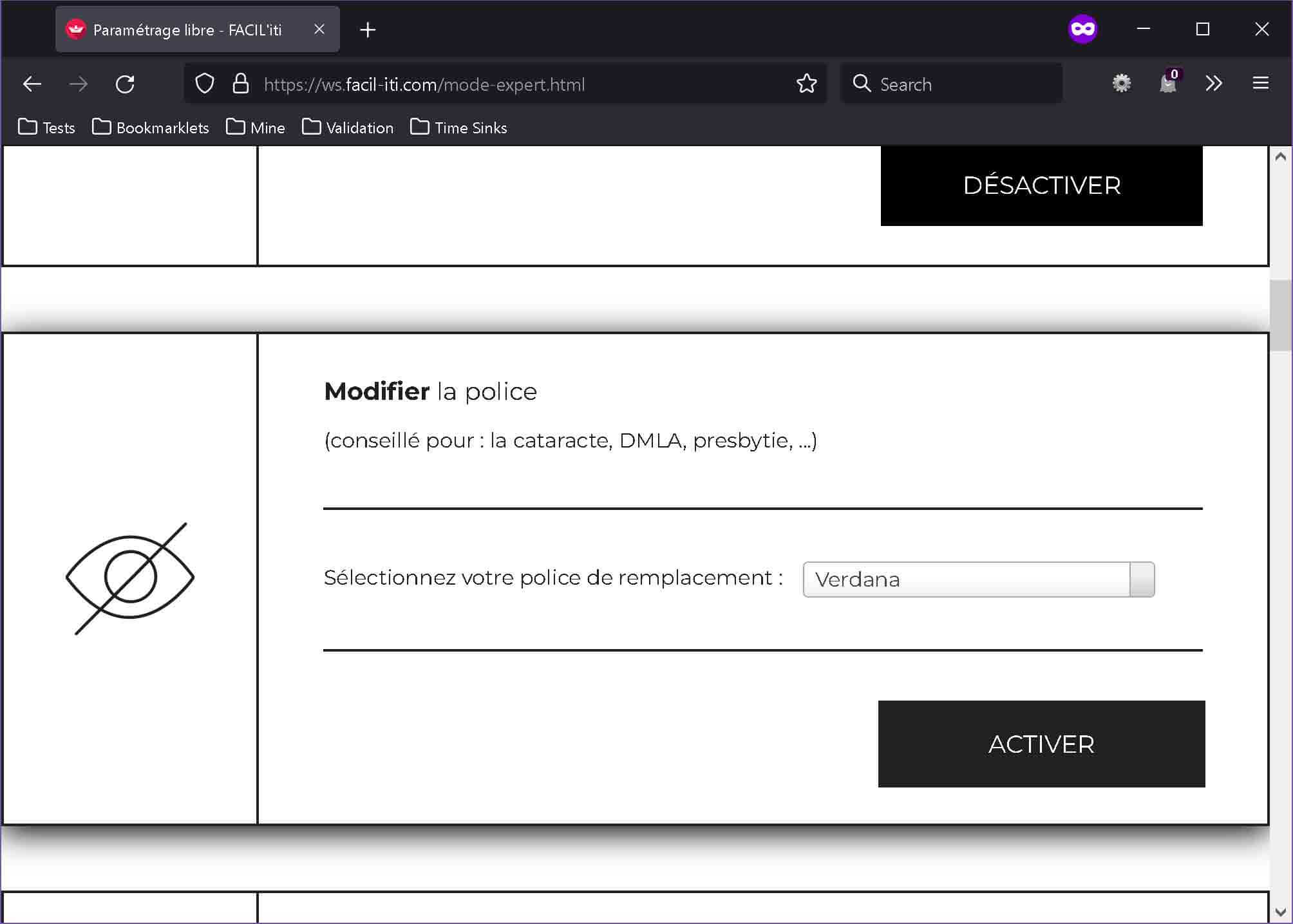
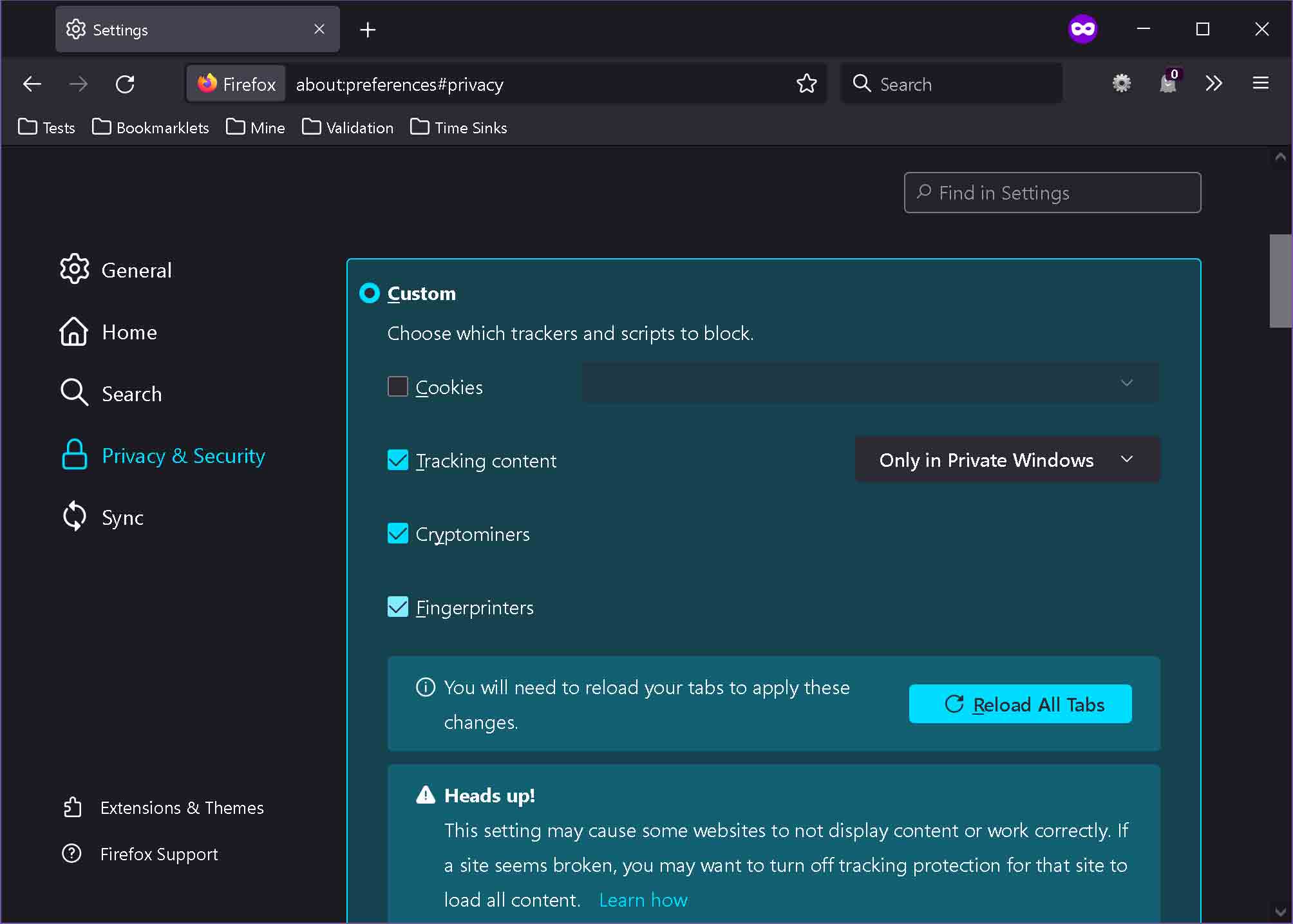
This is where I noticed the instructions were woefully out of date. For example, the Firefox application menu and settings screen no longer look the same or have the same menu items as the screen shots show. The standard privacy settings block cross-site tracking cookies (FACIL’iti recommends standard settings). This means you must go into the custom settings and explicitly disable all cookie blocking.
Then when I went back to the Paris Info site and saw it had applied both the black-and-white and Comic Sans settings. Until I clicked a link to another page.
Grabbing a couple other sites FACIL’iti lists as customers, and which display a FACIL’iti link somewhere on their site (the footer, in both cases), the FNAC site adopted the settings from the profile I made — except for the ad banners in the carousel. The Télé-Loisirs, however, ignores it completely.
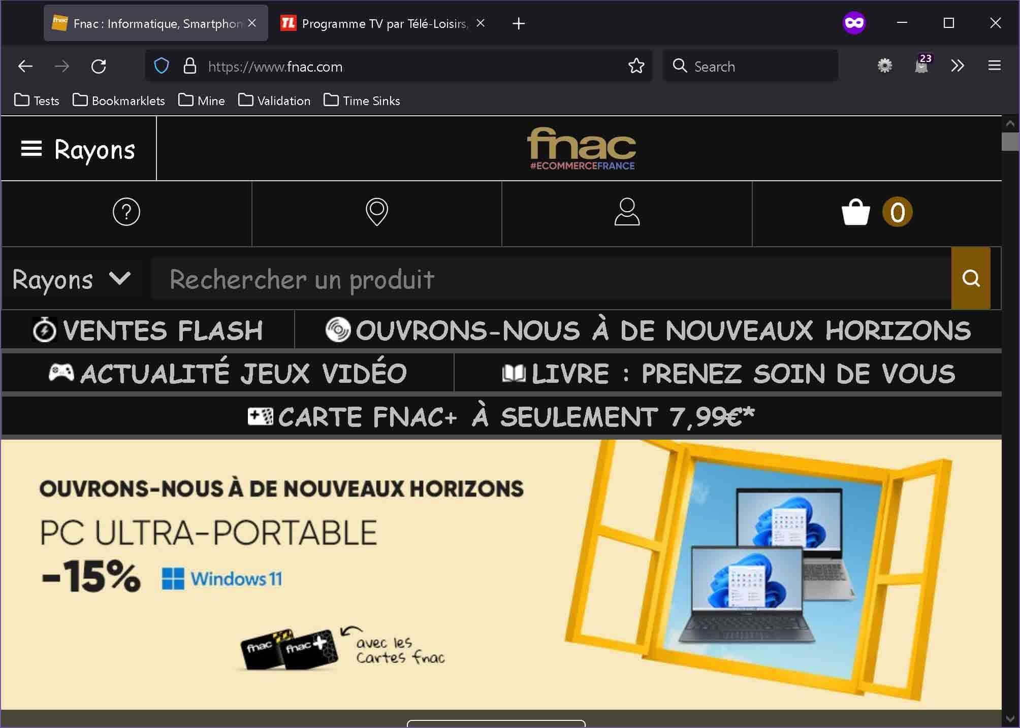
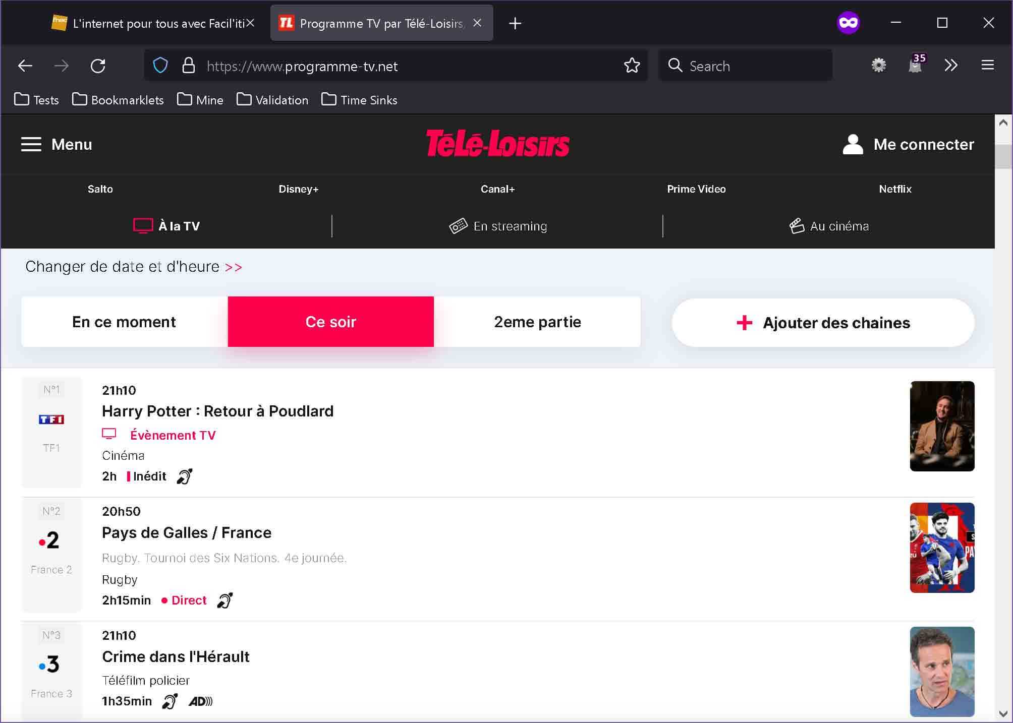
Interestingly, if the instructions to activate the FACIL’iti profiles on the FNAC site fail some WCAG Success Criteria. The instructions read, cliquez sur le logo rouge FACIL’iti
, which is asking the user to click the red FACIL’iti logo.
For a user who cannot see the page, there is no red logo. The red logo image has a blank alt attribute (a 1.1.1 Non-text Content issue in this context), so it will not announce to a screen reader user. That means the link wrapping it has no name (a 4.1.2 Name, Role, Value failure) and does not tell users where it goes (a 2.4.4 Link Purpose risk). Finally,the instructions rely on being able to see the red logo, or at least be made aware of it programmatically (a 1.3.3 Sensory Characteristics issue).
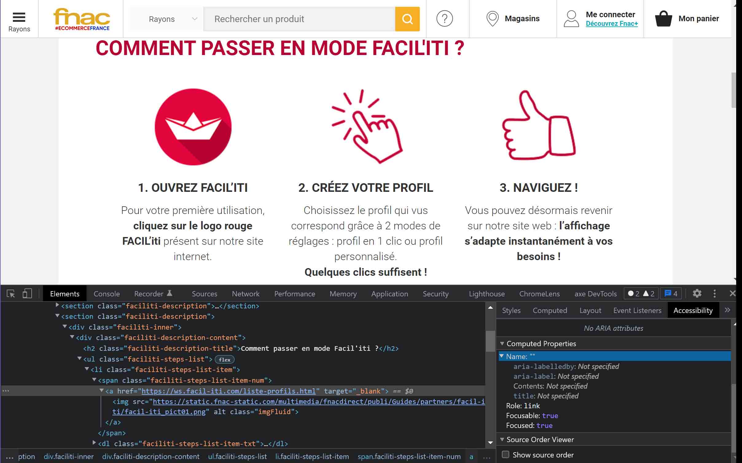
alt attribute, so the link has no accessible name.If FACIL’iti provided this content to FNAC as-is, then FACIL’iti added up to 4 WCAG 2.0 failures to its customer’s site.
Privacy
Unlike other overlays that ask users to choose accommodations they find helpful, the FACIL’iti overlay asks users to identify their disability. Dyslexia, Parkinson’s disease, Wilson’s disease, multiple sclerosis, and osteoarthritis are all options. Ostensibly this is to provide pre-set generalized changes to the content.
Unlike other overlay vendors, FACIL’iti’s privacy statement makes no claims about privacy for its users beyond what it collects in contact forms.
If you dig into the overlay you will find a link to the Personal data and security management policy. It talks about using localStorage to ensure your data is stored only in your browser, reminding you that you can delete it. It also claims not to store the medical condition you identified, but only settings from choosing that condition. Re-assembling that condition from a series of settings is not hard, of course.
I encourage you to review the policy before using the tool. Given how many people with disabilities are cautious about disclosing their disability or medical condition(s), you should be comfortable with the policy before using FACIL’iti.
Remember what we saw on the non-overlay version of FACIL’iti’s offering. To get the profiles working you have to reduce the security and privacy settings of your browser. You have to allow third-party tracking cookies. You have to go against browser security defaults.
If wary of tracking technologies, regardless of the FACIL’iti privacy claim, there is still more.
The Overlay Is Easily Blocked
For a site making a good faith effort to help users by adding FACIL’iti, the owners may not understand how often visitors never see the FACIL’iti overlay.
For many people who use tracking blockers, the FACIL’iti overlay will not work. My instance of Ghostery blocks Google Tag Manager, without which the FACIL’iti overlay, even on FACIL’iti’s own site, does not activate.
Using FACIL’iti’s home page as an example, the first instance of the FACIL’iti overlay trigger is a link. That link uses script to prevent it from navigating the user to a new page, opening the overlay instead. But if the user’s ad blocker blocks Google Tag Manager, the user is instead sent to a page promoting FACIL’iti’s browser extension.
The second instance on the same page of the FACIL’iti overlay trigger is a button. This button does nothing when Google Tag Manager is blocked. FACIL’iti does not hide the button if it lacks the script to open. FACIL’iti does not progressively enhance the button to take the user to a different page when Google Tag Manager does not load. Instead, FACIL’iti silently fails when a user tries to activate its overlay in this scenario.
For users who know what FACIL’iti promises, they will assume FACIL’iti itself is broken. For users who are new to FACIL’iti, they may assume the site owner, FACIL’iti’s customer, has a broken feature.
FACIL’iti provides a helpful link explaining that, as a user, you need to enable cross-site tracking. But only if you can activate the overlay to get to that helpful link.
In order for FACIL’iti’s filters to work on all the websites equipped with the service, you need to allow cross-site tracking in your browser.
You are using Windows and Firefox.
To enable cross-site tracking, please click here.

Yes, that is a click here link. Also yes, that link would probably fail 1.4.1 Use of Color (I have an explanation why).
Insufficient Features
Some of the features the overlay offers don’t do much for users. I will not go through every one (such as FACIL’iti’s much-debunked use of a dyslexia-specific font), so I will examine just a couple.
Screen Reader
FACIL’iti conflates broadly known terminology with its own claimed features. For example, FACIL’iti’s overlay offers what it calls a “screen reader”. A real screen reader uses the accessibility tree of the browser to announce not just content, but the constructs, structure, states, properties, and names that hold that content. This is done primarily in the service of blind and low vision users, with mobility-impaired users as a significant audience among others.
The FACIL’iti version of a screen reader only speaks text that the user can see and then hover with a mouse. Blind and mobility-impaired users are excluded. Yet FACIL’iti uses the commonly-understood term screen reader (Wikipedia link) to imply its feature is somehow the same as a real screen reader.
The operation of the feature is also a bit confusing. After you activate the control, the overlay scrolls to another button for you to really activate the control. Then you need to understand that “highlight” does not mean that the text simply changes color. You will also need to understand what text it cannot read, such as the navigation. These instructions may also fail 1.3.3 Sensory Characteristics.
To read content, hover over it until you see it highlighted and click on it, I hovered the nearest piece of text at 0:24. It highlighted. I clicked. But because the nearest text was a link in the navigation, and the hovering highlight was the navigation hover style, all I did was load a page. You need not turn up the video, because even though I recorded sound none is produced.
Animation Blocker
The FACIL’iti overlay offers a one-click option for “Photosensitive epilepsy” which, when activated, claims it Stops animated content.
The challenge here is that FACIL’iti and users may not agree on what is animated content. Would it be a slide-out button? A window darkening behind a disclosure? A full-screen wipe to a bright color?
The FACIL’iti home page has all three of these kinds of animated content. None of which are stopped by the FACIL’iti feature. FACIL’iti also does not honor user preferences for reduced motion to stop these three pieces of animated content.
All this begs the question — does FACIL’iti have its own definition of animated content or is the feature simply broken?
WCAG Failures
I want to stress that just because something passes WCAG, at any level, does not mean that it is accessible. All that WCAG conformance guarantees is WCAG conformance. WCAG failures, however, signal known accessibility barriers for users. They may be minor and they may be severe. But any WCAG failure should be treated as a likely barrier for some set of users.
I have no interest in performing a free audit for FACIL’iti. However, demonstrating clear, obvious, testable WCAG errors is not too heavy of a lift. So simple, in fact, that FACIL’iti could do it (could have done it) with nearly any of the automated testing tools on the market.
This speaks to the level of rigor for a company claiming it is increasing the compliance with WCAG 2.0
on its flagship accessibility product.
FACIL’iti as a Poor Consultant
Abilities Expo has the FACIL’iti overlay. Ostensibly Abilities Expo did not simply copy a piece of code and paste it into the page given how Abilities Expo touts the partnership
with FACIL’iti. The announcement includes this important qualifier (which I also used earlier in this piece):
It’s important to note that this technology is designed to take an already WCAG compliant website to the next level of accessibility and not intended to be a substitute for the incorporation of important accessibility features into the bones of your platform.
Essentially this partnership
with FACIL’iti consisted of no more than embedding the code for the overlay, since FACIL’iti did nothing to address the 2.1.1 Keyboard issue on the font sizing controls nor the 1.4.3 Contrast (Minimum) failures with the orange-on-white color scheme Abilities Expo uses (and which were there before FACIL’iti’s overlay was added).
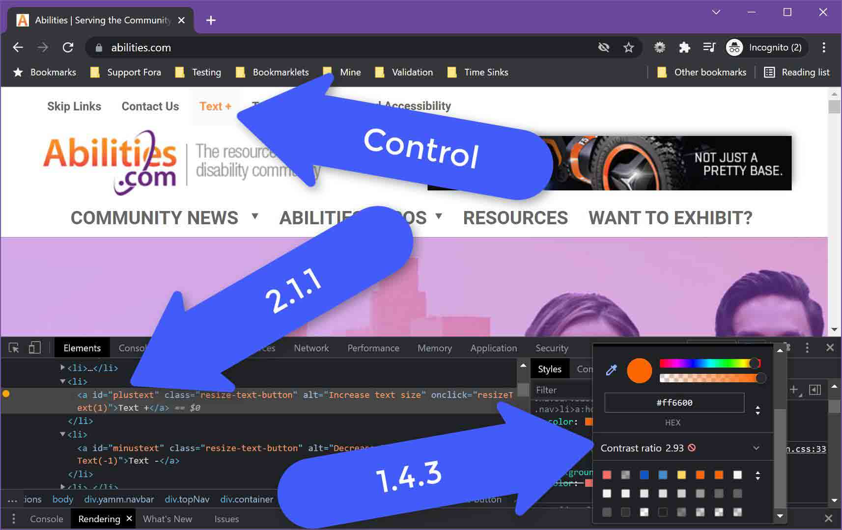
<a> element with no href (and an alt for some reason) that turns orange on hover (since it cannot get focus), which has a 2.93:1 contrast ratio with white.To paraphrase the press release, it’s important to note that FACIL’iti will not take an already WCAG failing customer site and fix it.
Language Selector
The language switching feature on the FACIL’iti site commits the internationalization sin of conflating country flags with languages (I speak American, not British, thank you very much). It also fails to expose itself as one of a number of documented and understood patterns. It has no ARIA attributes to turn it into a disclosure widget (best fit), a menu (not such a good fit), or even a listbox (terrible fit).
The simplest fix would be to add aria-expanded to the button. Toggling its value between true and false will convey to a screen reader user whether or not the button has expanded. This quick fix would also prevent a 4.1.2 Name, Role, Value failure.
<button class="active-lang montserrat-regular" title="Choose your language (active language : English)">
 <span class="picto-before picto-chevron open-chevron" aria-hidden="true"></span>
 <span class="pictoAlign">en</span>
 <span class="picto-lang" aria-hidden="true">
  <img src="https://www.facil-iti.com/wp-content/themes/faciliti/img/lang-flags/flag_en.svg" alt="">
 </span>
</button>
The controls also have inconsistent names. The trigger button has the accessible name “en”, derived from the visible text. The French link has the accessible name “French website”, derived from the invisible aria-label. Because the visible label doesn’t match the accessible name, the French link is also a 2.5.3 Label in Name failure. To compound it, the French link has lang="fr", but the aria-label is in English. This is probably a 3.1.2 Language of Parts failure.
<span class="lang-select-container lang-select-container-visible">
 <span class="lang-select">
  <a class="montserrat-regular" rel="noopener" hreflang="fr" lang="fr" href="http://www.facil-iti.fr/" aria-label="French website">
   <span class="pictoAlign">fr</span>
   <span class="picto-lang" aria-hidden="true">
    <img src="https://www.facil-iti.com/wp-content/themes/faciliti/img/lang-flags/flag_fr.svg" alt="">
   </span>
  </a>
 </span>
 …
</span>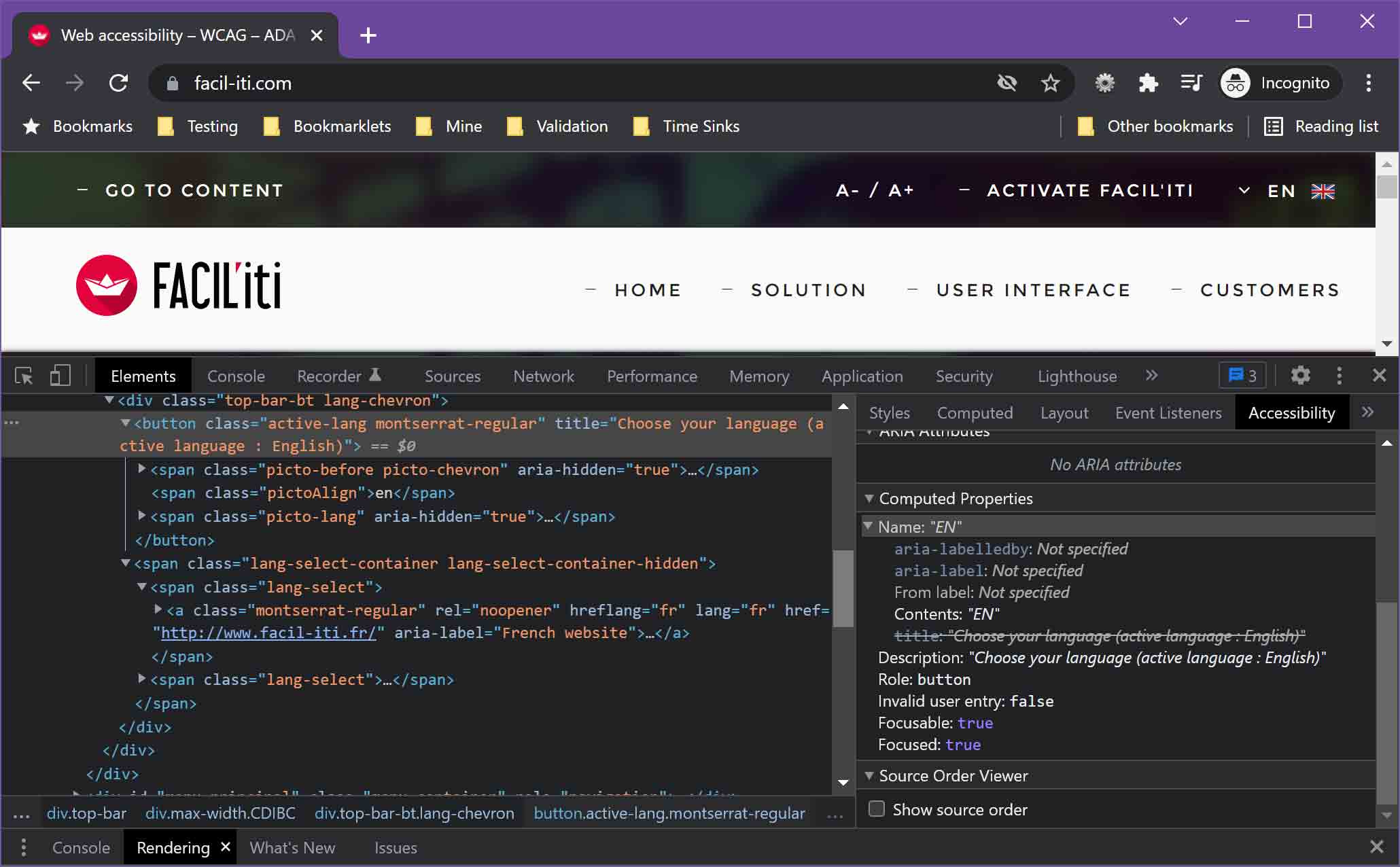
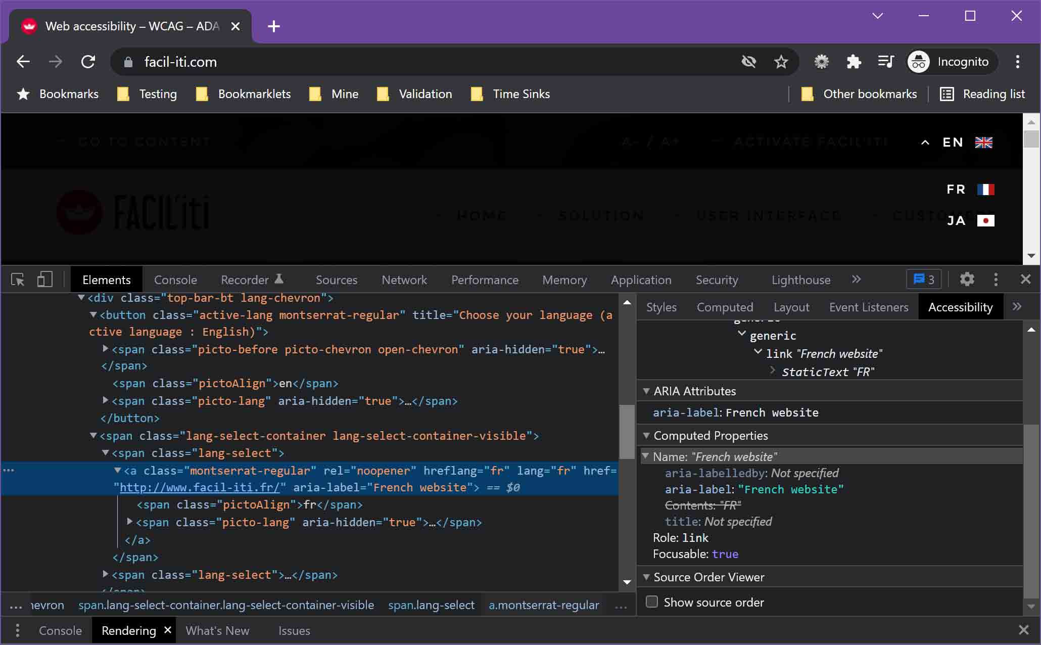
While this demonstrates how FACIL’iti does not meet WCAG on its own site, the language selector is only a problem for site visitors, not overlay users. It is, however, an indicator of FACIL’iti’s understanding of WCAG and testing rigor.
The Overlay Trigger Button
The button to open the FACIL’iti overlay introduces one to three WCAG violations to a site just by a FACIL’iti customer adding it. Even if tracking blockers prevent it from working.
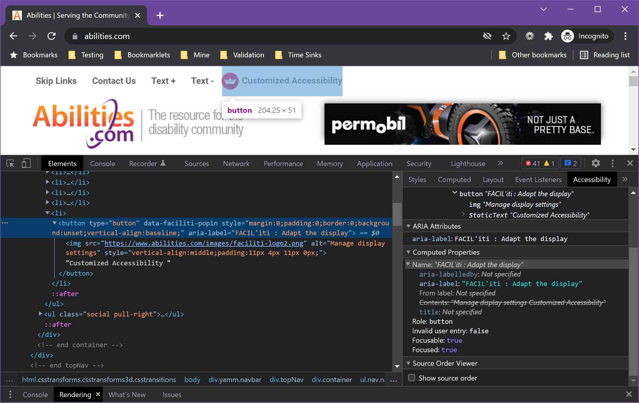
Using the Abilities Expo site as an example, it has the FACIL’iti button in its header. The button has an image of the paper boat with the alternative text Manage display settings
, which does not explain the image at all (a potential 1.1.1 Non-Text Content issue). The image alternative text and visible text combined would make the button’s accessible name Manage display settings Customized Accessibility
, except there is an aria-label that overrides it to FACIL’iti : Adapt the display
. Because the visible text is not the accessible name, this is a 2.5.3 Label in Name failure.
For good measure, when you put keyboard focus on the button it has no visible focus style thanks to a general :focus style of outline: 0 !important. This failure to provide any visible indicator, while actively suppressing the browser default, is a 2.4.7 Focus Visible failure.
Overlay
The FACIL’iti overlay itself has some issues. Each visible toggle is not a native interactive control. There are a few patterns for making a self-submitting toggle, all of which make it easy to assign an accessible name and to manage the state both visually and programmatically.
FACIL’iti chose a different approach. Each toggle is a <section> with a tabindex="0" to make it accept keyboard focus. There is no interactive role and no programmatic state (so a 4.1.2 Name, Role, Value issue). This means the accessible name has to convey everything. Given the documented risks with relying on a dynamic accessible name, this is a surprising approach.
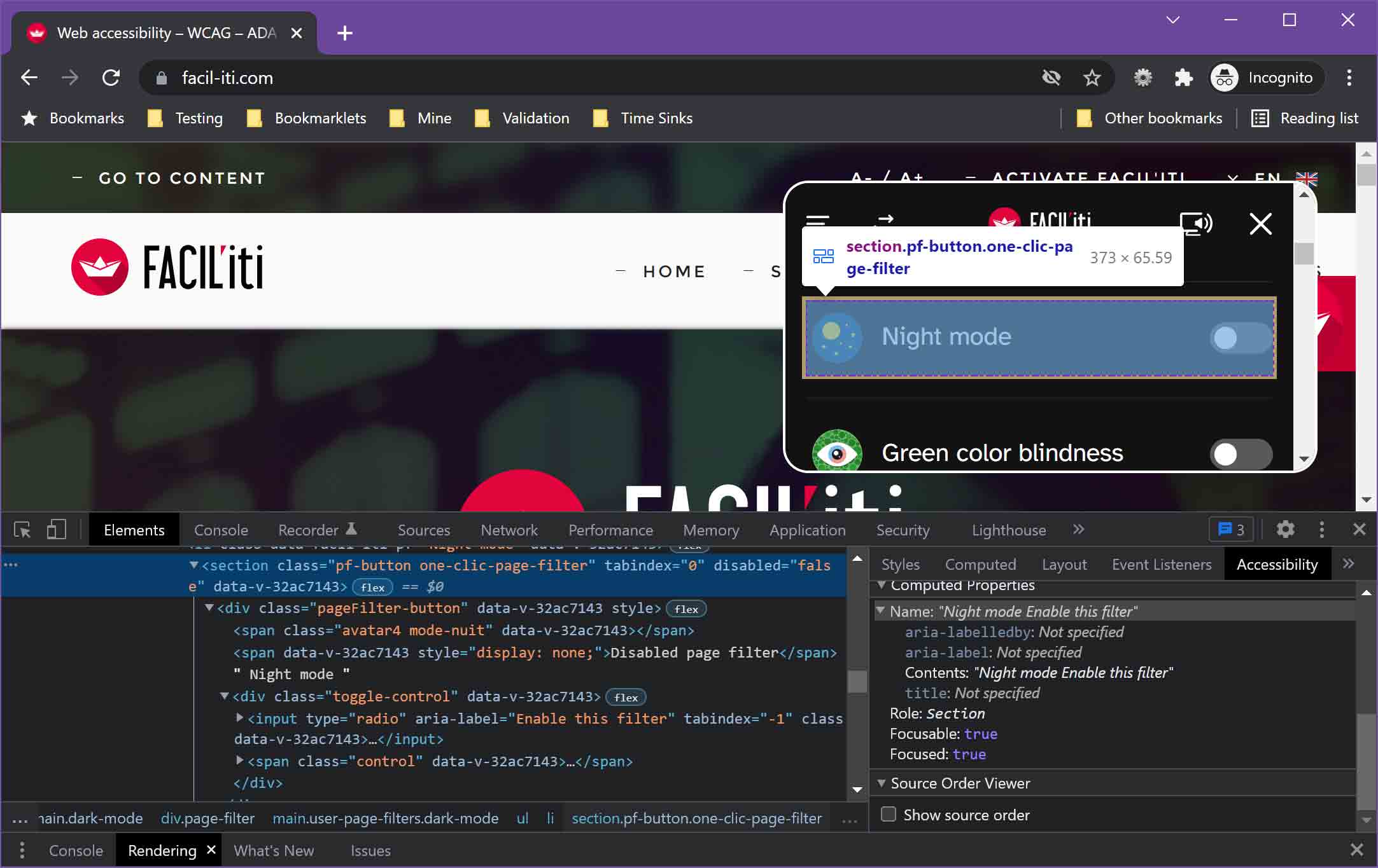
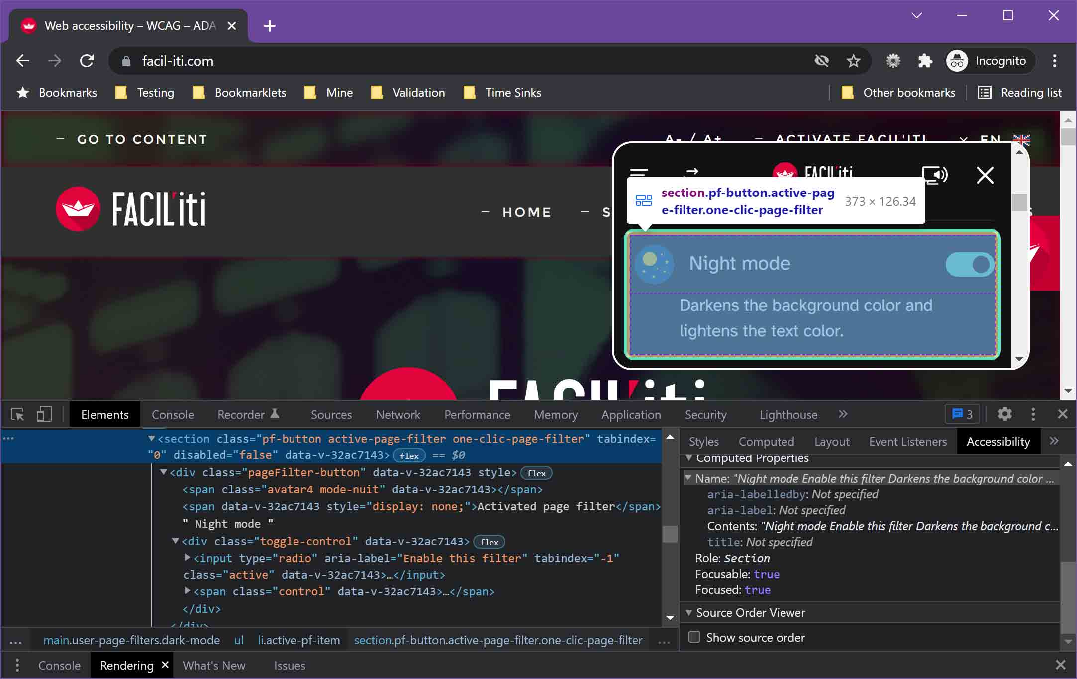
Night mode Enable this filter. When active, it reads
Night mode Enable this filter Darkens the background color and lightens the text color. This additional wordiness comes from the text node within the section.
To compound the problems with this pattern, within this section is a radio button with tabindex="-1" (which could be a 4.1.1 Parsing issue for nesting interactive controls). A screen reader user will encounter this radio button simply by arrowing or swiping through the page, because tabindex="-1" is not an appropriate way to hide interactive controls. Further, bringing up a list of elements will show all the radio buttons. Which also shows us they all have the exact same accessible name (“Enable this filter”) whether or not the filter is activated, a potential 2.4.6 Headings and Labels issue.
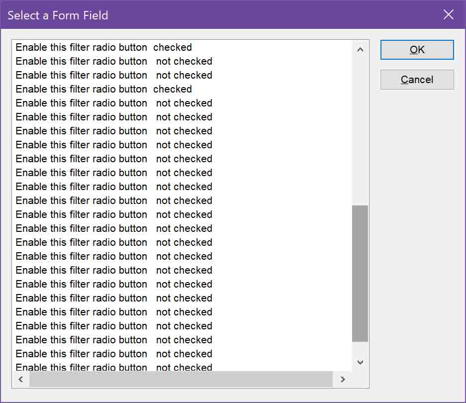
Overlay Filter Configuration Buttons
Mis-using aria-label appears to be normal for the FACIL’iti overlay. In this simple example, a user who activates the dyslexia filter is presented with a button that reads enter the characters you get confused and choose a reading guide
. Except that is not the accessible name.
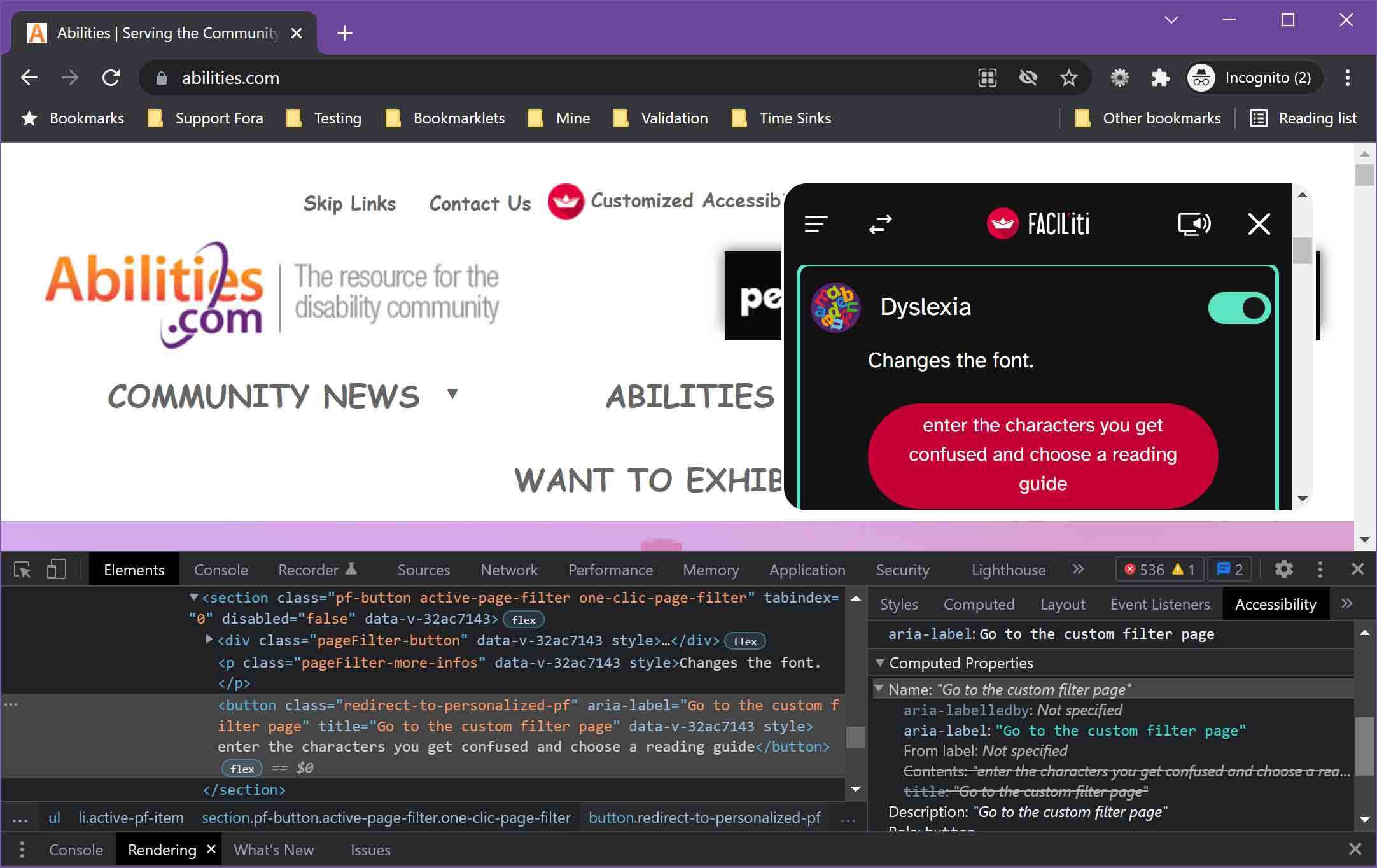
Here is the code:
<button class="redirect-to-personalized-pf"
 aria-label="Go to the custom filter page"
 title="Go to the custom filter page" …>
  enter the characters you get confused and choose a reading guide
</button>
The button’s accessible name comes from the aria-label and its accessible description comes from the title. For a user relying on a screen reader to aid reading comprehension, they would hear Go to the custom filter page button, Go to the custom filter page
. A voice user might also struggle to know how to refer to the button. This is yet another 2.5.3 Label in Name failure.
This is not limited to just the one button. The personalized filter
button at the bottom of the overlay:
<button class="redirect-to-personalized-pf"
 aria-label="Go to the custom filter page" …>
  personalized filter
</button>
And so on.
Frivolous Lawsuits
The title of this post has an additional meaning. You might indeed get sued. But by FACIL’iti; if you are critical of its product.
For a little context, RGAA is Référentiel Général d’Amélioration de l’Accessibilité, the French law that incorporates WCAG.
I want to also state that I have had no private communication with either of the two entities I discuss next. All of my interactions have been public tweets. There has been no coordination for this post or otherwise.
Koena
In April 2021, French accessibility consulting firm Koena published Koena given formal notice by FACIL’iti (original French piece: Koena mise en demeure par FACIL’iti). Koena was not the first, according to the post. FACIL’iti had been threatening people who had tweeted criticism of FACIL’iti’s overlay, but Koena was the first to publicize it.
I encourage you to read Koena’s post. It does a good job of breaking down FACIL’iti’s claims and complaint:
- FACIL’iti: a common practice of formal notice
- Content of the formal notice against Koena: the arguments put forward
- “There is no single form of accessibility that can meet 100% of Internet users’ needs”
- “The tool developed by my client has been the subject of 5 years of research and development and a patent filed with the INPI”
- “In addition, the solution is the subject of tailor-made work on each website and cannot be assimilated to a simple automated plug-in”
- “The adjustments my client suggests are tested and approved by people with disabilities, in partnership with reference associations”
- “These actions are all the more serious as you enter into a relationship of direct competition with my client”
- Now what do we do?
- Koena’s response to the formal notice
- Counter-proposal for FACIL’iti: discuss and compare FACIl’iti’s research with a second opinion
- Koena’s response to the formal notice
The complaint and triggering tweets…
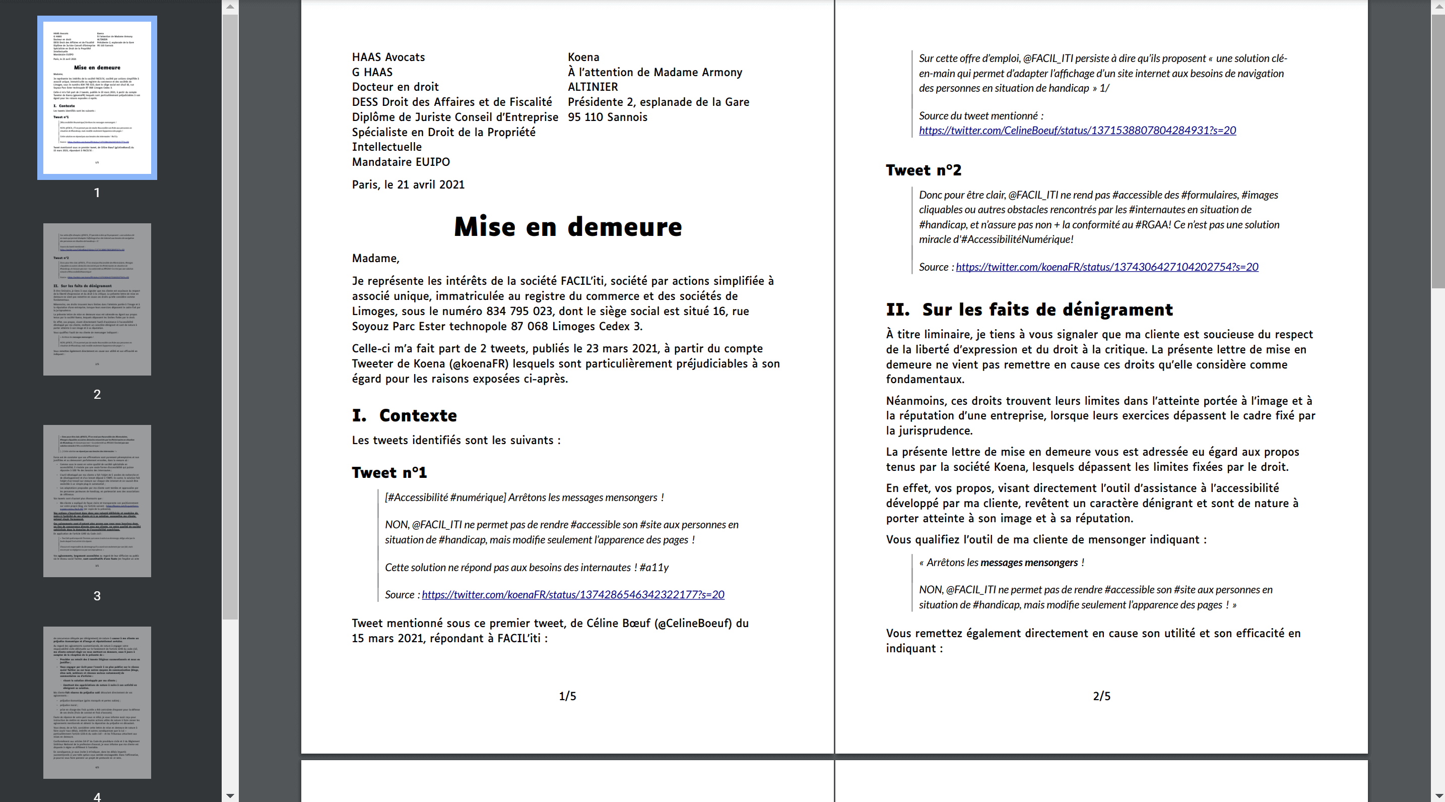
[#Accessibilité #numérique]
Arrêtons les messages mensongers!
NON, @FACIL_ITI ne permet pas de rendre #accessible son #site aux personnes en situation de #handicap, mais modifie seulement l’apparence des pages !
Cette solution ne répond pas aux besoins des #internautes! #a11y twitter.com/CelineBoeuf/status/137153…
Donc pour être clair, @FACIL_ITI ne rend pas #accessible des #formulaires, #images cliquables ou autres obstacles rencontrés par les #internautes en situation de #handicap, et n’assure pas non + la conformité au #RGAA! Ce n'est pas une solution miracle d'#AccessibilitéNumérique! pic.twitter.com/VURyXcgyPP

In May 2021, Koena received another letter from FACIL’iti, 2e courrier avocat de FACIL’iti. In June 2021, Koena received a summons to the commercial court, Assignation de Koena par FACIL’iti au Tribunal de Commerce. In mid-November 2021, Koena filed its response, Procès FACIL’iti : conclusions de Koena déposées le 12 novembre 2021, including statements from five French accessibility practitioners. FACIL’iti submitted its response in February 2022, and now Koena will publish its response to that response by 1 April 2022.
Koena Update: 6 December 2023
In depressing and disappointing news, a judge has ruled against Koena and ordered Koena to pay FACIL’iti 26,256€ ($28,302.86 USD as of 6 December 2023). Koena also deleted the two tweets that over which FACIL’iti decided to get so litigious and file a SLAPP suit. On top of this, Koena has removed the posts on its site that covered the case.
Koena has covered this development in the post FACIL’iti contre Koena : jugement + cagnotte and also made a request for donations to cover its legal bill to raise an appeal. I encourage you to support them. The post includes the legal filings.
I have updated my links above with the Wayback version of each.
I am not an attorney, and certainly know nothing of European law, but you can easily find concerns about SLAPPs used to silence critics in Europe (and maybe you can support anti-SLAPP efforts as well):
- SLAPP Lawsuits threaten critical voices in France, 9 March 2018
- France: Reprisals against PPLAAF and Global Witness intensify with new SLAPP procedures, 23 November 2020
- Anti-SLAPP: EU protection against legal actions that silence critical voices, 27 June 2023
- How SLAPPs increasingly threaten democracy in Europe – new CASE report, 23 August 2023
- Anti-SLAPP: MEPs reach deal with member states to defend critical voices, 30 November 2023
Independent Practitioner
Koena noted it was not the only entity being threatened with legal action:
This person informed me that she was part of the group of people who had received a formal notice from FACIL’iti. I wanted to know more. She kindly sent me a copy of the formal notice received, and put me in contact with other people who were also the subject of a formal notice.
Another chose to speak up about legal action from FACIL’iti.
In November 2020, the French Minister of State for Digital and Telecommunications tweeted about FACIL’iti. Unsurprisingly, there were critical responses. In December 2020 FACIL’iti opted to send a legal threat over one (though it may have sent out many more). But instead of sending it to the person who tweeted, FACIL’iti sent it to that person’s employer.
Even though the author deleted the tweet, in March 2021 FACIL’iti sent another letter to the author’s employer, followed by a subpoena in May 2020 demanding up to € 10,500 in damages and fines.
You can read more in the post Aide pour mes frais d’avocate dans mon procès contre FACIL’iti, also available in English: Help for my lawyer’s fees in the FACIL’iti lawsuit against me
One thing these cases lay bare is that FACIL’iti is willing to target disabled women with lawsuits and financial damages (including a thinly-veiled effort to deprive someone of employment), not just threats, in an effort to silence valid criticisms of its product.
Wrapping Up
We have established a few things here:
- FACIL’iti is very careful about its claims, but they are still questionable;
- Users with ad blockers may never be able to activate the FACIL’iti overlay;
- The features in the overlay don’t always work;
- Just adding the overlay button adds WCAG failures to your site;
- The overlay itself introduces even more WCAG failures;
- The overlay may be inaccessible to many users;
- Being critical of the overlay risks legal action from FACIL’iti.
If you are considering the FACIL’iti overlay for WCAG compliance, know it increases WCAG failures on your site. If you are considering it to provide customization features, know the filters don’t always work and require some users to identify their medical conditions. If you are considering it to reduce complaints of any kind, know you may end up fielding complaints about a product over which you have no control. And if, as a result, you openly criticize FACIL’iti, know you may get sued by FACIL’iti.
In the US as the number of web site accessibility legal complaints increases, overlays arguably put you at greater risk by painting a target on your site.
One Comment
I haven’t read this all the way through yet, but I’m in the second paragraph and I already have a comment. I really wish these vendors would quit bringing compliance into this, because compliance is a binary state. Either you are or you aren’t. It’s not a thing that can be improved in the sense that improvement somehow makes you more compliant unless whatever that improvement is bumps you to actual compliance.
Leave a Comment or Response