ARIA Grid As an Anti-Pattern
First I will cover what an ARIA grid is per the ARIA specification, and then I will discuss two patterns proposed by the ARIA Authoring Practices.
ARIA 1.1
ARIA provides the grid role to help authors create programmatic relationships within content that you might otherwise use an HTML <table> to create.
Unlike a <table>, which is a static container that can contain interactive controls, a grid is an interactive control that can contain static content and interactive controls.
There are nine (9) composite widgets in ARIA 1.1, of which grid is one. The others are combobox, listbox, menu, menubar, radiogroup, tablist, tree, and treegrid.
At its simplest, this is the definition of grid in ARIA 1.1:
A composite
widgetcontaining a collection of one or more rows with one or more cells where some or all cells in the grid are focusable by using methods of two-dimensional navigation, such as directional arrow keys.The
gridrole does not imply a specific visual, e.g., tabular, presentation. It describes relationships among elements. It may be used for purposes as simple as grouping a collection of checkboxes or navigation links or as complex as creating a full-featured spreadsheet application.
Essentially a grid is a single tab-stop on the page and the author has to make some decisions on managing focus within that widget:
To be keyboard accessible, authors SHOULD manage focus of descendants of a
gridas described in Managing Focus. When a user is navigating thegridcontent with a keyboard, authors SHOULD set focus as follows:
- If a
gridcellcontains a single interactivewidgetthat will not consume arrow key presses when it receives focus, such as acheckbox,button, orlink, authors MAY set focus on the interactive element contained in that cell. This allows the contained widget to be directly operable.- Otherwise, authors SHOULD ensure the element that receives focus is a
gridcell,rowheader, orcolumnheaderelement.
From experience, the may and should qualifiers mean implementations can vary and often do.
With that covered, let’s look at two patterns.
Data Grids
In my post Hey, It’s Still OK to Use Tables I compare and contrast native HTML <table>s with ARIA grid roles. For simple tabular data, an HTML <table> is all you need.
There is a combination of limitations within HTML, CSS, and browsers, of course. For those who want some Excel-like (or just made-up) behaviors, we see developers and designers abandon the native <table> and grab <div>s and grid, often unaware that ARIA table roles exist.
HTML and CSS can handle some requirements without the need for grid roles or even piles of script, and do so accessibly. Some examples:
- content that is clipped by a cell without excluding keyboard-only users;
- responsive tables that even account for unfortunate browser bugs;
- providing unique accessible names to controls in cells;
- allowing for adding / expanding content in cells or by adding new rows;
- fixed headers for columns and/or rows;
- clickable rows without click handlers.
My general rule is that you should probably ignore ARIA grid unless you are trying to recreate Excel.
This take is not controversial. However, mis-applied ARIA grids are common thanks to pre-packaged libraries such as ag-Grid. Its accessibility bugs make developers think data tables are harder to get right than is true.
Layout Grids
You would be right to be confused here. I am not talking about CSS grid properties. I am talking about a concept introduced in the ARIA Authoring Practices 1.1 — the ARIA layout grid.
I need to take this opportunity to stress that the ARIA Authoring Practices are not a specification nor standard. They are a Working Group Note. They are not production ready and (assuming my issue gets addressed) they will say so at the top of every pattern in the next release.
As Defined
With that out of the way, let’s take a look at the assertions from the pattern:
The
gridpattern can be used to group a set of interactive elements, such as links, buttons, or checkboxes. Since only one element in the entire grid is included in the tab sequence, grouping with a grid can dramatically reduce the number of tab stops on a page.
If your objective is to reduce tab stops on a page, a grid will do that. Given that example, a user who may expect to tab to a link, button, or checkbox they can see in the grid may be confused when they tab past it.
Remember, as of now grid semantics are only exposed to screen reader users. While a screen reader user will hear the grid role announcement, and may even understand that the interaction will change, a keyboard-only user will have no idea.
This is especially valuable if scrolling through a list of elements dynamically loads more of those elements from a large data set, such as in a continuous list of suggested products on a shopping site.
The pitch here is that large collections of links can be a problem for keyboard-only users. This is true; we know this from testing with users. But using grid in this way does not mean you are welcome to use infinite scroll, a pattern which we know is even worse for keyboard-only users.
Remember that while a user may only have to press Tab once to get to the collection of links (reducing the number of times they have to press Tab on the page), the user still has to press ↓ to navigate to and through each link in the infinite scroll container.
The final sentence of that opening explainer:
If any elements in the group also have associated elements that appear on hover, the grid pattern is also useful for providing keyboard access to those contextual elements of the user interface.
Ideally, nothing should appear on hover that also does not appear on focus. This pattern does not define the only way to do that, so this pattern is not unique. Further, this argument still does not address touch users.
You may remember the opening sentence talks about grouping controls. You may have noted it is very specific about the controls, and there is a reason for that (third paragraph):
Because arrow keys are used to move focus inside of a
grid, agridis both easier to build and use if the components it contains do not require the arrow keys to operate. If a cell contains an element like a listbox, then an extra key command to focus and activate the listbox is needed as well as a command for restoring the grid navigation functionality. Approaches to supporting this need are described in the section on Editing and Navigating Inside a Cell.
Forget for a moment that it asserts how easy something is to build (or how it defaults to a listbox instead of a native <select>). Instead pay attention to how the developer must support additional keyboard commands to allow a user to both start and stop using a native HTML form element.
In addition to the section Keyboard Interaction For Layout Grids you also have to implement Editing and Navigating Inside a Cell.
Here are some key challenges you now face:
- How do you provide these instructions to users, without risking a 3.3.2 failure?
- How do you convey to a skilled screen reader user, who hears the
gridrole announced, that this specific case behaves differently? - How do you convey any of this to a less skilled screen reader user?
- How much testing are you prepared to throw at your reimagined control now that it is no longer a vetted pattern.
The Provided Examples
Let’s take a look at the language used to describe the pattern on the example page.
In addition to streamlining keyboard interfaces, these grids also convey logical grouping and semantic relationships for the elements they contain. For people who can see the screen, these groupings and relationships are visually communicated with layout and other elements of the visual design.
I think the opening statement about streamlining keyboard interfaces is up for debate. Focus on the second sentence, where the visual layout is meant to reinforce the structure and, ostensibly, the navigation.
This does not speak to what happens in a responsive context. In a smaller viewport or when the page is zoomed, that layout may need to change. Since this is not a data table it does not get an automatic pass under 1.4.10, so your carefully crafted arrow navigation may be meaningless if the cell on the right shifts to become the cell below.
Alternatively, your key handlers need to adapt in lockstep with your width and height media queries, or any CSS flex, grid, or float reflow that is not triggered via media queries. Remember that this change only benefits sighted users. It will likely confuse users who cannot see the layout at all but who have resized the page (accidental zoom, maximizing, etc, all surprisingly common use cases in my own testing).
The distinguishing feature of
gridthat enables it to be used for grouping other widgets is that its cells are containers that preserve the semantics of their descendant elements. That is, grid cells do not override or suppress the semantics of the elements they contain.
This is not a distinguishing feature of grid. There are plenty of native HTML elements that group widgets without overriding semantics. However, grid is the only one of the nine (9) composite widgets identified in ARIA 1.1 that allows this.
Thus, a link contained inside of a grid cell is presented to a screen reader as a link. By contrast, a link inside of a menu is presented as a menuitem, and a link inside of a listbox is presented as an option.
This argument is spurious at best. The menu is only there because of this same document’s insistence that menu should be used for site navigation (for which I filed an issue in April 2017 and also wrote about in detail here). The listbox example does not fit because if you use a link in a listbox, you would likely fail 3.2.2 (and you probably do not want a listbox at that point).
I am going to run through each of the patterns presented.
I am being critical, though my intent is not to belittle the effort that went into making them. These would be difficult patterns for any developer. The point is that these patterns as coded are not copy-paste production-ready code. In impromptu testing they confused skilled users.
1. Simple List of Links
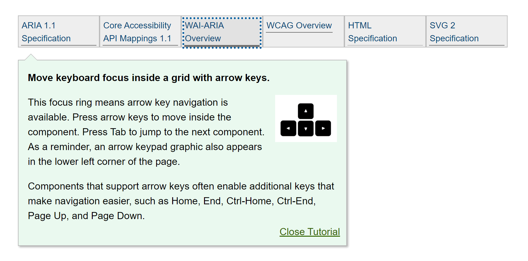
Here the pattern claims arrow keys change to correspond to a responsive reflow of the page. Except that is not true. When I get two rows of links, arrowing up from the bottom row just moves me to the left.
Note that the layout itself is achieved via CSS, not ARIA grid. The CSS display property used is inline-block. There is nothing wrong with this approach, though I would recommend against the fixed pixel height on the boxes (CSS flex or grid would be a better fit here).
When first focusing the control it presents a giant box giving me instructions on how to use it. This box can create a horizontal scrollbar when zoomed, and the Close Tutorial control at the end has a button role but does not fire when I press Space.
These are confirmations that the pattern is not production ready, even if you are unfamiliar with ARIA grid.
2. Pill List For a List of Message Recipients
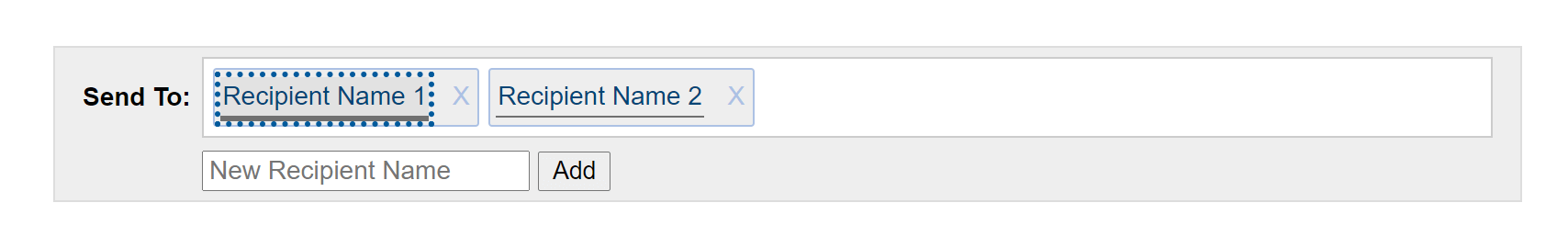
This is an interesting pattern on its own, regardless of how you solve it. For a sighted user (because I tested with people other than me), understanding that up/down arrows navigate among like items across recipients, versus left/right arrows that navigate through everything, took getting used to.
More time was spent experimenting with and understanding the control than using it. Users are generally cautious when they discover something behaves differently than expected, particularly when an errant press can delete data (as this allows).
Frustration was voiced when adding a new name and then pressing Shift + Tab put focus on a name other than the one added. This is an implementation detail that could be sorted with testing.
3. Scrollable Search Results
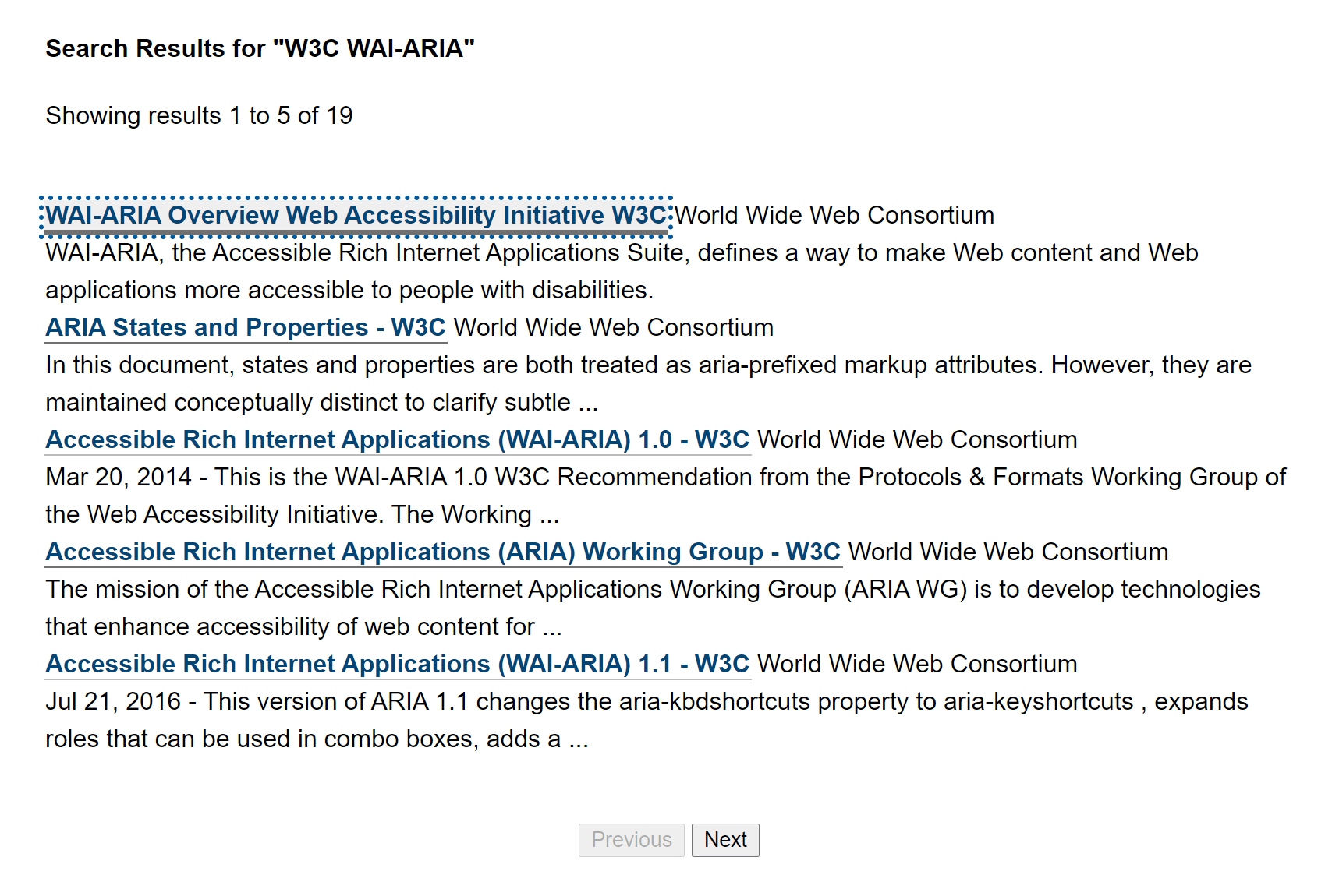
This is an example of paging (not scrolling, which the class names also give away). Ostensibly the pitch here is that a keyboard-only user can jump past the very long collection of links by tabbing once.
Other than a novel focus style (dotted), a keyboard-only user will discover this feature only after tabbing completely past the links. As I discussed above, this is not an interaction someone should expect.
It took me a few tries to realize that up-down arrowing triggers the infinite scroll experience, while left-right arrowing changes what the up-down arrows choose. It took a few more keypresses to get the focus back on the link I wanted to follow.
The benefit for a screen reader user is slim to none. These users can press B to bypass the links completely by jumping to the button. As it is, using arrows still navigated in virtual cursor mode, offering no benefit. Using table navigation commands revealed no column headers and verbose cell announcements. Moving to the next screen seemed to throw the column indices off since I could not get back into column 1 with table navigation.
Alternatives
Each of the examples above can be done more simply with regular HTML and far less scripting.
- For the simple list of links, use an HTML list (
<ol>or<ul>) holding links. It takes no more keyboard presses to navigate than the example. A screen reader user also gets to hear a count and current position within the list. Pair it with a “jump” link so users can skip over the navigation completely. - For the pill list, put the pills after the field (to minimize risk of a 1.3.2 or 2.4.3 issue). Then consider a list (which will provide count and position for screen reader users) where each list item holds the link and the button. Add a link to jump past the pills directly to the message.
- For the search results, put the previous and next buttons both before and after the results. And definitely do not use infinite scroll. Be very careful in using arrows to navigate since visually using content type as the functional differentiator is confusing. Probably dump the table construct, or at least give it column headers.
Aside from the provided examples, if your sole reason for considering the layout grid is to allow users to quickly jump past an area of the page, you have other options.
Using HTML headings and landmark regions, along with the correct controls where appropriate, means a screen reader user can already jump around the page. Using raw HTML properly gets you this benefit for free.
To support keyboard-only users who are not using screen readers, consider widgets that allow them to choose when they move around the page. Skip links are a great example. Disclosure widgets can collapse large swathes of content that are tab-stop minefields. Accordions and tab panels can do the same.
No matter which approach you take, do not launch it without testing with real users on real equipment in real situations.
Exceptions
You may find that for a specific use case and audience the layout grid pattern as defined works well. If the users prefer it (after given the opportunity to try other options), then by all means use it.
Congratulations. You have found an edge or corner case.
Need
Regardless of the ARIA pattern, there is still a need to let non-screen-reader keyboard-only users quickly jump past content. There is a limit to how many “skip thinger” links, disclosure widgets, and tab panels you can have. Simplifying the page may not be an option (slide 8) and some developers still want to cram as many links into a small space as possible. Consider… dashboards.
People smarter and more resourced than I are experimenting. With code, with users, with real screens. In the end it won’t be a repurposed ARIA role that solves this challenge, though ARIA will be needed to ensure these patterns make sense to screen reader users.
If you have examples of places this is done well, or have ideas of your own to improve the experience, feel free to share in the comments.
Wrap-up
Before using ARIA grid on a project, identify your goals and be prepared to test with users.
If you want an Excel-like experience, ARIA grid may be a good fit. If all you want is the ability to sort, have fixed headers, and hold a few text inputs, then using grid is probably overkill.
If you want to let users jump around the page, bypassing mountains of tab-stops, and you find that native HTML skipping mechanisms or some widgets do not work for your users, maybe experiment with a layout grid. But definitely test with users and be prepared for the WCAG failure risks it brings.
Regardless of your opinion on a layout grid, if it is a strong opinion (for or against) then you are welcome to leave a comment on the issue I opened in October 2019: Remove layout grid examples
Acknowledgments
Thanks to Sarah Higley for reviewing this post for technical inaccuracies and commentary on my wordiness.
Update: 10 July 2020
Sarah Higley has published her own review of ARIA grid patterns, and the title tells me there will be more to come: Grids Part 1: To grid or not to grid
So what does misusing a grid look like in modern web development, now that layout tables are passé? Generally the not-grid grids I come across fall into two general categories:
- It’s not all that interactive, and should probably be a table
- It’s highly interactive, but not tabular data. It should be something else entirely.
Sometimes there seems to be the misconception that if a table has any interactivity, it must be a grid. Tables can be sortable, filterable, virtualized, and can contain links and buttons without needing to be a grid. We’ll go a bit more into how to choose a table vs. a grid in the next section, but for now, remember: tables can be your friend too.
Go read the rest of it, it’s good.
Update: 11 January 2021
Sarah Higley has posted her follow-up, Grids Part 2: Semantics.
She covers a lot, including the brittleness of ARIA grids, the ARIA roles you need, and how to manage lazy-loading rows and complex headers. Go read it.
Update 20 May 2022: APG Relaunches
On Global Accessibility Awareness Day (GAAD) 2022, the APG relaunched and rebranded itself as an accessible pattern library:
Want to use #ARIA to make your web apps more #accessible, yet tired of slogging through a LONG doc? Good news: ARIA Authoring Practices Guide (APG) is redesigned as shorter pages!w3.org/WAI/ARIA/apg/
(related email: lists.w3.org/Archives/Public/public-wai-…) #a11y #ARIAapg #GAAD #WebApps
I am thrilled this no longer looks like a standards doc and is much easier to navigate.
I am less thrilled this left a pile of 404s with the move, implies it is a ready-to-use pattern library, obfuscates the (watered down) warnings I fought so hard to get added, quietly hid some of its worst patterns with no acknowledgment in years-old issues, appears to have happened outside the W3C redesign project with Studio24, and introduced WCAG issues.
Most relevant to this post is the APG home page does not mention ARIA grids. The grid pages are there, however, including the layout grid.
17 Comments
Hi, Andrian! Thanks for the awesome article!
I would like to know how would you classify the Emoji Picker on MacOS (Windows has a similar widget): https://pbs.twimg.com/media/EcheHTAXYAEdpXE?format=png&name=small
A very similar component is used in other apps, like Slack.
Before reading your article, it was obvious to me that it was the grid pattern (or a combobox with suggestions in a grid, if you’re interacting with the search box).
In response to . The columns and rows have no particular relationship. They exist only as a function of available space. So to me it is not a grid. Keep in mind, you can still enable arrow navigation whether or not it is an ARIA grid.
If this pattern had functional groupings where the columns and rows had some relationship (all faces in one gridded view with columns and rows corresponding to implied emotional state in a ranked flow, for example), then I think you have a case for a grid pattern where navigating within a theme on differing axes is a fit.
In response to . Thanks for the reply!
In case of enabling 2d arrow navigation without a grid role, how would you communicate it to screen reader users? And what role would you use instead (for example, for the emoji picker, which also has a search box)?
By not using the grid pattern the user would lose the information about the position of the item, which is something sighted users have for free. Isn’t this a bad thing?
In response to . In case of enabling 2d arrow navigation without a grid role, how would you communicate it to screen reader users?
With plain text that is visible so keyboard-only users can benefit as well (also satisfying 3.3.2).
And what role would you use instead (for example, for the emoji picker, which also has a search box)?
Button roles on the emoji glyphs, and a group role for the individual groupings. The search box is a text input, the entire container is maybe a dialog or just a group or potentially a tab and tab panel construct if I am guessing on the white text at the bottom correctly.
By not using the grid pattern the user would lose the information about the position of the item, which is something sighted users have for free. Isn’t this a bad thing?
Those positions are potentially meaningless to a low/no-vision user, particularly if those positions are arbitrary (based on a container width).
Directional navigation does not make it any easier than Brownian motion to find the desired emoji. If you do not know what is in the next row, arrowing down neither increases nor decreases your chances of stumbling across what you want.
If they were in some sort of meaningful structure where rows and columns convey this, then I would want to retain the positional information.
So, in general, chunk and structure the data. Then the burden of navigating a hundred buttons is easier for all users.
I wrestle with calendar datepickers. (I don’t mean the shitty tiny ones attached to input fields that always seem broken in a creatively different way in each implementation.)
We want them to be a single tab stop, with arrows for moving between the dates in the four directions of the wind, and there’s always a relation between the headers (days of the week) and the columns, and sometimes (depending on calendar) there’s a far-left row for the week number as well. I always have to look it up on Wikipedia to know what number is which week, especially when some upper-management type sends an email with “in the 21st week, we’ll…” wut?
Every time we’ve tried to build a grid calendar, however, it’s been unsatisfying. Using grid roles meant we lost the natural ability of tables to expose the column header names (days of the week) as a screen reader moves through the days using table navigation. For that matter, we lost table navigation: all users have to use the Arrow navigation. This isn’t necessarily bad, since a calendar shouldn’t wrap days to be responsive, but due to poor grid support a few years ago, instead of having the table cells themselves be the interactive elements, we had to put buttons inside them. Also because we lost the table semantics, it turned out every button had to have a dynamically inserted buttload of aria-label to give you something useful like “Wednesday, 4 April” instead of just “button 4”.
Still, the keyboard pattern makes sense: if I’m on a Wednesday, the UpArrow should bring me to a previous Wednesday. The DownArrow to the following Wednesday. Left and right go forward and back a day (haven’t seen research on whether people expect to wrap to the prev/next week or not. Either could be confuzeling).At this point, if it still seems worth it to prevent sighted keyboarders from possibly Tabbing 30 times to reach the 30th of some month, and if you have to use a bucket of buttons with aria-labels, there’s no point anymore in using a real table and we just visually style the thing to look like a grid of rows and columns.
This just leads to major frustration and shoe-throwing. It would be nice if a user of AT, like a screen reader, could choose whether to use the JavaScript fuckery such a calendar offers, or use their regular table navigation and press Enter on a date, triggering the same effect as for everyone else. But you can’t do that with grid roles.
(Note: no, there’s no consideration of some completely different design pattern. For people who can see who care about what day of the week a date is, and need to see the length of a chosen range, and see things like whether weekends are available, a visible calendar is essential. Not everyone works best with these, so we’re assuming in the best case there is also more than one way for a user to choose a date (-range), but there is still a pickable calendar present as well, and 30 Tab stops is still not cool.)
Grids were reason number 43 for my drinking.
Thanks for yet another enlightening article Adrian
Unrelated question: what tool do you use for the videos? Being able to show what JAWS announces and the keys being pressed is amazing.
In response to . Andrea, I use Camtasia. I manually add the captions (exporting to .srt and then converting to .vtt) and manually add the key presses. None of this is automatic, sadly.
“Regardless of the ARIA pattern, there is still a need to let non-screen-reader keyboard-only users quickly jump past content.”
I know how to fix this. :)
- Firefox: https://bugzilla.mozilla.org/show_bug.cgi?id=670928#c70
- Chrome/Edge: https://bugs.chromium.org/p/chromium/issues/detail?id=704698#c23
- Safari: https://bugs.webkit.org/show_bug.cgi?id=172817#c2
Yes, that’s comment number 70 in the 9 year old Firefox issue. ;)
(I also had one for pre-chromium Edge, but apparently they’ve deleted the whole issue tracker…)If you agree with me, please follow, vote, or leave a comment in any of the above issues. And tell your friends… :)
In response to . I am thrilled to see you filed those. I was also happy to see the reference to Matthew’s Landmark extension.
Microsoft deleting its customer feedback / tracker / voting thing at User Voice was an unfortunate decision that lost plenty of good feedback and ideas. I checked the Wayback Machine and only found one capture of the accessibility requests (from 23 July 2019) and even then only one of three pages.
Hi Adrian, It is amazing how thorough you are in your research.
I was considering using the grid design pattern for a chat component where each message in the chat would be an element in the grid, allowing the Up and Down arrows to navigate between them.
I was concerned about keyboard users though, since their mental model will tell them to use the Tab key to move from one message to another, in particular if we define each message in the stream of messages as an anchor.
In response to . Talyah, you need to make it a grid to add arrow key support. And you don’t need to worry about Tab key support — unless you plan to use the Tab to navigate the container and not the items.
If that is the case, then you may want to include instructions for users. Visible so they can all see it. Then provide a group label and role (perhaps
region) and your users will adapt. If this is for the general public then you will need to accept that they may not use it enough or be familiar with it to learn that interaction, so be sure that pressing Tab has no destructive effect and maybe even exposes extra instructions or tips if the user takes actions you recognize may cause confusion.I don’t know if that was your question (if you had one, or were just venting), but now you have my quick thoughts.
In response to . This is perfectly what I wanted Adrian, just to reassure myself that my recommendations are correct. Thank you so much.
This application is for a dedicated group of users and not for the general public. The interaction is very similar to other applications like One Drive, Google Drive and so on. They are applications that are being implemented on a browser, they are definitely not websites. The grid solution will allow the users to work much faster than before with the keyboard as well as with a screen reader. Again, I appreciate your interlegible input.
Thanks for the article. Small request, the following sentence is missing the word “are”: “Then I move back and try to use table navigation to get around. This pattern also does not tell me how many links there”
In response to . Done.
I just noticed in the section “As defined” in the list of key challenges you have a link to SC 3.3.2 that actually points to SC 3.3.1.
In response to . Fixed. Thanks!
A grid can offer a very efficient mechanism for navigating emails or chat messages. But I think we sometimes go for the difficult option and forget that we could use either native HTML elements or even ARIA widgets that are more suitable for the job. For example why not implement search results as a well-built listbox that has first-letter navigation and the results sorted alphabetically.
Leave a Comment or Response