Disclosure Widgets
A disclosure widget is a simple control whose sole purpose is to hide or show stuff.
Native
HTML has one built in via the <details> and <summary> elements. Until recently, if you wanted to use it in modern browsers you needed to use a polyfill. In most cases it was easier and simpler to skip the polyfill and use ARIA and JavaScript to make a disclosure widget.
Today you can use either method, and it is not hard to style them to look the same. If you need to support IE11, then you have your choice between the polyfill and an ARIA disclosure widget. I have more details on detecting support and using the polyfill in an old post.
For a simple disclosure pattern, where you have a summary that leads into details, then <details>/<summary> are a good fit. Once you start to go much beyond that, things get more complicated. As I wrote in Details / Summary Are Not [insert control here], it can be tempting to extend them to do more, but it may not work the way you want for all users.
ARIA Disclosure Widget
The structure is straightforward. A <button> (or a control with role="button") acts as the control that toggles display.
Add aria-expanded with either true or false to convey to assistive technology whether the widget is expanded or not.
Add aria-controls with with the value of the id from the element whose visibility is being toggled. This is optional, and support in assistive technology is sparse, but this programmatic association may allow for easier reference via CSS or script.
Keyboard Interaction
When the disclosure control has focus either Enter or Space activates the disclosure control and toggles the visibility of the disclosure content.
WAI-ARIA Roles, States, and Properties
- The element that shows and hides the content has the
buttonrole. - When the content is visible, the element with role
buttonhasaria-expandedset totrue. When the content area is hidden, it is set tofalse. - Optionally, the element with role
buttonhas a value specified foraria-controlsthat refers to the element that contains all the content that is shown or hidden by referencing itsid.
Focus and Reading Order
For a simple disclosure do not move focus. This allows a user who accidentally triggers the control to not lose their place and immediately trigger it again.
Ensure the disclosed content immediately follows the control in the DOM. For screen reader users this allows them to continue reading without the need to hunt for the content. If the disclosed content includes interactive controls (tab stops), this allows keyboard users to quickly move to those controls.
ARIA Authoring Practices
The disclosure pattern at the WAI-ARIA Authoring Practices 1.1 is one of the few patterns there that is complete and works well across devices and platforms. The examples are also simple and straightforward.
Simple Disclosure
This example shows the basic implementation of keyboard support and ARIA. You can also see a debug version of the simple disclosure widget
See the Pen Basic Disclosure Widget by Adrian Roselli (@aardrian) on CodePen.
The following video shows how each part of the HTML is used by the screen reader to announce the name, role, and state of the control, while also showing the values and styles change.
JavaScript
This JavaScript is by no means ideal, nor is it progressively enhanced. It is only meant to show that you have to change one property only — aria-expanded.
function toggleDisclosure(btnID) {
  // Get the button that triggered this
  var theButton = document.getElementById(btnID);
  // If the button is not expanded...
  if (theButton.getAttribute("aria-expanded") == "false") {
    // Now set the button to expanded
    theButton.setAttribute("aria-expanded", "true");
  // Otherwise button is not expanded...
  } else {
    // Now set the button to collapsed
    theButton.setAttribute("aria-expanded", "false");
  }
}
CSS
The CSS is even simpler. You want to either hide content or leave it be. What this means is you should toggle between display: none and allowing the default to apply. Since setting the wrong display property can remove its semantics for assistive technology, it is likely safest to not define the default state and let the native semantics of the element apply or, if using display properties for layout already, allowing those to apply.
button[aria-expanded="false"] + div {
  display: none;
}
The attribute selector ensures you are only visually toggling the display when the programmatic state has been correctly set.
The next-sibling combinator (+, formerly the adjacent sibling combinator) means that your disclosed content container must immediately follow the control in the DOM, helping to enforce the reading and focus order.
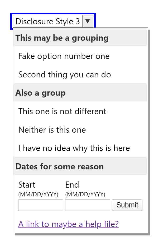
Extended Disclosure Patterns
Disclosure widgets are not restricted to just toggling narrative content. If you start to use them to mimic menu-like controls then you may need to add support for Esc or click-outside-to-close. Similarly, support for arrow keys, Home, End, Page Up, Page Down and potentially Shift + F10 may be warranted. If displaying the disclosed content overlaying other content, then z-index will be necessary.
No matter what you initially add, testing with users will be critical to creating a pattern that makes sense. Remember that once you start to modify an existing vetted pattern, that makes it no longer an existing vetted pattern.
Link + Disclosure Widget Navigation
In Link + Disclosure Widget Navigation I show how disclosure widgets can be used to create site navigation. Since disclosure widgets can contain structured and interactive content, this can become a mega-menu easily.
Table with Expando Rows
My post Table with Expando Rows demonstrates how disclosure widgets can toggle the display of structured content, such as table rows.
Accordion
An accordion is more than a few disclosure widgets or <details>/<summary> elements one after another. While an accordion is built up from a series of disclosure widgets, these widgets should be grouped and use a group label to inform screen reader users of the relationship.
Ideally they also should allow only one to be open at a time, and restrict the height of the entire collection to no taller than the viewport. The height is maintained by making the disclosed panels for each scroll instead. The accordion section of the article Designing for Progressive Disclosure gives more detail (along with other disclosure widget uses)
The following example demonstrates it, but the code is not production ready. You can also view the debug version of this accordion.
See the Pen Accordion by Adrian Roselli (@aardrian) on CodePen.
If you are interested in code that is more production-ready and progressively-enhanced, start with Scott O’Hara’s Progressively enhanced ARIA accordions. If you agree with me that the accordion should have a fixed height and scrolling panels within, then you will need to adapt Scott’s code.
Other Uses
Disclosure widgets can be modified a bit to take on other tasks. A simple example is a hamburger navigation. A more complex example could be a tool-tip replacement. An even more complex example is to create a listbox-like control that, unlike a listbox, allows the control to contain content other than items with the option role.
Each of the examples above warrants testing with real users — specifically the users of your product / service / screens. That testing should include people with disabilities, ideally whose skill levels correspond to your audience.
Closing the Widget
Each of these examples should close when the user presses Esc. This does not correspond to the native <details> / <summary> experience. However, there are many cases where closing (hiding) on Esc make sense, particularly where your control can obscure other content.
Some design implementations may warrant closing (hiding) the additional content when a user clicks or taps outside the content area, particularly when used as navigation or controls that resemble native form elements.
Managing Focus
Disclosure widgets by default do not move focus to the content area that is displayed. For your users, there may be cases where that makes sense.
In those scenarios determine if moving focus to the first interactive item is the best fit, or to the container instead. If you move focus to the container, the container must be able to accept focus (tabindex attribute) and have an accessible name and appropriate group role.
Keyboard Navigation
If you are using a visual style that looks like a <select>, then you may want to add support for arrow keys. Bear in mind, if you do that you will also want to add support for Home, End, Page Up, Page Down and potentially Shift + F10.
Remember that screen readers intercept arrow keys, so be certain to test. It is important you understand how it functions and if there are any problems for real users.
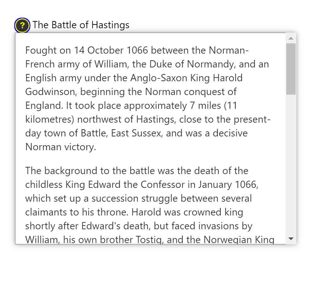
Displaying on Hover or Focus
Generally you want to avoid revealing the hidden content when a control receives focus or is hovered. Tool-tips are a valid exception, but in most other cases this will produce usability challenges.
If you pursue it, ensure that there is no nested interactive content, as a user may be unable to access it when only hovering. Unless the revealed content persists. Which means it will also need to be dismissable (see Esc support above). See Success Criterion 1.4.13: Content on Hover or Focus (AA, WCAG 2.1) for more detail.
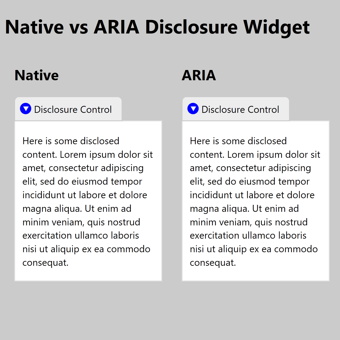
Native versus ARIA Comparison
That was a lot. From here to the end I am just tracking screen reader announcement.
Visually the native <details>/<summary> can generally be styled to look the same as a simple disclosure. You may need different selectors since in an ARIA disclosure the control and the disclosed content are (or should be) siblings, while the <details> element is the parent to <summary>.
See the Pen Native vs ARIA Disclosure Widget by Adrian Roselli (@aardrian) on CodePen.
Following are examples of how different screen reader and browser combinations announce the two patterns. I use accName to stand in for the visible text on the controls so you do not confuse the name with what the screen reader announces.
JAWS 2019 / Chrome 81
As far as JAWS is concerned, these are the same control. Under the hood in Chrome, the <summary> has a role of DisclosureTriangle, but it is either mapped to the button role or just announced as if it is. Note that if you use a control other than a <button> for the ARIA pattern (why?), but use the button role, you had better add support for the Space bar since that is what JAWS tells users to press.
- Native
- accName button [collapsed|expanded]. To activate press Space bar.
- ARIA
- accName button [collapsed|expanded]. To activate press Space bar.
NVDA 2019 / Firefox 76
NVDA also considers them to be the same, at least for the user. Under the hood in Firefox, the <summary> has the summary role, and the <button> has the pushbutton role.
- Native
- accName [collapsed|expanded].
- ARIA
- accName [collapsed|expanded].
macOS 10.15.2 / VoiceOver / Safari
VoiceOver considers them functionally the same, but since each is a different control type it says so.
- Native
- accName [collapsed|expanded] summary.
- ARIA
- accName [collapsed|expanded] button.
Android 10 / Chrome 81 / TalkBack
TalkBack with Chrome will announce <details>/<summary> as disclosure triangle
, while the ARIA pattern is announced as button
(because I used a <button>).
- Native
- [collapsed|expanded] accName disclosure triangle
- ARIA
- [collapsed|expanded] accName button
Android 10 / Firefox 68 / TalkBack
TalkBack with Firefox will not announce <details>/<summary> when navigating by controls; it gets skipped completely. If <summary> has a child node (such as an SVG), it becomes another tab-stop. The state of neither is conveyed.
- Native
- accName
- ARIA
- accName button. Double-tap to activate.
iPadOS 13.4 / VoiceOver / Safari
VoiceOver does not expose <summary> as interactive when the <details> is expanded. This may not be a big deal unless you have verbose content or controls that would annoy VoiceOver users to have to navigate through or otherwise jump past (if not, why did you use it?).
- Native, collapsed
- accName collapsed. Double-tap to expand.
- Native, expanded
- accName.
- ARIA, collapsed
- accName button collapsed. Double-tap to expand.
- ARIA, expanded
- accName button expanded. Double-tap to collapse.
iPadOS 16.5
The <summary> is more broken (tested 9 August 2023).
- Native, collapsed
- accName.
- Native, expanded
- accName.
iPadOS 17.3
The <summary> is less broken (tested 28 January 2024).
- Native, collapsed
- accName collapsed. Double-tap to expand.
- Native, expanded
- accName expanded. Double-tap to collapse.
Wrap-up
A disclosure widget is a simple control whose sole purpose is to hide or show stuff. Using the native control should be limited to simple content. The ARIA pattern can be extended to behave as richer controls. No matter what, always test.
Update: 1 February 2021
In this post I recommend using a native <button> as the trigger for your disclosure widget. Owing to recent conversations, I should note that aria-expanded can be applied to more than <button>s. In fact, a link can accept it.
Don’t do it, of course. Do not add aria-expanded to a link. Doing so is confusing for screen reader users in particular, but can also be counter-intuitive for all users.
When users hover or focus a link, they get some immediate visual feedback from the browser’s status bar (area) that they are about to be navigated to a new URL (on the same page or not). Mouse users also get a pointer difference. Screen reader users hear a link and then that is collapsed.
When I put together my disclosure widget navigation prototype, I had the opportunity to test with a handful of users across technology profiles and capabilities. Using a link as the disclosure trigger proved problematic and confusing for everyone.
The visual cues I mentioned meant most sighted users expected to navigate, and when the disclosed content was styled similarly to the rest of the page, they sometimes failed to see it. Voice users assumed they had selected the wrong control. Screen reader users who are familiar with disclosures were confused to hear a link (one user assumed it was a bug).
You may think this is a good way of progressively enhancing your navigation. That this could be a way to ensure that if the script fails to add the click handler to the link, a user can still navigate. But you also need to exclude the aria-expanded until the script fires. And, of course, you still need to add a handler for Space because otherwise the page will scroll instead of triggering the disclosure. At which point, you might as well keep the link as a link and use the script to add the disclosure button instead.
No matter what you do, remember that if you rely on this kind of navigation (that hides sub-navigation items) then you have to show those sub-navigation items on the child pages as well. Otherwise anyone with a script error can never get to your sub-pages. This seems basic, but I see this failure all the time.
I subsequently tested links as the disclosure trigger for non-navigation uses. People were still confused, particularly when the disclosure replicated what a native <details>/<summary> would typically handle. Using it for non-navigation scenarios makes even less sense here (even if you rely on an anchor link and use a :target selector as your fallback).
Update: 25 July 2022
If you look in the accordion example above, you may see that I have two selectors to make the disclosures work:
/* All the CSS needed to make disclosures work */

/* :has() is supported nowhere yet */
h2:has(> button[aria-expanded="false"]) + div {
  display: none;
}

/* until :has() is supported */
h2.collapsed + div {
  display: none;
}
Now that the :has() relational pseudo-class is getting support in browsers, it is worth calling this out in my post.
Once support in your audience is complete, you can remove the selector with the .collapsed and lean on the :has() selector instead. It will simplify the script since you will not need to toggle two values, and it will help ensure the programmatic state drives the visible display. I outline this overall concept in my post Using CSS to Enforce Accessibility.
:has() selector instead. The video shows how it would look if completely broken.Again, probably do not do this until you can be certain support is complete for your audience.
Update: 13 September 2022
Scott O’Hara discusses The details and summary elements, again, wading deeply into features, accessibility bits, and support. He also compares and contrasts with an ARIA disclosure widget. I recommend you read it if you plan to implement either.
12 Comments
Great topic. One remaining major “gotcha” with the native details/summary widget is the lack of support for headings in the
summaryelement in JAWS. Headings may not be necessary in every implementation of disclosure widgets, but it’s a pretty important pattern. There does not appear to be a complete consensus over how thesummaryelement should be treated by user agents (is it a button? Should headings be allowed within it, even though they are not valid within buttons? etc.)
I came here to ask if this would be a good pattern for making a transcript available for video / audio, but then I saw Peter Weil’s comment, and I’m thinking not…
In response to . It depends how you do it. For example, I have a transcript in
<details>at the end of my post Scraping Burned Toast.
Wondering what you think about using a checkbox/label combo for a disclosure trigger. Eg. like this:
<input type="checkbox" id="toggleExtraContent" name="toggleExtraContent" role="button" aria-expanded="false" class="hidden" aria-hidden="true" tabindex="-1">
<ul>
<li> some content </li>
<li> some content </li>
<li> some content </li>
<li class="extra"> some content </li>
<li class="extra"> some content </li>
<li class="extra"> some content </li>
<li class="extra"> some content </li>
</ul>
<label tabindex="0"><span class="sr-only">Button, expandable</span>Show more content</label>
By using a checkbox it’s possible to progressively enhance: users without JS (unlikely to be SR users) will still have a working “toggle button”. Users with JS get the full experience (obviously making sure that space works on the label).
It’d be nicer to get the role=button on the label itself, but that’s not allowed by the HTML spec sadly. Adding the hidden text allows to mimic the experience for SRs. The checkbox needs to be before the content it shows/hides. Whereas the label can be anywhere. By shifting focus, SR users do not have to search for the new content. By hiding the checkbox it doesn’t show up in the focus order, the label takes it’s place.
In response to . I am assuming you want to use a CSS selector like:
#toggleExtraContent:checked + ul {
  display: block;
}
Though you can also use the following and move the
<label>to immediately follow the checkbox:#toggleExtraContent:checked ~ ul { display: block; }You will also want to add
hiddento the<ul>so it starts collapsed.Ok, so here are the risks I see at a quick glance:
- Screen reader users are just as likely to be in a non-JS situation as any other user (it is rare for users to disable JS, but not rare for it to break from network issues, bad code, etc.), so your qualifying assumption is … risky.
- Because you use
aria-hiddenon the checkbox, thearia-expandedis moot (not conveyed) nor is the state of the checkbox, meaning there is no way to programmatically convey the state of the control to blind SR users;- When I navigate by control type (button or checkbox), nothing is exposed (due to the
aria-hidden);- As a result, you have to include the control type in the accessible name to have any chance of convincing a user what the control is and then there are auto-translation concerns.
I appreciate the approach, which is smart, but I would go with a native
<details>/<summary>as it exposes the role and state correctly and does not rely on a potentially brittle DOM structure for the CSS to work.
Thanks for the detailed writeup!
One thing I’ve always found frustrating about disclosure elements is that the native browser search functionality can’t search inside a closed disclosure. It would be nice if the contents of a closed disclosure could still be searched and would open automatically if a hit was found. This would add quite a bit of complexity, but would be a life-saver for API documentation sites which make frequent use of disclosures.
I guess a good middle-ground would be to include expand/collapse all so that if someone wanted to do a search, they could just expand all and do a search that way, but it’s a few more steps. Any thoughts on this?
In response to . I tend to avoid disclosure widgets within content because they break in-page search (Wikipedia on mobile being the most frustrating example). In testing with people, I also find they generally do not like disclosure widgets that arbitrarily hide content.
In response to . Could you keep details open and use visually hidden to collapse the disclosed content so it’s available to in page search? Then, when a result is found and focused, use focuswithin to expand the content to full height? The content would always be available to screen readers and search. The collapsing is more of an enhancement for visual users to aid in faster scanning. Could you also associate headings (visually hidden) with summary by use of aria-labelledby? So you could have Section heading titleSection heading title…. Aria-labelledby is probably not needed since aria-hidden=”true” is used. For screen readers, you get the heading and content combo and for visual users you get summary and collapsed (visually hidden) content.
In response to . Oops! My code was stripped, but basically…
[h2 class=”visually-hidden” id=”1″]Section heading title[/h2]
[details open]
[summary aria-labelledby=”1″ aria-hidden=”true”]Section heading title[/summary]
[div class=”disclosure__content” class=”visually-hidden”]…[/div]
[/details]Probably more trouble than worth the effort. The main point is to keep the content visually hidden so it’s searchable.
In response to . Bart, I am not Danny, but I submit that this could be incredibly confusing for screen reader users. Sighted screen reader users would hear content that is not on the screen. Non-sighted screen reader users may hear something you do not expect (you would have to test this pattern to see how browsers/SRs expose
<details>sans<summary>).
Great article, Adrian. From your perspective, is there a particular point at which a disclosure widget should become a dialog? In other words, is there something that, if added to the Other Uses examples, would warrant a dialog implementation instead?
In response to . If non-modal, meh? That comes down to testing with users, in my opinion, and what their expectations are in the context of your overall use case.
If modal, then yes. If you want a pattern that requires the user to respond / act in some way before proceeding, and for which you want to ensure the underlying page is functionally hidden, then that is probably a use case. If you are debating it simply because of visuals then maybe not a use case. Either way, prototype and test in situ with your users.
Leave a Reply to Bart Cancel response