Under-Engineered Custom Radio Buttons and Checkboxen
I keep seeing overly-complex controls with additional elements as style hooks, scripting to make up for non-semantic replacements, images that need to be downloaded, and so on.
This is silly. Here are some really simple styles to make radio buttons and checkboxes look unlike native controls (which seems to be the main goal from these over-engineered attempts).
The code in here is not perfect, but it is simple, semantic, and accessible. It does not require any third-party libraries, it does not use images, and no scripting is needed. It is pure HTML and CSS. Barring the <div>s (for layout within the page only), the HTML cannot get much leaner. I have embedded a CodePen so you can play around with it. Or you can visit it directly on CodePen.
See the Pen Under-Engineered Custom Radio Buttons and Checkboxen by Adrian Roselli (@aardrian) on CodePen.
Some Detail
There are a few bits in here that I think warrant some explanation beyond just throwing CSS and HTML at you. After all, when making something without jacking up the HTML, I think it is important to note how you did not jack it up.
Some HTML Notes
The styles rely on the following very simple mark-up: <input>, then <label>. That is it. If you use explicit labeling (by wrapping the entire control and its text inside a <label>) then you will need to re-write the CSS. That is on you.
<input type="radio" name="spam" id="spamY" checked>
<label for="spamY">
  Please send me all the spam.
</label>
What is great about this approach is that if your CSS fails for some reason, you still have a fully functional accessible field.
Please note that there is no ARIA, whether by converting a <button> element via role abuse or relying on any of the aria-label, aria-labelledby, nor aria-describedby variations.
Some CSS Notes
I do not remove the control from the page. I do not give it a display: none property since that hides it from assistive technology. Instead I rely on a CSS technique to visually hide the control that does not rely on the kinds of hacks that mess up RTL content (or content translated to RTL). If you see me answer questions on Stack Overflow about off-screen techniques, this is the style block I typically use, but with a visually-hidden class name as the selector:
input[type=radio],
input[type=checkbox] {
  position: absolute;
  top: auto;
  overflow: hidden;
  clip: rect(1px, 1px, 1px, 1px);
  width: 1px;
  height: 1px;
  white-space: nowrap;
}
Having visually hidden the controls, I can now create some fake visible replacement controls using CSS:
input[type=radio] + label::before,
input[type=checkbox] + label::before {
  content: '';
  background: #fff;
  border: .1em solid rgba(0, 0, 0, .75);
  background-color: rgba(255, 255, 255, .8);
  display: block;
  box-sizing: border-box;
  float: left;
  width: 1em;
  height: 1em;
  margin-left: -1.5em;
  margin-top: .15em;
  vertical-align: top;
  cursor: pointer;
  text-align: center;
  transition: all .1s ease-out;
}

input[type=radio] + label::before {
  border-radius: 100%;
}
Note the transition. That helps animate the control just enough that it feels like an action happened instead of just an awkward swap. Note that the radio button is made into a circle, but otherwise is the same code. All sizing is based on ems so this should scale to whatever font size you want. You can test it in my example by changing body { font-size: 100%; } to whatever value you want.
The radio button is easy. It just gets a fill and shadow. It animates easily enough, and does not get announced by screen readers.
input[type=radio]:checked + label::before {
  background-color: #00f;
  box-shadow: inset 0 0 0 .15em rgba(255, 255, 255, .95);
}
The checkbox could be as easy, but the shape of square versus circle is not enough in my opinion to denote the difference between the two types of controls. Originally I added a checkmark character, partly because I was using ::after pseudo-element to add the text (disabled)
for disabled controls in other contexts. One context was Windows High Contrast Mode, but I address it differently below. So I changed my tactics and now use a pseudo-element to make the checkmark.
input[type=checkbox] + label::after {
  display: block;
  content: '';
  position: absolute;
  top: .5em;
  left: .5em;
  width: 1em;
  height: 1em;
  transform: rotate(0deg);
  transition: all .1s ease-out;
}

input[type=checkbox]:checked + label::after {
  top: .4em;
  left: .7em;
  width: .4em;
  height: .8em;
  border-right: .25em solid #00f;
  border-bottom: .25em solid #00f;
  transform: rotate(45deg);
}
There is so much code because I am changing its size, position, and rotation in order to make it more obvious in the transition. You can, of course, change that whatever you prefer.
Right-to-Left Support
The generated replacement controls are floated, and padding is given to the text to fit them. Changing them to work in the opposite flow is a matter of swapping and resetting values.
*[dir="rtl"] input[type=radio] + label,
*[dir="rtl"] input[type=checkbox] + label {
  padding-left: .5em;
  padding-right: 2em;
}

*[dir="rtl"] input[type=radio] + label::before,
*[dir="rtl"] input[type=checkbox] + label::before {
  float: right;
  margin-left: 0;
  margin-right: -1.5em;
}

*[dir="rtl"] input[type=checkbox] + label::after {
  left: auto;
  right: .5em;
}

*[dir="rtl"] input[type=checkbox]:checked + label::after {
  left: auto;
  right: .7em;
}
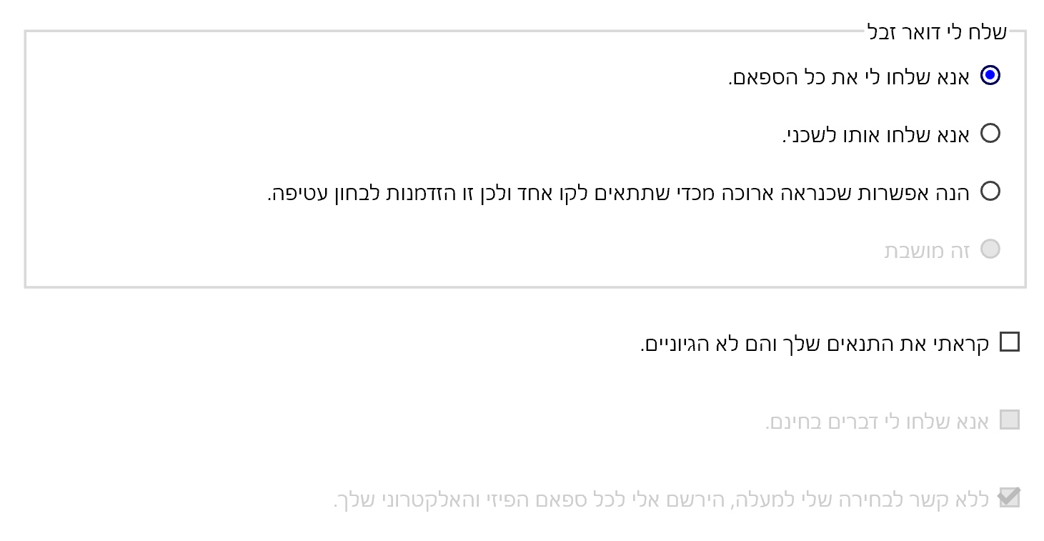
Dark Mode
If you choose to support a dark mode, make sure to adjust all your text, border, outline, and shadow colors to have sufficient contrast. I stick with the blue theme but go with a much brighter color against a dark background. Where possible, only change color values, such as with border-right-color instead of redefining all the styles for border-right. This can help ensure the styles do not fall out of sync across different media or feature queries.
@media screen and (prefers-color-scheme: dark) {
[…]
  input[type=radio]:focus + label,
  input[type=checkbox]:focus + label {
    color: #0ff;
    outline: 1px dotted #0ff;
  }
  input[type=radio] + label::before,
  input[type=checkbox] + label::before {
    background: #000;
    border-color: rgba(255, 255, 255, .75);
    background-color: rgba(0, 0, 0, .8);
  }
  input[type=radio]:disabled + label::before,
  input[type=checkbox]:disabled + label::before {
    border-color: rgba(255, 255, 255, .1);
    background-color: rgba(255, 255, 255, .1);
  }
  input[type=radio]:disabled + label,
  input[type=checkbox]:disabled + label {
    color: #555;
  }
  input[type=radio]:checked + label::before {
    background-color: #0ff;
    box-shadow: inset 0 0 0 .15em rgba(0, 0, 0, .95);
  }
  input[type=checkbox]:checked + label::after {
    border-right-color: #0ff;
    border-bottom-color: #0ff;
  }
  input[type=checkbox]:checked:disabled + label::after {
    border-right-color: #555;
    border-bottom-color: #555;
  }
}
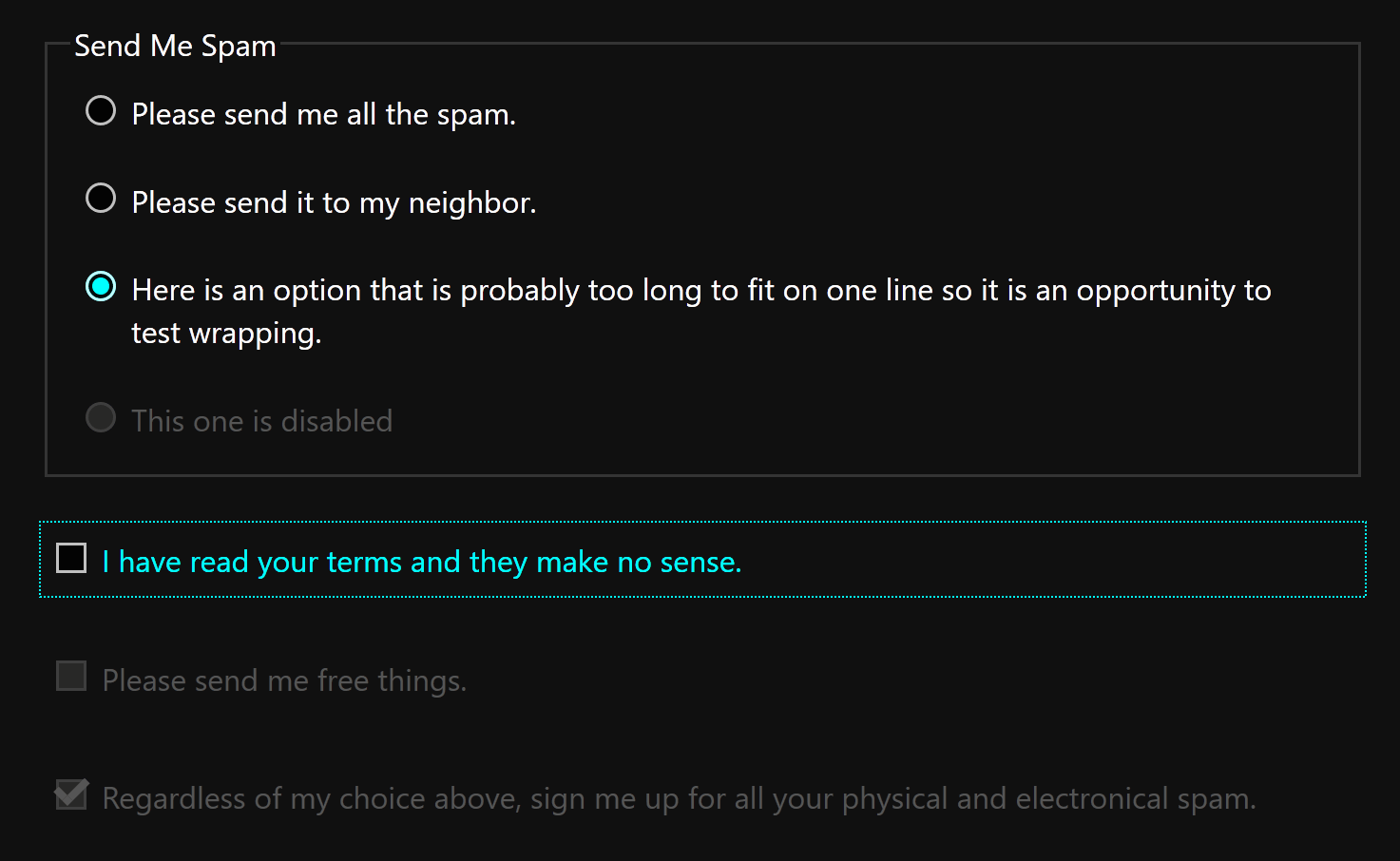
Sometimes people print forms as a record. Consider if you want to undo styles and revert to the native controls, if you want to make everything black and white (to maybe save users’ color ink), or if you want to preserve your controls as-is. I opted to keep them as-is.
@media print {
  input[type=radio] + label::before,
  input[type=radio] + label::after,
  input[type=radio]:disabled + label,
  input[type=checkbox] + label::before,
  input[type=checkbox] + label::after,
  input[type=checkbox]:disabled + label {
    -webkit-print-color-adjust: exact;
    color-adjust: exact;
  }
}
Windows High Contrast Mode
As I was reminded in a comment, I forgot to add styles for Windows High Contrast Mode (I have a post on WHCM for more information on the mode).
Changing the checkbox to work is easy — just change the border color:
@media screen and (-ms-high-contrast: active) {
  input[type=checkbox]:checked + label::after {
    border-right-color: windowText;
    border-bottom-color: windowText;
  }
The radio button is trickier since above I am using a box shadow to create the dot. As that will not work in WHCM (and -ms-high-contrast-adjust: none; does not do what I need), I re-create it as a pseudo-element using almost the same code as I initially used for the checkbox.
  input[type=radio] + label::after {
    display: block;
    content: '';
    position: absolute;
    top: 1.05em;
    left: .9em;
    width: .2em;
    height: .2em;
    border: none;
    border-radius: 50%;
    background-color: transparent;
    transition: all .1s ease-out;
  }
  input[type=radio]:checked + label::after {
    top: .85em;
    left: .7em;
    width: .6em;
    height: .6em;
    background-color: windowText;
  }
  *[dir="rtl"] input[type=radio] + label::after {
    left: auto;
    right: .9em;
  }
  *[dir="rtl"] input[type=radio]:checked + label::after {
    left: auto;
    right: .7em;
  }
And do not forget the disabled text:
  input[type=checkbox]:disabled + label, input[type=checkbox]:disabled:checked + label::after, input[type=radio]:disabled + label {
    color: grayText;
    cursor: not-allowed;
    border-right-color: grayText;
    border-bottom-color: grayText;
  }
}
I also have a screen shot:
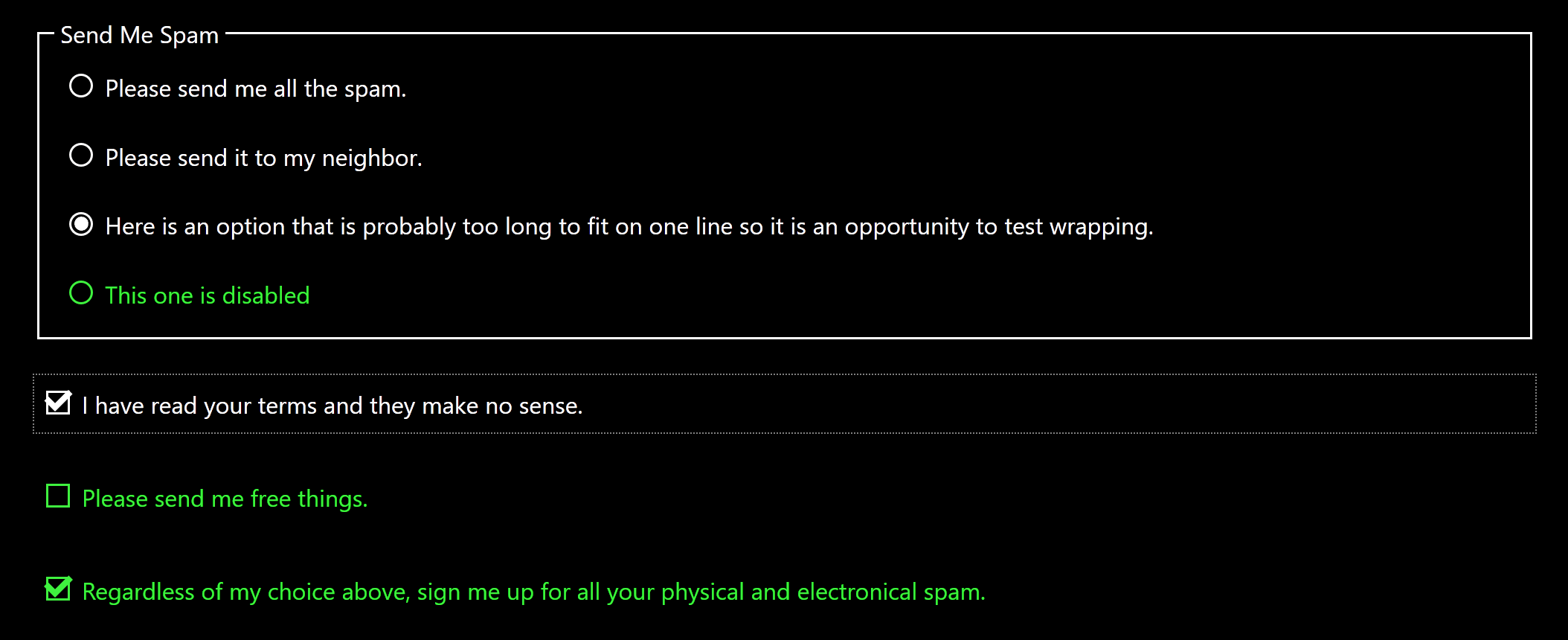
WHCM Update: January 19, 2020
The new Chromium-based Edge (ChromiEdge) does not honor WHCM quite the same as in legacy Edge nor Internet Explorer 11, for which I have filed issues, so you will need to test your styles now and when this gets sorted.
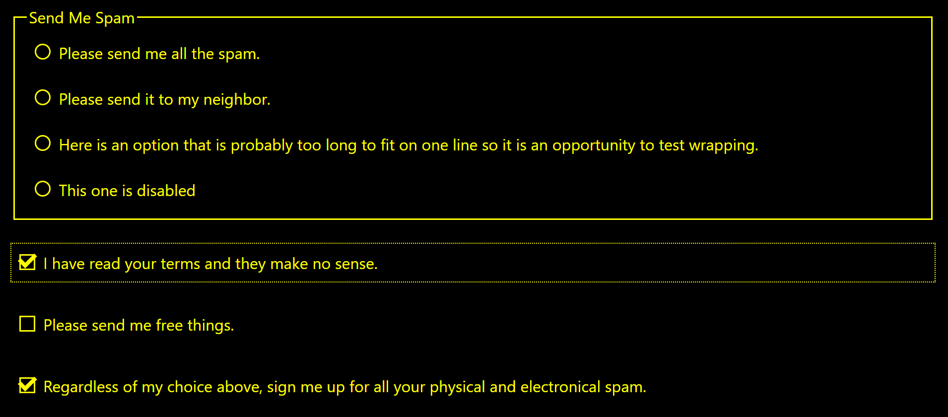
Variations
The colors I chose are arbitrary. You can obviously change them. You can also play around with the CSS generated content. For example, in this (less accessible) example (embedded below) I replaced the circle in the radio buttons with a peach (🍑), and checkmark in the checkbox with an aubergine (yep, I called 🍆 that).
See the Pen Emoji Buttons! by Adrian Roselli (@aardrian) on CodePen.
Please be aware how this impacts a screen reader. As I navigate through the form with the emoji using NVDA and Firefox, this is what I hear (and NVDA is correct to do it this way):
Peach please send me all the spam radio button checked one of two.
Clickable eggplant I have read your terms and they make no sense.
I kinda like putting screen reader output in <blockquote>s when it is talking nonsense that is my fault.
Update
There is always more than one way to skin a form. From the Twitters, here is a variation using SVG that is hidden from screen readers:
@aardrian @a11yhunt <label class="customCheckbox">
<input type="checkbox">
<svg aria-hidden="true"><use/><g/></svg>
MOAR SPAM??
</label>
Update: July 28, 2017
Heydon Pickering offered a similar but somewhat different version of this approach in 2014 in the article Replacing Radio Buttons Without Replacing Radio Buttons. I just discovered it today. Oops.
Update: February 13, 2019
If you are using your SVG images for the markers, check out Scott O’Hara’s post Quick Note on high contrast mode for potential gotchas that may apply if the controls are disabled.
 Update: March 25, 2019
I leaned on techniques I outlined above and made a new post to style the oft-incorrectly-used toggle: Under-Engineered Toggles
It includes considerations I did not account for here, such as reduced motion (was not necessary), supporting dark mode (did not exist), and left-to-right languages (oops). At the very least, you can take some of those details and apply them to this code.
Update: August 16, 2019
Jen Simmons has also created a CSS-only, JavaScript-free checkbox. Her approach relies on -webkit-appearance: none;, a pre-fixed / non-standard property which I do not use. Her example does not include disabled styles but you can grab CSS selectors from above and make your own. She also made radio buttons, though they have some layout issues in Chrome unrelated to the radio styles.
Update: June 24, 2020
Sara Soueidan has also created a CSS-only, JavaScript-free checkbox and radio button in her post Inclusively Hiding & Styling Checkboxes and Radio Buttons. She uses SVGs for the visual controls, and uses SVG animation to add some whimsy. She also accounts for Windows High Contrast Mode in the SVGs, which is ace. Otherwise the approach should look familiar if you have just read my post (similar but different).
Update: August 19, 2021
If the only reason you want to make a custom radio button or checkbox is to apply your brand color, then you may want to wait until CSS accent-color is supported by the browsers of your audience. Support is coming in Chromium 93 and Firefox 92.
So far it only works with checkboxes, radio buttons, range sliders, and progress bars. There is a write-up at CSS accent-color and a test page.
Update: March 24, 2022
Now that accent-color support is in all the major browsers, remember it only applies to a few elements, you are now on the hook for meeting WCAG contrast requirements, and in Firefox it becomes the default focus ring color if you do not otherwise have a custom focus style.
23 Comments
That’s refreshing! ;-)
For what it is worth, I prefer to not qualify the attribute selectors as it increases specificity for no good reason. In other words, I prefer to use
[type=checkbox]rather thaninput[type=checkbox].
In response to . A valid point, but in a larger collection of form element styles having the
inputin the selector has proven handy. Whatever selector specificity gets the job done works for me, so by all means if you can do it with a simpler selector then readers should give it a go.
white-space: nowrap; /* https://medium.com/@jessebeach/beware-smushed-off-screen-accessible-text-5952a4c2cbfe */
This is true for elements thats have content. Inputs are content-empty.
In response to . Note that in my explanation of the style I explain that this is my general accessible hiding style. As such, that declaration would be in there anyway. Consider it a bonus.
neat technique. but a label wrapping the form input is called an implicit label, not explicit. Explicit is when you link via for/id.
In response to . Per the WAI tutorials, you are correct:
Whenever possible, use the
labelelement to associate text with form elements explicitly. Theforattribute of the label must exactly match theidof the form control.Per the HTML5 spec, it is less clear:
The
formattribute is used to explicitly associate the
labelelement with its form owner.The following example shows three form controls each with a label, two of which have small text showing the right format for users to use.
<p><label>Full name: <input name=fn> <small>Format: First Last</small></label></p> <p><label>Age: <input name=age type=number min=0></label></p> <p><label>Post code: <input name=pc> <small>Format: AB12 3CD</small></label></p>In short, I need to do some more digging to figure out the discrepancy (which does not mean I am right, I may just be mis-reading it). My take above dates back to 2014.
In response to . The @for attribute links a form label element to a form control element (via ID). The @form attribute links a form control element (including LABEL) to a particular FORM element (again, via ID).
Backgrounds disappear in high contrast mode. Accessibility is more than blind people ;)
In response to . Ugh. And I know better. Conveniently, I can steal the media queries I need from this handy post and update this example. Will update here when I get to it.
In response to . Ramón, I have updated the code with a WHCM media query and appropriate styles.
Hmm – none of these examples actually update the ‘checked’ property on the radio button that you select. It always leaves the first radio button as the checked one, which means the correct data won’t be sent to the server. Am I safe to assume some javascript is required to update the checked status of the hidden inputs?
In response to . Scott, no JavaScript is needed. I have updated the pen with a
valuefor each radio button and addedmethod="get"so you can see the value come through in the query string if you submit the form in the debug view. As I navigate the radio buttons with a screen reader, it announces each as checked (when it is checked). Note that if you just inspect the nodes you will not see thecheckedattribute change between them.
Thank you for such well written write up on how to style radio buttons and checkboxes.
One minor quibble though, and I hope this is not perceived as being prudish, but the use of the Butt Sex emoji pairing to illustrate the use of emoji feels kind of puerile and detracts from overall tone and tenor of the post.
thanks again!
In response to . A fair criticism; probably why this post will never get coverage on the local news.
Great stuff Adrian!! Two things…Suggest “explicit” be changed to “implicit” as mentioned above. Also, for hiding controls visually via CSS, don’t need white-space rule since there’s no text.
I wonder if rather then having all the rtl css code, you could just leverage writing modes e.g. padding-left becomes padding-inline-start etc. I know it’s still somewhat early, but support is rapidly improving, google et al are behind it, and it seems to be the way moving forward to write direction agnostic css. I have a little framework I’m building which will likely be done in 2021 sometime and, since it’s browser targets are somewhat aggressive, I’ve opted to globally change all my padding / margin to use writing modes. The reason I think this is a win, is because when I look at your codepen, there’s a lot of lines of CSS to maintain—so being able to nuke the whole rtl section would be a win to my mind. But just a thought! Thanks for the thoughtful articles here ;-)
Also, I appreciate the updated links. I had already read the Sara Soueidan and I think it’s interesting that there’s guidance there to leverage opacity 0 and to not kill the touch haptics by using clip rect as done here. I’m curious if you have any reason to assert it is better and/or does not in fact hurt mobile touch discoverability?
In response to . Rob, this post pre-dates CSS logical properties though when support is better I plan to update this post again. That will address the writing modes / RTL styling you mention.
I use
clipbecause that overall block of styles has been tested and validated as a good baseline for hiding content visually while still keeping it accessible to screen readers. If I had usedopacitythen Windows High Contrast Mode users (at the time of writing) would still see the object I was trying to hide. Finally,clipdoes not impact touch here because the<label>is expanded to cover the area of the control and is the tappable target.
In response to . Thanks for the quick reply! So you mentioned a couple times (at the time of writing)…would you generally say today that Sara Soueidan’s assertion that you should use
opacity: 0instead of theclipapproach for touch haptics true or no? Fun topic—thanks for engaging Adrian.
In response to . Also, I should mention this is very “top of mind” for me. No obligation, but I have a pen I’ve been using which sort of merges Sara’s (hiding) and Heydon’s (use border and box-shadow to style) points of view:
https://codepen.io/roblevin/pen/PozQLGx?editors=1100
I’d be curious if you have any feedback on the core approach there? Feel free to be critical! I should mention, it matters a lot to me how many lines of code and how readable it is. If I’m honest, I really liked your approach, mostly, but did find there was a lot of CSS to pull it off. I’m empathetic that some of this was written a while back and also this is just my own opinion so don’t take personally :-)
Again, enjoying the dialogue and article a lot Adrian!
In response to . Both our approaches support explore by touch (what you are calling touch haptics). My approach can match hers by expanding the coverage area of the
<label>.I intentionally did not do so based on some limited testing with this pattern (and broader testing of explore by touch across projects). When text wraps, the dead/empty space under the checkbox surprised sighted users (screen reader and not) when it was part of the tap target. Blind users didn’t notice that the checkbox was not part of the tap target. Excluding it just worked better for my case.
As for Windows High Contrast Mode, this was written and updated before Legacy Edge went away, so WHCM will give different results in Chromium Edge today.
Take whichever approach works for your users.
I made a write up about a new approach to the very under engineered custom styled radio button that I came up with a while back.
https://dev.to/adbutterfield/custom-styling-radio-buttons-the-modern-way-the-butterfield-way-emk
In response to . Adam, not too different from Scott’s approach (the 2021 update at the start). Looking at your post, some cautions:
- I suggest using relative units versus
px(because you want form fields to scale with text);- I also suggest not relying solely on wrapped
<label>s (because there are still bugs).
In response to . Thanks for the feedback!!!
Leave a Comment or Response