Keyboard and Overflow
Imagine that as a user you regularly use the keyboard for non-data-entry tasks. Think about how frustrating it is to have to grab the mouse to hover over something on the screen just to see it. Now imagine that you are a keyboard-only user.
That problem can be addressed somewhat easily by just making sure you enable :focus (or its equivalent) for anything where you rely on :hover (or its equivalent) to display. Now imagine a feature that doesn’t use hover, but relies on a mouse, like a scrollable area of the page.
Steve Faulkner has demonstrated a simple technique to make scrollable regions accessible to keyboard users in his post Short note on improving usability of scrollable regions. Add tabindex="0" to the element.
As we might recall from my post on tabindex, adding the attribute with a value of 0 puts the element into the tab order of the page, meaning a keyboard user can access it. This also means a keyboard user can scroll up and down (and/or left/right) by first giving it focus.
What about Hidden Overflow?
Steve’s post came right about the same time I was looking at a data grid with a client that has a large chunk of content that is hidden on overflow which only displays on hover. No scroll. The client wanted to retain this.
There is an added wrinkle — because screen widths and the volume of content are variable, sometimes the cell can fit all the content and sometimes it cannot. I certainly don’t want to make a tab-stop for every cell as that can be annoying and slow.
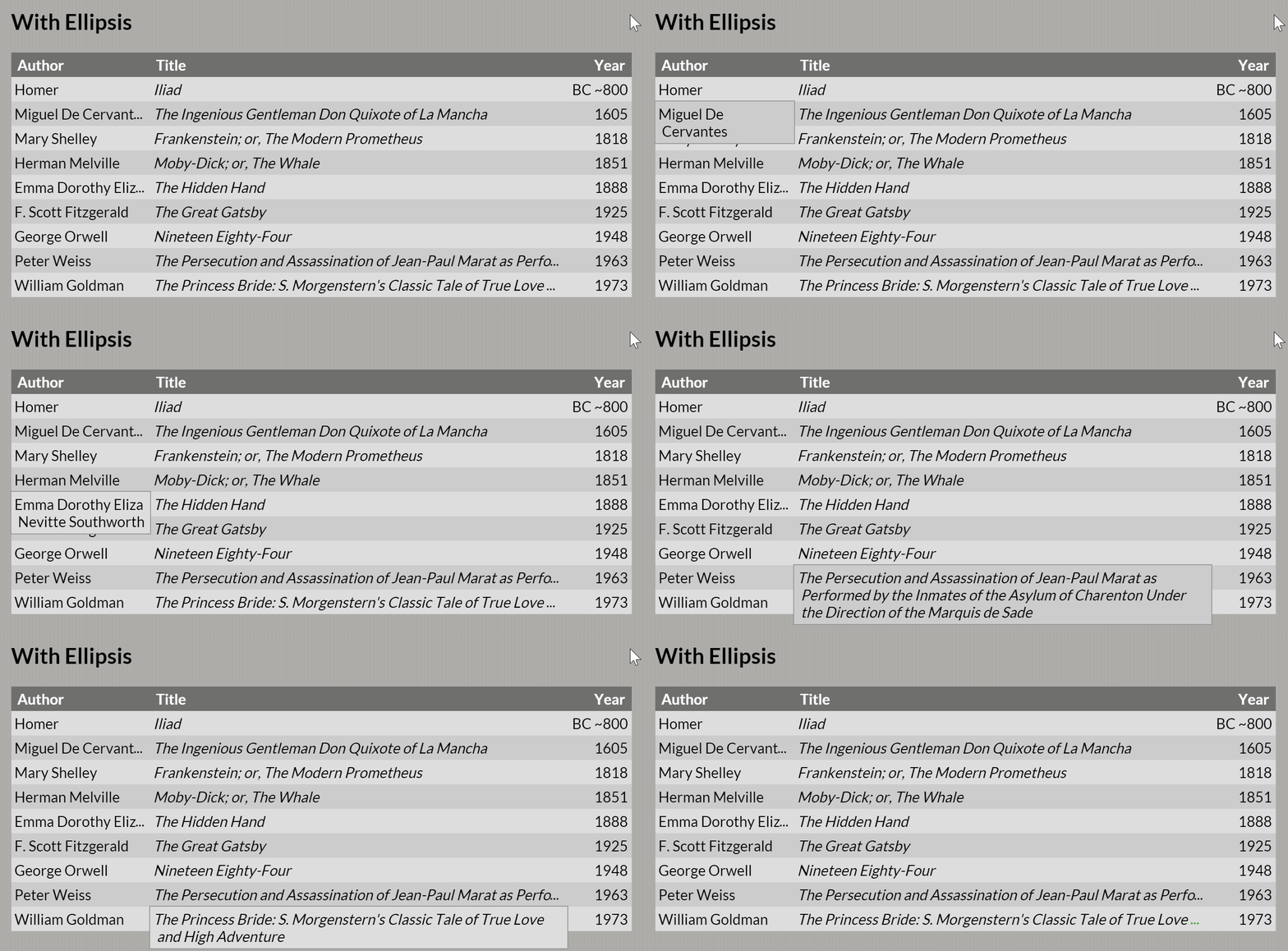
So I began to experiment with both overflow: hidden and text-overflow: ellipsis to hide content without a scrollbar. Then I worked up some (barely passable) script to find content that overflows (since this can be different for every piece of content and every viewport) and add tabindex="0".
What I found out pretty quickly is that <table> and overflow don’t work as well as I had hoped. Once I had stuffed a <div> into every <td> and leaned on vw units (block elements need a width to work with ellipsis, which doesn’t work so well in a liquid <table>), I had a mostly responsive table that worked with text-overflow: ellipsis.
Then I folded in my script and created some sample grids with content that will overflow at various viewport sizes. That experiment is embedded below, though you can also go to the full-page version so you can run through it more easily with a keyboard.
See the Pen Testing Overflow in Tables by Adrian Roselli (@aardrian) on CodePen.
Animated Examples
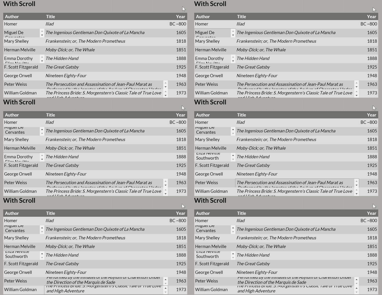
I’ve made some animated GIFs to show the effect (Chrome, Windows):


To-Do List
This demo is nowhere near done. This is not production-ready code.
The requirements with my client changed, so I shelved this a few weeks ago. However, I thought this might be a neat idea worth sharing. Perhaps someone sees something obvious that I missed. Perhaps someone has a better idea. Perhaps this is a wild goose chase. Feedback is (generally) good, but I cannot get any if I leave it sitting on my machine.
As such, I have a brief to-do list:
- See if there is a better way to detect overflow than measuring heights (ellipses don’t appear to be exposed in any way).
- More cross-browser testing.
- Perhaps only fire the function to add
tabindexif the user starts tabbing through the page. - Perhaps add
tabindexto every element, and only use client-side script to remove it from elements with no overflow, in an effort to honor progressive enhancement. - Update the functions so it will work as well with
overflow: scroll. - Make the function fire when the viewport is resized.
- Figure out how to control the ellipsis better so it doesn’t hide one character that it could otherwise fit without the ellipsis.
This Is a Hack
Some of this would not be necessary if the browsers properly exposed scrollable regions to the keyboard. As for non-scrolling hidden regions, well, that’s a slightly different take as it depends on whether the intent is to display it with any user interaction.
Regardless, Steve Faulkner has filed bugs with two browsers to address the lack of keyboard support of areas that scroll as a result of an overflow declaration.
- Microsoft: CSS overflow:auto does not allow scroll via keyboard
- Google: Issue 584618: CSS overflow:auto does not allow scroll via keyboard
Update: 10 November 2018
Google has stated its intent to ship the fix for Steve Faulkner’s bug report on scrolling areas. And it only took nearly three years.
Remember, Firefox has supported it for some time. Note that without a public bug tracker and lack of developer relations, I have no idea on Safari’s plans. The bug Steve filed against Edge is essentially 404.
Update: 9 June 2022
In my post Keyboard-Only Scrolling Areas, I explore other methods for a keyboard-only user to make scrolling areas scroll.
My recommendation at the end of that post is to continue to use the scrolling approach I outline above (not the hover). Chrome never shipped its fix for scrolling areas (well, it shipped and then rolled back the fix within a week) and Safari shows no plans.
Update: 6 July 2022
In The Ballad of Text Overflow, James Edwards points out myriad problems with text-overflow. He makes it clear that truncating text leads to WCAG violations (and I have even flagged it under 2.5.3 Label in Name when used on a button).
He suggests techniques beyond more robust layouts (or less restrictive designs), including word breaks and soft hyphens.
6 Comments
As for
text-overflow: ellipsis, the functionality from your demo should be provided by the browsers themselves, I think. If a part of the text cannot be displayed due to width limitations, that part should not be completely lost to the user, and the browser should provide a mechanism to access it. What do you think?
In response to . I think I agree. The browser should already provide a tab-stop for
overflow: auto, as the bugs Steve has filed suggest, so I thinktext-overflow: ellipsisshould be included. Though it occurs to me that perhaps that should be an explicit request as it might not occur to the browser engineers.
[…] Keyboard and Overflow – Adrian Roselli – https://adrianroselli.com/2016/02/keyboard-and-overflow.html […]
Well, here we are at the beginning of 2021 and this still doesn’t work properly in Chrome 88.
In response to . Bruce, do you mean something in my demo does not work, or are you referencing the fact that Issue 584618: CSS overflow:auto does not allow scroll via keyboard is still open 5 years later?
In response to . Ha, sorry about the confusion, the latter. Was just testing this again with Chrome and they still haven’t fixed it. Maybe they need another 5 years?
Leave a Comment or Response