Screen Shots of Win8/IE10 Media Query Values
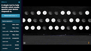
There is a nifty tool at MQtest.io which gives you a breakdown of how your device reports features you might use for media queries. To use the tool’s own explanation:
This test isn’t about what media queries your device can or cannot see (but it does show an ‘unsupported’ label if a device doesn‘t support something). Instead it shows you which dimensions your device will respond to when using ‘width=device-width,initial-scale=1.’
As one of the seemingly few owners of a Windows 8 tablet (specifically the Asus Vivo), I sometimes get asked to check sites to make sure that a developer’s media queries work properly. It was testing my own site that led me to discover the prefixed styles that IE10 needs in Metro view (which lead to my surprisingly popular post, IE10, Metro, and Media Queries).
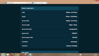
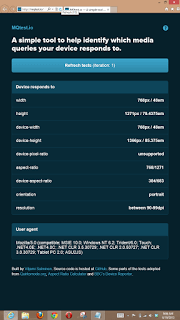
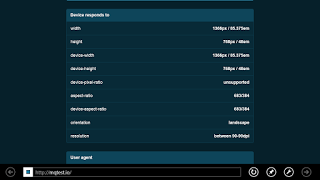
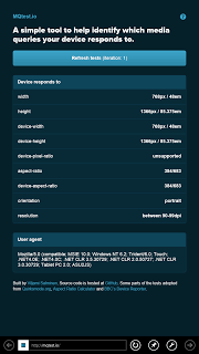
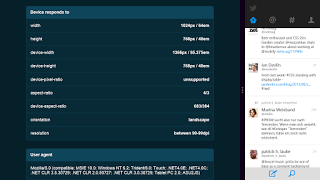
Armed with the features that MQtest.io can help identify along with a Win8 tablet, I figured perhaps others without a Win8 tablet could benefit from some screen shots showing the MQTest.io results in various configurations of Internet Explorer 10. Please bear in mind that the numbers are for my device, and probably will not match those you would get from a Microsoft Surface or another Win8 device. At the very least, however, these will show you what tests will run in Win8/IE10 and the types of values you can expect to see.
Leave a Comment or Response