Under-Engineered Patterns for #WCBUF

The slides for my talk are available as a

The slides for my talk are available as a

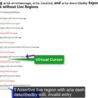
This post is about exposing field errors programmatically. I have already shared some opinions (such as a caution about displaying messages below fields or avoiding default browser field validation), but this post dives into using ARIA to convey them to screen reader users. With fields that produce error messages on…

Using ARIA instead of HTML is generally fine for content, layout, structure, and other static bits of a page. A <div role=”heading” aria-level=”1″> is the same as <h1> as far users and accessibility APIs are concerned. It is unlikely a user will ever notice the difference unless you use both…

Spanned table headers are not well supported across screen readers. While you can visually style these all sorts of ways to make the spanning clear, I am focusing on the programmatic outcomes. Which essentially means how they are exposed to screen reader users. This post uses only HTML <table>s. It…

There is a non-zero chance that WCAG Success Criterion 4.1.1 Parsing will go away in WCAG 2.2. This isn’t a problem for users, regardless of the problems it may pose for the WCAG process, ACT rules, automated testing tools, or ossified testing processes. The joke here is using an antique…

3 January 2025: This post is out of date. Read my post Updated Brief Note on Description List Support for the most recent results of testing. TL;DR: Description list support is generally good (with Safari being the outlier), even if you may not like how it is supported. This post…

It’s a dice advent calendar. I have no idea how five Platonic Solids and some D10s will carry for 24 days, but I am going to find out. Web developers around the world have for years given a nod to Saturnalia solstice Isaac Newton’s birthday Yule wassailing mummering end of…

The slides for my talk are available as a

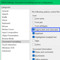
Thanks to a conversation on the A11y Slack, I ran desktop browsers and screen readers through a test to see how they announce content marked up as superscript and subscript. I spun up an old demo from mid-2018 for a quick test: See the Pen HTML Buddies: sub & sup…

I need your help. Legal documents are common on the web. Each site that has a Terms of Service written in impenetrable and indecipherable legalese, like this sentence, delights in that complexity to dissuade users from reading it and realizing just what they are giving up. “Am”, “add”, and “it”…

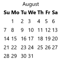
If you build calendars on the web and abbreviate the days in the column headings (you do use column headings, yeah?), this is how it sounds to a JAWS user. Sorry, your browser doesn’t support embedded videos, but don’t worry, you can download it. The caption file is also available…

For years developers have been confused about, fought over, ignored advice on, and generally mis-treated headings. It has bordered on irrational. But let’s look at some actual irrational headings. <hφ> <hφ> corresponds to a heading at roughly level 1.618033988749…. This represents the Golden Ratio and is handy for identifying a…