In February the GitHub blog announced users would be able to Include diagrams in your Markdown files with Mermaid. I thought this was nifty, and even noticed on an initial scan that they considered screen reader users. Until I read this (since deleted): …clients requesting content with embedded Mermaid in…
Photo courtesy Steve Faulkner, taken outside the CSUNATC 2022 venue after we had chicken and rice, free from the food desert of the venue. Who has two thumbs and is not a lawyer? For years I have worked with clients who refer to digital/web accessibility as ADA work. They have…
Disclaimer: This post and the headline is my opinion. I provide verifiable facts throughout to inform that opinion. I am also not a lawyer and this post does not constitute legal advice. FACIL’iti is one of many vendors that claims its accessibility overlay product can make your site “accessible”. Like…
The name of this page is a play on the CSS-Tricks name. My site generally is full of accessibility “tricks”, but this page specifically collects a few other places where I have left accessibility tricks behind. CSS-Tricks Following are links to posts at CSS-Tricks where I (mostly) left comments. Some…
Following is the live stream of the talk from YouTube. Owing to Fat Tuesday, I stepped away from a feast of gumbo, jambalaya, red beans & rice, and etouffee to give this talk (and went back for king cake immediately after). Which explains the beads. Which, it turns out, were…
The required set of radio buttons. The white whale to many a developer who is trying their darnedest to ensure they are conveyed accessibly while not also making it sound like every individual radio button must be toggled. 1961 Cadillac Wonderbar dashboard radio by Nicholas Lucien (cropped). CC BY 2.0.…
Data tables need column headers. Monolitten, a granite column of humans (each with a head) at Vigelandsanlegget, a sculpture park in Frognerparken in Oslo, Norway. What they probably do not need is a new set of column headers every few rows, particularly not when they change the meaning of the…
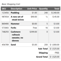
The online holiday shopping coupled with my need to make a new invoice template got me looking at a common table structure that is harder to expose to screen readers than it seems at first glance. One I first coded in, checks watch, 1997 when I was an ecommerce developer…
Google has an extensive history of releasing products and tools that fail basic accessibility. This is not a function of individuals — Google has some very talented and capable accessibility practitioners. Instead, this is an organizational failure. Failure to require accessibility in its products or services. Failure to support teams…
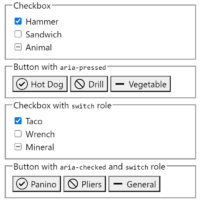
Others in this sorta-series: Under-Engineered Custom Radio Buttons and Checkboxen Under-Engineered Toggles Under-Engineered Toggles Too Under-Engineered Text Boxen Under-Engineered Select Menus A common interface pattern allows users to choose one item from a pre-defined set of choices, while still allowing them to add a custom selection if nothing else fits.…
A collection of images, videos, tweets, articles, and links referenced in my talk for Web Directions AAA 2021. This may not make much sense if you did not attend the talk. Or even if you did. Intro I had the title before I had the content. I tried to shoehorn…
Whether you use a <button> or <input type=”checkbox”> as the basis for your switch depends on a few factors: Use <button> if: you can count on JavaScript being available, and flipping the switch has an immediate effect. Go read Under-Engineered Toggles Too. Use <input type=”checkbox”> if: you want to progressively…