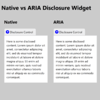
A disclosure widget is a simple control whose sole purpose is to hide or show stuff. Native HTML has one built in via the <details> and <summary> elements. Until recently, if you wanted to use it in modern browsers you needed to use a polyfill. In most cases it was…
HTML has all sorts of built-in features that, when used correctly, are accessible, will localize, and which just work. For example, if I want a button, I use <button>, and a screen reader will announce it as button. For users in other languages, they will hear whatever is their word…
When an organization receives an accessibility complaint about its web site, a common defense is that there are physical places available for a customer / constituent / user to complete transactions. With a brick-and-mortar available, the web site is simply an added service and so is exempted from Title III…
The moment you change it. As soon as you start to tweak the underlying code or aspects of the design, you run the risk of introducing bugs. That part should be easy for any developer to understand. The tougher part to get your arms around is that once you add…
Please do not use this post as an excuse to beat up the devs at Apple or Google. If you are doing that, you have missed the point of this post and you are being unnecessarily mean to individuals who may have no control over broader organizational decisions. Do not…
The good:Chrome 80 rolled out on 19 February 2020, and with it came a pile of fixes for how elements with CSS display properties have their semantics exposed in the accessibility tree. These huge accessibility bug fixes featured prominently in my CSUN talk this year (starting at slide 36). The…
While originally I was scheduled to attend CSUN to present two talks one talk, I ended up not attending (my father won A Major Award so I joined him instead). I gave my talk remotely in my scheduled slot (during my father’s award dinner). While I would have loved to…
TL;DR: Stop using the word drop-down. Instead choose a term that accurately describes the control you want. I have worked both with native platform developers and web developers. While control names might differ, if a control was functionally the same then it was not an issue. A TextBox, for example,…
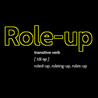
transitive verb [ ‘rōl əp ] roled-up, roleing-up, roles-up Definition of role-up To use an ARIA role on an HTML element to change its semantics and/or force it to accept an accessible name (via aria-label, aria-labelledby, or even aria-describedby). To add ARIA roles everywhere without understanding, often via framework or…
Whether you call them cards, block links, or some other thing, the construct of making an area of content clickable (tappable, Enter-key-able, voice-activatable, etc.) is not new. While hit area size is mostly a usability issue, marketers often want a larger click area around their calls to action (CTAs) to…
TL;DR: Regardless of what accessibility conformance level you target, do not arbitrarily open links in a new window or tab. If you are required to do so anyway, inform users in visible text. Overview Throughout this post I am going to use the terms browser window and tab interchangeably. While…
In current user interface terms a toast is a message that appears on the screen; it is often short, often appears only briefly, and often animates up from the bottom (like a piece of ghostly yet precisely-crafted toast), though other directions and a fade-in/-out is common. The Name When Google…