Don’t Use Web•dev for Accessibility Info
Web.dev is a site from Google Chrome developer relations that provides content both to evangelize Chrome and to more broadly support the web platform. Rachel Andrew’s monthly “new to the platform” posts are effectively required reading to try to stay abreast of the browser support landscape.
However, the accessibility content in many of Web.dev’s articles and posts is problematic.
My experience is a function of either stumbling across posts on my own or developers treating accessibility guidance in one of its articles as gospel — even when it is demonstrably wrong or harmful.
Examples
Generally the content is not written by digital accessibility experts, so there are bound to be errors; we all make mistakes. This excludes the dedicated accessibility training material, which I have not reviewed.
I have corrected some articles as free labor:
- Note on WCAG risk for fluid type #4080
- Fixed ARIA ref #8653
- Fixed the demo 404 #8958
- Fixing accNames #117 (the author’s personal repo for a demo used in the Web.dev site)
I had made a video for that last one
Here is an issue (not pull request or edit) with a good interaction and outcome:
These were examples where I was happy to donate my time because the impact on users of potentially incorrect information warranted it. But then I filed an issue on a post for an …accessible tooltip custom element
that encoded WCAG violations — barriers for users and legal risk for developers:
The author participated briefly, but never addressed the problems. When the issue moved to a new issue tracker, nobody from Web.dev participated any further and the original incorrect article has persisted since October 2022:
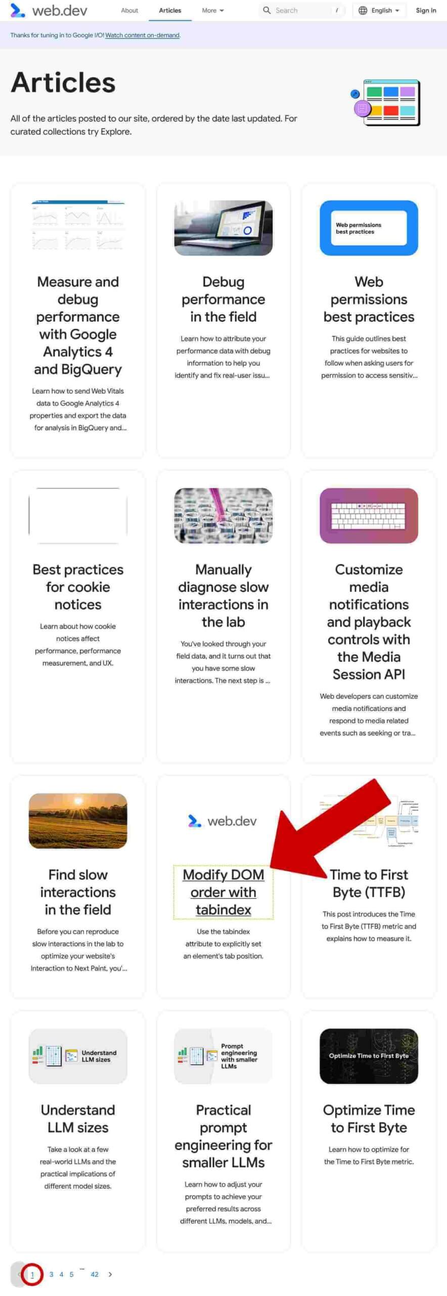
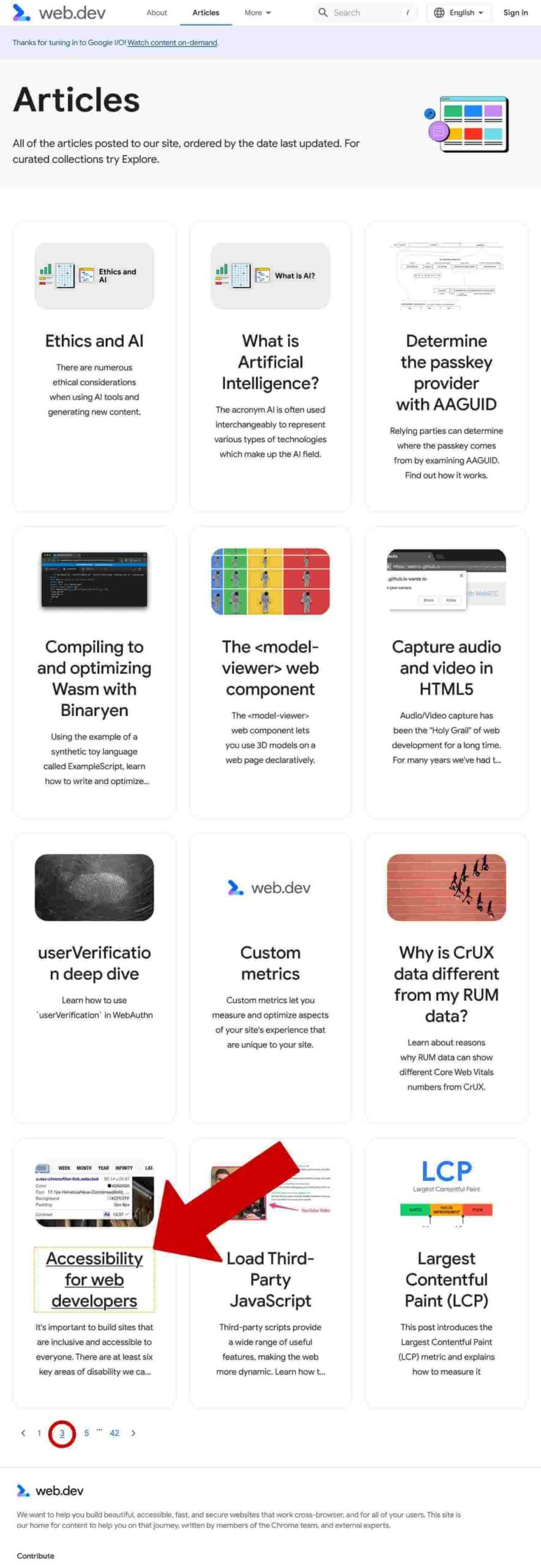
Most recently a dev directed me to two articles that provided poor guidance on tabindex. This dev was using the articles to justify creating a WCAG-failing pattern, so I filed two issues:
In each of those eight cases I encourage you to read the issue, the interaction, the timeline, and the resolution (if any) and decide if you think the issues and outcomes were adequate.
Please note that these are the cases where I took the time to file issues. I have had many more cases over the past few years that I did not track but where I counseled someone to ignore a Web.dev article at least in part.
Other Factors
When I visit a web site I tend to look for signals for whether I can trust it. I was informed one of those tabindex articles was from 2016 and had been updated since then, hence the four authors. I realized there was no way for a casual reader to know that.
Factors on Web.dev that lead to my general wariness:
- No articles have publication dates.
- Articles contain a single “Updated” date at the end, with no indication how many times it was updated.
- It appears the “Updated” date at the end could also be the publish date if no updates have been made.
- There is no indication in any updated articles precisely what changed or why.
- The “Updated” date may not reflect an update (13 July example with a 3 July edit but an update date of 1 July).
- The URLs for articles do not include dates of any kind.
- The meta data for the post includes no original publication date, so I cannot even query it.
- Articles are sorted in the index by their update date, not their publication date.
This means that you can click the top-most article in the index and not know when it was actually published, if it has been updated, how many times it has been updated, and what was updated.


If you copy code which results in all sorts of breakage, then later go back to the article to confirm it and find the code is now different, you will only know because you looked for it. The update date can at least confirm something changed, but then you have to run a diff to find what changed.
What about when you share it with a client or vendor or co-worker? How will you know the thing you wanted them to read is the same?
This assumes a fix to an article is not lost at some future date, too.
These factors trigger revisionist history alerts in my brain. At no point can you as a casual reader know something changed. Even when I knew a change was coming, I had to keep the original page open so I could compare it with the update to know how it changed.
This is a terrible way to build trust in your content.
As a truly solo writer (yes, that’s a callback if you read the tool-tips issue), I have learned that including the original publication date, the most recent update date, and date-stamping all my updates helps ensure I am not mismanaging expectations or retconning my posts (the date in the URL contributes as well). I try to be honest about when I get my posts wrong and have to clean them up, along with how and why.
The Site Itself

In January 2023 I wrote Comparing Manual and Free Automated WCAG Reviews. I wanted to use a site with a rich collection of WCAG failures, both familiar and novel, and the Web.dev home page fit the bill.
On the Web.dev home page I found 18 WCAG violations across 37 unique issues (from 180 distinct instances), though only 2 were critical. Nearly any automated tool would have picked up a handful of these.
I even used the Web.dev home page to educate a WCAG tester on how to evaluate how trustworthy a reference site might be, which I shared on Twitter.
Beyond that now-ancient home page, WCAG risks are easy to find.
Within individual articles, links are still differentiated by color alone (a technical WCAG pass but knowingly problematic for users).
After being greeted repeatedly by auto-playing videos with no way to stop them (though the authors have fixed them when I asked), I made a bookmarklet to restore controls to videos specifically for this site.
Readers have filed other accessibility bugs, such as horizontal scroll, text contrast, auto-playing videos (Chrome dev blog too), broken skip link, contrast of controls, and focus order.
Those are the readers who got past the disability-wall the new bug tracker throws in front of first-time bug reporters.

It doesn’t comfort me as someone filing bugs that many of these existing bug reports collect spam.
Wrap
Posting this means some people there will take it personally. That sucks and I feel for them. But I have chosen to share this because I believe content that suggests other devs encode barriers in their projects (leaving disabled users stranded) is a far worse outcome than maybe hurting some feelings. I want Web.dev as a whole to learn, its authors to be able to advocate for more support from the mother ship of Google, and never again feel they are a solo author
.
Please do not use this post as an excuse to beat up anyone at Google. If you are doing that, you have missed the point of this post and you are being unnecessarily mean to individuals who may have no control over broader organizational decisions. Do not be that guy / person / jerk. This is an organizational failure.
There are genuinely good people doing important work. I reference some of the content on the regular because of the good work of those people, but I still caveat it so nobody considers it an endorsement of any other content. I hate that. I don’t want to do that.
Related
- Listen To Me And Not Google by Heydon Pickering, January 2020.
- I Don’t Care What Google or Apple or Whoever Did by me, March 2020, and not restricted to Google.
- More Google and Afterthought Accessibility by me, January 2022
- My Request to Google on Accessibility, by me, May 2025
Update: 24 July 2024
Stéphane Deschamps discovered that the browser support list for features promoted on Web.dev doesn’t actually provide the browser name anywhere. Pat confirmed it relies on CSS generated content of a background SVG. So filed The browser support list on web.dev does not include browser name. I recommended they use an <img> with good alt text.
Update: 4 September 2024
Thomas Steiner fixed the issue Stéphane identified, though he had to deal with me a lot (which, you know, ugh for that guy but also yay for Google getting more free labor from me). So kudos to a good fix and responsiveness from Google.
On the other hand, that inaccessible tool-tip post by that solo writer I mentioned is not only still unaddressed, but that solo writer has decided to use draft standards to build a series of Chrome-only (and I quote) accessible
popovers (which he calls overlays). I’m disappointed his effort went into these instead of fixing the long-broken one, so I left a comment on one of the videos. I am imperfect; I get that.
The comment…
Unsurprisingly as of 7 September the comment has not been approved, or was approved and hidden, or however they do it so nobody sees it but the count of comments still goes up.
I appreciate this showcases features coming to the web platform, but that means it won’t be viable for most organizations for a while.
In the meantime, can you take some of the effort you are putting into promoting this video and fix the existing tool-tip guidance you wrote two years ago? It still encodes WCAG failures (legal risk for those who use it and barriers for users) even after detailed feedback.
Ref: https://issuetracker.google.com/u/l/issues/298296173
Assume This Applies to Developer.Chrome.com
Over at the Chrome developer site, Scroll Snap Events demonstrates that the same technology, processes, and people that created all the issues I outlined above are just as active there.
I have always argued that Google’s refusal to underline links in runs of text is a problem. But when it does it for special cases, it still finds a way to make them do weird stuff, like dance, or mildly clip preceding text, or otherwise making them visually ineffectual. The posts still seem to rely on autoplaying looping videos with the video player controls removed, regardless of all the motion and flashing and WCAG violating. But the author(s) still promote standards-track yet Chrome-specific features that don’t work with a keyboard and lie to a screen reader. Even when you strip away all the custom code, the underlying pattern is a voice control nightmare and unintentional self-parody of the phone number UI meme.
Don’t use Developer.Chrome.com for accessibility info.
CSS Carousels
I had been raising concerns about the pattern Carousels with CSS for some time, but Sara took the time to ask Are ‘CSS Carousels’ accessible?. The answer, as with most patterns pushed by this team in the last few years, was a resounding no.
Don’t use Developer.Chrome.com for patterns, and definitely not for its posts trying to shoehorn Google patterns into the CSS specification.
5 Comments
I’m really glad to see you raised the point on publication dates and change history. Many articles and blog posts no longer seem to provide this information. Of course on a personal blog authors can do as they please. But if they are providing information that might be referenced in some way, a fixed publication date is really important, since information can date very quickly.
The fact that the web.dev site itself has questionable semantics under the hood and a DOM outline with an inconsistent/incomplete hierarchy was the first red flag for me who is no means an expert in these things. Thank you for enumerating the other issues, I’ll be sharing this with my team!
Thank you for posting this, they offer a web accessibility course that I was considering and am now going to examine closer before recommending to other staff. We reference examples from component/pattern libraries and organizational knowledge repositories in our accessibility remediation often, and this shows its namesake lends it more credibility than it should. I am always on the lookout for accessible development libraries!
In response to . Rae, one note I made above about the accessibility course:
This excludes the dedicated accessibility training material, which I have not reviewed.The person who worked on it as an accessibility practitioner, versus the other content where someone claims the knowledge they clearly don’t have.
Hmm, on the related ‘training course’ as part of the site. I audited the course, it is free, online, easily found (sort of) and it’s content is OK for what it is.
There is more benefit in starting an accessibility learning path on-it compared to not learning ‘anything’. Perfect being the enemy of good.
Is it ‘webring’ in its build qualities, maybe not.
It did lose Chrome GMail account based login every few minutes across a few modules. A feature? A surprising pain.
The help-desk did update items I wrote to them on, comments referring to 2.1 instead of 2.2 etc., so great that they weren’t in a bubble of denial too.
WAI and Alphabet are not 2.2 adherent, I’m not sure that Lighthouse is either. WAI is a ‘do as I say’ thing isn’t it, but not every corporation does.
Thanks for the article Adrian.
Leave a Comment or Response