Disability:IN 2024 Agenda Bookmarklet
I had some issues using the Disability:IN 2024 Conference Agenda so I made a bookmarklet:
You may have seen this originally posted as a CodePen, but I opted to move it here since I can embed videos showing a before-and-after experience.
Fixes
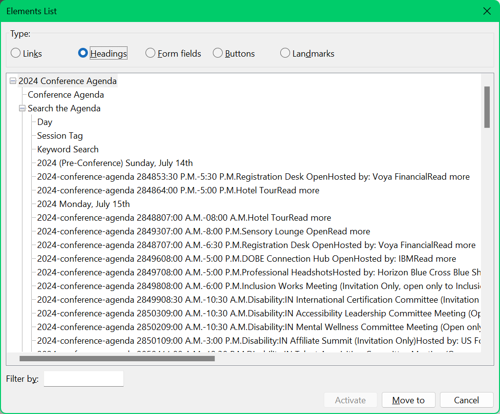
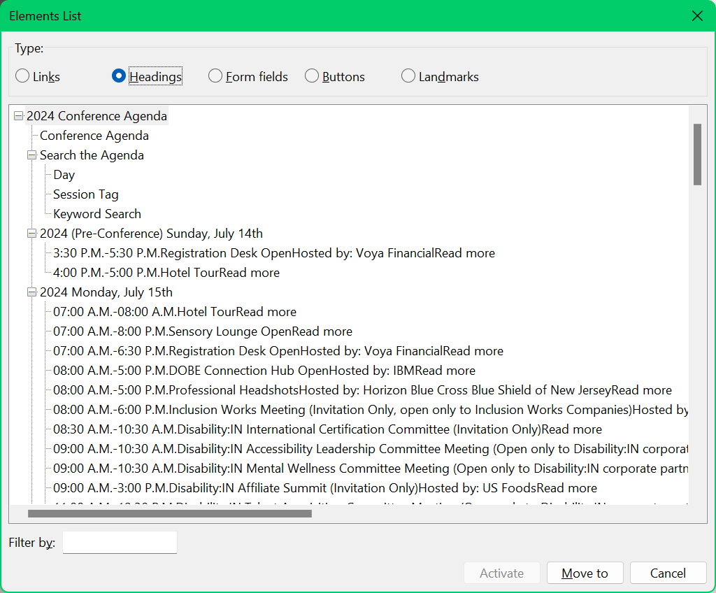
Removes empty trigger link before each session, which cuts tab-stops in half and undoes a 4.1.2 violation for a disclosure trigger with no accName.See 27 June update.Makes the sticky header unsticky, reducing some hassle for my zoomed viewport with panels open (and mitigating a 2.4.11 Focus Obscured risk).See 27 June update.- Loosens up the leading a tiny bit in the session names / headings and adds a bit of space above each.
- Because each session has an
idand I want to link to specific sessions, I added a:targetstyle to make it more obvious which one I linked. The page uses some scroll-linked animations, so this will be hit-and/or-miss. - For those who also link to session anchors, I add the
idvalue above each session. Sadly, it is not selectable since it uses CSS generated content. I opted not to add links since this page is a tab-stop forest. Converts all the date headings fromSee 27 June update.<h3>to<h2>for a more reasonable heading structure (and easier navigation for SR users, though not necessarily a 1.3.1 risk).
The disclosure triggers as links bother me, but probably not worth converting to buttons. While that would make it more appealing to then add anchor links, keyboard users would be back up to too many tab-stops even if screen reader users could navigate by buttons alone.
Code
Script to change date <h3>s to <h2>:
const h3 = document.querySelectorAll(".sticky>h3");
h3.forEach(h => {
	const h2 = document.createElement("h2");
	h2.innerHTML = h.innerText;
	h.replaceWith(h2)
})
These are the style changes it makes:
/* Removes unnamed tab-stop / redundant disclosure trigger */
h3 > a {
	display: none !important;
}

/* Style an anchor when it has been navigated */
@keyframes Target {
	from { outline-offset: -.25em; outline-color: #00f; outline-width: .1em; }
	to { outline-offset: 2em; outline-color: transparent; outline-width: 1em; }
}
:target {
	outline-width: .2em;
	outline-style: solid;
	outline-color: #00f;
}
@media screen and (prefers-reduced-motion: no-preference) {
	:target {
		outline-width: 0;
		animation: Target 1s ease-out 3;
	}
}

/* Get the sticky header out of the way */
.fusion-is-sticky .fusion-header-v1 .fusion-header {
	position: unset;
}

/* Make an anchor option visible, but sadly not copyable */
div[id^=panel].fusion-panel.panel-default::before {
	content: '#' attr(id);
	display: inline-block;
	margin-top: 2em;
}

/* Loosen up the leading for easier reading */
a[aria-expanded] {
	line-height: 1.25 !important;;
}
Before & After
I made videos showing how I was using the site with a screen reader and with my keyboard both before and after the bookmarklet is applied.


CodePen
See the Pen Disability:IN Agenda Bookmarklet by Adrian Roselli (@aardrian) on CodePen.
Update: 27 June 2024
I posted an abbreviated version of this to LinkedIn. Today, Disability:IN’s Chief Accessibility Officer shared this:
It’s no secret that #Accessibility is a constant journey of learning, growing, and evolving.
Today, I wanted to take a moment to highlight and thank Adrian Roselli for helping improve Disability:IN’s Global Conference agenda page through his innovative bookmarklet. With his help, we have addressed navigation and usability issues on the page, improving the heading structure and making anchor-linked sessions more visible, which enhances the navigation experience – especially for screen reader users.
As Chief Accessibility Officer at Disability:IN, I love learning how we can continue improving digital spaces and help empower all users to engage fully and meaningfully with content online. By sharing our ideas and expertise, we can continue building disability-inclusive environments that are #Accessible to everyone. #GAAD365
As he notes, the headings were adjusted to match what my bookmarklet does, the unlabeled links are now hidden, the navigation is no longer sticky.
Use my bookmarklet if you want the target style, the leading adjustment, and the visible text of the session anchor (for sharing the URL for a specific session). The bookmarklet still addresses those.
Since I made the bookmarklet, I was asked about fixing the search. Since I did not use the search, I did not realize none of the fields has an accessible name (4.1.2) and the reset link is effectively invisible when focused. I may take a stab at that later.
Also, Jennifer Strickland did a nice job of politely pointing out that for once I wasn’t a jerk.
Update: 28 June 2024
I removed the code that addresses the parts Disability:IN fixed (yay!) and added new code to (by request):
- give the search fields accessible names (4.1.2),
- restore focus outlines (2.4.7), and
- address the reset link contrast when focused (1.4.3).
As before, drag this into your bookmarks:
Script to copy the form <h4> text into a <span> that I put into the existing <label>:
const h4 = document.querySelectorAll("form.searchandfilter h4");
h4.forEach(h => {
	const s = document.createElement("span");
	s.innerHTML = h.textContent;
	var l = h.nextSibling.nextSibling;
	l.prepend(s);
})
Style changes it makes to the page:
/* RETAINED: Style an anchor when it has been navigated */
@keyframes Target {
	from { outline-offset: -.25em; outline-color: #00f; outline-width: .1em; }
	to { outline-offset: 2em; outline-color: transparent; outline-width: 1em; }
}
:target {
	outline-width: .2em;
	outline-style: solid;
	outline-color: #00f;
}
@media screen and (prefers-reduced-motion: no-preference) {
	:target {
		outline-width: 0;
		animation: Target 1s ease-out 3;
	}
}

/* RETAINED: Make an anchor option visible, but sadly not copyable */
div[id^=panel].fusion-panel.panel-default::before {
	content: '#' attr(id);
	display: inline-block;
	margin-top: 2em;
}

/* RETAINED: Loosen up the leading for easier reading */
a[aria-expanded] {
	line-height: 1.25 !important;;
}

/* NEW: Hides the search h4s */
form.searchandfilter h4 {
	display: none;
}

/* NEW: Makes the new labels white and fit */
form.searchandfilter label span, form.searchandfilter a:focus {
	color: white !important;
	display:block;
}

/* NEW: Restores focus outlines that the site's CSS reset removes */
form.searchandfilter select:focus, form.searchandfilter input:focus, form.searchandfilter a:focus {
	outline: auto;
}
You can replace the existing bookmarklet since I retained the anchor text, leading, and target styles in this one.
Update: 2 July 2024: App
The Disability:IN conference has a dedicated app, Whova, where one of its listed features is to Gain accessibility resources.
There is a caveat, as listed in the email announcing it:
While generally accessible, the Whova app has areas with unlabeled buttons that cause issues for screen readers. Please download our Whova Accessibility Tips document to help you navigate through those areas.
I had some trouble downloading the document and I know at least one person had it blocked at their corporate firewall (because Microsoft Word documents downloaded off the web can be malware vectors). Given how getting access to accessibility resource info may be critical for some, I’ve converted it to HTML and stuffed it in this disclosure widget.
Whova Accessibility
Agenda Tab
The days of the conference are not listed as buttons. However, using the single finger double tap gesture on the day you want to select will change the agenda to that day’s sessions.
All time slots can be accessed by their headings. Swipe right to hear details for each breakout session under that time slot.
Beneath each session are four unlabeled buttons:
- The first button initially will say, Agenda: Gray. This means the session has not been added to your personal agenda. using the single finger double tap gesture, you can add the session to your personal agenda. Once selected the button will say, Agenda: Blue indicating it has been added to your personal agenda.
- The second unlabeled button initially will say Dim button. This is the number of attendees indicator. This button will keep a tally of the number of attendees for this session.
- The third unlabeled button initially will say Dim button. By using the single finger double tap gesture, it will open the session details. Here you can click on the Like button to Like this session. This button will keep a tally of the number of Likes for this session.
- The fourth unlabeled button will say Dim button. By using the single finger double tap gesture, it will open the session details. Here you can click on the Chat Button to start a chat for this session.
When you click the “Go back” button at the top left of the screen the focus is placed at the top of the agenda screen. Use the headings navigation to navigate back to the time slot headings.
Attendees Tab
To view the details for an attendee, use the single finger double tap gesture on the attendees, name.
There are four unlabeled buttons under the attendees, name.
Swipe right past the four unlabeled, buttons to get to four actionable headings that are labeled that do the same thing as the unlabeled buttons.
The actionable headings are labeled as follows:
- Bookmark: using the single finger double tap gesture you can bookmark this contact.
- Say Hi: using the single finger double tap gesture you can send this attendee a message.
- Message: using the single finger double tap gesture you can see the list of messages and send additional messages to this attendee and create a group message if desired.
- Let’s Meet: using the single finger double tap gesture you can send a meeting request to this attendee.
3 Comments
Taking the heading text and assigning it as innerHTML in the new heading element opens the door to XSS. You should either work only with text or only with HTML, but not mixing the 2 (especially not in this direction)
In response to . Christophe, I am open to suggestions for a change! I was sloppy because I would like to think the user is running it on one page on one site only over the course of the next month.
In response to . Without having access to the PHP, I totally get why Adrian used JS for the sake of presenting these changes in a usable format.
But the overall points still stand about H2 vs H3 and the danger of an XSS attack so editing the PHP output directly satisfies both of those aims.
Leave a Comment or Response