Keyboard Challenges for Twitter’s New ALT Badge
On 7 April 2022, Twitter added a feature to let all web users display the alternative text on images in tweets. I am glad to see this feature in the wild for everyone.
It has some issues, however, which complicate the experience for sighted keyboard users. The following video demonstrates poor contrast, absent styles, and inconsistent key support.
Quasi-Transcript
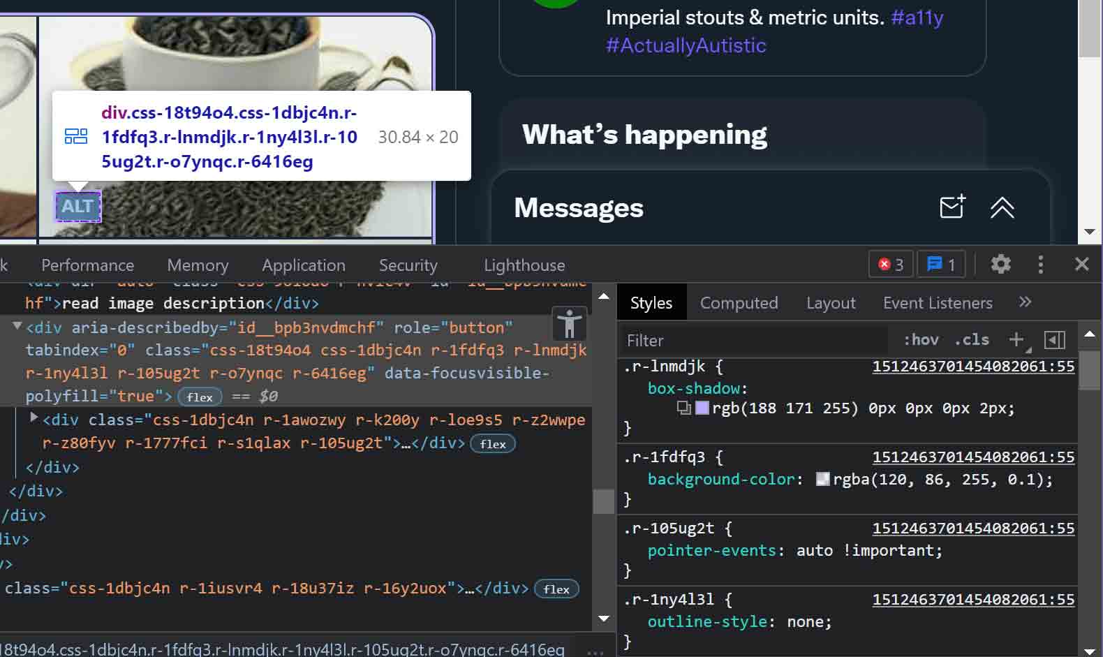
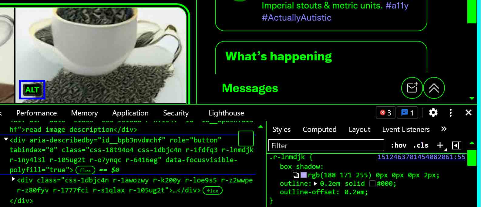
I start pressing Tab and see the group of four images gets a lavender focus indicator (as an offset outline). Then it moves to the first ALT control on the first image. Then focus disappears on the next Tab press, and then goes to the second ALT control on the third Tab press. I repeat this to get to the third ALT control after two more Tab presses.
In each case, the ALT control is over an image where it straddles both white and dark areas, making the lavender focus indicator very difficult to see owing to low contrast.
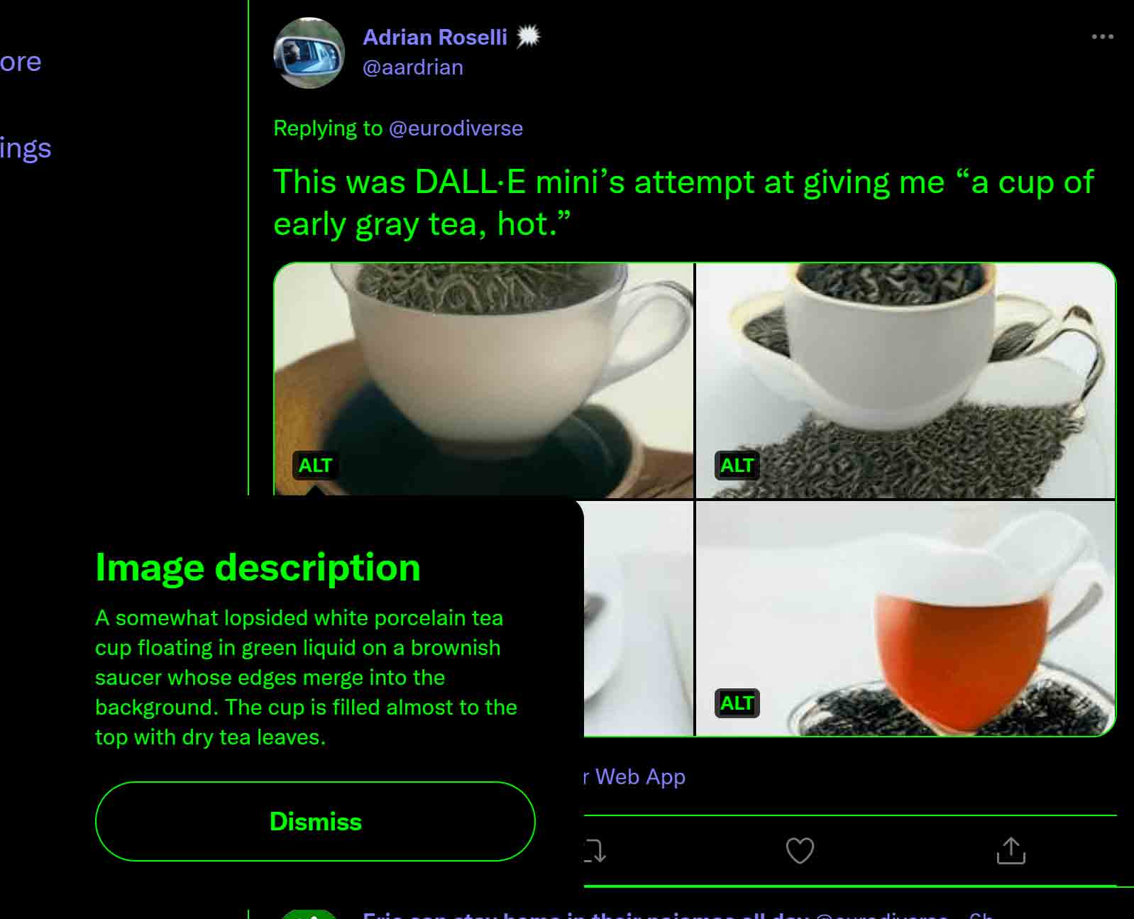
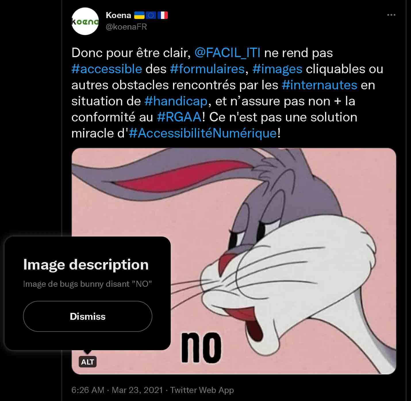
While the ALT control has focus I press Space to activate it and nothing happens. Then I hit Enter and it opens a large tool-tip like container with a giant Dismiss control.
I press Tab four times trying to put focus on the Dismiss control, but I see no focus indicators anywhere. Finally I press Space and the container closes. Apparently the Dismiss control had focus and/or is the only thing that can take focus. The background of the page never “grays out” to indicate I am in a modal dialog.
After the large tool-tip like container disappears, I see no indication of where my keyboard focus has been set. I press Tab and see the group of four images gets a lavender focus outline. I press Tab again and end up on the fourth and final ALT control.
I press Enter and the large tool-tip like container appears. I press Enter again and it disappears. I press Enter yet again and it re-appears, Enter a final time and it disappears. In none of this interaction is any indication of focus visible.
The ALT control is a <div> with role="button". It does not activate on Space. The Dismiss control (also a <div> with role="button") does activate on Space, however.
At the very least, these should be consistent. They should both fire on Space. That is how buttons work. For a sighted screen reader user, it is announced as a button, so that user could expect Space to work.
Because Twitter does not use native HTML <button>s, its developers must handle the keyboard interaction for every control. The risk is this kind of inconsistency in the interface.
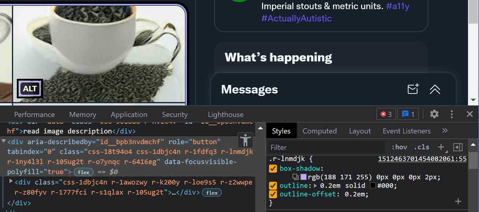
outline is suppressed and the focus style is a shadow.There are also gaps in the focus styles:
- It is not always clear what has focus (sometimes nothing shows focus);
- The focus style contrast with some images is poor;
- The focus styles do not match hover styles.
Some of this is likely due to reliance on CSS classes instead of a :focus selector, meaning script is necessary to add and remove classes. The script may be listening for keyboard events and not catch when focus is set programmatically, such as when the description container opens or closes.
When the large tool-tip like container (programmatically a modal dialog) containing the alternative text opens, keyboard is constrained within the dialog — this is good. But with no focus styles, it is hard to know the Dismiss control has focus, or that focus has not moved into the underlying page.
When dismissing the large tool-tip like container, no focus style is set on the trigger that displayed it.
The decisions on focus styles break down in Windows High Contrast Mode (renamed Contrast Themes in Windows 11).
The focus styles rely on box-shadow. The problem here is box-shadow is ignored in Windows High Contrast Mode. Remember that the outline style is removed. Which means WHCM users have no focus styles at all.
A developer either must restore outline styles, create more robust styles, or use a contrast feature query.
But using an obvious outline can help with the poor contrast identified earlier. Maybe using a thicker outline with outline-offset. Then WHCM will use it too. For example:
.r-lnmdjk {
    box-shadow: rgb(188 171 255) 0px 0px 0px 2px;
    outline: 0.2em solid #000;
    outline-offset: 0.2em;
}
This is by no means perfect, but we can see the change pretty quickly.
For screen reader users, Twitter’s developers also need to add aria-haspopup="dialog" to the ALT control. This manages expectations about what will happen when activated. Blind screen reader users are unlikely to use the control much, but sighted screen reader users have reason to.
For future consideration, I would love to be able to search tweets based on their image alternative text, or Ctrl + F on the page to find specific alternative text. The native HTML <details> / <summary> would get you that for free. If you don’t believe me, search this page for grays out
in Chromium browsers and see how it expands the quasi-transcript above.
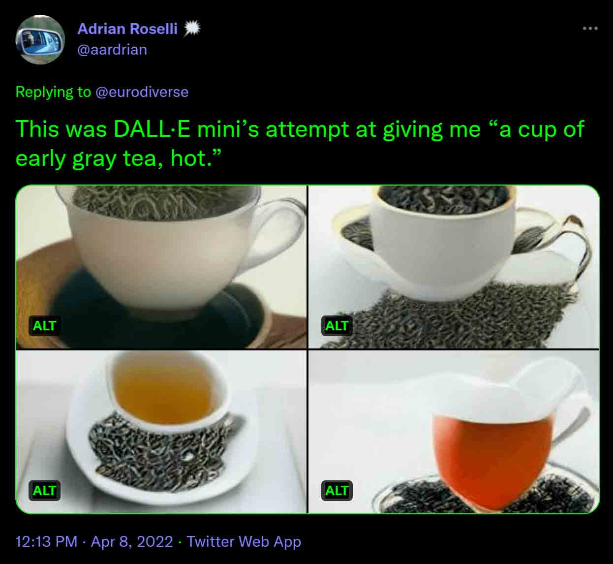
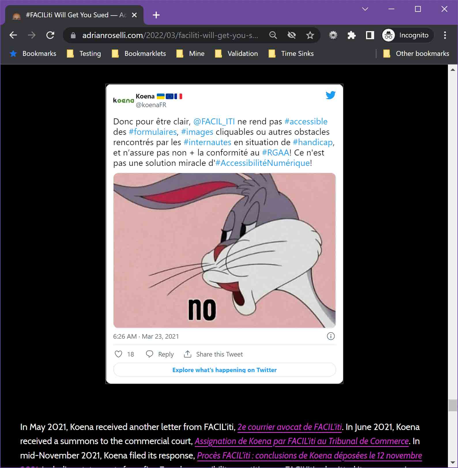
I also look forward to embedded tweets supporting this feature. As the following example shows, it is a different experience than on the web.
Ultimately, this is a great and welcome feature. It goes above and beyond. Hopefully it will normalize adding useful alternative text to images (and not be used to hide gags and terrible content).
But Twitter’s ongoing reliance on inline styles, JavaScript to add and remove classes on interaction, and ARIA instead of native controls, all have increased the effort needed to test and remediate this. Which contributes to why it feels so buggy.
Update: 10 April 2022
Amelia Bellamy-Royds points out this new feature does little for one set of users — those using Twitter’s data saving mode.
If you are using a pointer device (mouse, finger), you cannot access the ALT controls because the control to Load images is laid over the entire area of the image container.
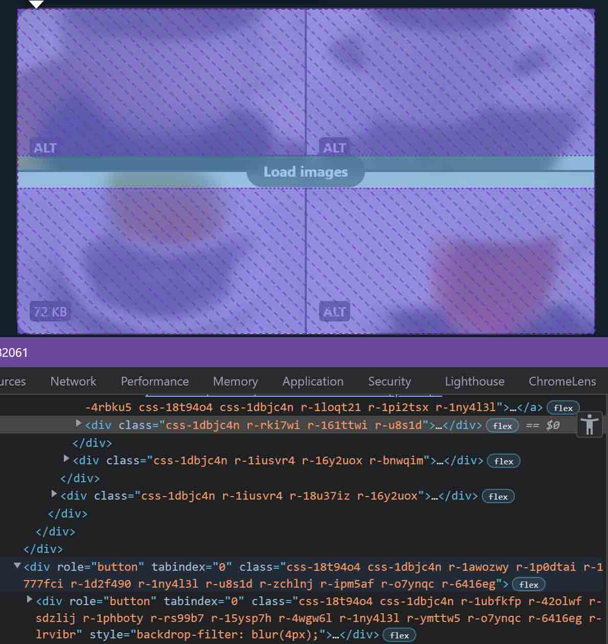
role="button" and that it has a child node with role="button", which is a WCAG 4.1.1 violation.This is a case where being a keyboard-only user works to your advantage. While the control to load images overlays the ALT controls, it does not disable them. You can get to the ALT controls, and activate them, without triggering the load of higher resolution images. Granted, all the visible focus issues I outline above still apply.
You can try for yourself in the web view by going to More menu items (the visible … in the navigation bar) → Settings and privacy → Accessibility, display, and languages → Data usage → Data saver (checkbox, with a much longer accessible name). Then start navigating an image tweet.
Update: 11 April 2022
This is not a keyboard issue, but is still an issue. While the proposed WCAG 2.2 Success Criterion 2.5.8: Target Size (Minimum) is not final, under the current language the ALT control is not tall enough. When an item is smaller than the 24×24 minimum area, it must have some non-interactive space separating it from adjacent controls. Even with that space, the control sites on top of the image, which is interactive, which means the changes of a mis-click or mis-tap are already high.

I made a bookmarklet that will turn your cursor into a 24×24 square so you can conduct your own 2.5.8 testing on your own projects.
Update: 12 April 2022
Thanks to a tip from Bruce B (and the fact that my videos and screen shots are Edge and Chrome), I failed to notice that keyboard focus is not constrained to the large tool-tip like container. As a user who has activated the ALT control and is trying to find out what has focus, I end up pressing Tab enough times to lose myself completely in the page (and the larger thread).
Considering focus is restricted in other browsers, pointer users cannot use the rest of the page when this control is visible, and there is an element in the DOM that blocks clicks and taps (even though it does not gray out the page), this feels like a modal dialog that is buggy in Firefox.
6 Comments
The background of the page never “grays out” to indicate I am in a modal dialog.Maybe this wasn’t intended to be a modal? I am able to break out of the alt text dialog by tabbing, but if I do a shift+tab to go back into the dialog and continue shift+tabbing then I can’t break out (it cycles between the div button and the dialog div). It seems Twitter can’t make up their mind on how they want this to behave.
In response to . It has the
dialogrole. A<div>is inserted to overlay the page and block clicks. Those are strong signals of intent. While I cannot move into the underlying page with a keyboard, Twitter’s reliance on script to dynamically add and remove nodes and classes (instead of relying on CSS:focusor even HTMLhidden) suggests bugginess in the script and its timing is what you encountered.
In response to . I did a little more testing with the keyboard breakout issue and it appears to only be happening with Firefox. Click on the tweet first so it’s the only one showing. When the alt text dialog is up I can break out of it by tabbing. If I then go back into the dialog with shift+tab and continue shift+tabbing it is captured in the dialog.
Takes a lot of skill to break something for only one browser.
In response to . Bruce, I just confirmed I can break out of the alternative text modal in Firefox. It loos like I can do it from the timeline as well. I guess my Firefox testing was poor since I was so focused on using Chrome’s dev tools for the screen shots. Thanks!
Thanks for this post. I was curious about
aria-haspopup="dialog", and I came across this discussion on the aria-practices repo. It seems there is some controversy about whether current screen reader implementations actually do a good job of supporting this, and if it causes more problems than it solves. I’d be interested to know your take.
In response to . Nolan, generally I am on board with Scott O’Hara’s points about deprecating
dialogas a value foraria-haspopup. I still believe something (a kind of generic value was proposed elsewhere) should be there to manage a screen reader user’s expectations, however.
Leave a Comment or Response