More Google and Afterthought Accessibility
Google has an extensive history of releasing products and tools that fail basic accessibility. This is not a function of individuals — Google has some very talented and capable accessibility practitioners. Instead, this is an organizational failure. Failure to require accessibility in its products or services. Failure to support teams with expert resources. Failure to budget, in time or money, for accessibility.
Designcember is the latest example of Google’s failure to support accessibility as a fundamental aspect of its work. Intended to be a showpiece for container queries and Chrome’s support for the new technology, it had the unintended effect of suggesting container queries are hard to make accessible.
I want to stress — this is not a criticism of the authors/developers of the site (despite my criticisms of the work). It is instead a demonstration of how they were not supported by a multi-billion dollar company more interested in creating a promotional site than an accessible one.
I vented my frustration on Twitter.
So. Has anybody tried designcember.com with…
A screen reader?
Voice control?
Keyboard only?
Zoom?
Low vision?
WCAG‽
Is this the best Google can do? #a11y
If I seem angry:
11 names worked on this project. They got paid.
As a self-employed accessibility consultant scraping together end-of-year work, I found ~10 issues in a few minutes.
I am not compensated for that.
But 11 names got paid to make this WCAG-failing experience.
One of the people behind the site asked for more information. I offered it.
Quick example:
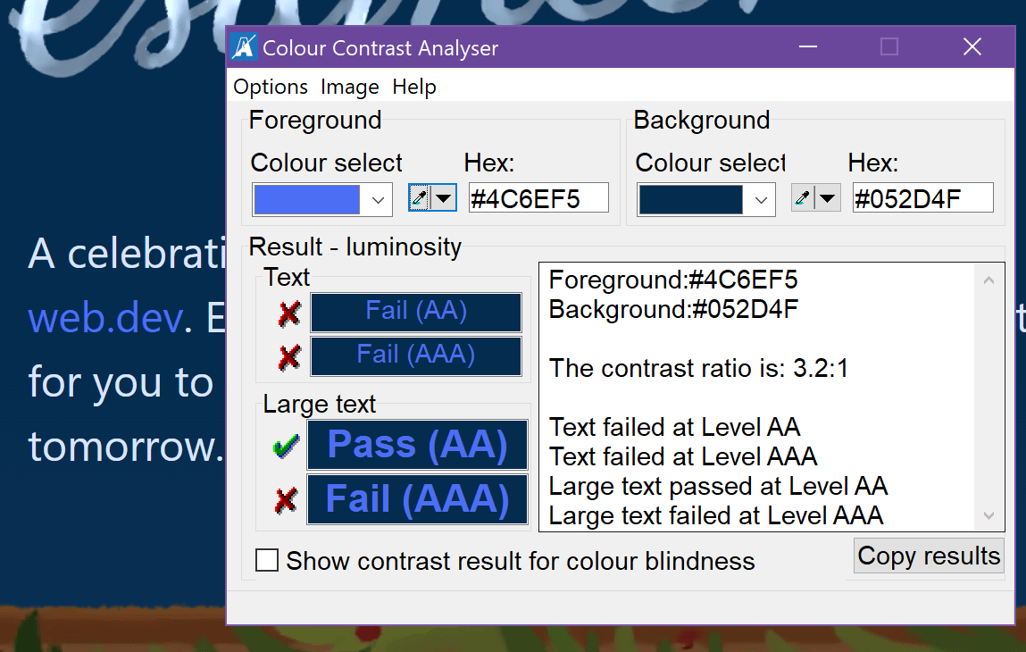
Link text is differentiated by color alone, so that is a 1.4.1 failure.
Blue link (#4C6EF5) on dark blue background (#052D4F) has a contrast ratio of 3.2:1, which barely passes because it is 24px, but look at the smaller links in the revealed content. pic.twitter.com/IQ5gr6iSou
As I tab through the page and the content is exposed, how do I get to the “Explore the project” links using just my keyboard?
Why is every link “Explore the project” instead of something unique?
Sometimes the revealed content appears outside the window, requiring arrowing up.
I surf in dark mode. There is a flash as I load the page and goes from light to dark.
The link text is a number, but you override it with aria-label, making for a weird voice user experience.
Using a screen reader, not all the content is available.
Why are the focus styles on the number links just the browser defaults? If I have scrolled down far enough I will not see the image change to indicate the day has focus.
And so on.
Those are just quick reactions.
One of the authors responded to explain one of the core interactions, which corresponds to a broken disclosure widget, and I responded.
As a user, I see the content when it gets focus. I had no reason to hit Enter. Since I see what I think is a link (again, 1.4.1 failure), I expect to be able to Tab to it.
Without instructions (3.3.2) you have a de facto 2.1.1 failure.
Why not a basic disclosure widget?
Following is a little more detail to my tweets.
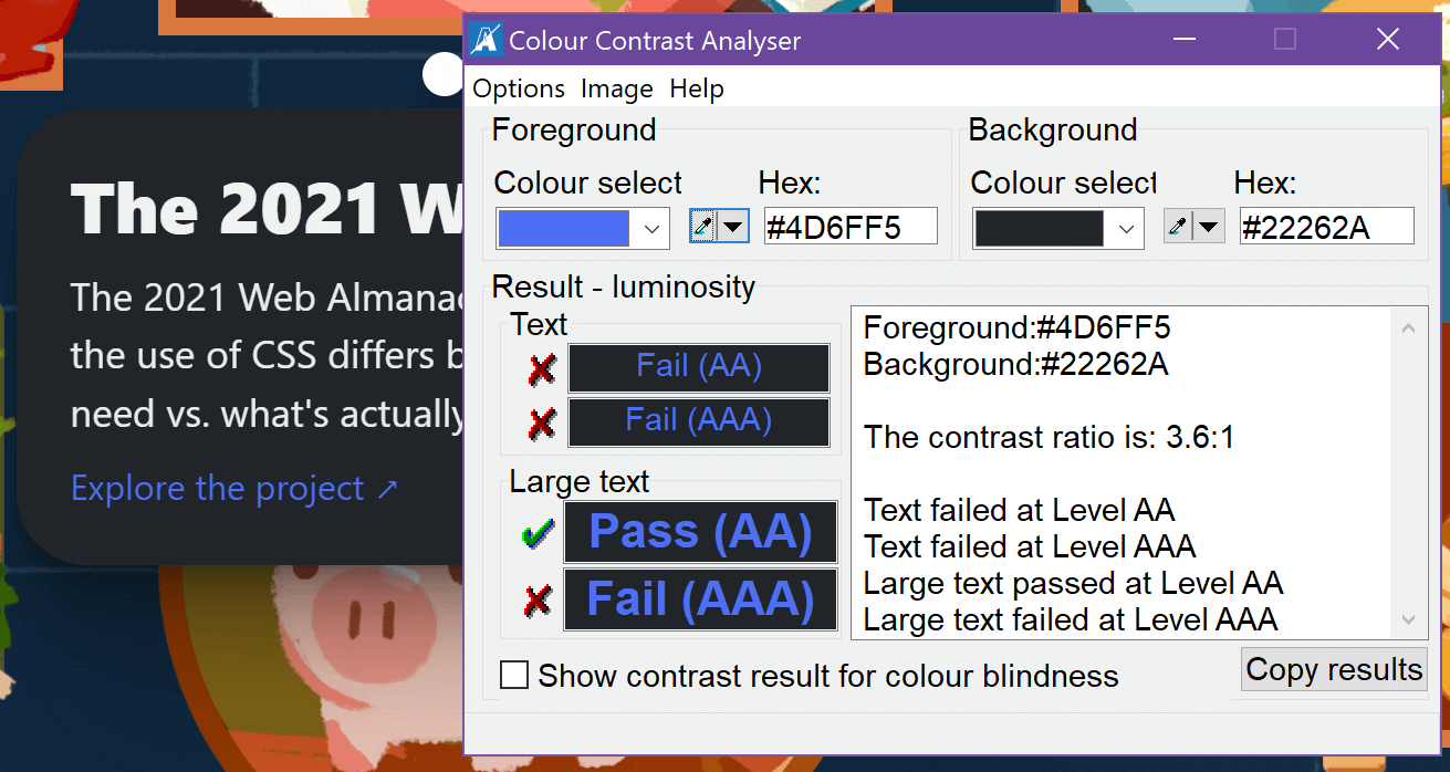
While the contrast issue (not failure) I pointed out was fixed in an update, the single link that gets re-used over and over for each day of the calendar still has a WCAG-failing contrast ratio. It seems no automated test was run after I raised the issue.
This is the theme toggle button. It uses title for the accessible name, which is valid (the last fallback in the computation) but not a best practice. It is also its own live region, which is an interesting and seemingly untested choice. This when aria-pressed is an option. Even a checkbox extended to be a switch could work (and switch support is well documented).
<button […] id="theme-toggle" title="Toggles light & dark" aria-live="light" […]>
 <svg aria-hidden="true" […]>
  […]
 </svg>
</button>
The flash of the unstyled content is nothing new on the web. It is more annoying when you encounter it every time you go back to the site for each day of the advent, even though the files are cached.
When first visiting the page, you can navigate directly to the current day of the advent by using not a skip link, but a jump button. Even though skip links date back to 1998 and advice on using them is updated as technology changes, this site chose to ignore the common pattern and rely on JavaScript.
<button class="helpful-birb astro-0hXqrWm2">
 <p […]>Jump to today!</p>
 <picture>
  <source srcset="/helpful_birb.avif" type="image/avif">
  <source srcset="/helpful_birb.webp" type="image/webp">
  <img alt=" " decoding="async" role="presentation" src="/helpful_birb.png">
 </picture>
</button>
This link uses aria-label to override the visible accessible name. This is not a 2.5.3 Label in Name violation because the number 6 is still in the accessible name. This assumes the browser chooses to apply aria-label to a <span>, something it is not obligated to do per the spec.
<a href="#6th" […]>
 <picture>
  <source srcset="/blank.avif" type="image/avif">
  <source srcset="/blank.webp" type="image/webp">
  <img alt=" " decoding="async" role="presentation" src="/blank.png">
 </picture>
 <span aria-label="Day 6" […]>6</span>
</a>
Note the <img>s in those links with role="presentation" instead of a blank alt attribute. That alt is not blank, it uses alt=" ". Without the role="presentation" the image may have announced as “image” instead of being skipped by a screen reader, so the role may have been to spackle over bad code (I am guessing it announced as “image 6”).
<img alt=" " decoding="async" role="presentation" src="/helpful_birb.png">
<img alt=" " decoding="async" role="presentation" src="/blank.png">
This “tool-tip” appears as the first child of the <body> element. This explains why leaving the area puts focus back at the top of the page.
<div id="tooltip" […]>
 […]
 <section tabindex="0" class="tooltip […]">
  <h3 […]>Announcing: the UI Fund</h3>
  <p […]>Do you have an idea for a project that could make a real impact on the CSS ecosystem? We're announcing a fund to help you make your ideas a reality.</p>
  <a […] href="https://web.dev/ui-fund/" […]>Explore the project
   <span aria-hidden="true" […]>↗</span>
  </a>
 </section>
</div>
Some of the decisions about what accepts focus, where it lives in the DOM, and how it is assigned when interacting with the faux disclosures, create an interesting keyboard interaction overall. I demonstrate this in the following video. The keyboard info visible in the bottom right corner is from Sarah Higley‘s Keyboard Visualizer. I confirmed its presence did not impact how the page worked.
Because the page re-uses the same “tool-tip” node, rewriting only the href of the link, there is only ever one link to the each day’s resource and it always has the same link text:
<a […] href="https://web.dev/ui-fund/" […]>Explore the project
 <span aria-hidden="true" […]>↗</span>
</a>
Remember that aria-label is not meant for generic elements, such as <div>s, and if a browser conveys it then it is doing something it is not obligated to do. One risk with aria-label is that it overrides the contents of a node. Unless the browser allows the interactive child node to override the override. Thanks to some decisions by browser makers in the user’s favor, this code presents the attempt at image alternative text as the developer expected (which is not on the image, but on the container the developer chose instead).
<div id="6th" class="day six stacked astro-TH3w1RIM" aria-label="A circular window where a coin drops into a lucky piggy bank." […]>
 <span class="plaque astro-TH3w1RIM">
  <a href="#6th" class="number stacked astro-NP0oW9SC" […]>
   <picture>
    <source srcset="/blank.avif" type="image/avif">
    <source srcset="/blank.webp" type="image/webp">
    <img alt=" " decoding="async" role="presentation" src="/blank.png">
   </picture>
   <span aria-label="Day 6" […]>6</span>
  </a>
 </span>
 <div class="frame stacked astro-TH3w1RIM">
  <div class="bg astro-TH3w1RIM"></div>
  <picture>
   <source srcset="/day6/frame.avif" type="image/avif">
   <source srcset="/day6/frame.webp" type="image/webp">
   <img alt=" " width="1031" height="924" decoding="async" role="presentation" src="/day6/frame.png">
  </picture>
  <div class="pig astro-TH3w1RIM">
   <picture>
    <source srcset="/day6/piggy.avif" type="image/avif">
    <source srcset="/day6/piggy.webp" type="image/webp">
    <img alt=" " decoding="async" role="presentation" src="/day6/piggy.png">
   </picture>
  </div>
  <div class="coin astro-TH3w1RIM">
   <picture>
    <source srcset="/day6/coin.avif" type="image/avif">
    <source srcset="/day6/coin.webp" type="image/webp">
    <img alt=" " decoding="async" role="presentation" src="/day6/coin.png">
   </picture>
  </div>
 </div>
</div>
Bringing together some of the code and patterns I have walked through shows how confounding this experience can be for a screen reader user. No disclosure widgets are announced, everything is a same page link, there is no <h1> to use as a signpost, focus moves arbitrarily, and I never get to the link to the current day’s resource. Note that I recorded this on December 6, before the disclosure-like controls were modified after my feedback.
<h1>, but end up on an <h4> in the footer. I rightly guess there is a <main>, jump to it at 0:29 and start tabbing through the page (where we can hear aria-label is not applied to the <span>s in the links). At 0:56 I decide to try one of these same-page links I keep hearing, but nothing happens. I get to the current day (at 1:14), where I know the UI Fund link exists, but cannot find it. At 1:31 I am just looking for any link. Having given up, I try a link for a day in the future 1:59, which brings me nowhere. So I stop, convinced the page is broken.I know some of these things I have identified seem a bit niche. Without being an accessibility practitioner, these might not be on your radar as problems or risks. However, a pass with automated tools (which I did when I first encountered this site on December 6) gives a non-zero number of violations and potential violations:
- Axe found 377 issues,
- ARC found 758 issues,
- WAVE found 274 issues,
- IBM checker found 194 issues,
- HTML Nu Checker found 231 issues.
A lot of those are warnings. But we also know only about 30% of WCAG is testable with automated tools (so there are more). We should also consider that those tools sometimes throw false negatives. All the more reason to follow specs, standards, and long-known best practices. Especially when you want to showcase support for a new technology and want it to work for all users.
As a Christmas gift to myself, I declined to help fix this site when it was clear Google was not going to pay for my time. As I said at the beginning, this is an organizational failure at Google. Failure to spend the token amount of money to support its own team and its disabled audience.
3 Comments
Good for you for not giving away your time and knowledge for free to a company that has more than enough resources to address accessibility and should really know better. What a poor example to set by such an influential company.
At the same time, thank you for doing critiques like this so people like me who are trying to increase their accessibility knowledge can benefit from your experience.
Slightly bit off track but I have one question regarding a failure you mentioned above:
“Link text is differentiated by color alone, so that is a 1.4.1 failure. ”
In a study group I take part of we just covered this SC and while I was preparing to discuss it I found this note on Failure of Success Criterion 1.4.1 due to creating links that are not visually evident without color vision:
“Red and Pink are the same color (hue) but they have different lightness (which is not color ). So red and pink would pass the requirement for “not distinguished by color (hue) alone” since they differ by lightness (which is not color) – as long as the difference in lightness (contrast) is 3:1 or greater. For example, if surrounding text is RED and the link is PINK it would pass.”
Is this really saying that pink link text in a paragraph of red text is enough on its own to pass 1.4.1? Or am I reading it wrong? The distinction between hue and lightness is not something I was familiar with. I just assumed color was color and thus you needed something else, such as an underline or font-weight change.
In response to . Bruce, if you want to wade into a larger discussion on the loophole that is F73, I encourage you to read this WCAG GitHub issue dating back to 2016: #201 Technique G183 (and note 1 in F73) provide loophole resulting in inaccessible content (was: Technique G183 not applicable to touch/inputs that lack hover/focus).
There is some follow-up discussion in the PR that closes that issue: #1500 Rework understanding for 1.4.1 to be firmly only about visual aspect
In my own post on link underlines, I address the G183 escape hatch (and roundly dismiss it).
In response to . Thank you for those links. Interesting reading. So it looks like this F73 loophole is going to become authoritative in WCAG 2.2. At least they aren’t hiding it any more.
Leave a Reply to Bruce Cancel response