Sentence Forms (not Mad Libs)
 Whether you call them sentence forms, narrative forms, fill-in-the-blank forms, or Mad Libs forms, you are probably describing a form where the fields are interspersed within words in a sentence. Unlike more traditional forms, laid out with simple pairings of labels and fields, these forms are meant to be read in a flow.
They were popular in the late aughts and early teens, but mostly waned after that. Maybe building and maintaining them was difficult (often a copywriter was best suited to construct them, and many tech efforts lack that), they were seen as passé (so not cool anymore), or promises of 25-40% conversion rate increases fell flat (once the novelty wore off).
More than a decade on, I am seeing a resurgence in the format. As with the first time these were dreamed up, the accessibility, and therefore usability, of most implementations leaves a lot to be desired.
Challenges
Some of what I note here comes from my own testing on these forms going back a decade or more. I have broken it up as a bullet list since it may be useful for your team to add to any checklists you have.
- The easiest challenge to identify here is how screen readers will interpret the forms. Léonie Watson covers the three ways a screen reader navigates content in her 2014 post Understanding screen reader interaction modes. I have videos later in this post demonstrating two of them.
- In browse mode, which the screen reader might hear when first loading the page or choosing to have a chunk of page read to them, it will be a muddied sentence with other context added for each field (such as type and attributes) and may not flow very well. Some of our clients’ whimsical forms ended up frustrating their audience.
- In forms mode, the screen reader user will not encounter the fields in the context of a sentence. Each field will be announced with its type, any attributes (required, errored, etc), and its accessible name. We found this confusing for users. Each field needs to stand on its own. It can be done, but requires some deft copywriting.
- Screen magnifier users were annoyed in some cases where the lines got long, particularly since they were accustomed to parking their magnifier to straddle the labels and fields. When labels wrapped, it caused confusion because they were missed or required dragging the magnifier around.
- We found radio buttons and checkboxes within sentences confounded users. That meant using
<select>s instead. Most users disliked them given they had to interact to see all the options. Designers were frustrated by the inability to style<select>s (no longer an issue) and so devs made inaccessible custom controls as a result. - Some users with cognitive issues were thrown by the different method of gathering information and different way of presenting common fields. Some expectation management proved necessary (instructions and samples helped). Users with dyslexia generally hated the overall experience.
- Almost all versions of these forms were poor candidates for automated translation tools. Some tools struggle with the overall context (because they do not see it as a sentence) and translate individual strings surrounding a field in unexpected (incomprehensible) ways. We had clients who used human translation, but then it became a copywriting exercise again, but for each language.
- Traditional methods to indicate errors were deemed clunky by the designers, but we found users did better with a clear list of errors with clear references to the fields. This can be tricky if there are a lot of fields and their names are verbose.
- Since I first ran those tests with users and clients, voice interfaces have become a thing. Your layout will need to provide some cues to voice users on what to speak to activate specific controls. Without that, I imagine many will find the form frustrating.
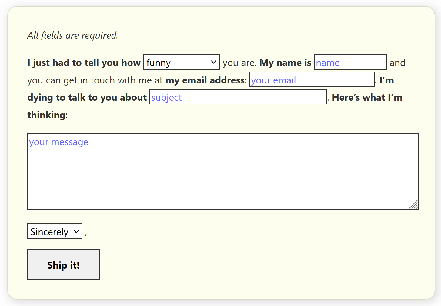
An Example Form
I found a form online, linked from one of the sites that promises more paying customers from genius contact forms if you follow its 5 easy something or others and which pitched this format in May of 2021 (so a decade late?). One of the featured forms has already been dumped by its owner, so I dug it out of the Wayback Machine and used that as my base.
Once I had created a similar but different form (in wording and fields), I went to work making it pass WCAG. Notice I am not saying that I made it accessible, or even usable. I only took the steps to make it pass WCAG.
You can play with the embedded version or visit the debug version to try it with your preferred assistive technology.
See the Pen by Adrian Roselli (@aardrian) on CodePen.
WCAG Changes
In order to pass muster with WCAG (levels A and AA), I had to make some modifications. A few were easy (like adding autocomplete). Some not so much, such as adding error handling (it is not robust) to identify what fields are in error and manage the focus as part of it.
The following is a simple list, but mostly it is there to guide the kinds of things you will need to consider before you even get your sample form in front of users for testing.
- 1.3.5 Identify Input Purpose: Added
autocompletevalues, - 1.4.3 Contrast (Minimum): Adjusted the contrast on the placeholder text (and made it blue to maybe not confuse it with user-entered values),
- 1.4.4 Resize text: Set text styles on default fields to honor user text sizing,
- 1.4.10 Reflow: Ensured form fields do not create scrollbars at tiny viewports,
- 1.4.11 Non-text Contrast: Gave the fields borders with sufficient contrast so their bounds are clear,
- 1.4.12 Text Spacing: Added basic styles to form elements to inherit word, letter, and line spacing changes,
- 2.2.2 Pause, Stop, Hide: Added an animation to draw attention to the errors, making sure it does not run past 5 seconds and is wrapped in a
prefers-reduced-motion: no-preferencefeature query, - 2.4.6 Headings and Labels: Augmented the accessible name (beyond the bold
<label>) so the first field made sense out of context by usingaria-labelledywith multiple IDs, - 2.4.7 Focus Visible: Added clearer focus indicators instead of relying on browser defaults,
- 2.5.3 Label in Name: Tried to make the label visually clear (bold) so it can be identified for speaking and tapping/clicking,
- 3.3.1 Error Identification: I added error messages,
- 3.3.2 Labels or Instructions: Added instructions saying all fields are required,
- 4.1.2 Name, Role, Value: Gave each field an associated name, an error state when in error, and a description of the error when in error.
I also tried to keep the error messages friendly and follow the tone of the form. Obviously, your forms and messages would differ.
This may be one of the few cases where placeholder text is necessary for the fields to give context to the read — and also conveys the Mad-Libs-like cues we expect.
In a Screen Reader
I made two videos using NVDA 2021.1 with Firefox 91 to show how this form performs in a screen reader. The first video uses the “read-all” feature, where NVDA reads from the top of the page. The second is me tabbing through the form with a bonus few seconds showing the errors in action.
placeholder gets announced with each field as well as the accessible name. The error message receives focus when I submit, which NVDA reads through no effort from me.References
The following may be useful to understand some of what I am doing in the code:
- Under-Engineered Text Boxen, which handles the text fields so they can adapt to text sizing and spacing, while also handling error states and supporting Windows High Contrast Mode.
- Under-Engineered Select Menus, which does the same as the previous link, but for
<select>s. - Methods to Provide Context Sensitive Name/Description Text, which is a very brief list of guidance from the Using ARIA W3C Note.
- My Priority of Methods for Labeling a Control in case you find you need other, more complex sentences and therefore field naming techniques.
Tangentially Related
Justin Yarbrough wrote an article, Exploring airline form accessibility for service animal handlers, where he detailed some of the now-mostly-corrected challenges in the PDF forms airlines provide. They are based on a US Department of Transportation document and they use a bit of a sentence format by letting you insert the animal name into simple statements like, blank is vaccinated for rabies.
You can see an example of the form from Delta.
Wrap-up
Probably do not use this style of form. If you do, get a copywriter on board, make sure to address all the WCAG Success Criteria at Level AA, and then put it in front of users to test.
If you plan to use the form across languages then you may need to customize it per language with a copywriter. If you know you will have users who may auto-translate the form, be prepared for them to be confused.
2 Comments
I’m trying to figure out how to create the double drop down on this page: https://www.ciee.org. I need two drop downs, in a sentence structure, with a dynamic “Go” button (the destination changes depending on the combination of the two drop downs. The second drop down options are dependent on the option selected in the first drop down. Any thoughts on how to do this? Are there any WordPress plugins or services that do this?
In response to . Russ, this post does not speak in any way about the kind of paired form control you want. However, a quick search for “linked select menus” brought me to this undated post that references comp.lang.javascript (as a sign of its possible age): Linked Select Elements
Obviously you would need to add field labels, a submit button, and otherwise account for WCAG and progressive enhancement.
Leave a Comment or Response