Link + Disclosure Widget Navigation
Early in 2017 I filed an issue against WAI-ARIA Authoring Practices (APG) requesting a change to the menu navigation pattern. Despite a great deal of feedback in agreement, it languished. In late 2017 I wrote Don’t Use ARIA Menu Roles for Site Nav and started actively campaigning against the APG pattern.
Not much has happened since then. A little good news is that use of role="menu" for web page navigation has fallen out of favor with developers who test with users.
Less than a month ago Sarah Higley issued a pull request against the APG to propose a navigation pattern. You can see a version of that pattern as the navigation bar at USA.gov.
A few days ago Marcus Herrmann wrote Menu (or not) where he outlines his own path trying to find the best way forward for a menu on a shopping cart.
These two examples have different objectives and use cases, but it also made it clear to me that I have been promoting a pattern that I have failed to write up for the broader community to review. While I have tested it with users, that is not the same as letting other practitioners take a run at it.
The Pattern
Sarah’s navigation pattern is quite similar to the one I have developed. Except in my pattern the top-level items are all links, and some of them may have more links hidden under them. I am not suggesting that hers is wrong, it is just a different pattern.
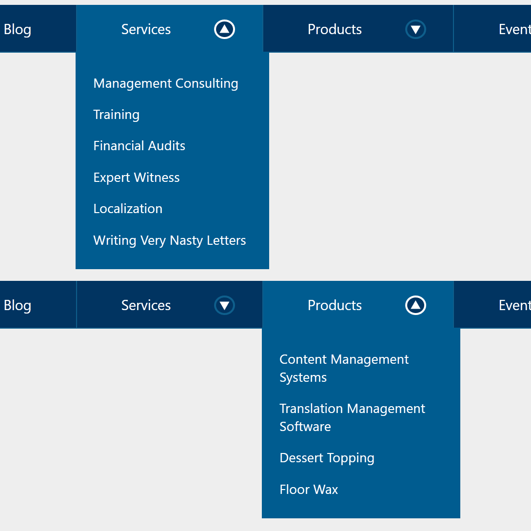
Embedded below is the navigation. You can visit it directly at Codepen, as well as a debug version which is free of Codepen cruft.
See the Pen WCAG 2.1 Compliant Navigation by Adrian Roselli (@aardrian) on CodePen.
The Container
The navigation lives in a <nav> as a list with nested lists.
<header>
  <nav id="Nav">
    <ul>
    […]
    </ul>
  </nav>
</header>
The Links
The links are regular hyperlinks. They work with a keyboard, assistive technology knows what to do with them, and links are generally well understood by users.
Note that I do two things here to identify that the current page is the About page. The first is add aria-current="page" to the link as that will convey it to screen readers. I also add class="selected" to the parent <li>, though that is strictly for styling the container in my design.
Ideally you want to use a CSS selector like a[aria-current="page"] to ensure your visual indicator stays in sync with your programmatic indicator.
      <li class="selected">
        <a href="http://example.com/?2" id="Item02" aria-current="page">About</a>
        […]
      </li>
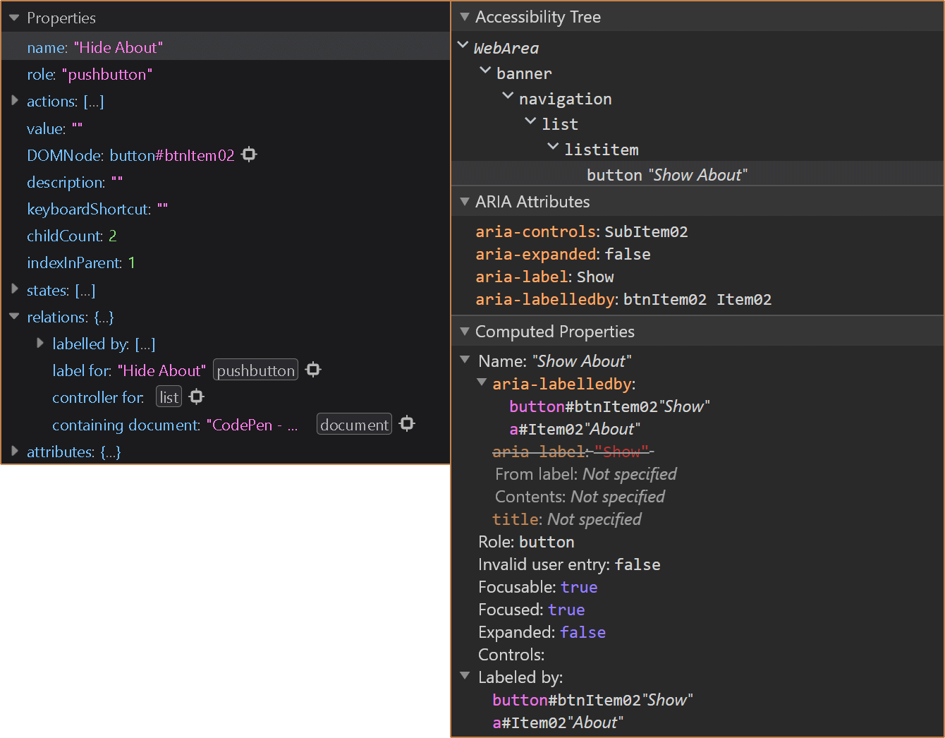
The Disclosure Button
This pattern needs the aria-expanded attribute to work properly, where its value must be toggled from true to false to correspond to the presence of the content it is showing or hiding.
I use aria-controls to point to the id of the nested list. This creates a programmatic connection between the two. Heydon Pickering identified in 2016 that aria-controls has limitations and spotty support. Prior to that, in 2014 Léonie Watson laid out the benefits for when aria-controls does work, and given this simple pattern it does not prove to be an issue in current browsers and screen readers. For those combinations that do not support it, the navigation is not confounding.
I use an inline style to hide the nested list of links to minimize the chance that it will display while any CSS is still being processed. My JavaScript function simply toggles that value.
        <button type="button" id="btnItem02" aria-controls="SubItem02" aria-expanded="false" aria-labelledby="Item02" onclick="toggleSubNav(this.id);">
          […]
        </button>
        <ul id="SubItem02" style="display:none;">
          […]
        </ul>
Naming the Disclosure Button
Providing an accessible name to the disclosure button takes just a little planning. Ideally you want to lean on the text in the navigation wherever possible. In this pattern, I initially set the name of the button with
aria-label.
An advantage is when the content gets localized, the button name will match. However, if you do not do your own localization already, this will not be translated by auto translation services unless you are using Google Chrome and its built-in Google Translate service. For cases where it does not translate, the
aria-expanded conveys the state to a screen reader user anyway.
In my script I alternate the value of the
aria-label based on whether the sub-navigation is displayed (Hide) or not (Show). This almost definitely will not be auto-translated even in Chrome since it is being injected by script.
Then the accessible name of the button is built up from the button’s own name as well as the associated text link by using
aria-labelledby to point at the ids of both (aria-labelledby accepts a space-separated list of ids to build an accessible name).
I noted in a comment in July 2020 that further testing with screen reader users told me the compound accessible name was too verbose. I have since stricken it and simplified the pattern here and in the embedded example.
This means there is only one node providing the accessible name, it is already visible, and already likely to be translated. It also means the accessible name does not get out of sync with the programmatic state.
        <a href="http://example.com/?2" id="Item02" aria-current="page">About</a>
        <button type="button" id="btnItem02" aria-controls="SubItem02" aria-expanded="false" aria-labelledby="Item02" onclick="toggleSubNav(this.id);">
          […]
        </button>
Esc Support
There is a function in this pattern that listens for the Esc key and, when pressed, hides any visible sub-navigation lists. This means a user can Tab through the navigation, show a sub-navigation list, and not have to Shift + Tab to the button that displayed it nor Tab to the next button to show another sub-navigation list.
While I am comfortable in HTML, CSS, and ARIA, JavaScript is not my strongest skill so you may want to adapt this function.
document.onkeydown = function(evt) {
  evt = evt || window.event;
  var isEscape = false;
  if ("key" in evt) {
    isEscape = evt.key == "Escape" || evt.key == "Esc";
  } else {
    isEscape = evt.keyCode == 27;
  }
  if (isEscape) {
    toggleSubNav("");
  }
};
Click-to-Close Support
From testing with users, they generally expect the sub-navigation lists to disappear when they click or tap somewhere else on the screen. I have not built that support yet. You probably should.
What ARIA I Did Not Use
I did not use any widget roles that correspond to menus, such as menubar, menu, or menuitem. If you read my original post, Don’t Use ARIA Menu Roles for Site Nav, I explain in more detail why.
The gist is that these roles switch a screen reader into a forms or application mode and tell the user what keyboard commands to use — commands which not only do not belong on a regular web page, but commands which you will now have to support.
I also do not use aria-haspopup. I hope the following explanation of the attribute gives enough context with why I do not use it.
A popup element usually appears as a block of content that is on top of other content. Authors MUST ensure that the role of the element that serves as the container for the popup content is
menu,listbox,tree,grid, ordialog, and that the value ofaria-haspopupmatches the role of the popup container.
Styles
The styles in this navigation are beyond the scope of an accessible pattern. But I do want to call out a few things that may be useful should you implement this.
- The button uses an arrow SVG that I rotate when the sub-navigation list is shown or hidden.
- I have made no considerations in this example for non-LTR content.
- I am not stressing about what CSS display properties do to list semantics because in this case users are already accustomed to it.
- There is no consideration for a dark theme
- There is no consideration for Windows High Contrast Mode.
- I have been playing around with a fork of this where the buttons are 44px to conform to WCAG 2.5.5 Target Size and my own general recommendation.
As you can see, I kind of phoned in the styles since they were not my goal here.
CSS Flex
I use flex styles to allow the navigation to expand or contract for any viewport size. I am generally opposed to hamburger menus (particularly at desktop resolutions) and feel that navigation can do just fine if you let it adapt to the viewport.
I have arbitrarily chosen 60em as the desktop width below which I allow it to wrap, and above which I make sure the last nested list does not flow outside the right edge the viewport. For between, I was looking at the Intersection Observer API to identify when anything falls out of the viewport and then brute-forcing it back.
Examples
Browser accessibility inspector screen shots and videos with NVDA, JAWS, and VoiceOver are below.
Future
After Sarah’s navigation pattern has been accepted by APG, I plan to submit mine. Ours are close enough, but satisfy different use cases, that I have opted to let her do all the hard work of going through the APG process. I have said as much, so at least she already knows I am a terrible person.
Update: 1 February 2021
In this post I recommend using a native <button> as the trigger for your disclosure widget. Owing to recent conversations, I should note that aria-expanded can be applied to more than <button>s. In fact, a link can accept it.
Don’t do it, of course. Do not add aria-expanded to a link. Doing so is confusing for screen reader users in particular, but can also be counter-intuitive for all users.
When users hover or focus a link, they get some immediate visual feedback from the browser’s status bar (area) that they are about to be navigated to a new URL (on the same page or not). Mouse users also get a pointer difference. Screen reader users hear a link and then that is collapsed.
When I put together my disclosure widget navigation prototype, I had the opportunity to test with a handful of users across technology profiles and capabilities. Using a link as the disclosure trigger proved problematic and confusing for everyone.
The visual cues I mentioned meant most sighted users expected to navigate, and when the disclosed content was styled similarly to the rest of the page, they sometimes failed to see it. Voice users assumed they had selected the wrong control. Screen reader users who are familiar with disclosures were confused to hear a link (one user assumed it was a bug).
You may think this is a good way of progressively enhancing your navigation. That this could be a way to ensure that if the script fails to add the click handler to the link, a user can still navigate. But you also need to exclude the aria-expanded until the script fires. And, of course, you still need to add a handler for Space because otherwise the page will scroll instead of triggering the disclosure. At which point, you might as well keep the link as a link and use the script to add the disclosure button instead.
No matter what you do, remember that if you rely on this kind of navigation (that hides sub-navigation items) then you have to show those sub-navigation items on the child pages as well. Otherwise anyone with a script error can never get to your sub-pages. This seems basic, but I see this failure all the time.
I subsequently tested links as the disclosure trigger for non-navigation uses. People were still confused, particularly when the disclosure replicated what a native <details>/<summary> would typically handle. Using it for non-navigation scenarios makes even less sense here (even if you rely on an anchor link and use a :target selector as your fallback).
Update: 18 November 2021
A year ago the draft ARIA Authoring Practices got a version of this navigation model thanks to Sarah Higley, who honored the commitment I failed to. This is not to imply that she lifted it. If anything, she improved it by writing script that honors arrow key navigation as well as Home and End support, along with closing when clicking outside the navigation.
Check it out the disclosure navigation in the draft 1.3 APG note. While I had intended to add it as an update on this post forever ago, the recent PR to add a CodePen button prompted me to not only add the reference, but to save it (since the button opens a fresh pen) so you can view it in debug mode and to embed it below.
See the Pen APG 1.3: disclosure-navigation-hybrid by Adrian Roselli (@aardrian) on CodePen.
16 Comments
I took a shot at the
isEscapefunction, if you’re interested:document.addEventlistener("keydown", function(evt) { if (evt.isComposing || evt.keyCode == 229) { return } if (evt.key == "Escape" || evt.key == "Esc" || evt.keyCode == 27) { toggleSubNav(""); } });
- The
window.eventfallback is be necessary for truly ancient IE versions — at least, I think so. You may know better than I do — I can only test in some versions since VirtualBox can overwhelm my old laptop.- The
isComposing/keyCode == 229bails out early in case the keypress event is from IME composition.- It’s okay to test equality for nonexistent properties on the
evtobject — they evaluate toundefined, which is a perfectly cromulent thing to compare.addEventListener()is slightly safer in that it won’t overwrite or be overwritten by any other JavaScript. This may sound paranoid, but a lot of terrible ad/analytics/other garbage scripts will ruin your day if you useonkeydown.(Also, I can only select one line of code at a time in your code samples on MacOS Firefox. It seems to be the fault of the
filter: invert(100%)as part of your new Dark Mode CSS? Weird.)
In response to . I am definitely interested, and thanks for taking the time to offer the function. Any chance you can point me to a function to also close the nested navigation for any click outside of them?
Also, I think the code selection issue is a function of how I do the animated scanline effect. I suspect I am due to revisit that.
In response to . This is the JS function I used to close the nested nav when clicking outside. Essentially it listens to a blur event, then checks if the element receiving focus is within the nav:
function handleBlur(event) {
  var menuContainsFocus = rootNode.contains(event.relatedTarget);
  if (!menuContainsFocus && isOpen) {
    closeDropdownNav();
  }
};
In response to . Thanks! An update to my pen is in order!
That aria-label/labelledby pattern is some next-level stuff. :D
In response to . Thanks. It may be too verbose for some users, but I like the flexibility.
The aria-label and aria-labelledby is an interesting combination; that could be used in other useful ways. Read more links come to mind.
The only warning I offer is for implementors to consider the words used in relation to the open / closed state of the widget—as this can sometimes cause confusion when announced by a screen reader in conjunction with the aria-expanded state.
Hi Adrian,
Good job! I like the way you clearly explain your design choices, it’s useful to any reader.
You might be interested to expand on this, and provide a technique to implement multi-level menus. I made this quick-and-dirty demo: https://codepen.io/oliviernourry/pen/WXeqKw, with a hint of progressive enhancement, for the use cases where JS is not supported.
I hope you’ll find this useful.
Cheers,
Olivier
In response to . Olivier, yeah, your method of only adding the
<button>by JS is probably how I should have started this. Sometimes despite all my PE raving I still forget the basics.
Just commenting exclusively from screen reader user perspective… I think label show/hide is not necessary because collapsed/expanded tells me the state and gives me enough information on what to do. Making clear and concise is very tricky balance especially for screen reader users, so we don’t hear more than we need.
In response to . Chi, after testing with more and more users, I agree with you. The navigation on this site reflects that lesson.
Wow this is so great, thanks so much!
Also thanks to commenters @Chi and @Adrian Roselli for the tip about removing the “Show” / “Hide” text.
I definitely don’t want to be the person making screen readers hear redundant stuff (like “Image of image of people at work” from an alt tag of “image of people at work”… just “people at work” would do fine).
I find the interaction on usa.gov to be pretty problematic. A visual drop-down menu that stays open when I navigate from it? Tab navigation inside something visually presenting as a menu? An Esc that dismisses something visually completely unassociated with my current position on the screen? I get some of your concerns, but this is not a better solution, IMO.
In response to . I am not a fan of the disclosures staying open as you navigate away from them, and the implementation of navigation on my site does not suffer from that (I need to go back to that pen and add the script). The
Tab navigation is not an issue for most users (I have done testing), and even then only sighted users perceive a menu that might support arrow keys. However, you can still add an arrow key handler if your testing shows it warrants it. The Esc support is partly for mis-clicks and quick exits. If you don’t want it, don’t use it.
In a distant future where
popoveris universally supported, would it make sense to use that for the disclosure pattern? From what I can tell that would take care of thearia-expandedstates and the only scripting that would be needed would be for closing any open popovers onfocusoutof the<nav>(and adding optional arrow key support). My searches for guidance on implementing the disclosure pattern withpopoverhaven’t yielded much, curious if you have any thoughts.
In response to . Frankly, it comes down to exposure, operation, and expectations. If / when native support behavior matches existing patterns across all contexts, then yeah, you can probably start to swap them. My suggestion is to build it and keep it handy both to see how
Also, thanks for being among the very few commenters who encoded your HTML correctly.
Leave a Reply to Sarah Higley Cancel response