Reviewing Twitter’s New Profile Header
 Today Twitter announced that it has added header images to profiles, similar to what Facebook and Google+ have done. In addition, Twitter has updated its apps for iOS and Android devices to use those header images. Twitter explains why it has added this feature:
Starting today you can make your presence on Twitter more meaningful with new Twitter profiles. […] You can upload your header photo, which appears above your Tweets, to express yourself instantly, anywhere.
By adding a header image, I am both making Twitter more meaningful and expressing myself. Even though I have used Twitter for 15,000+ of my own tweets so far to express myself, and follow a group of folks that bring meaning to my Twitter stream. In case it’s not obvious, I am suspect of the reasoning. It feels to me more like Twitter trying to make itself more like Facebook (and Google+ and App.net), especially with the promotion of any photos from my timeline into their own prominent photo bar on mobile displays.
Twitter offers only two parameters for providing the header image — it should not be over 5MB and it should be 1,252 × 626 pixels. I can only assume this over-sized behemoth is Twitter’s way of accounting for high resolution displays. And so I dutifully made and uploaded my header image.
Desktop Browser
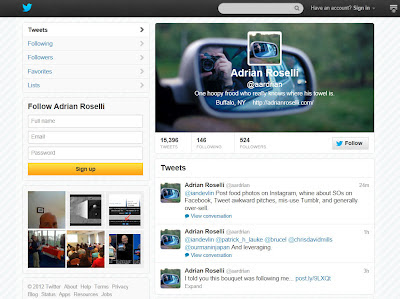
Screen capture of new Twitter header on desktop browser.
I am wholly unimpressed with the desktop browser experience. Not only has the image been scaled down (which I expected), it was scaled down to 542 pixels in width, or by a factor of 2.31. That’s not a nice even number and it relies on browser image scaling (which isn’t even bicubic in older browsers) to present the image.
In addition, my name and description are lost in the image, which means I’d have to build a space into my file just to account for the text. On top of all this, the link to my web site doesn’t stand out in any way as a hyperlink. It is not obvious that it is clickable, and that’s ultimately the thing I want people to click if they visit my profile page.
Forgetting how the image disrupts copy laid on top of it, the size of the image header leaves (at the window size I was using) only 3 tweets visible in my timeline. While at this same window size I only had 5 tweets visible with the old header, I’d rather have those two tweets back given the issues I have with the new header.
Compare this with my profile page before the header:
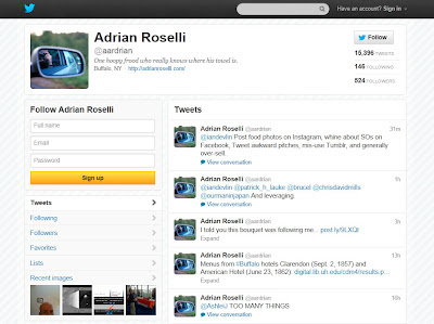
Screen capture of old Twitter header on desktop browser.
Mobile Browser
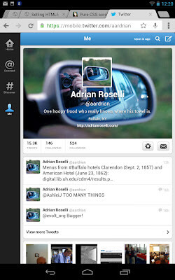
Screen capture of new Twitter header on mobile browser (Chrome on Nexus 7).
The mobile browser experience isn’t much better. The text is nearly illegible, but at least the hyperlink to my site appears to be bold, if smaller. Only three tweets are visible and then there is a bar with images I have posted. The worst part is that only one of those is mine (the other five are retweets), they are from July, and the thumbnail, when tapped, loads the wrong image. I don’t like my tweets being truncated for this low-value content.
Without the header image, however, the experience is almost no better. I still lose the same amount of space to a header image I have not defined. The only plus is that the text is now legible. See the before photo:

Screen capture of old Twitter header on mobile browser (Chrome on Nexus 7).
Mobile App
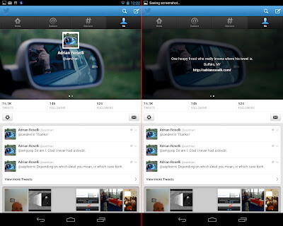
Screen capture of updated Twitter app with new header (Nexus 7).
Everything I said about the mobile browser experience with and without the new Twitter header applies.
Except this is even worse.
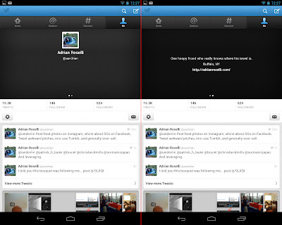
You can’t see my description, location or web site address in my profile without swiping to a second panel. Perhaps in some misguided attempt to make the text more legible by laying down a black overlay on the background header image, Twitter has now made my biographical information and link to my site totally invisible without some user interaction.
Not providing a header image does not save me from this mistake. As you can see below, custom image or not, my information is still a screen away.
Screen capture of updated Twitter app without new header (Nexus 7).
Conclusion
I removed the header image. I see no reason to push all those kilobytes to users to lessen their experience should they stumble across my profile page. On top of that, I don’t want to hide any more tweets than necessary nor obfuscate the link to my site (though I have no control over that in the mobile app). Perhaps in the future I’ll take time to craft an image to better fit the layout, but I have more important things to do than try to shoehorn something into Twitter’s mistake. Not to mention they can just change the rules again at any time.
Frankly, I’d rather Twitter enable Twitter cards for all sites. There is far more value to me as a content creator and as a user in that feature. And that feature leans on the existing Twitter experience, not some vapid attempt to copy other social media platforms.
Update: 2:19PM
I just discovered .net Magazine did a brief piece on the Twitter header image this morning, and the sources they cite say pretty much the same thing as I do.
3 Comments
I totally agree, I'm trying for the first time to make a twitter account and it feels terribly ungly and unprofessional, the older header was way better…
Is there a way to convert an account to the old set without the header picture?
Danielle, nope.
The old header doesn't fit with the direction Twitter is going and Twitter isn't likely to keep the extra codebase around when it's easier to just push users to the new one. I suggest using a simple color or texture since no matter how you try to line text up with an image, some user on another device with different font settings won't see it the same as you.
Leave a Comment or Response