Google Instant Preview Overview

It’s like I’m running out of novel titles or something.
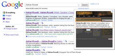
With the launch of Google Instant a couple months ago, the landscape for SEO changed as now site authors had to consider targeting keywords for search results that appear as the user types (see my post at evolt.org: Google Instant and SEO/SEM). Anyone who thought that Google would still for a while from there was wrong. Just last week Google introduced Instant Previews, which now shows search users the preview of a page before visiting it (see the announcement at Beyond Instant results: Instant Previews). The embedded video from Google below provides an overview of the feature.
To be fair to others, Google didn’t exactly pioneer this, but as the biggest player in the market, Google’s implementation can have an effect. As a result, expect to see people react to it in different ways. Many users, however, may never know the images are available since they will have to click the magnifying glass icon (or use the right arrow key) to activate the feature.
One key feature of Google’s implementation is that it highlights the keywords in the screen shot, showing users just what the search term hit within the page. This is particularly handy to see if your search term is hitting some main content, or just some ancillary content on the page, potentially saving users extra clicks and time spent reading through a site. In looking at my own site, I can see that it highlighted the introductory text instead of the giant h1 with my name in the banner.
Since showing the preview to the end user doesn’t get reported in a site’s Google Analytics data, it will be very hard to measure how effective the preview is at getting users to visit your site.
Before you get excited that as a user that you can now spot SEO spam sites before clicking a link, don’t get your hopes up. Google offers support for a meta tag that allows you to exclude a site from the preview (read the Instant Previews entry on the Google Webmaster Central blog for the scoop on other bits for web developers):
Currently, adding the nosnippet meta tag to your pages will cause them to not show a text snippet in our results. Since Instant Previews serves a similar purpose to snippets, pages with the nosnippet tag will also not show previews. However, we encourage you to think carefully about opting out of Instant Previews. Just like regular snippets, previews tend to be helpful to users—in our studies, results which were previewed were more than four times as likely to be clicked on. URLs that have been disallowed in the robots.txt file will also not show Instant Previews.
SEO spammers will likely use this, including domain name squatters and people who squat on misspellings of common web addresses. In time, users may even come to recognize that a lack of a preview is akin to hiding something.
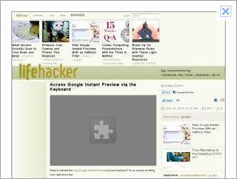
If your site relies heavily on Flash or third-party plug-ins, you may also need to spend some time testing how it looks in Google Instant Preview. There is a reasonable chance that the preview will have broken puzzle piece icons in place of the Flash element. In the words of Google:
Currently, some videos or Flash content in previews appear as a “puzzle piece” icon or a black square. We’re working on rendering these rich content types accurately.
This screen capture of the preview from Lifehacker with an embedded video, which almost ironically show how to use Google Instant Preview with your keyboard, shows what happens when you have plug-ins embedded in the page.

You may also want to skip splash pages or interstitials (the modern splash page for within a site). A splash page may become the preview, and that could end up keeping users from following the link to your site. I’ve been railing against splash pages for well over ten years (see my article showing developers how to allow users to skip them from over 11 years ago: Let the User Skip the Splash Page), but perhaps this new feature of Google can help push more developers to abandon them.
Time will tell how well this feature is received by end users, and more importantly, how developers consider making changes to their sites as a result. I predict it’s just a matter of time (probably backward in time, since I suspect this has already happened) that someone implements a user agent sniffer to detect the Google crawler and serve up different styles to optimize the layout of the page for the preview size and format. If I wasn’t writing this post I’d probably be working on that instead.
2 Comments
In producing the preview, does Google use the Chrome rendering?
This is the UA it reports when loading a page on the fly (which could be different from its regular crawl):
Mozilla/5.0 (en-us) AppleWebKit/525.13 (KHTML, like Gecko; Google Web Preview) Version/3.1 Safari/525.13
Leave a Comment or Response