Inside the evolt.org Rebuild: The HTML and CSS
It’s been three months since evolt.org rolled out its new design. People have been asking what we did, why we did it, and how we did it. I’ll try to address these questions in the context of the HTML, the CSS, and the overall site design. (Nobody seems to care where we did it, but I’ll touch on that, too.)
What we did
In short, we created a site that is HTML 4.01 Transitional compliant, is CSS Level 1 compliant, conforms to Level A of the Web Content Accessibility Guidelines 1.0, and passes accessibility checkpoints as detailed by CAST’s Bobby validator. Any browser and any user can use this site, and with the browser archive at our disposal, we feel pretty confident making that statement.
Why we did it
We wanted to create an example of how it is possible to build attractive, usable, accessible, and compliant sites. We wanted to stop using font tags, and all the other deprecated or non-standard horrors to which we’ve grown accustomed over the years. We wanted to have a simple style guide for our users who submit articles. We wanted to make it easier to maintain the site. We no longer wanted to leave users out in the cold, enabling them instead to use the site regardless of their system. And ultimately, we want our users to customize the site to suit their needs. You may ask why we didn’t go straight to XHTML, and that is a good question. The answer was pretty simple for us — not all the browsers out there can handle it. Internet Explorer 5.0 for the Mac will even display it as source code if the mood strikes it.
Who we did it for
Let’s not kid ourselves. Nothing is completely altruistic. We all had our reasons, but luckily they all had the benefit of helping out the users. We, as volunteers who maintain evolt.org, got to flex our coding muscles on a project that we feel has a lot of weight in the community. We got to finally test the theory that a site can be built to be compliant, accessible, and attractive, all without those meddling clients.
Where we did it
Offices, apartments, and houses in Buffalo, Kopavogur, Milwaukee, Portland, Edinburgh, Adelaide, Anchorage, and all the places in between. There is no evolt.org home office, we are distributed as haphazardly as the Internet itself. Who ever said telecommuting doesn’t work?
Yeah, yeah, yeah, enough of that. How’d you do it?
I’m glad you asked.
The design
 We were lucky on this one. Isaac had whipped up a design with which we had all fallen in love, even before we had decided to make a standards-compliant site. Luckily, that design lended itself well to being repurposed into where we were heading.
The code
We wanted to make sure that everyone could use the site. As I’ve mentioned, accessibility was one way to achieve that. However, we also wanted to allow those users who don’t have the latest browsers to still use the site. We try to be an inclusive community, so why would we want to exclude anyone at our site? As such, we had to make some decisions about how we would code the layout. We dumped CSS-P pretty early on. Yes, users of older browsers could just see a stack of divs in the corner of their browser, but what fun would that be? Using tables for layout seemed to be the most sensible thing to do, while still allowing us to keep the content and style independent. Given that, visit this site on any older browser, and you’ll see the same old black tab in the corner, and the same layout of the content. No, it won’t be in color, but at least you can still see it. I refer you to the screen captures presented below.
Since the style and the content are independent, we found it was extremely easy to create printer-friendly pages. A very simple header, some changes to the CSS units, and flow the content in. All articles are printable, even if not all of them should be printed (I know for a fact most of mine are dry reading).
The styles can be changed quickly as well. Just load a new style sheet, and it’s a whole new look. But I talk about that more later on. Once we knew that we wanted to allow different styles for different sections or users, we realized we had to create the black tab at the top of the page with aliased edges. The curves may not appear terribly smooth on a white background, but at the very least there aren’t any ugly halos around the curves, either.
Splitting the page into three stacked tables allows the browser to render it progressively, first rendering the tab, then the content cell, then the black footer. This does have some drawbacks, however (see the caveats below).
We wanted to limit the number of tags allowed on the site by authors. This way we could do our best to enforce standards in our articles, and ensure the CSS applies to every article equally. The trick was deciding on what to use. For instance, the debate came up about i vs. em. We chose to go with em since it implies context and structure, and not just style. One of the benefits is that a screen reader will know to pronounce that differently. As another example, we chose to use strong over b, code over tt, etc.
You may also wonder why our code blocks are displayed within textarea tags. That question is not quite so easy. Since the site is made up of stacked tables, and since the primary site navigation is on the right, any long lines of code would push the navigation off the screen. So, in an effort to make the blocks of code easy to view, without compromising the site design, we chose to use the textarea. It isn’t the best use, but it is valid HTML, and doesn’t cut out any users. An added bonus is that for newer browsers, putting the focus on the textarea, whether to scroll or highlight, the contents of the entire textarea are automagically selected and ready for copying to the user’s clipboard. The advantage for authors is that they need only enter those blocks of code into pre tags, and some highly trained gnomes re-code it for them on the server.
For all instances of form elements on the site (the login forms, the rating radio buttons, etc.), we’ve made every effort to use the accessibility features introduced in HTML 4.01. This includes the use of the attributes ‘tabindex,’ ‘accesskey,’ ‘id,’ as well as the label tag and even the rare use of fieldset and other elements. The advantages to these tags are that form elements can act more like form elements in the user’s operating system. For example, clicking the text next to a radio button or a checkbox will select that radio button or checkbox, using a key combination with the accesskey of a form element will give that field focus, tabbing through the form can happen in a logical order, and other benefits. Older browsers just ignore these tags and attributes, without interrupting their performance in any way.
Screen caps from various browsers
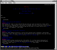
 The evolt.org home page and an article page as viewed in Lynx 2.7. As you can see, it’s a few screens high, but all the content is accessible, and the table structure is logically ordered to allow for ease of use for Lynx users, and by association, screen-readers and other text browsers.
 The evolt.org home page as viewed in Lynx for Linux. Looks just as nice as in the MS Windows version of Lynx.
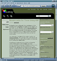
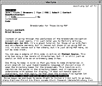 An article page on evolt.org as viewed in MacLynx. Noticing a trend?
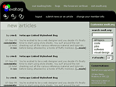
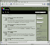
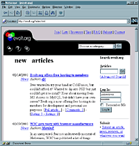 The evolt.org home page as viewed in Netscape Navigator 3.04. All the page layout matches that seen by the latest browsers. It degrades very well to older browsers while still retaining the site identity. All features of the site are still available, even if the browser doesn’t support the JavaScript in the form fields.
 An evolt.org article page as viewed in iCab for Mac. iCab is a very nice standards-compliant browser. It cannot handle the CSS that colors the page, fonts, and form elements, but it does display the correct typefaces and sizes.
 The evolt.org home page as viewed in Mozilla 0.8, probably the most standards-compliant browser out there.
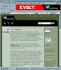
 An evolt.org article page as viewed in Netscape 6.01, built on the Mozilla engine, with all the bloat we’ve come to love and expect.
 The evolt.org home page as viewed in Opera 5.0, also considered one of the most standards-compliant browsers available.
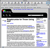
 An evolt.org article page as viewed in Opera 5.0
The caveats
Not everyone who posts an article or a comment can be guaranteed to use good coding practices, despite our best attempts to clean their code. That being said, not all article pages will validate, especially the older articles which we haven’t yet converted.
Some browsers experience an unfortunate offset with the black tab; it sits a few pixels too high and off to the side a bit. We did everything we could, really, but we just couldn’t get 100% conformance and still be standards-compliant. This is most noticeable in comments where somebody posts a very long URL and it pushes the content table beyond the width of the browser window. It’s just something we’ve chosen to accept.
Down the road
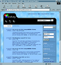
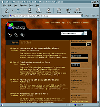
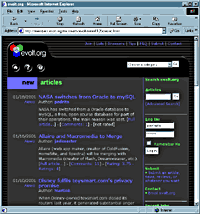
One of the features the site is able to support, but doesn’t just yet (hey, we’re volunteers with day jobs… er…) is user-defined styles. Since the colors and font sizing are independent of the HTML, all we have to do to change the look of the site is link to a different CSS file. This means that if the text is too small, or doesn’t have enough contrast, you’ll be able to adjust it to a comfortable reading level. As a bit of a teaser, the three images below are screen captures of the exact same page, with a pointer to a different style sheet. You’ll mostly notice only color differences. I like the font size.
Do you think you’re special?
Yes, but that’s because my mom told me that while growing up. I think it was because she dropped me on my head. But you’ve heard that, and seen my incessant stuttering anyway…
But we’re not the only ones who’ve taken this step. Another web community, A List Apart, staged its own Valentine’s Day Massacre of all its non-standard HTML and rolled out a new version of its site. However, they took a slightly different approach.
Joining it to the Web Standards Project’s browser upgrade initiative, they’ve taken it a step further. They’ve dumped the use of tables for layout in favor of a two-column layout driven by CSS. Why would they do this? Well, I’ll leave it to them to explain, they do a much better job. They even have a great article going into the sordid details of how they trotted those poor old HTML tags out into the back alley to put a bullet in their bracket. Is their approach better? No, just different. In their case, they want to show developers it can be done, and try to promote the adoption of newer browsers. In evolt’s case, we want to show it can be done, and work in all browsers. These different goals result in a good contrast of ways to implement a standards-based site.
Have you seen others coding to standards? I know there are some others out there, but I’d love to hear from you (use the comment form below) if you’ve seen other sites who’ve taken this step.
Whose fault is all this?
There’s a long list of people who had a hand in this, and I’ve listed them below. They all deserve a lot of credit for sticking with this redesign for over six months when they could have been drinking milkshakes and trolling the list.
- aardvark, the initial coding, validating, and browser testing. You can blame him (me) for much of the HTML and CSS.
- djc, helping to integrate all this with the ColdFusion templates and data sources.
- .jeff, for integrating some handy JavaScript and beating the hell out of ColdFusion to get it to work with our design.
- isaac, for the initial design and helping ensure we stayed true to it.
- mccreath, for updating the styles, the HTML, and working it into ColdFusion
- elfur, also for updating the styles, the HTML, and working it into ColdFusion
- martinb, for testing and pushing compliance.
- marlene, for general harassing us into doing something.
- rudy, for making me defend the structural appropriateness of practically every tag used.
- thesite, evolt’s mailing list dedicated to discussing all the development on the site, past, present, and future. Lots of good people there who threw ideas on the table and helped us test.
Leave a Comment or Response