Using ARIA instead of HTML is generally fine for content, layout, structure, and other static bits of a page. A <div role=”heading” aria-level=”1″> is the same as <h1> as far users and accessibility APIs are concerned. It is unlikely a user will ever notice the difference unless you use both…
Spanned table headers are not well supported across screen readers. While you can visually style these all sorts of ways to make the spanning clear, I am focusing on the programmatic outcomes. Which essentially means how they are exposed to screen reader users. This post uses only HTML <table>s. It…
As the world’s leading expert on a people-first approach to computer vision, I am dedicated to providing insights that enable designers, developers, and copywriters to create accessible images at the highest possible velocity. A velocity so high, in fact, you can almost hear the point whistling over their head, like…
First, a very important qualifier — this does not represent how Braille display users experience the web. All this post does is show how to enable the Braille display emulators in JAWS, NVDA, and VoiceOver. This can be handy when testing issues reported by users and you do not have…
Now that it is a market differentiator to talk about accessibility in projects, that’s all many do — talk about it. In a sea of pop-dev noise, “accessibility” can be claimed with little risk someone will challenge it. If someone does, the response is often a fine balance between silence…
I need your help. Legal documents are common on the web. Each site that has a Terms of Service written in impenetrable and indecipherable legalese, like this sentence, delights in that complexity to dissuade users from reading it and realizing just what they are giving up. “Am”, “add”, and “it”…
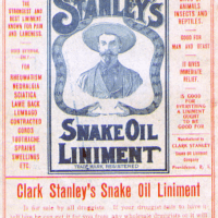
Dear sighted reader, I want you to read this post without looking at the images. Each has been hidden in a disclosure. Instead, read the alternative text I provide and visualize how it may look. Then read the automatically generated alternative text, and try to visualize it then. Consider how…
Native controls can be different from their roled-up ARIA equivalents in a variety of ways. For example, an expanded native HTML <select> on mobile behaves differently when the dismiss gesture is used than when the same gesture is used with an expanded ARIA listbox. Using Android with TalkBack, a down-then-left…
I have spent a few years banging on about ensuring scrolling areas on a page are accessible to keyboard-only users. This is partly because the term “keyboard” maps to other input types that we distill to “keyboard” for ease of reference (speech input, sip-and-puff, on-screen keyboards, scanning software, etc.). When…
Others in this sorta-series: Under-Engineered Custom Radio Buttons and Checkboxen Under-Engineered Toggles Under-Engineered Toggles Too Under-Engineered Text Boxen Under-Engineered Responsive Tables Under-Engineered Select Menus Under-Engineered Dependency Questions This post is not about <select multiple> nor a bunch of <div>s roled-up into a listbox with aria-multiselectable. Both the APG examples and…
On 7 April 2022, Twitter added a feature to let all web users display the alternative text on images in tweets. I am glad to see this feature in the wild for everyone. It has some issues, however, which complicate the experience for sighted keyboard users. The following video demonstrates…