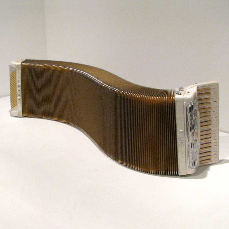
Foolishly Responsive
Honoring April Fools’ Day I have created a foolishly responsive accordion control.
Typically a responsive effort shoehorns a large pattern into a narrow viewport, often based on iDevice screen sizes. Less typically a responsive layout will also consider viewport height, and far less typically a responsive layout might even consider print. Never mind other even edgier cases.
I decided to try the inverse. I took a pattern optimized for smaller screen real estate and scaled it up.
Using the sample accordion I made for my Disclosure Widgets post, I added a media query that converts the entire widget to a horizontal flex layout and rotates the triggers 90° whenever the screen gets wide enough. “Wide enough” is 40em, so some smart phones in landscape will see the switch.
Collapse the HTML panel to probably see the wide-screen layout (either below or at the pen on its own). You can also visit the debug version of this pen in a new window/tab and squish your browser size (or rotate your device) to see it swap layouts.
See the Pen Pointlessly Responsive Accordion by Adrian Roselli (@aardrian) on CodePen.
Now that I have explained how I built it, don’t do this. This is absurdist. It adapts a small-viewport-friendly visual UI of progressive disclosure by retaining its context-specific elements and, as a result, makes it worse at wider viewports.

This is analogous to when designers and developers try to scale an expansive rich pattern down for a narrow viewport and in doing so create a convoluted pattern that does not take into consideration the platform or context. Assuming the large-screen use of the pattern was warranted to begin with.
Users are bewildered when content or controls are hidden for no clear reason. When the current view dynamically alters HTML or page order, then low-vision, mobility-impaired, and stressed or distracted users can be thrown off. If the underlying roles, states, and properties change, screen reader users will have a jarring and confounding experience.
This can happen when a user rotates the device, zooms the page, splits the screen, or simply continues a task on a different device. Dismissing those changes and their outsized impact on disabled users as nothing more than “edge cases” is all too common.
Conveniently, for the absurd example I made for this post, a blind screen reader user will get exactly the same interface regardless of viewport size. As it should be. No content is re-ordered. No roles, states, properties, or accessible names are changed. No interactions change.
Do not let the artifacts of a poor visual design decision punish users whose experience is defined strictly from the code.
Leave a Comment or Response