Block Links, Cards, Clickable Regions, Rows, Etc.
Whether you call them cards, block links, or some other thing, the construct of making an area of content clickable (tappable, Enter-key-able, voice-activatable, etc.) is not new.
While hit area size is mostly a usability issue, marketers often want a larger click area around their calls to action (CTAs) to make them more prominent. Without thinking about the impact on screen reader users, that can make for extremely verbose controls. For voice users, it can be confusing what to say to select one of these.
There are no earth-shattering techniques here. I am mostly demonstrating how doing it the wrong way can be a problem and how a little planning can make the better way less awful.
Links
Perhaps the worst thing you can do for a block link is to wrap everything in the <a href>.
If you fail to make the link to display: block, it will have dead areas around words or chunks of text, which can make them feel like distinct links for a mouse user. If you use an underline on the entire block of text, it can be hard to read, while no underline at all can remove that visual affordance.
Worse, for a screen reader user the entire string is read when tabbing through controls. In the following example, the first link contains the heading, image (without declaring it as an image), and block of text, taking about 25 seconds to read before announcing it as a link. When tabbing, you do not always know the control type until the accessible name is complete.
The other two links wrap either the <h3> (second example) or the Read more…
text (third example). For the third one I use aria-describedby to point to the <h3> for more context on the link, but that is not the only nor best way to do it.
The following example demonstrates arrowing through the content. Since there is a misconception among developers that screen reader users Tab through everything on a page, they often forget to test the primary way screen readers scan a page — by arrowing (or swiping if on a touch device).
You can hear how every chunk of text is announced as a link, and it is not clear that they are all the same link. Only a more skilled user is likely to recognize the pattern and guess they all go to the same place without further inspection.
The CSS for the block link is generally straightforward:
.block a[href]::after {
  content: "";
  display: block;
  position: absolute;
  top: 0;
  bottom: 0;
  left: 0;
  right: 0;
}
Note that this approach prevents selecting the text.
Heydon Pickering goes into more detail on cards in Inclusive Components, which generally covers the same stuff as here but without the screen reader examples. Specifically, Heydon uses script to enable selecting text (at the heading The redundant click event) in that post.
Variations
I get asked about two challenges to this approach regularly. Content order and additional controls.
Content Order
Because I feel strongly that headings should be used to structure your content (content following a heading contextually belongs to that heading), some developers may not know how to mark up a design where an image visually appears above the heading. After all, if the image is in the card, it probably belongs to the heading and text in that card.
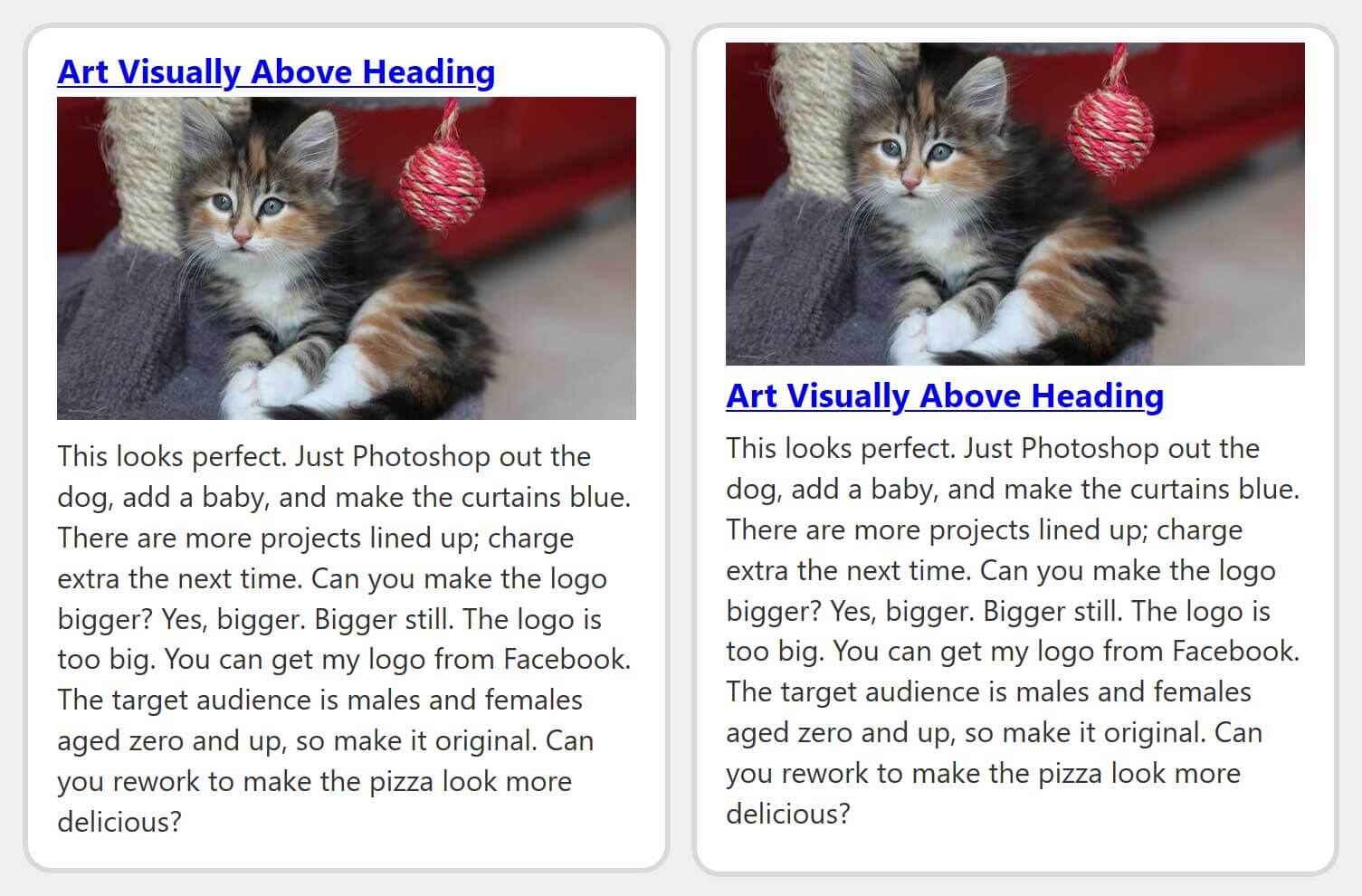
This is one of the few cases where I advocate using CSS to re-order the content to achieve the visual design. If you use my reading order bookmarklet on this, you will see the image is moved above the heading.
The CSS:
.reorder {
  display: flex;
  flex-direction: column;
}

.reorder h3 {
  order: 2;
}

.reorder p {
  order: 3;
}
If you only set order: 1 on the <img> and none of the other content get an order defined, then the <img> will appear after the other content.
Content Order — Updated
As Dannie notes in the comments, I could have used the following CSS instead:
.reorder {
  display: flex;
  flex-direction: column;
}

.reorder img {
  order: -1;
}
I adjusted the Codepen example as well. I did not thoroughly test this, either. I cannot say if I just forgot about using a negative value or purged it from working memory due to some issue somewhere, so of course test.
Additional Controls
If you need to have an additional link, or a button, or some other control within the card and the design places it at the bottom or top (or even along a side), you can account for this by leaving space for it. This or similar CSS may do the trick:
.block.extracta a[href]::after {
  bottom: 3.75em;
}

.block.extracta p a[href]::after {
  content: none;
}
In my example, I am basing it on the the current text size (em units), but you may need to get more creative if your content will be unknown to you, translated, localized, or otherwise variable. My example is sloppy because I have such a broad selector for links in my cards, so I have to remove the generated content from the additional link.
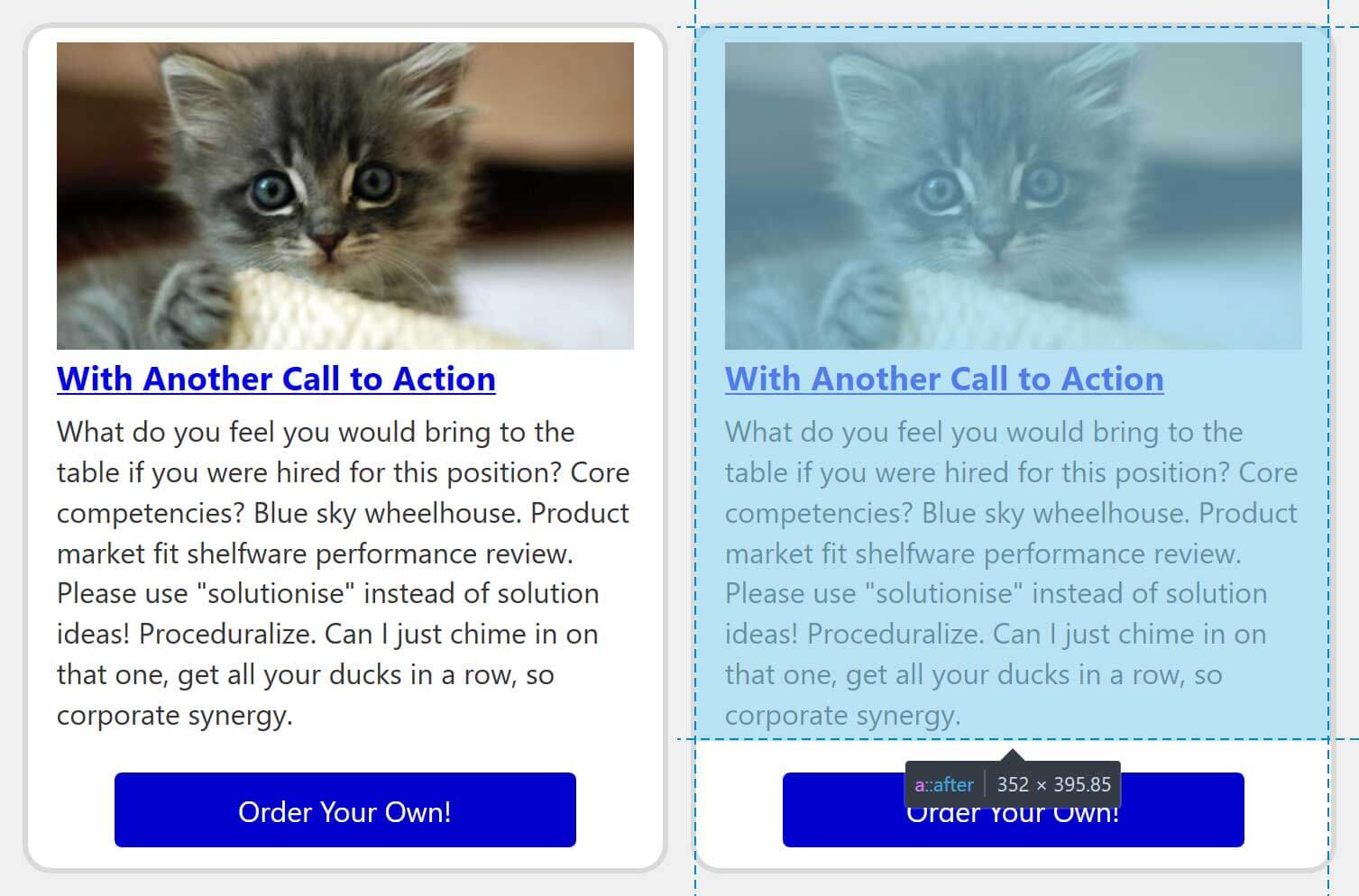
In the image, see that I leave some dead space above the other interactive control. Ideally this can help prevent mis-clicks/-taps.
Buttons
Most of what I review above applies to <button>s as well. As more and more web content tries to be more appy (think SPAs), a native button might be used to change settings or preferences. Dashboard pages often include card-like interfaces, and those cards similarly stuff way too much into a <button>.
Unlike a link, which allows nested headings, lists, and so on (regardless of how verbose that is), nesting structured content within a <button> removes that structure. An <h3> inside a <button> is no longer a heading. It is just a piece of text. The following video demonstrates that in action.
Arrowing through the content of a <button> does not mean that structure will be exposed either.
A user familiar with the screen probably is fine with a control that announces only as Settings
. Even if confused, it is a simple (and faster) process to arrow backward or jump to the preceding heading for the needed context.
The styles I used to make block links generally apply here. If for some reason your button has an image or needs to have another control within its visual container, the tactics I used above also generally apply.
Demo
All the code for the examples is embedded below. You can visit the Codepen directly to play with the code, or view it in debug mode with your own assistive technology.
See the Pen vYOGpXb by Adrian Roselli (@aardrian) on CodePen.
Update: February 23, 2020
At the end of this post is a comment asking about Smashing Magazine’s home page. While I responded to the question, images do a better job.
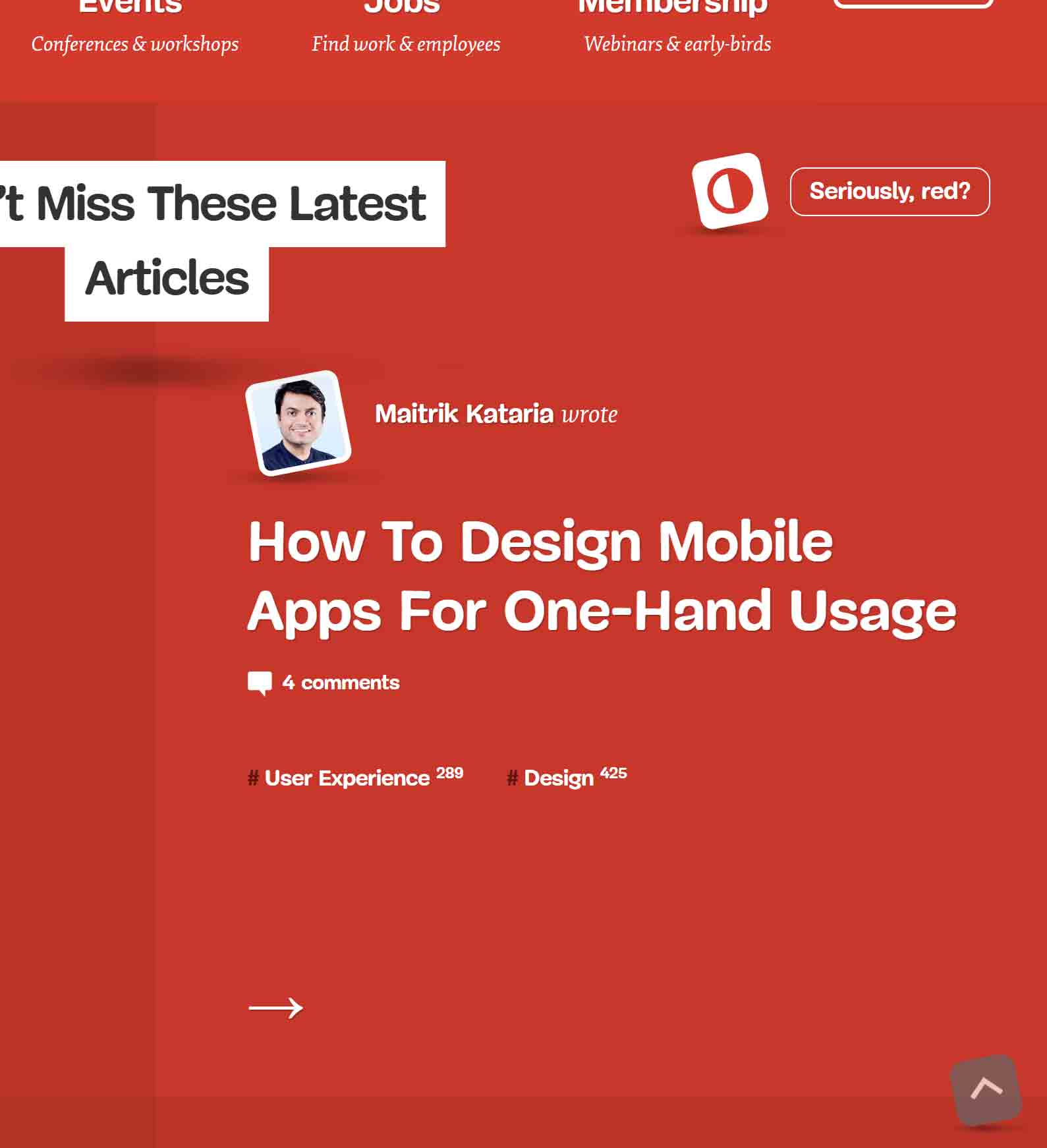
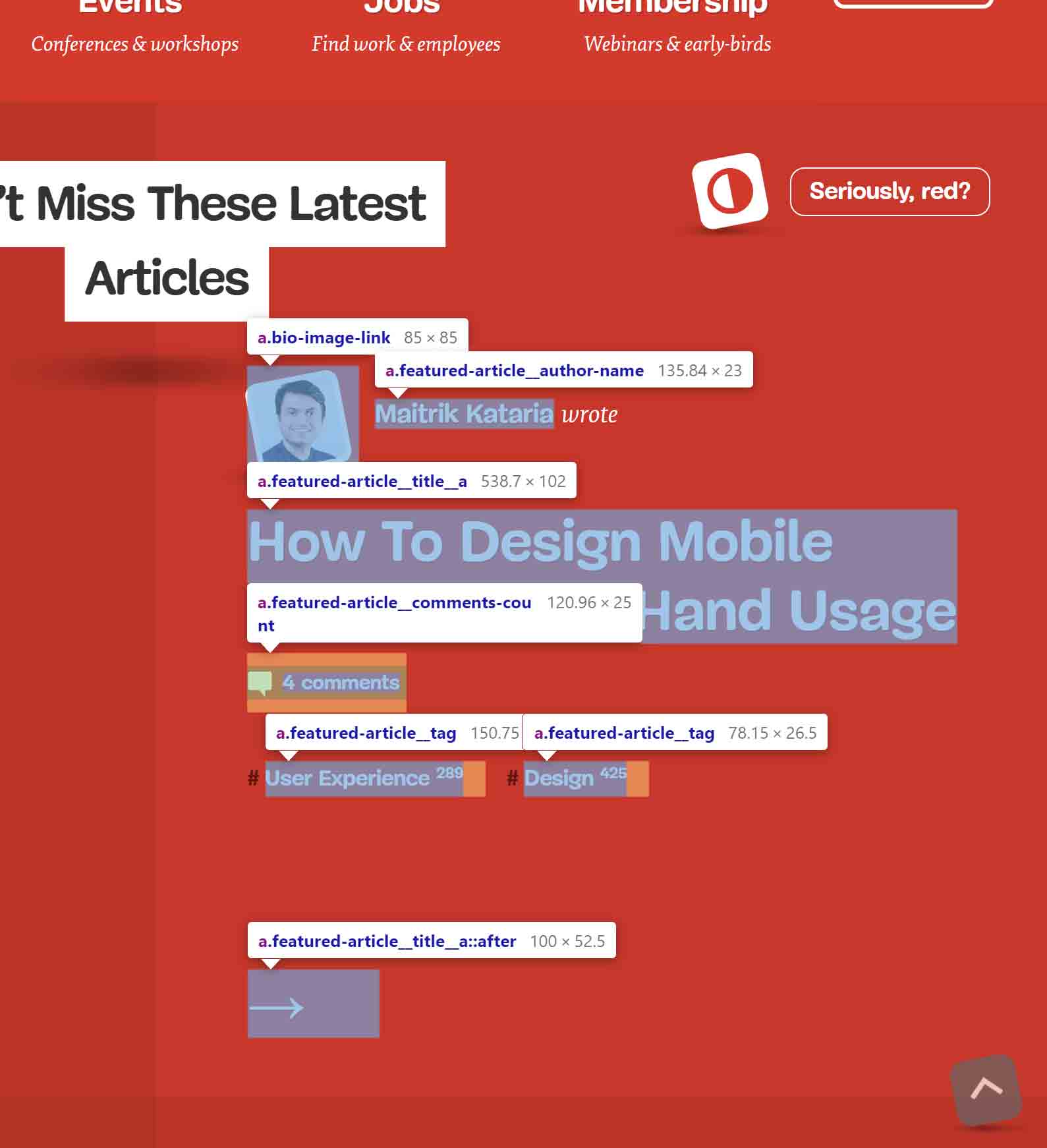
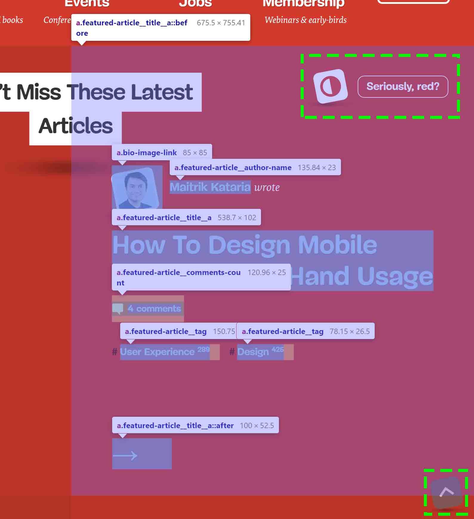
::before that overlaps all seven links as well as the page’s contrast widget and scroll-to-top feature.
In my response, I note that the simplest fix for this problem is to remove the ::before on the <a> around the article title. This would help average mouse and touch users. It can also be a boon to mobility-impaired users and blind users who may be using explore-by-touch in their mobile screen reader.
Update: March 31, 2020
I was asked about clickable table rows, which are a particular annoyance to many screen reader users. The current practice across libraries is to attach a click handler to the row, which means everything in the row announces as clickable.
We can adapt the block approach to work with rows. Unlike cards, you want to the control’s clickable area to extend beyond its parent container, which is a cell.
In the following example, the width is generally known (100% minus the 1vw margins) and the tables are rather wide. While not perfect (on wide screens) this at least works for the example and shows the concept. In the comments, Mike Foskett showed a cleaner approach which I integrated into my embedded example.
There are two tables. The first uses links in the first column, and the second example uses buttons in the last column.
Visit the tables example directly at Codepen or view the tables example in debug mode and test with your own assistive technology.
See the Pen Block Table Rows by Adrian Roselli (@aardrian) on CodePen.
Update: April 1, 2020
Great point about selecting text from cells:
The potential downside for this approach is that it is now difficult to select and/or copy text in other cells. Any thoughts on that?
I mention the copying caveat elsewhere, but specifically on this point:
Yes. That is a trade-off where a decision must be made for each case.
IME making an entire row clickable is already an anti-pattern; some JS techniques fire on the wrong event creating same problem.
As always, context matters, test with your users.
Update: August 18, 2020
Nomensa has a post outlining what I cover above. Just as I am not the first to write about it, they will not be the last. This is good since it reinforces and/or adjusts existing patterns.
Update: 29 September 2025
This post got a mention from Tina Reis at WordPress Accessibility Day 2024.
YouTube: WP Accessibility Day: How to Design and Implement Accessible Cards, 52:33, mention at 6:36.
27 Comments
Great post as always, Adrian!
Just a small note on the reordering:
You can reorder with negative numbers meaning that you only need to set the order of the img to “-1”, effectively generating the same result. That way, you won’t have to keep track of the ordering for the other elements.
img {
  order: -1;
}
In response to . Thanks! I have adjusted the example code and pen.
What would your recommendation be for cards that contain ‘nested’ links? For example the links to articles on Smashing Mag where the card also contains a link to the author.
In response to . Yeah, as your quotes imply, they aren’t nested, but the clickable areas clearly overlap.
Those links are a bit much. The article title clickable area overlaps all the other links (author, comments, and tags), so a user needs precision to avoid a mis-click/-tap. For the top-most links, the clickable area overlaps the
<h1>and the contrast switcher button. Similarly, the hit area butts up against adjacent article hit areas.My post Target Size and 2.5.5 talks about the need for dead space between clickable / tappable areas, showing examples from platform development guidelines.
The two links to the author have the same link text (the
altis the same as the text), so those should be combined.To wrap this up, the link to each article should be generally limited to the article title. The simplest fix would to remove the
::beforeon the article title<a>.
In response to . David, I updated the post with images that might better explain what I was saying.
Great post, thanks for the detailed writeup. I often use aria-owns to reorder the DOM and it’s pretty well supported. It might be worth trying that instead of relying on CSS to re-order the DOM?
In response to . Gurmukh, I am not re-ordering the DOM in CSS. I am using CSS to visually adjust the layout.
Given that a screen reader is needed to understand that relationship, relying on this approach can leave other AT users (such as keyboard-only users) caught out if the layout becomes more complex or starts to integrate other interactive components.
Where
aria-ownsis supported, that may be adequate for your use case. I avoid using ARIA unless I have a compelling case.
In response to . Gurmukh, it turns out
aria-ownsseems to trigger a weird bug in Chrome 79 through at least 81 (Issue 1071123: aria-owns with aria-hidden on a label hides disabled fields from AT) and JAWS 2018 (not 2019) when paired with Chrome (Issue 1071147: aria-owns on Causes SRs to announce control type of adjacent field).If you are not testing these scenarios, I suggest you do so. If you update the bugs with your findings (replicate or not) that would be ace.
Really enjoyed this post. One consideration I found with the third example (Somewhere in text) is that the Read more… link’s `aria-describedby` does not appear in Rotor mode in VoiceOver, so the context of the heading is lost. If a site had several cards and users were navigating via a list of links in Rotor mode, they wouldn’t be able to differentiate between distinct links. What about including the heading text directly within the link as screen-read-only text?
This is a tricky pattern! I’ve been following the pseudo element approach but I’m sensitive to the fact that users can’t select text.
In response to . David, because
aria-describedbyis supplemental information, VO is behaving as expected. It’s the same in NVDA and JAWS when using their links navigation dialogs (analogous to the rotor). When moving to the link, NVDA will at least announce thearia-describedby, but JAWS does not under default settings.If this is a problem for your users, you can use
aria-labelledbyto construct a more detailed link or use visually-hidden text. Your approach will depend on needs, verbosity, expectations, AT support, and good old-fashioned user testing.
Silly question time:
You say “When tabbing, you do not always know the control type until the accessible name is complete.”
But why don’t screen readers announce a link BEFORE reading the link? To me it’s always sounded counterintuitive to announce the link after reading it.
In response to . It depends how you are navigating and/or which screen reader. Listen to the first two videos. In NVDA, when tabbing, “link” is read after the accessible name; when arrowing, it is read before. In VoiceOver in the second two videos, “button” is announced after no matter how you navigate. These are decisions the screen readers have made which are ostensibly based on testing with their own users (or getting feedback from them).
What are your thoughts about cards used on e-commerce sites where there is a single image of the product identified by the heading text? Could the image be considered decorative and given an empty alt, thereby eliminating the DOM order conundrum?
For example, cards similar to these over on Amazon’s site: https://imgur.com/a/LjkvuSb
In response to . I am not sure you can consider an image for a product to be truly decorative. For sighted users it is critical to quickly scan options, particularly when they are truncated as in the Amazon example. For a sighted screen reader user, the alternative text is a great way to help disambiguate when the image is too small or has poor contrast.
Is the only difference between products a color? Is that color name not in the product name? Is the color name some weird marketing construct? How do I know I have chosen red lipstick (described as passion in the product name) instead of the maroon lipstick (described as seduction in the product name) if the alternative text does not include it?
In response to . I agree! My company works a lot with e-commerce clients, and we’ve seen that even medium-sized companies can have hundreds of thousands (maybe even millions!) of undescribed product images. Figuring out how to get them to dedicate the resources it would take to address the issue has been a head-scratcher for me for a while.
Do you happen to remember writing or reading any articles that talk about strategies for this all-too-common scenario “at scale”? I’m happy to dig if you even just remember keywords :)
In response to . No, I do not. In my previous life I ran / oversaw an ecommerce platform. Our clients typically came to us with structured data (databases, Excel files, XML) nad we would work with them to identify what attributes warranted going into the alternative text. If none existed, then came the work of building a (human) process.
Friendly heads up, in your March 31, 2020 update you explain the setup of your code example as “There are 2 tables. The first uses links in the first row, and the second example uses buttons in the last row.” Each type of element mentioned is actually in the first and last column of each table.
In response to . D’oh! Fixed, thanks!
Good stuff!
Another content order hack that does work on reordering images and headings for most screen readers is aria-owns:The something of something
The alt text of the image is included at the beginning of the heading.
A screen reader would announce “blog post, the something of something” (works in most NVDA/Jaws combinations with IE11/Firefox/Chrome).
The alt text of the image is always announced first.
If you need it to be announced last, you need to create a separate div that owns both the heading and the imagethe something of something
Though this is getting much hackier and only works in Chrome, I believe
Still prefer the CSS reordering of ARIA hacks but I’ve used this from time to time to include an informational image in the heading of a card.
(note this trick would work with a link too, obviously)
About the clickable table rows: this may create an additional issue where users might have trouble scrolling the page on touch devices. The entire viewport will basically be clickable if the table is moderately high, and we know that misclicks happen, especially for users with e.g. Parkinson.
Instead, I’d ask why the entire row needs to be clickable in the first place—one specific element that is obviously interactive (like the link or the button in your example) seem enough.
(not to mention that the table rows aren’t obviously clickable for touch users, the `:hover` styles only cover certain cases)
Great article, loved it, explained a lot to me.
In the clickable table row example, may I suggest
tr {position: relative}instead of thetd {position: relative}?
It removes the width requirement, and the need to reposition the button cell pseudo:
tr {

  position: relative;

}
td > :is(a[href], button)::after {
content: "";
display: block;
position: absolute;
inset: 0; /* replacement for TRBL settings *//* No longer required: */
/* width: 98vw; */
/* z-index: 1; */
}/* No longer required: */
td button::after {...}
In response to . Mike, that is indeed much nicer. I updated my pen as well. Thanks!
That’s a wonderful article. In the clickable table row example 1, when I tried on Safari+Mac, as soon as I hover the page, entire screen seems clickable or feels like target with mouse. Am I missing something here. thank you!
In response to . Shannara, I had implemented changes from the comment prior to yours but failed to confirm they work in Safari. I have rolled it back so now the examples work in Safari. Dunno how I missed your comment for so long considering I approved it.
Thanks a lot for this blog post.
I tried these patterns with my Mac’s default screen reader and if I wrap the header into an a tag as in most of the examples shown, the screenreader will announce the content twice (“Only on Heading, Only on Heading”). While I personally find this confusing, I am not a screen reader user, so I wonder if this is something screen reader users would expect?
I could not really find any info on this. Would I rather not put the title into a heading tag in this case (even though semantically it would make sense)? Does anyone have any solution for this?
In response to . Are you using Safari with the screen reader (VoiceOver)? I ask because VoiceOver works best with Safari; it behaves oddly with Chrome and especially Firefox.
In response to . I am getting the exact same behavior on Safari (as well as Firefox and Chrome). Is this not happening for everyone else? I wonder, if I set up something wrong with VoiceOver?
Leave a Reply to Adrian Roselli Cancel response