Accessible Drop Caps
Since the early days of the web, when images could be floated and text would wrap around them, designers have wanted to bring drop caps onto the web.
Then we learned how terrible a pattern like <img alt="M" align="left">atthew is for users, and CSS introduced :first-letter, letting us believe all our woes were solved.
Edge cases aside, they mostly were and still are.
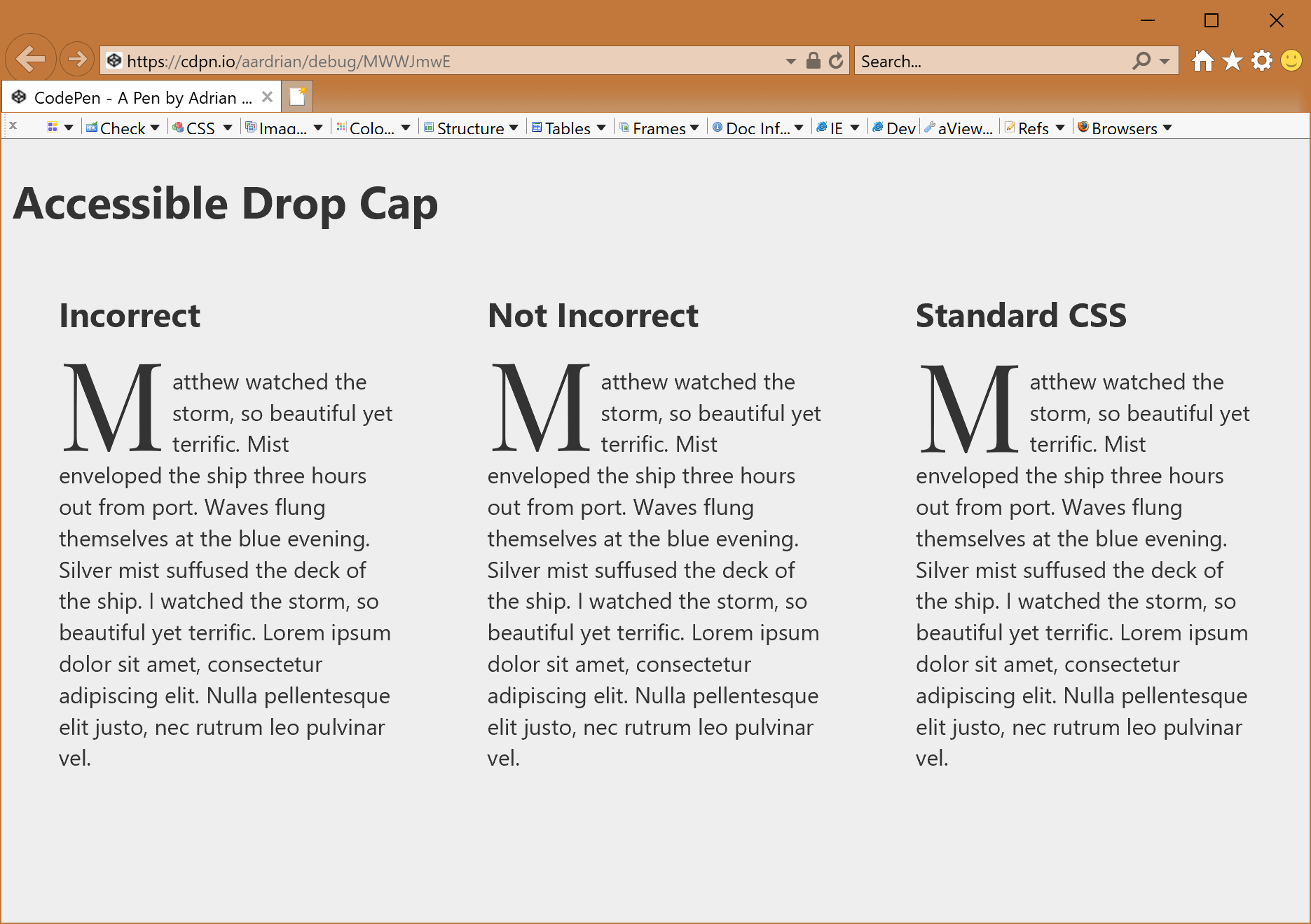
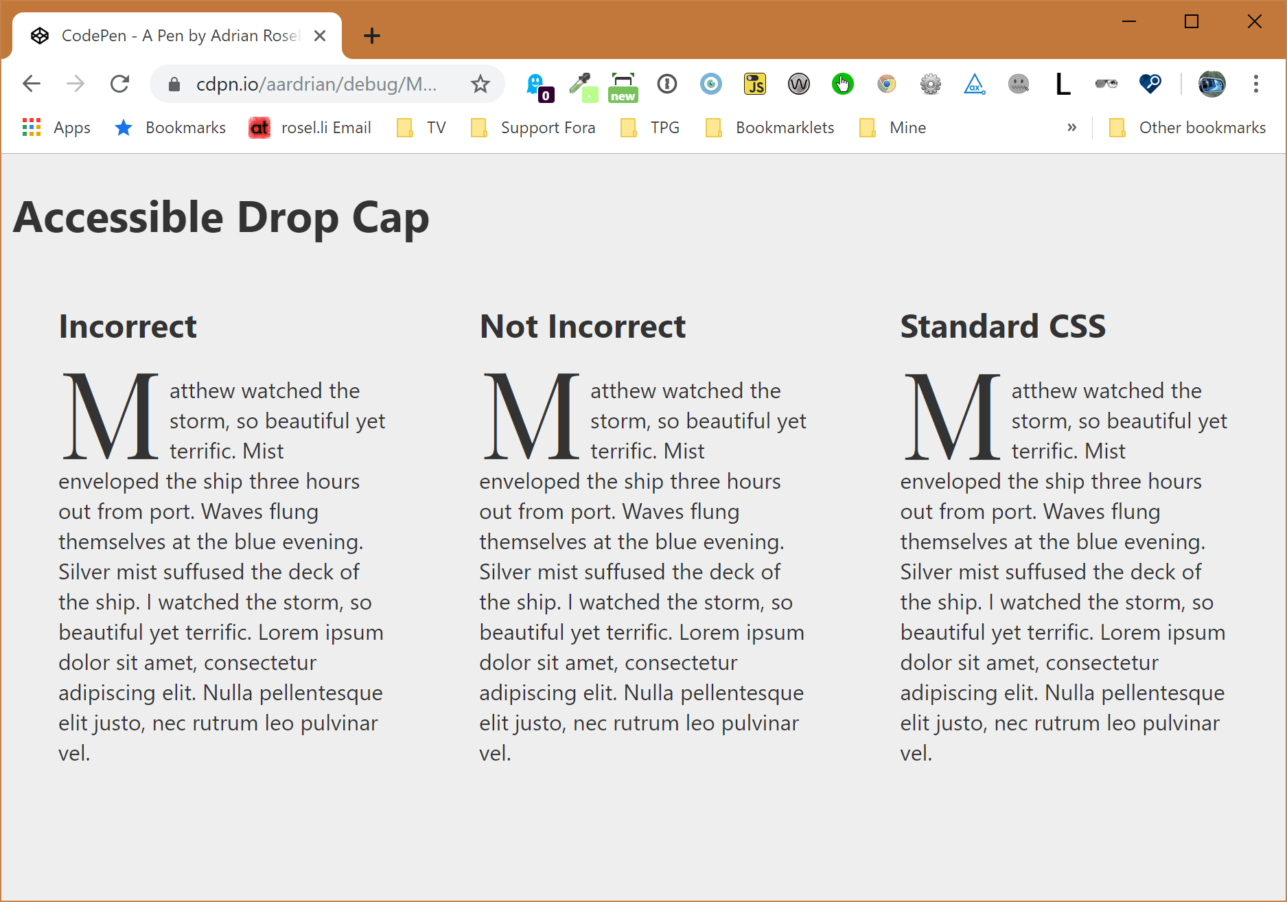
An Incorrect Pattern
I read a tip recently on how to make an accessible drop-cap using HTML, CSS, and ARIA. The pattern, however, relies on two bits of code to work. One bit is an ARIA role and another is an ARIA attribute, neither of which works for more than a sub-set of users.
<p>
  <span aria-labelledby="word--first" role="text">
    <span aria-hidden="true">
        <span class="dropcap">M</span>atthew
    </span>
    <span id="word--first" hidden>Matthew</span>
  </span>
  watched the storm, so…
</p>
This is not robust (nor correct) for two key reasons:
-
First, there is no
textrole in ARIA. You can confirm by checking the full list of roles in ARIA 1.1. Nor is it in the roles list in the ARIA 1.2 Working Draft. As Scott O’Hara points out, this only works in WebKit browsers, which is why this role works if using VoiceOver with Safari on a Mac. -
Second,
aria-labelledbygenerally does not work on<span>s. Instead,aria-labelledbyis meant to provide an accessible name for interactive elements, landmark roles, widget roles, and<iframe>&<img>elements. The Using ARIA document from the W3C provides more detail, though you can find a more readable explanation from The Paciello Group. Further, usingaria-labelledbyin that way will be against the spec in ARIA 1.2 (see Prohibited States and Properties).
In short, don’t use this pattern.
An Accessible Pattern
If you have to use this pattern, then simplify it by first getting rid of the invalid code.
We hide the entirety of our fake drop cap and truncated opening word with aria-hidden="true". That will prevent a screen reader from announcing it, but will still display visually.
<p>
  <span aria-hidden="true" class="drop">
    <span>M</span>atthew
  </span>
  <span class="visually-hidden">Matthew</span> watched the storm, so…
</p>
Then we lean on a proven set of styles to visually hide the word that we want screen readers to actually announce.
.visually-hidden {
  position: absolute;
  top: auto;
  overflow: hidden;
  clip: rect(1px, 1px, 1px, 1px);
  width: 1px;
  height: 1px;
  white-space: nowrap;
}
No roles, no references to text elsewhere to provide an accessible name. However, if your CSS does not load (because the class is in an external file), you will have double display.
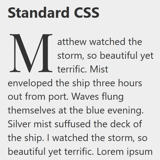
An Ideal Pattern
Use :first-letter. If you do not like the way your drop cap rests with the surrounding text, play around with line-height.
This degrades most gracefully of both options, and you do not need to force authors to use arcane HTML constructs. Nor do you need to write some scripts to create this HTML construct for them.
Using the original example, by setting line-height: .6 from an original value of 1, I achieved an equivalent outcome as the other two options.
p:first-letter {
  font-family: "Playfair Display", serif;
  font-size: 5.5rem;
  float: left;
  line-height: .6; /* from 1 */
  margin-right: 0.05em;
}
Obviously there are cases where this may not work well. You will need to adjust the line-height for different typefaces and surrounding text styles. It may not work for other reasons as well, particularly if you require pixel-perfect cross-browser designs. But start from this simplest approach first, then consider the more complex HTML hackery for the exceptions only.
Obviously you need to test you effort in more than the default browser and screen reader on your computer. Test across platforms, rendering engines, and screen readers.
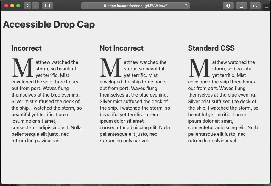
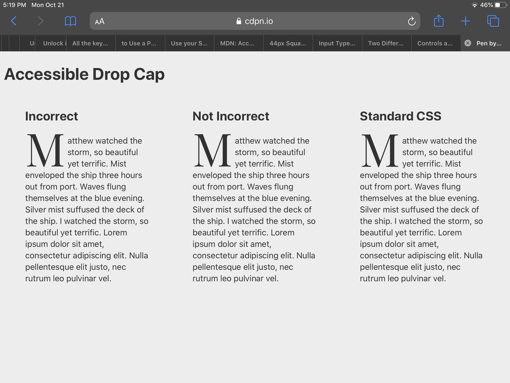
Comparisons
I made an example to demonstrate each of the three variations.
See the Pen MWWJmwE by Adrian Roselli (@aardrian) on CodePen.
Screen Reader
I grabbed the most popular screen reader to compare the three variations.
VoiceOver on iOS and macOS generally handle the incorrect pattern without the pause. JAWS does reasonably well depending on browser. TalkBack pauses as in the example here.
Screenshots
How it sounds is moot to most designers if it does not look how intended. The good news is that each of the variations is consistent across at least 9 browser and platform combinations, which I show below.


Update: 6 August 2020
Justin Gagne has written a post, Rethinking Accessible Drop Caps, where he also adds a block of alternative text to describe the drop cap style. I recommend against this in most cases, but there may be a special case where the style is integral to the content at hand, so it is nice to see the option.
I found a link in that post to a video by Ethan Marcotte, Creating Beautiful and Accessible Drop Caps (also embedded below) where he presents a revised version of his earlier drop cap advice in a digestable walk-through, which uses the two techniques I present above.
Update: 21 August 2020
Sitting in the CSS Inline Layout Module Level 3 Working Draft are the properties leading-trim and text-edge, which promise to make text boxes easier to manage. This could impact how easy it is to style drop caps, for example.
An article on Medium (that is devoid of useful alt text, as is the default on Medium) goes into more detail: Leading-Trim: The Future of Digital Typesetting. I captured a still from an animated GIF in the post (which you cannot stop) that I think does a good job of showing what these properties affect.
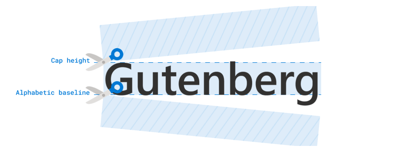
As of 1 March 2023, leading-trim (with default value of normal) has become text-box-trim (defaulting to none). And text-edge is now text-box-edge.
Update: 21 March 2023
Firefox bug 290125 [CSS21] floated :first-letter pseudo-element should act like normal inline (e.g., support line-height) from April 2015 was finally marked as fixed and I missed it.
You may want to see if the fix addresses your use case(s).
Update: 3 April 2023
Stephanie Stimac has written Greater styling control over type with `initial-letter`, which provides a good explainer and overview if you want to give it a spin (in supporting browsers).
Update: 24 August 2023
Apple has shared that it plans to drop the text role from WebKit (Safari). It notified the ARIA Working Group today.
Reasoning:
- The original use case (workaround) is no longer used in a high-profile product. (That product was the reason we couldn’t originally drop support when ARIA declined to standardize it.)
- The implementation makes any interactive descendants entirely inaccessible, which is often not the intention of authors, and unknown to them when they don’t test in VoiceOver, etc. This could potentially be fixed, but we think the fix is riskier and has a higher performance cost than dropping support.
- There are other, standard ways to achieve combined content label… The primary benefit of WebKit’s
role=textimplementation.- There are some sites still using it, mostly due to legacy support of a jQuery Ratings widget, but we don’t believe removing this support will break anything… A VO user might just hear a slightly more verbose label in places.
It also mooted ARIA issue 870: Consider early re-add of role=text, which was closed today as a result. There is no response yet on whether or not VoiceOver itself will get a modification to ignore it.
The outcome here is that if you have the non-standard role="text" hanging around in any of your projects, you may want to flag it for removal.
Update: 6 December 2023
Sarah Gebauer has identified a Safari bug when the font is user-installed in her post Day 2: Drop a cap? This means initial letter drop-caps could be tricky for someone with dyslexia (for example) that relies on a custom font to make it easier to read across the web. I found no Safari bug filed (and have no time to create the test case and file one).
10 Comments
I’ve implemented a drop cap the other day, and I’m glad I went the “ideal” way and don’t have to refactor now.
However, I wouldn’t call it “ideal.” Ideal seems to be what the
initial-letterproperty is supposed to do. So far only supported in Safari, and only for system fonts, not for webfonts; i.e. unusable in production yet.It turned out that the vertical position of the drop cap not only depends on the font, but also on the browser. Firefox doesn’t seem to care much about
line-heighton floated::first-letterpseudo-element. You might want to usemarginto position the drop cap in Firefox, and to useline-heightto adjust in Chromium/WebKit afterwards, see Codepen. (Sorry for the SCSS syntax instead of plain CSS.)
In response to . Agreed, “ideal” is a relative term. Today, it is more ideal; tomorrow it may not be (such as if/when
initial-letteris supported).As for your Codepen, conveniently Codepen will convert SCSS to plain CSS. And yeah, different typefaces will require different techniques. “Ideally” we exhaust all those before moving to redundant text and ARIA.
I’m not sure how that code font looks on other browsers, but it is absolutely horrible to read here on chrome. It’s blurry and wonky.
It’s a shame because the info might be good, but the ‘fun’ font immediately made me bounce.
In response to . I can understand when a typographic choice makes one immediately bounce, especially when you came back to leave a comment. I hope you visited the Codepen sample to see the full code.
In response to . To be honest, I also don’t consider this webfont (VT323) as a good choise.
What’s wrong with this simple one though?
Matthew likes dropcaps
With this approach a post author can set the number of dropcaps by setting the length of the span.
You need a second class or other selector for the letters Q & J, because their descenders project into the 4th line of text. See: https://codepen.io/seezee/pen/YzzEBwW
In response to . Chris, great example. And great point about how, in the end, we have to adapt the styles to our chosen typefaces,
Very nice. Thanks for sharing! When I added text content to a before selector, it capitalized the first letter of that content instead of the page’s html content. Very cool… seems like it could be handy to manipulate content in selectors in this way.
In response to . Jason, yup. As far as the browser is concerned, additional text inserted with
::beforeis just text. But since you can already style generated content (in the same styles that generate it), using the approach in this post may be overkill.
Leave a Comment or Response