A CSS Venn Diagram
A few years ago I made a Venn diagram using floats and absolute positioning. It was fine. Nothing to really brag about, but it got the point across.
I had use for CSS shapes in a project and wanted to play around beyond what the project itself allowed. I decided to revisit my Venn diagram and create something a bit more modern and flexible. This also gave me a chance to play with CSS grid overlaps, which I had not done yet simply because I had no reason.
This post is just a summation of what I made with some stuff I learned. To start, take a look at the base model of my CSS Grid and Shape-Outside Venn Diagram, also embedded immediately below.
See the Pen CSS Grid and Shape-Outside Venn Diagram by Adrian Roselli (@aardrian) on CodePen.
Technical Bits
I spent a good deal of time faffing about with this and trying to create a baseline set of HTML and CSS that I could just drop in anywhere and was natively responsive. That also meant I had to make some technical decisions and trade-offs that might bite me in the bum down the road.
HTML
Sorting the HTML was probably the easiest part for me. The bones are headings and paragraphs in containers. Mostly.
First I wrap the entire thing in an <article> because I expect my nonsense one-off Venn diagrams are something I may want to syndicate or re-use in different contexts. That necessitates a heading as well, which I set as <h2> because in most cases the syndicating page will (should?) have an <h1> of its own. The remaining sections are each designated with an <h3>
Each circle will be generated from a <div>, which imparts no meaning to the content. Nor should it. I also need an element for the CSS shapes to enable text wrapping the way I want. While I could use generated containers from ::before and ::after, that takes away the ability to do ad hoc novel styling for unique cases down the road. So instead I use two <span>s. I do that instead of <div>s because they collapse to nothing when no styles are applied.
  <article class="Venn">
    <h2>Stock Model</h2>
    <div class="circle one">
      <span></span>
      <span></span>
      <h3>One</h3>
      <p>
        Lorem ipsum dolor sit amet, consectetur adipiscing elit. Cras iaculis magna erat, eget condimentum metus faucibus eget. Sed venenatis sem dui, quis faucibus nibh pretium a. Lorem ipsum dolor sit amet, consectetur adipiscing elit.
      </p>
    </div>
CSS Shapes
The thing that really makes this work is support for CSS shapes, a 2014 candidate recommendation from the W3C. Today, CSS shapes is supported in all major browsers except Microsoft Edge. Developers have been asking for support in Edge since 2014 but so far it is only under consideration.
When you write your CSS shapes, you may find the syntax is a bit complex for manually coding anything more than a box or a circle. For the Venn diagram I have angles that I cannot easily plot onto points.
This is where the Firefox shape editor proved to be a life saver. Not only will it show you which point on a shape maps to which values in the syntax, it will let you drag them around or type in your own values. That also mean it was easy for me to re-use them by just doing some math updating the mirrored values across shapes.
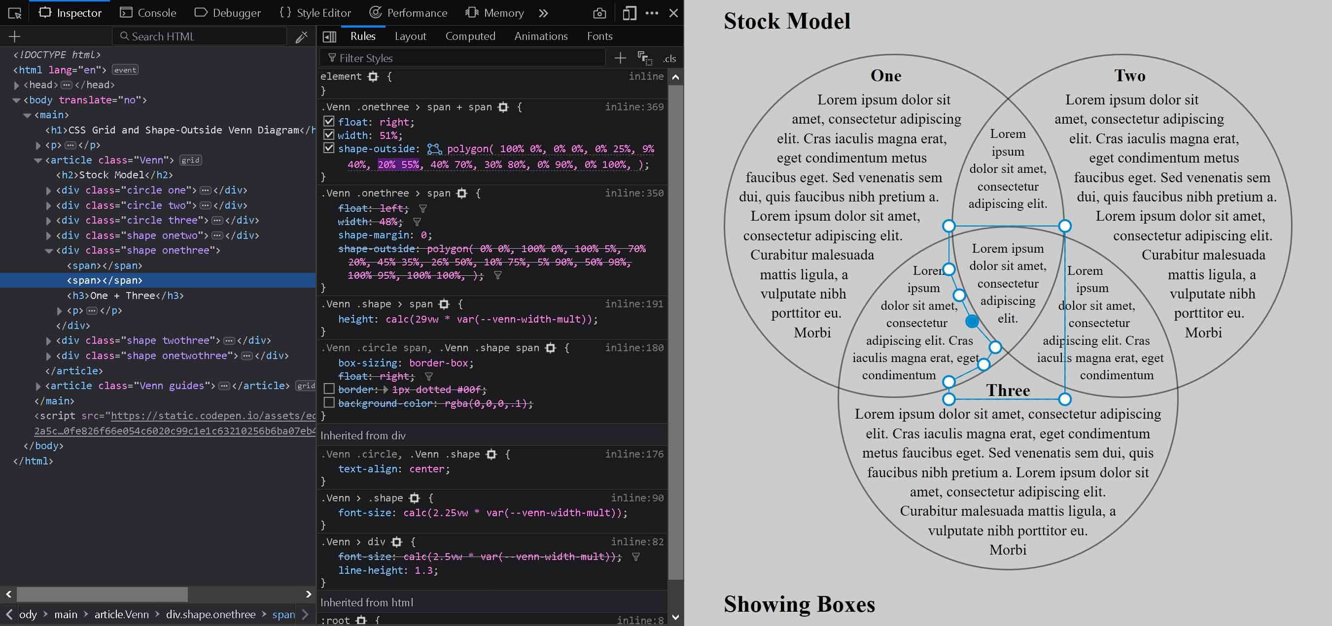
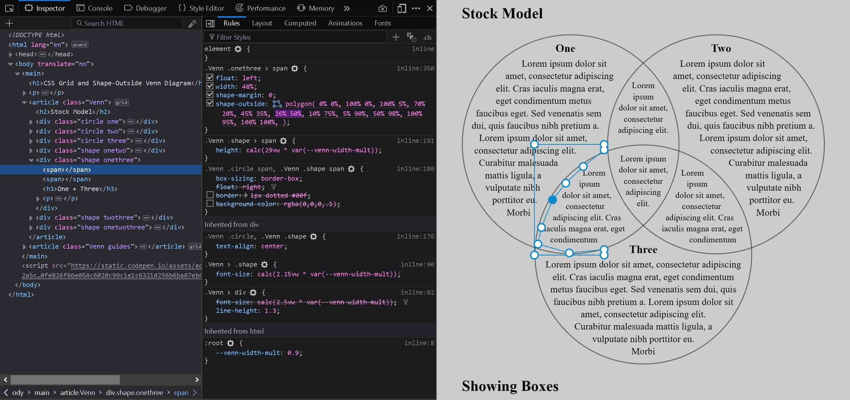
You may note that the CSS shapes do not go right up the edges of the containers and lines. This is intentional. I wanted some control over distance from edges at different points in the shape. The shape-margin property only accepts a single value, so you cannot set the top different from the left edge, like you can with margin or padding.
You should also note that using CSS shapes will result in more text clipping than just the fixed-size container itself. If you use the code as-is, you will also need to use text that will fit in these spaces. Be sure to test with your chosen typeface and font settings as well.
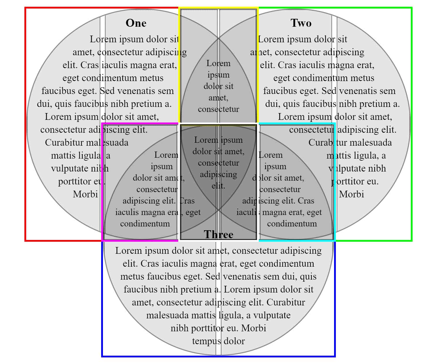
In the pen above and image below showing the boxes, you can see that the <span>s are shown via their bounding boxes as the gray areas in each circle with the dotted borders. You will notice a slight vertical gap between each. If the bounding boxes overlap, the text will be pushed below them both. I leave the gap as a cushion, confident I won’t have a tiny leading nor trailing “I” in my content.
CSS Custom Properties
I wanted my Venn diagram to be sized based on the viewport, not necessarily the page layout. My thought is that there would be greater chance of text being large enough to be legible. While it may not be an ideal long-term approach, I had to at least address an immediate limitation — embedding it in non-full-width layouts.
I added a CSS custom property that mostly just acts as a multiplier to the base sizing. If the layout in which I want to use the Venn diagram has a maximum width of 90% of the viewport, then I adjust --venn-width-mult to have a value of 0.9.
:root {
  --venn-width-mult: 0.9;
}
@supports (shape-outside: polygon(0 0, 0 50%, 50% 50%)) {
  .Venn .circle > span {
    width: calc(58.5vw * var(--venn-width-mult));
    height: calc(58.5vw * var(--venn-width-mult));
  }
  .Venn .shape > span {
    height: calc(29vw * var(--venn-width-mult));
  }
}
CSS Grid
I have used CSS grid in production sites since 2016. Doing it in a progressively-enhanced way and supporting Internet Explorer’s grid syntax was relatively easy for me. However, it meant I was limited in how far I could push grid.
My use of CSS shapes changed that calculus a bit for me. Neither Internet Explorer nor Edge support CSS shapes. That lack of support meant that I could not easily prevent text from flowing into the overlapping areas — at least not without a lot of extra elements and trickery.
Since my desire to use grid hinges on CSS shapes support, that allowed me to use a different support query. That also meant I could use some more modern syntax than I would have otherwise.
@supports (shape-outside: polygon(0 0, 0 50%, 50% 50%)) {
  .Venn {
    display: grid;
    grid-template-columns: repeat(5, 1fr);
    grid-template-rows: repeat(3, calc(28.8vw * var(--venn-width-mult)));
  }
}
My hope is that when browsers add support for CSS shapes, they will also already support this grid syntax.
With that handled, I could create a grid that allowed for overlaps. In this case, I made a six column, three row grid. You can, of course, tweak the column/row count to your own needs.
In the Codepen above you should see a second Venn diagram at the bottom. Each of the <div>s has a color-coded outline, with the <div>s representing the overlapped regions set to a mixed color corresponding to the two <div>s it is intended to join.
Fallbacks
For browsers that do not support CSS shapes, instead of the grid layout they get floated content. I use spacing and rounded corners to try to visually indicate how the joined areas are connected, but here I am really relying on the headings in each container to do that heavy lift. Note that these values are unset in the @supports query.
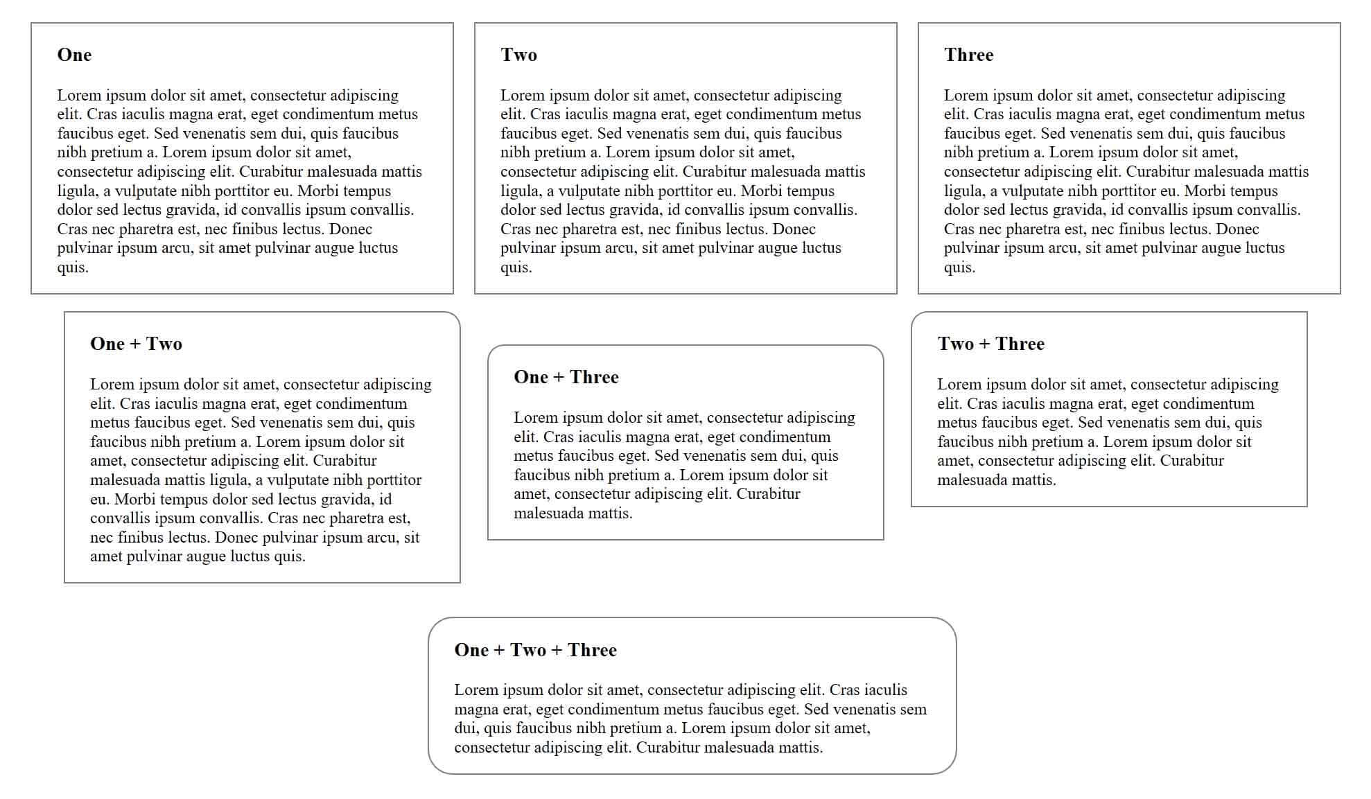
For these same browsers in a narrower view the floats go away via width media queries. At that point everything just stacks, the borders go away, and users will see what is essentially the raw structure of the page. Clear heading language is even more critical in this view to help the user understand which is which.
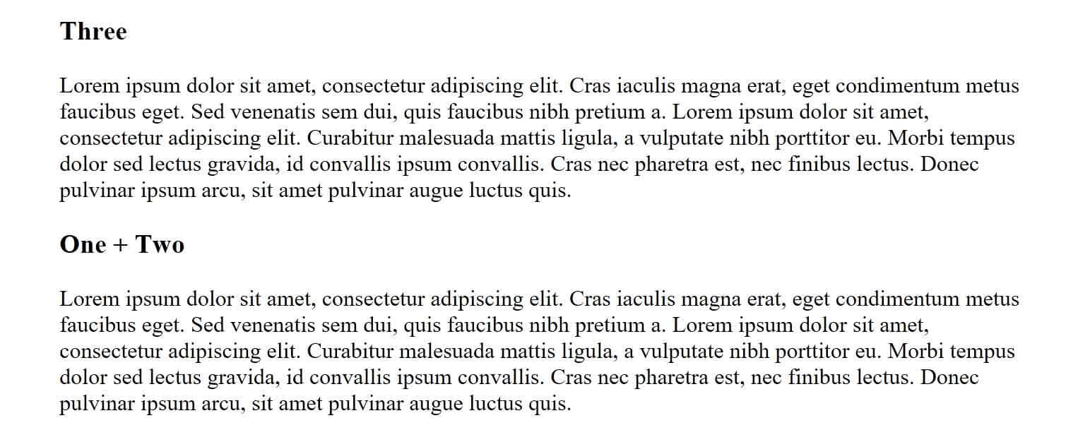
In both of these fallback views is there is nothing clipping the content. All the headings are displayed and all the content is displayed. If, for whatever reason, you had content in the full layout that you were counting on being clipped by the shapes, it will be visible here.
Accessibility
By default it is accessible to screen readers. It uses regular heading syntax and text, so nothing special there. The source order makes sense provided your headings are also clear. Text size and contrast is your responsibility when you customize it.
Print Styles
The base version has only one print style. It is there to make sure it scales up to fit as much of the paper as possible. You can, of course, override that. If you use background colors, just be careful to clear them out.
@media print {
  :root {
    --venn-width-mult: 1;
  }
}
Windows High Contrast Mode
You have nothing to do here. Internet Explorer and Edge are the only browsers that support Windows High Contrast Mode (WHCM) well. Firefox does, but from experience it has very few users and they are aware of the support differences. The good news is that both Edge and IE will get the floated box version and the borders will render fine. There is nothing you need to do. At least not until you start to customize it.
Two Circle Venn
You may have noticed that my Venn diagram uses three circles. Many are two circles (once you get to four and above you are just messing with higher planes of reality, so forget about those).
If you want a two circle Venn diagram, then use the code and techniques I outlined above and let me know when you have built it.
Update
Fine. I made one.
See the Pen 2 Circle CSS Grid and Shape-Outside Venn Diagram by Adrian Roselli (@aardrian) on CodePen.
An Example
I took my original Venn experiment and ported its content to this new version.
I added a hover/focus bonus, so pay attention to how I used CSS generated content and also ensure screen reader support. It has print styles, a terrible background, works in WHCM, and even uses a union symbol that screen readers announce correctly.
See the Pen The Venn Diagram of Christmas Traditions by Adrian Roselli (@aardrian) on CodePen.
Related
10 Comments
:)
Good Lord! This is a fine, well explained example! Thanks for sharing, I will check this out in detail a little later.
Love the Festive (COUGH!) background too :)
Why not just use SVG?
In response to . Accessibility, responsiveness, progressive enhancement, and because I wanted to do it this way. If you make an SVG version, please share it here.
If each slice of the diagram has its own heading, couldn’t it be a
<section>as well as a<div>?
In response to . Yup. That would work too. I opted against using
<section>since it is adding more structure than I felt necessary with the limited content and existing heading structure. If adding it helps your users, then by all means.
How can I make it so there’s one circle on the top and two others at the bottom?
In response to . The post walks through techniques to use CSS grid and shapes, and also provides a two-circle Venn. My suggestion is fork the pen(s) and start with the grid layout before working on the CSS shapes. Firefox is still easiest (in my opinion) for making the CSS shapes. Also, set colored borders on your containers as you go so you can more easily distinguish the overlays (which I show in one of the screen shots).
Thanks you so much!
Adrian, thank you for this, again.
Just found a strange bug when testing last Codepen example (with Chrome Version 119.0.6045.124 (Official Build) (64-bit) on Windows 11) that may be failing WCAG SC 2.3.1 Three Flashes or Below Threshold (Level A).
It’s not easy to find, but I was able to find it quite quickly (using mouse):
1. click Secular,
2. hover Christian and move mouse slightly out of Christian (towards top left corner),
3. you will see the white color used in the Christian red background flashing continuously.Will try to find the reason when I have more time on my hands, just wanted to let you know.
Leave a Comment or Response