Network Solutions and Dark Patterns
 We should be familiar with anti-patterns in user interface design — counter-intuitive or ineffective user interface techniques.
Dark patterns are user interface design patterns that intentionally try to steer users into taking actions that are in the best interest of the site owner, not the user. Sadly, users encounter these all the time. You can get a more verbose overview at the dark patterns wiki, which is from where I am stealing this phrase.
For example, do you ever notice how banner ads (typically for questionable weight loss or beauty aids) tend to vibrate every few moments, shaking just a pixel or two? This is intentional because our visual systems are trained to react to movement in our peripheral vision, like an attacking tiger (or liposuction ad).
The real problem comes when this intentional exploitation of user behavior is designed to ultimately confuse users into submission or to hand over (too much) money.
In the case of the latter, I have an example I’d like to take you through. I have used Network Solutions as my domain registrar for years, primarily because that’s who I was with before ICANN opened up the registry business to others. I have stayed with Network Solutions because of the hassle of moving away from it, even though the hassle of staying has probably far outweighed it by now.
As an aside, I’d like to take this opportunity to explain that I will not use the morally bankrupt filth that is GoDaddy for a variety of reasons, not least of which is related to its absurd objectification of women, its founder’s flimsily explained killing of elephants, its support of SOPA, or its status as a target to the likes of script kiddies.
Back to the meat of my post. I wanted to both register a new domain and renew an existing domain this week and found the process so overwhelming that I feel it’s a great example of an ecommerce anti-pattern, a dark pattern. I’ll run you through each process, both in my personal Network Solutions account and in my corporate Network Solutions account. I did this using two different browsers to avoid polluting my cookies, so I cannot say whether the differences in design elements are a function of my accounts or my browser.
For each screen capture you can click/tap/select it to see the full-size image.
Registering a Domain
My first test was to register a domain name using Firefox 16.02 and my personal account and Chrome 23.0.1271.64 with my company account.
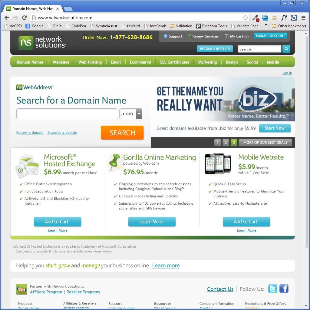
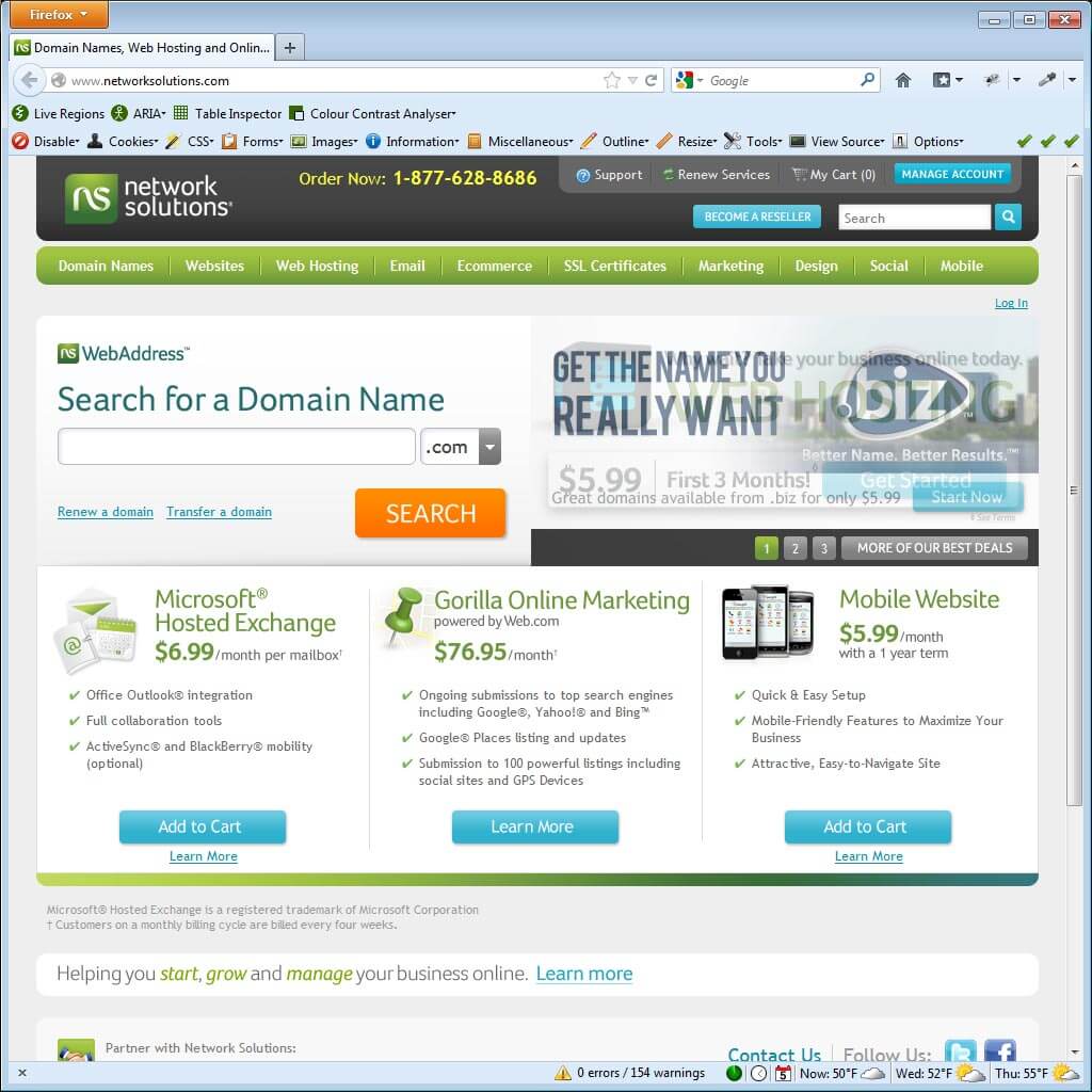
As you can see, the home page is pretty straightforward. There are a few sales pitches, and the link to log in may be hard to find, but the blue button is established as a prominent way of taking action.
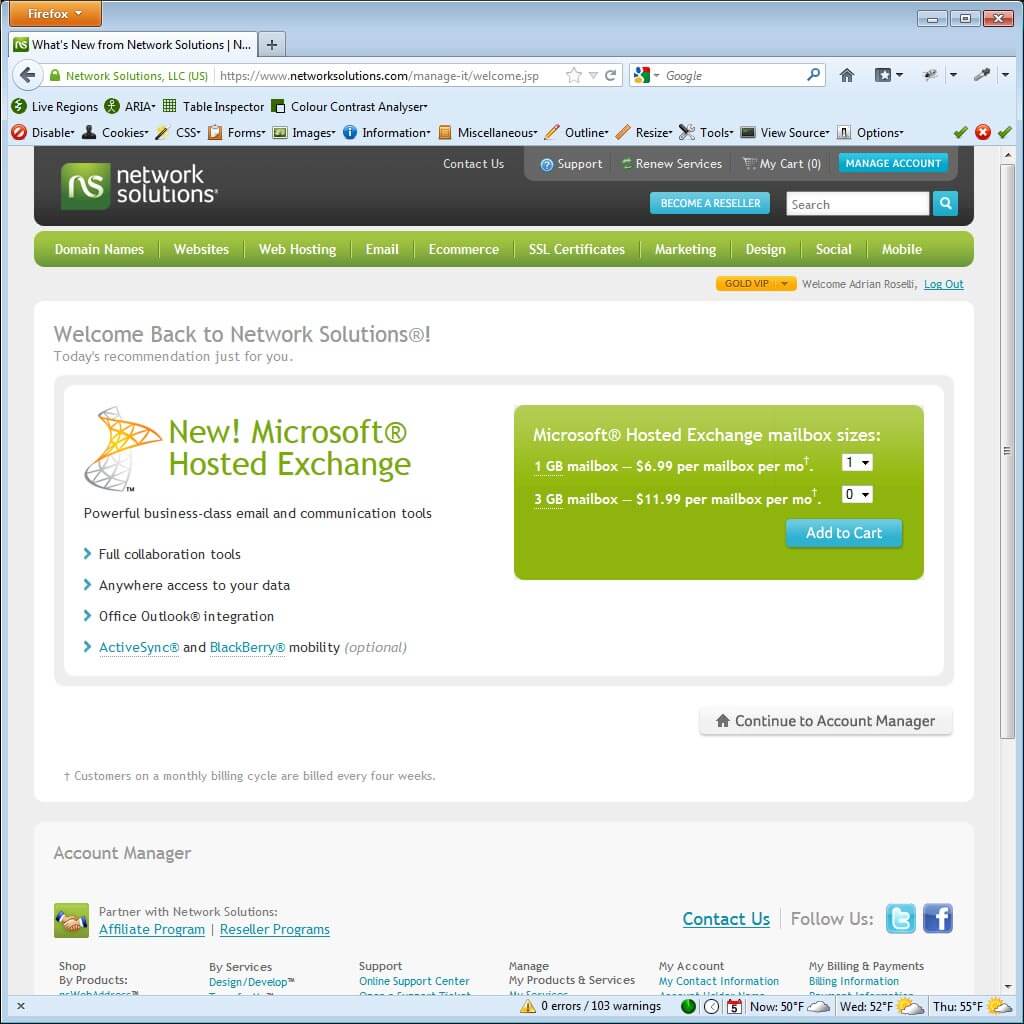
Immediately after logging into my personal account using Firefox I am presented with a sales pitch. Note the use of the blue button in the green box surrounded by the gray border. The option to continue without adding this product is drawn in grays below the sales pitch.
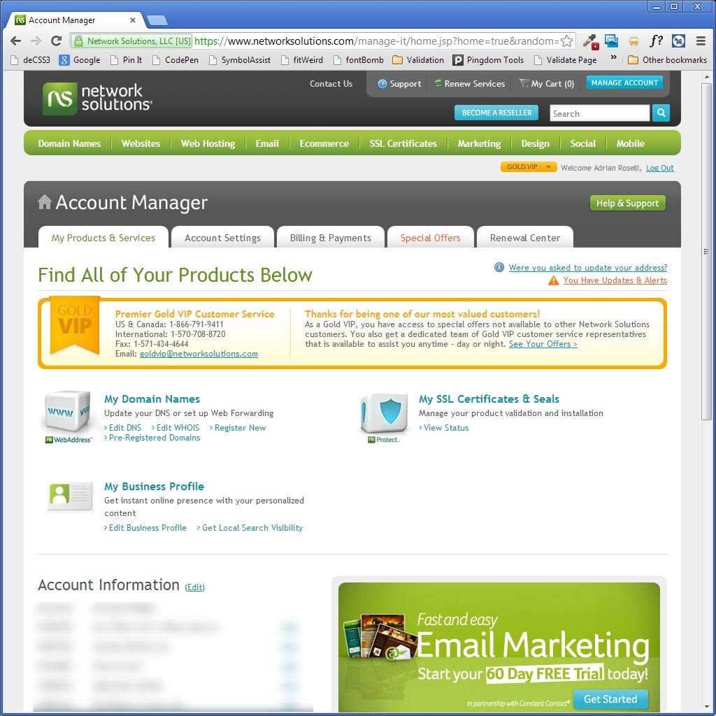

On my Account Manager page, my company account (left) is straight to business, listing domains and actions I can take. My personal account is trying to pitch me on the private registration product and also continues to establish the blue button as a means of taking action.
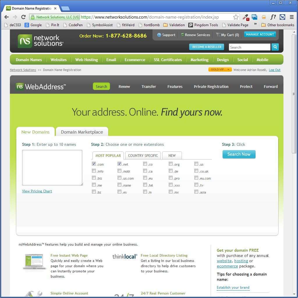
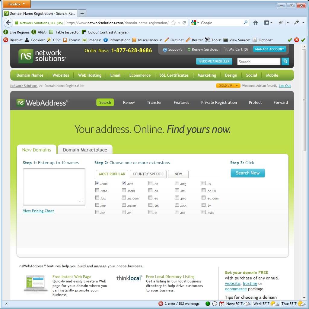
As I move to conduct a search for a new domain name, in both cases the .com and .net are pre-selected as options. I know I am only interested in .com, so I de-select .net as an option.
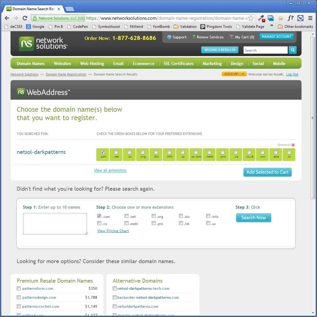
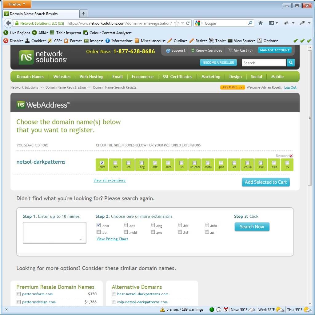
This screen is fairly straightforward — it shows me what is available, offers me more extensions from which to choose, and allows me to remove a domain entirely. The blue button allows me to add my selection to my shopping cart.
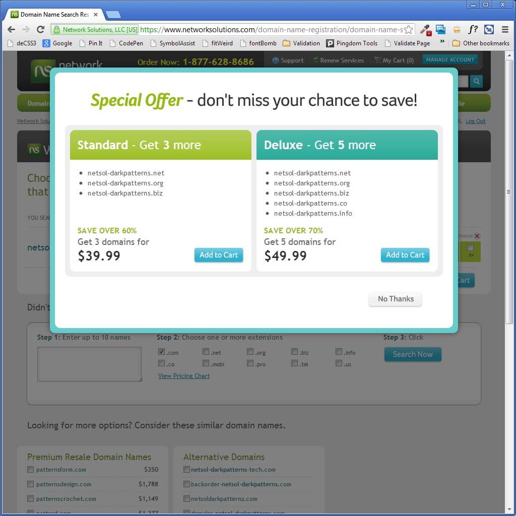
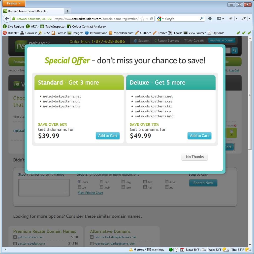
Clicking Add to Cart immediately results in this overlay for both accounts. I can add a bundle of three or five more domains, using the blue button. Or I can skip this with the far less prominent No Thanks button.
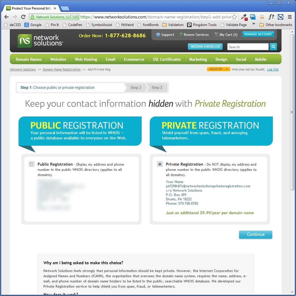
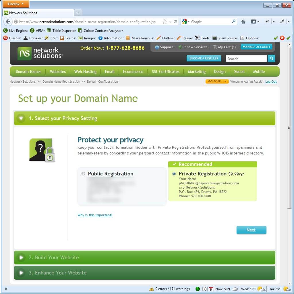
Now it starts to get a bit tricky. In both cases I am being offered an opportunity to keep my information hidden with private registration. You’ll note that in both cases private registration is pre-selected and the price is listed, though far less obviously in the Chrome view. There is no language saying that I am adding this to my cart (as I have seen on previous screens), just a Continue or Next button. There isn’t an obvious “no thanks” option, either.
To get past this screen without adding $10 to your order you have to read the text, which means you are being subjected to its fear-mongering language (I’m already getting spam, and telemarketers call my house, so there’s no real benefit to me). Then you have to choose the radio button for the standard registration, and then press the Next button. This is a departure from previous screens where the user has been trained to look for the gray “nope” option.
The Next button without an accompanying No Thanks gray button beneath it can cause users to breeze through this page without noticing the pre-checked option.
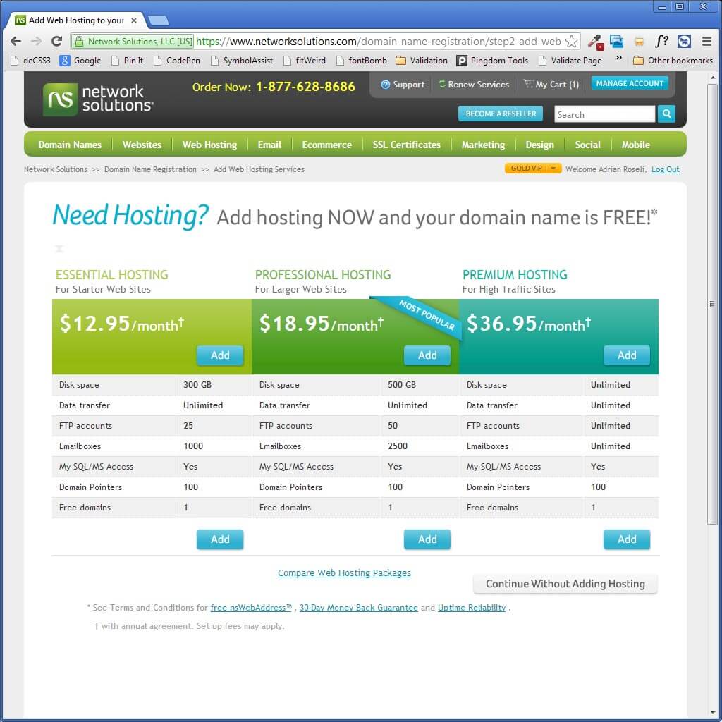

On this screen I am hit with the hosting pitch. Far stronger for my company account, but I still get the pitch when in my personal account. You may note the price difference between the cheapest plan for my company account versus the only plan offered to my personal account. The plans may in fact be different, but at a glance it looks like Network Solutions is playing a numbers game based on my account type.
You may also note that one screen offers a button to Continue Without Adding Hosting while the other simply uses a Next button with no hosting pre-selected.
These are the kinds of clues that suggest someone has made a conscious decision about what I should see as a customer and may be intentionally using these dark patterns.


Now I am getting hit with the leftover product pitches. For my company account (still in Chrome but spanning two screen shots) I see domain forwarding, email for my new domain, and SSL options. Reading the language for each, especially the SSL, these are clearly targeted to less technical customers. However, none of the options are pre-selected and just clicking the blue Continue button gets me past this screen.
For my personal account, I get similar product pitches. No SSL option is listed, but there is forwarding, email, and a “mobile” add-on option for the email. The “none” options are pre-selected, so in this case pressing the blue View Your Shopping Cart will get you past this screen without adding any products.
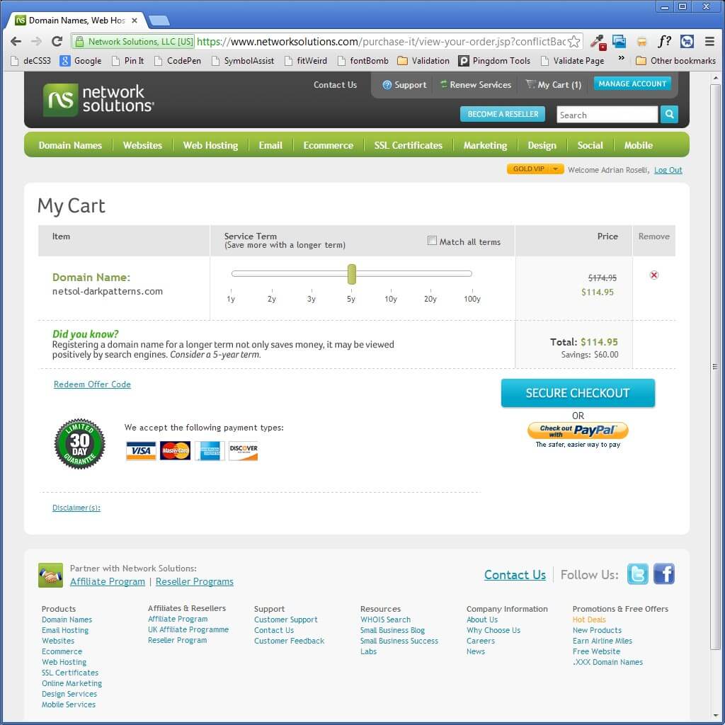

The shopping cart is your last chance to make sure you haven’t added anything you don’t want. For this demonstration I didn’t add anything along the way, so it’s easy to see what I have. Oddly, the shopping cart in Chrome for my company account shows me my “savings” and pitches me on why I should register my domain for five years. The shopping cart in Firefox (personal account) does no such thing.
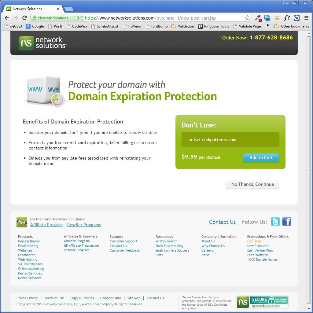
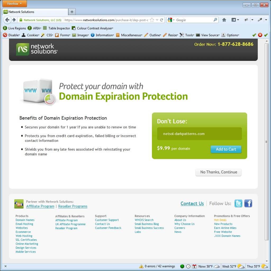
I bet when you clicked the all-caps blue SECURE CHECKOUT button you thought you were done with the sales pitches. Not so. Here we see the the pitch to protect your domain if you forget to renew it, along with a blue Add to Cart button. At least there is a gray No Thanks, Continue button below it.
This may be a bit jarring in case you thought you were free and clear, after all you were just in you cart, just reviewed it and are ready to pay. If you do accidentally click Add to Cart, you are not presented with your shopping cart again to verify the charges. It just takes you right to the payment screen.
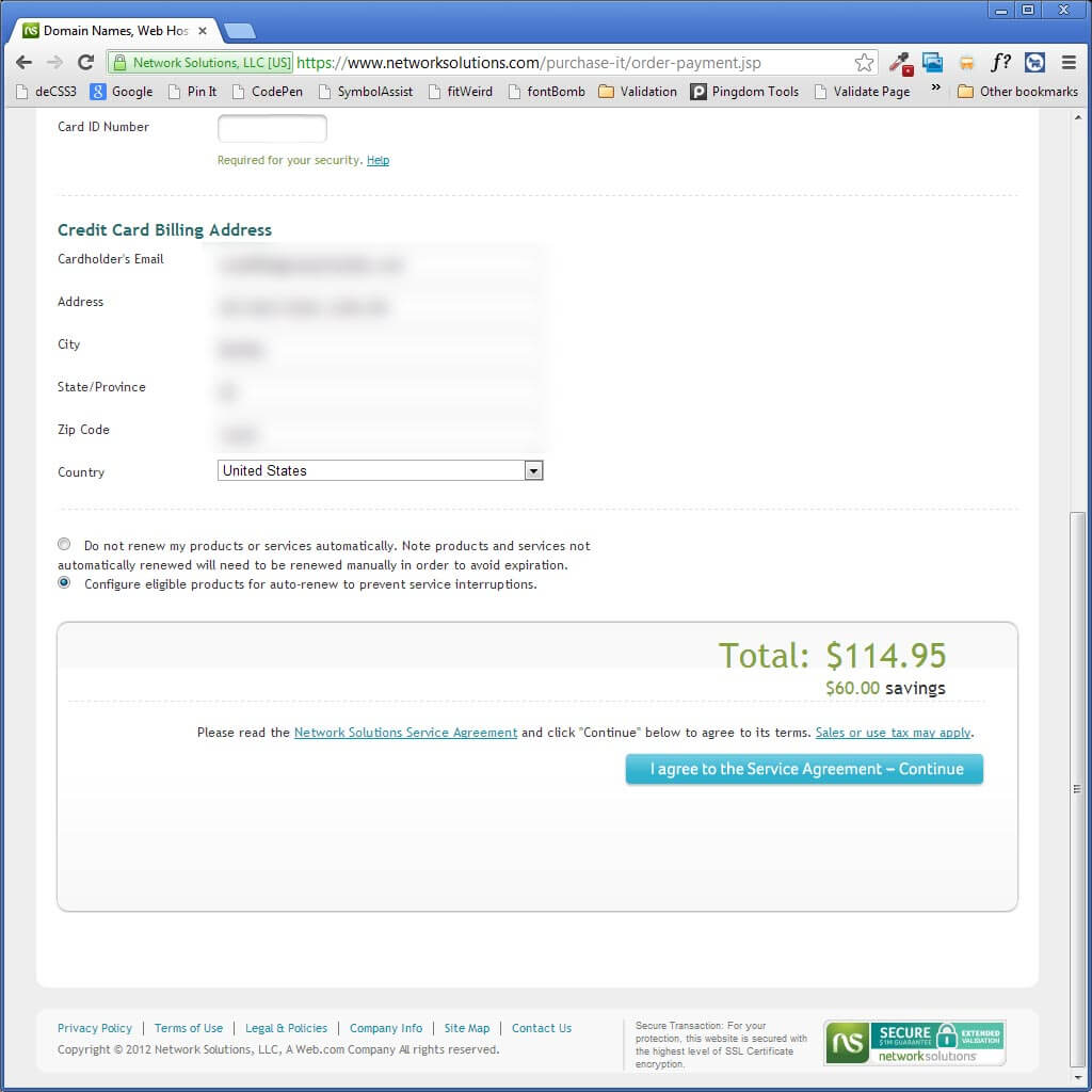
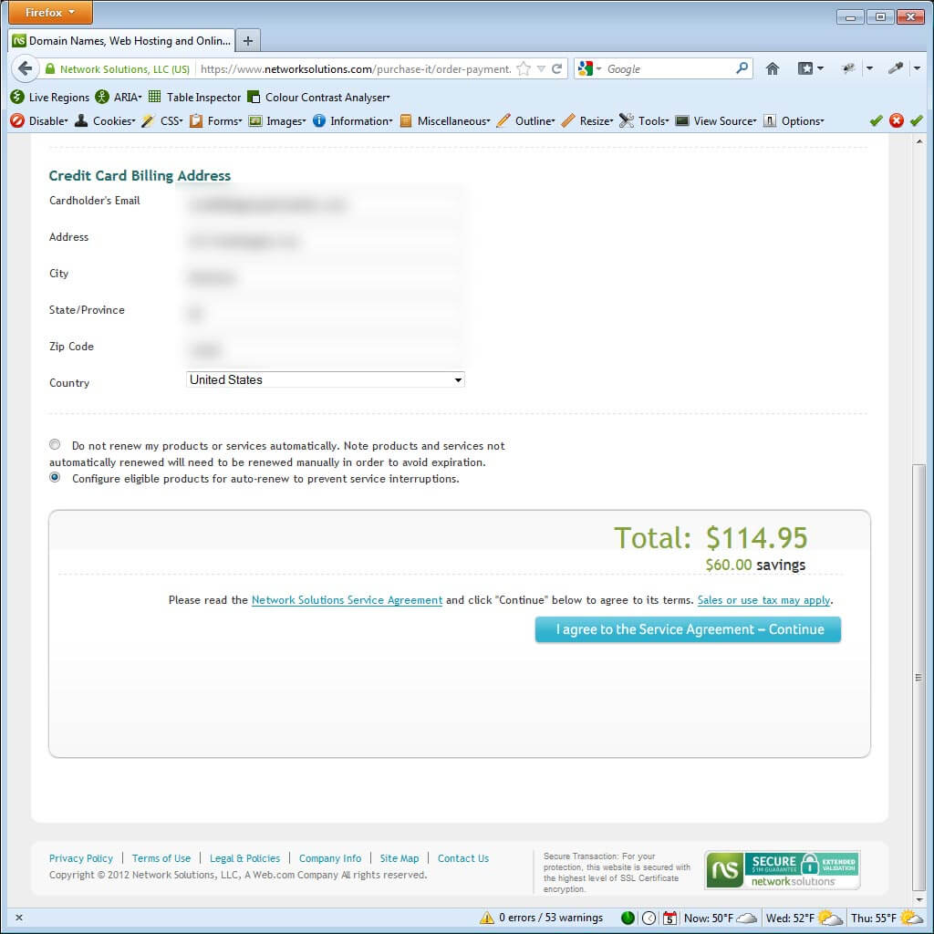
Here you see the total (I did not add the expiration protection), with no cart, as Network Solutions takes your credit card details and bills you. You may also notice that the auto-renew option is pre-selected. What isn’t mentioned is that Network Solutions will bill your credit card 90 days before the domain is set to expire, well before the period when many organizations make a decision to switch registrars and well before the 60 days-to-expiration window many registrars impose when they won’t allow a switch.
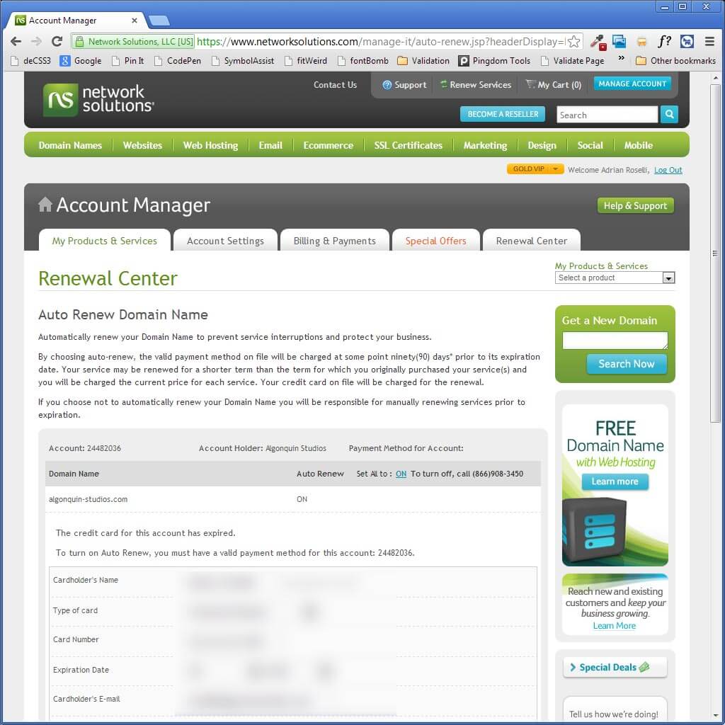
This screen shot is not part of the order flow. If you do select auto-renew accidentally you cannot simply deselect it in your account later, you have to call Network Solutions and sit through its CSRs’ protestations and sales pitches to undo it.
Renewing a Domain
Assuming you weren’t tricked into auto-renewing, this next test shows renewing a domain name using Chrome 23.0.1271.64 with my company account. I tried to do this in Opera, but had no luck:
@netsolcares Trying to renew a domain using @opera 12.2/Win doesn’t work. Checking box, pressing “Renew” returns same page, unchecked box.
— Adrian Roselli (@aardrian) November 21, 2012
Regardless, the process will look very similar. For each screen capture you can click/tap/select it to see the full-size image.
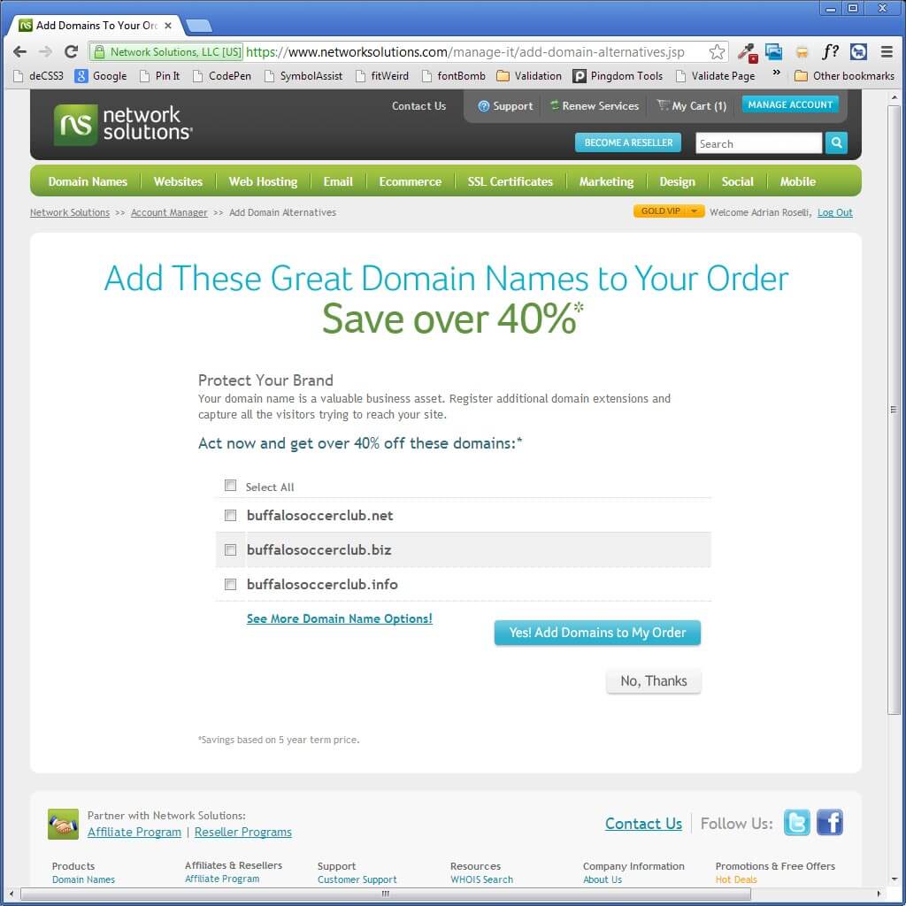
Upon choosing my domain to renew I am promptly pitched on picking up yet more domain names.
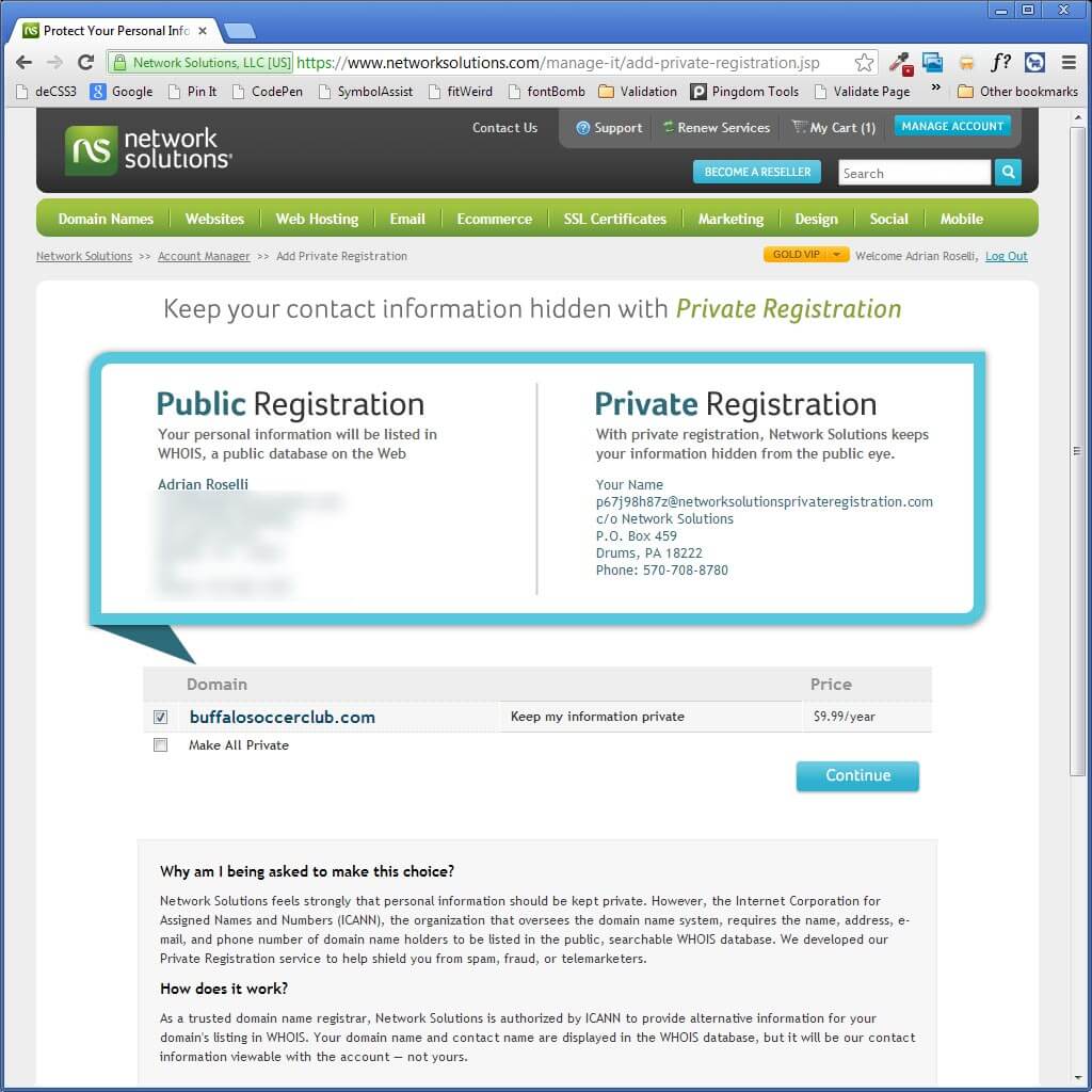
Here is the pitch to make my already-public information private (for a fee). You may notice that this screen is different from the two analogous versions we saw above. Here the radio buttons next to the two options are replaced with a grid below, though the option to add the $10 charge is still pre-selected with the big blue Continue button cheerily prompting you to click it without paying attention.
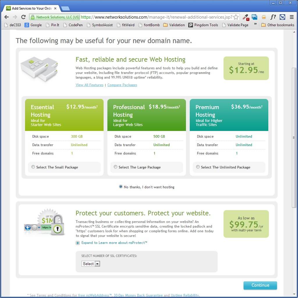
This pitch confounds me. I am renewing my domain, which already has DNS managed elsewhere, but I am still being offered hosting. At least on this screen, unlike the previous screen, it is safe to click Continue.
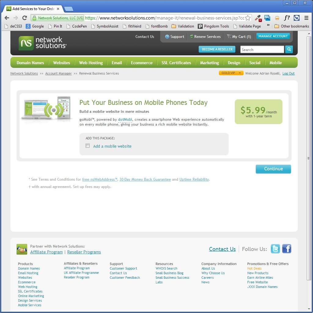
The suggestion that I need a mobile site is laughable and belies the complexity involved in taking a pre-existing site and suddenly spinning up a mobile version elsewhere. However, I can safely click Continue. Someone who adds this, however, may end up spending more time and money to undo it as a result.

The shopping cart is a brief safe area, assuming I am comfortable with the five year registration period.

Once again comes an offer after I have reviewed the cart, and as I mentioned above, adding the product at this point doesn’t bring you back to the cart. This screen makes it too easy to add more to your order without an easy way to verify it.
Wrap-up
Network Solutions is not the only one to make use of dark patterns. It just happens to be one that has tricked me before and has caught many of my clients as well. I simply consider the Network Solutions dark pattern order process to be low hanging fruit, an easy example of how a confusing ecommerce flow and user interface can negatively impact users, intentionally or otherwise.
Update, July 24, 2013
In a post titled The slippery slope, Harry Brignull provides even more examples of dark patterns.
Update, January 28, 2014
Not content to stop at just one stream of dark patterns, I found another one: Network Solutions and Yet More Dark Patterns
2 Comments
Great post Adrian. They really do make it so confusing. I've had clients that registered their own domains and are paying for things they had no idea what they were. GoDaddy is no better at all, and I left them for the same reasons.
I do highly recommend Hover though. This summer, I moved all of my domains to them, and didn't have to do more than email them list, where they were currently registered and they did all the work for me. It was painless and they did a fantastic job.
All the best for 2013.
Mich
I've been tempted to do a review like this of all the registrars because I believe they are all easily as bad. The problem, of course, is that I am certain I will get billed for something I didn't intend and will spend far too long trying to reverse it.
Leave a Comment or Response